4 minute read time
One of the Most Underrated Essentials in Email Design

Article first published September 2006, updated July 2019
These days there’s a growing list of essential content you should include in every email you send. You know the drill. Unsubscribe mechanism, postal address, link to web version, the list goes on.
The permission reminder message
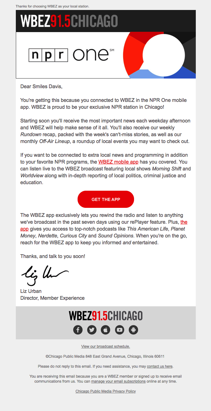
Of all the essential content though, there’s one consistently missing in many of the thousands of campaigns we deliver each week. What makes this more surprising is how easy this element is to add. I’m talking about the permission reminder message—a simple sentence or two reminding the subscriber how they gave you their permission to email them. Here’s a quick example:
Hi, just a reminder that you’re receiving this email because you subscribed via our website. As promised, this issue includes great tips on…
In two simple sentences you’ve assured each recipient that your email isn’t spam, and you’ve reminded them why they were interested in hearing from you in the first place.
Source: Really Good Emails
Don’t stop there
We’re nearly there, but now that you’ve reminded the subscriber how you got their permission and what you’re sending them, why not give those that are no longer interested the option to unsubscribe right then and there? Here’s a complete example:
Hi, just a reminder that you’re receiving this email because you subscribed via our website. As promised, this issue includes great tips on…, but you may unsubscribe if you’re no longer interested.
Not only is this good UX, but you’re legally required to provide this option.
You may be wondering how to use these email design guidelines to create design your own effective permission reminder email. Read on to find out.
Designing emails that emphasize transparency
Designing an email that emphasizes transparency is crucial if you are to gain your customer’s trust. Here are a few email design guidelines that help build loyalty and engagement:
Include a link to your preference center
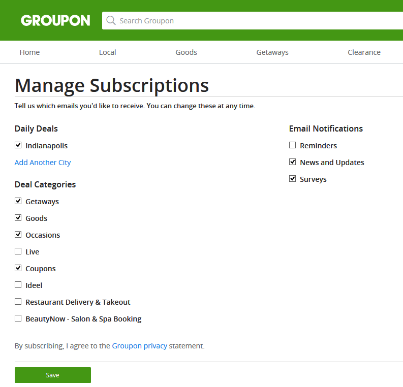
An email preference center is an important part of your email marketing strategy and linking to it in all your emails must be non-negotiable. What is a preference center, you ask?
A preference center is a page you take your subscribers to, allowing them to change or update the manner in which you communicate with them (frequency and type of content, for example).
Source: Delivra
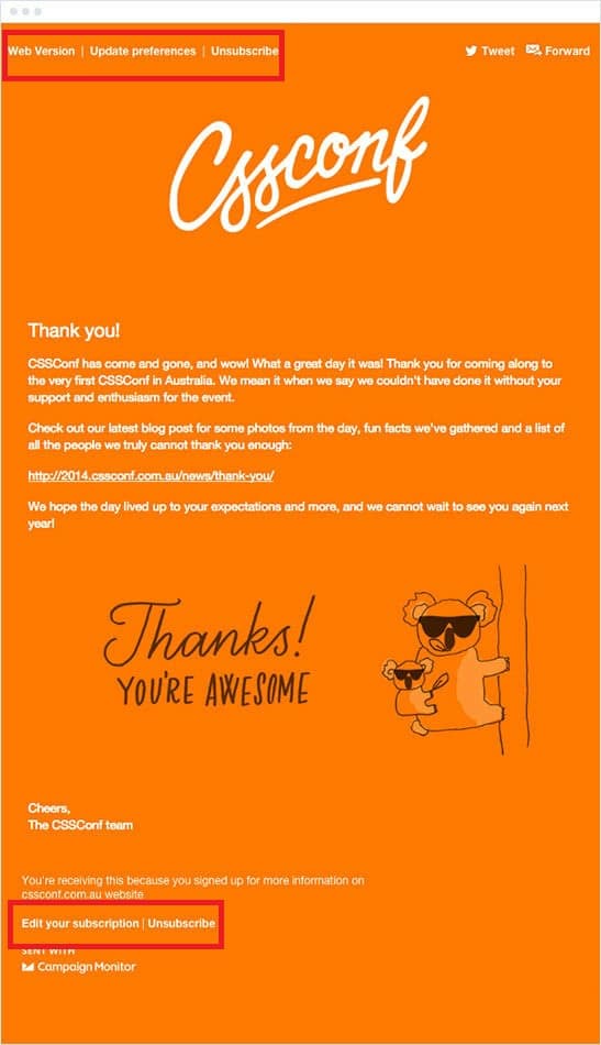
Clear and visible unsubscribe link
Another way in which you can increase transparency in your emails is by including a clearly visible unsubscribe link. No, this doesn’t encourage unsubscribes—quite the contrary. When your readers see that they can unsubscribe at any time, they feel more relaxed knowing they can control your relationship and communication.
Source: Campaign Monitor
How do you write a visually appealing email?
Emails should not be difficult to consume. A cursory look at email design should entice the reader to digest all the content and take action with the CTA. Here are some email design guidelines to help you create an impactful email:
Maintain a clean, simple design
An email that looks “busy” is a complete turn-off. Use a simple email template that has, at most, three columns that logically reads left-to-right and top-to-bottom.
White space is your friend
Contrary to popular belief, white space in your email is not a bad thing. It’s actually a great design element as it helps break up the content into scannable and easy to digest sections.
Be careful with your fonts
Fonts play a big role in ensuring that your emails are visually appealing. However, don’t get too fancy with them. Not all fonts display well in emails depending on the email client or device it is being read on. Instead, stick with web safe fonts to ensure your email renders correctly for all your subscribers.
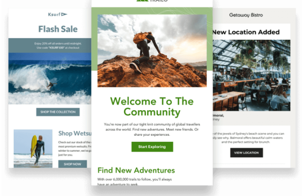
Spice it up with images
Lastly, in order to create a visually appealing email, you need to spice it up with relevant images. Make sure the images you use are high resolution and help convey your message (and not distract from it).
Wrap up
Permission emails are usually not given the effort they deserve when it comes to email design. Done well, however, this little known email design secret can drastically reduce unsubscribe rates and spam reports. Hopefully, these email design guidelines have inspired you to give your own a little more love.
Be sure to check out our article on how to personalize your permission reminders for more insight on designing and optimizing your permission emails.