7 minute read time
The Top 5 Email Design Trends to Watch for in 2019
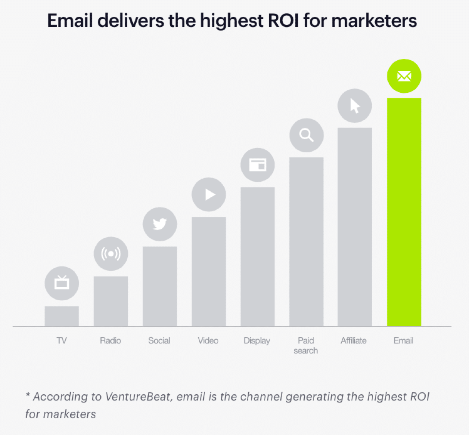
There’s no doubt about it—email marketing is here to stay. With the highest level of ROI for marketers, an email marketing strategy is a must-have for every digitally-savvy business.
But there are many ways to market through email and a lot of competition for your customers’ inboxes. That means marketers who really want to make the biggest impact need to provide cutting-edge email design.
To help you stay ahead of the competition, we’ve curated snippets of advice from design experts on the most critical email design trends to watch for in 2019.
Starting with the basics
With the number of email users expanding to an estimated 254.7 million by 2020, getting email design right is critical.
You’ll be able to reach millions of prospects with a single email, so it pays to spend time on the design and content. A well-designed, informative email will result in a higher return-on-investment (ROI)—and fewer unsubscribers.
In this way, email marketing remains consistently at the top of marketing strategies for businesses—and, with the highest ROI in the group, that’s no surprise.
Even though people switch media channels up to 27 times an hour, emails still hold attention if the content is relevant and personal.
And, since most people take their digital devices on the move each day, it’s important that your email marketing designs are optimized for mobile devices. That way, your emails are responsive and engaging, no matter where your target audience accesses them.
Of course, there are trends to consider—like the ones we’ve curated here. To be truly effective, you need a good grasp of the basics.
Tara Dagostino from 38th Street Studios provides two great tips to get started with email design best practices, including:
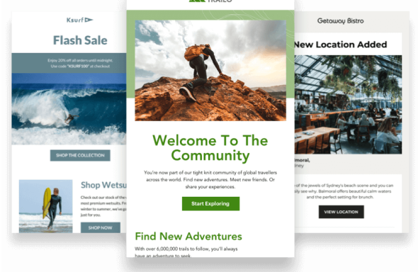
Staying on brand
“When designing your email, keep in mind your brand’s colors, fonts, and persona. Consistency is important; it reminds your readers who you are and what you represent. Most importantly: you become recognizable.
Is your brand light and funny? Or does it embody a more serious, minimalist tone? All aspects of your email design should reflect this. Once you’ve solidified your identity and personality in your emails, you build trust amongst your viewers, allowing them to connect with you more readily.”
Inserting an elevator pitch
“The top third of your email is the first part that your readers will see upon opening your email. This small space should do most of the work for you by combining that familiar branding identity with the succinct message that the email is conveying.
This is a powerful space, so utilize it to your advantage with compelling copy and images that are eye-catching and memorable, as well as a simple call-to-action that tells your readers what to do next.”
Additionally, Tara touches on some of the important details that have grown into emerging trends for 2019. We’ll see more of Tara’s insights later in this article.
But first, let’s look at the trends that are topping the charts as we head into 2019.
5 email design trends to watch for in 2019
1. Use a double-duty design
The experts at DesignHill note that internet giant Google has already adopted the fast-growing—and useful—trend of asking for customer feedback directly in the email.
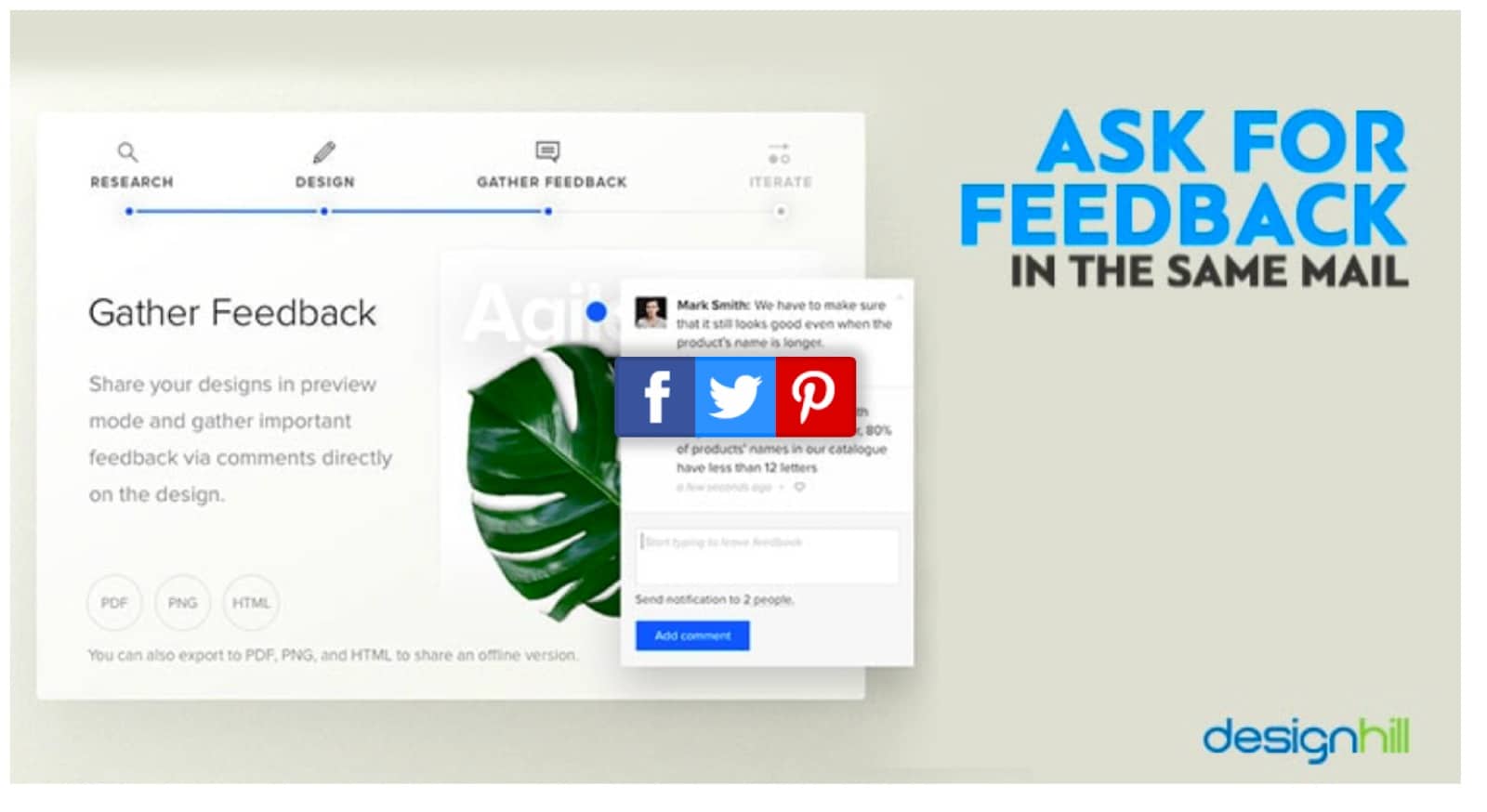
Image: DesignHill
Incorporate this same method using clever design. Allow subscribers to click a checkbox if they found an email interesting. You can also include a simple question or a short quiz.
Getting this kind of engagement—and pain point discovery—will help you fine-tune email content. By providing more relevant information to customers, they’re more likely to remain engaged.
Best of all, allowing customers to provide their thoughts instantly encourages a higher level of participation.
2. Make It minimal
The designers at Maxx tell us the trend in graphic design is toward minimalism. Minimalistic design is often associated with modern, niche, or luxury businesses, but it’s quickly becoming mainstream.
Minimalist designs—lots of white space and not much text—can deliver messages that come across as authentic and clean, fast and punchy.
As we move into 2019, minimalist designs will incorporate more color—leaving black, white, and grey behind.
Here’s a design that does this well, using racy red to match their message and product:
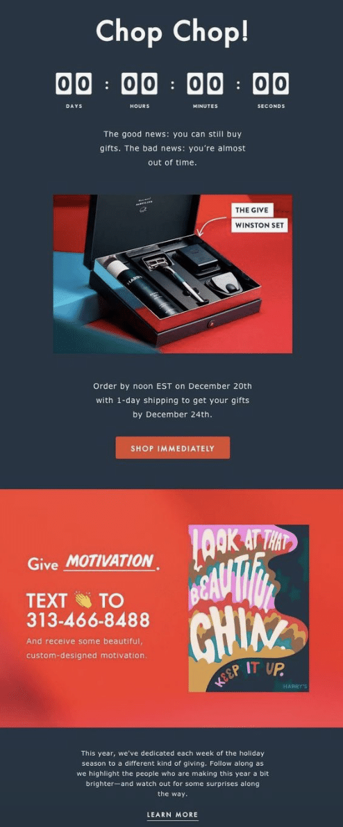
Image: Pinterest
The clean space and minimal type let subscribers skim through this email easily, while the color draws attention to important points in the body so nothing gets missed.
3. Personalization continues to impact results
Want 82% more opens? Use personalization. This technique is on the rise and with good reason. It works!
Trends come and go, but one thing that’s shown consistent staying power as we head into the next year is the movement toward making a personal connection with potential customers.
Personalized emails, and those designed with subscriber preference in mind, help customers see your emails as a friendly gesture rather than an annoyance.
Case in point: Stitch Fix CEO Katrina Lake discusses how deepening the customer experience is critical to her company’s success. She notes:
“The engines we’re focused on are improving and innovating on the client experience: how to be deeply personalized, how to use data science to get clients more of what they want. The second engine is new launches; we launched plus sizes, men’s and premium, and we’re excited to see those grow.”
Stitch Fix incorporates this progressive philosophy in their email design. They do this by sending opted-in customers a quick quiz to target fashion preferences. You can see this in the example below.
Image: A Little Insanity
Getting this information from their customers upfront allows Stitch Fix to send more personal, relevant content in the future. This relevancy earns the company a fixed place in customer inboxes.
4. Providing snackable content for hungry prospects
Video content is on the rise. In fact, it’s expected to make up 80% of all internet content in just a few years—2020, to be precise.
That means there’s going to be more video incorporated into email designs as 2019 looms large.
Still, the trend is toward minimalism and “snack ads”—or videos less than 10 seconds in length. Snackable content is a great way to amp up the power of your email marketing.
Curtis Tredway, writing for Medium, tells us to: “Expect to see shorter ads being used more by brands in the near future, to try keep their audience engaged.”
This practice can be expanded to include animated emails, too. Here’s an example from Art.com. The image below is the full email:
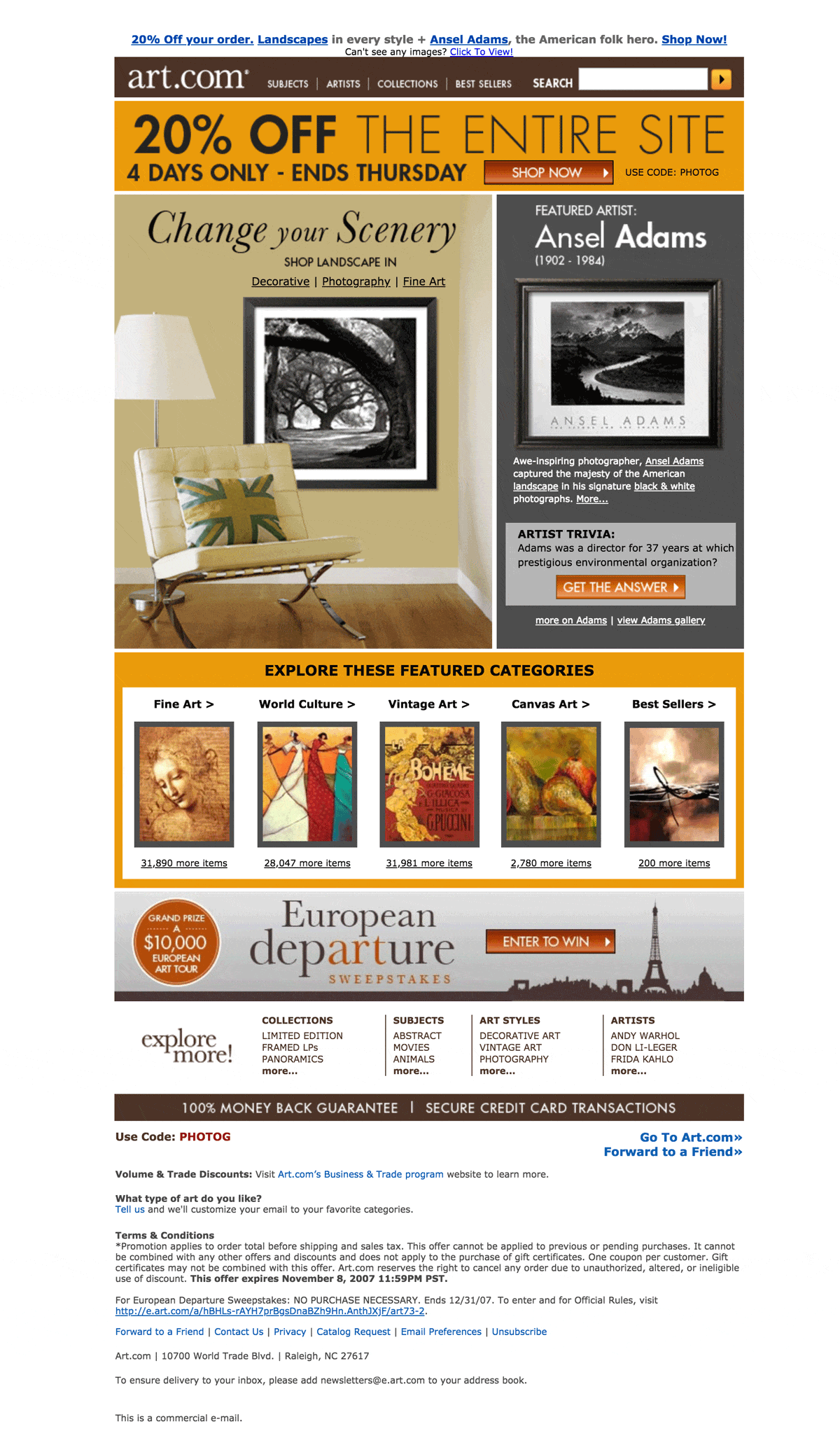
Images: Stylecampaign
The images in the main photo rotate to show other art options for the room.
While not technically video, this email gives subscribers small, snack-sized tastes of what the sender is offering. The email also provides the added benefit of showcasing art as it’s meant to be seen.
5. Let your customers create
User Generated Content (UGC) provides a great way to increase engagement and interact with your customer base.
Kamila Luksza at Voluum tells us:
Make an effort to motivate your customers to share their experiences with your brands. It will definitely pay off, as consumers are three times more likely to say that content created by a consumer is authentic compared to content created by a brand.”
GoPro is already on this bandwagon, sharing 5,000 or more videos each day under its #GoPro sharing site.
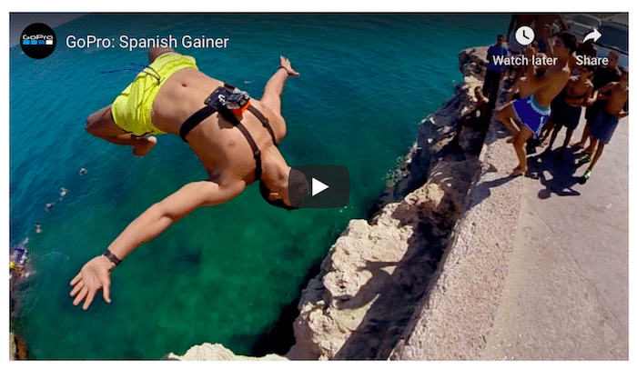
Image: Voluum
Using the momentum generated by UGC, GoPro has become one of the leading channels on YouTube, with over 3 million subscribers.
And here’s how they share their customers’ passions in their email marketing strategy:
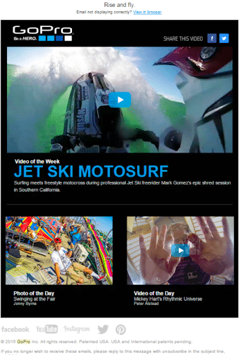
Image: GetApp Lab
Nothing is more authentic or engaging than having real customers promoting your product. And nothing warms your prospects’ hearts—and their wallets—like having their very own platform and 15 seconds of fame.
Wrap up
Some of the hottest email design trends to watch for in 2019 include a spectrum of designs that focus on the customer experience.
From minimalist designs with a punch of color to user-generated content that draws engagement and celebrates your relationship with customers, keeping customers’ needs and wants front-and-center is the order of the day.
Our expert opinions show that if you can provide a personalized, authentic experience to make a true connection with your audience, you’ll be on the right track for email marketing success in the coming year.