8 minute read time
How to Use Psychology to Optimize a Landing Page

As a digital marketer, you know that landing pages are essential for creating great first impressions and generating leads for each marketing campaign. But simply creating a landing page with a gated offer is not enough for your campaign to be successful.
Landing page design goes much deeper than making your pages look pretty and easy to navigate. You must know what makes visitors take action and what makes them abandon your page. This is where understanding landing page psychology can be the difference in winning a conversion or losing the prospect forever.
How to apply psychology and design an optimized landing page
In today’s post, we’ll look at how to design an optimized landing page and how to apply a few psychological principles that are proven to convince visitors to take action.
Create a compelling headline to draw visitors in
To capture visitors’ attention immediately and keep them engaged on your page long enough to evaluate your offer, you need a compelling headline. Speak directly to the benefits of your product or service and how it fulfills an essential need for your prospect.
One technique to use is the focusing effect.
The focusing effect is the tendency of people to place too much emphasis on one thing at the expense of others. When it comes to your landing page headline, though, you can use this to your advantage.
Your product or service likely has many benefits, but highlighting your unique value proposition (UVP) in your headline helps prospects focus strongly on that one feature. In turn, your UVP encourages them to click your CTA button.
JumpCrew lists several of its benefits in the copy, but highlights its UVP (more customers for less money) in the headline to grab visitors’ attention and make them hungry for more information:

Another way to craft a compelling headline is via message matching. Message matching provides a consistent message from ad to landing page to make prospects more comfortable in converting on your landing page offer. It is most common in headlines, but it can also be demonstrated through images, copy, and colors.
Include engaging media to keep visitors engaged
In the list of landing page best practices, video and images both play a critical role in persuading visitors to take action. For example, on average, a visitor will stay on a web page with video (5 minutes and 50 seconds) longer versus a page with only text and images (43 seconds). So it’s no surprise that videos have proven to increase conversion rates by as much as 80%.
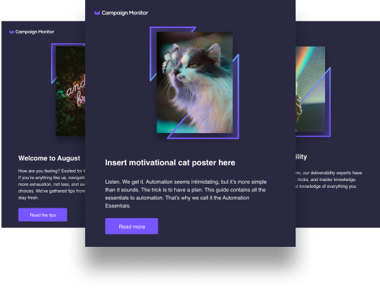
Landing page images often employ the “deictic gaze” — a visual cue to draw the viewer’s attention toward an intended object. The most common example of this is a person looking towards the CTA button, drawing the visitor’s attention to it so they click it.
Take a look at this page, and notice where your attention goes:

Write ultra persuasive copy
Not only should your copy be readable, it should also be easy to understand. Stay away from jargon and write in a way that a 6th grader would understand. For example, if your solution saves people money, don’t say “closefisted.” Instead, say cost-effective.
Also, loss aversion can be an effective psychological tactic. It’s based on the idea that people value not losing something more than gaining something. So telling your prospects what they’ll be losing if they don’t convert is a surefire way to get them to take action — especially when you combine this with a free offer.
Take a look how Webinfinity applies loss aversion to their landing page copy with their headline and first section header. First, they ask visitors if they’re losing the PRM technology game. Then, they tell visitors they’re losing the game if they’re still using older technology:

Urgency is another effective strategy to incorporate in your landing page copy. By letting prospects know they must act quickly to redeem the offer, you’re persuading them to convert. This is often done in conjunction with a countdown timer, like a webinar landing page or event registration page.
Next is the decoy effect. It involves at least three choices packaged smartly together using persuasive copy to convince prospects to select the option you want them to choose. Sales pages (like a pricing page) in particular use this tactic in which adding a decoy option (a third option) to a set of original options tends to increase the prospect’s preference for one option over the other original option. Meaning, one option is inferior to another, but in the middle ground compared to the least favorable option.
Here’s how The New Yorker uses the decoy effect on their subscription landing page. By adding the best value option — both print and digital subscription for the same price as just either one by itself — it makes choosing that one a no-brainer:

Utilize white space to focus their attention
White space and various color combinations are great for providing visitors with a pleasing visual experience, but they also play a vital role in persuading visitors to click your CTA button.
White space (aka empty space) helps isolate certain elements on your landing page, like forms and CTA buttons, so they can draw maximum attention. By surrounding important elements with white space, you effectively tell visitors what you want them to focus on.
When it comes to color, consider the Von Restorff Effect, which states that people tend to remember things that stand out to them most. With landing pages design your CTA button in a contrasting color (preferably a color that hasn’t been used anywhere) so it’s very obvious where they must go to redeem your offer. If you’re unsure of which color to choose, look at the color wheel and choose the opposite color of your page’s dominant color. For example, if your page is mostly blue, select orange for the CTA button.
Look how Five9 surrounded their CTA button and video with white space and designed it in a contrasting color to make it “pop” off the page:

Add trust indicators to make visitors feel safe
Maslow’s Hierarchy of Needs teaches us that one of the most basic human needs is safety. When marketers don’t apply safety elements to landing pages to instill trust, it’s easy to understand why they abandon the page: they don’t feel safe and secure providing their personal information.
Trust indicators come in many forms: customer badges or testimonials, awards, industry ratings, and a privacy policy link. All of these can help make prospects feel confident enough to convert on your offer, or at least stay on your page long enough to consider it.
Social proof is one of the best ways to gain prospect’s trust. Displaying customer testimonials and prominent publications that your brand has been featured establishes credibility for your offer. It makes people more comfortable knowing other people trust you.
Here is a Highfive landing page that incorporates both a customer testimonial and industry ratings to make prospects feel safe:

Design an attractive form and CTA button to seal the deal
The lead capture form and CTA button are the two most important elements for conversions. After all, the form collects leads’ information and clicking the CTA button is how a prospect finalizes their conversion.
Since these are the most important elements on your page, they need to stand out.
Encapsulation, or creating an enclosed window of focus, is a great way to highlight your form and draw attention to it. You can do this with outlines and/or contrasting colors.
Freshsales encapsulates their lead capture form using white:

Getting the form noticed is one thing. Convincing prospects to take further action takes more than a noticeable form. That’s where CTA copy comes into play.
Instead of using vague words like “Download,” “Submit,” or “Register,” being specific and emphasizing the benefits of your offer is more likely to boost conversions. Notice how Healthcare Software Hub crafted their CTA copy to be specific and action-oriented:

Wrap up
Simply creating a landing page and generating traffic to it is not sufficient to increase your conversions. You must design the page with the right elements while implementing some psychological principles. Only then will your visitors be persuaded to take action and your marketing funnel start to collect more and more leads.