9 minute read time
How to Create a Signup Form with No Coding Experience: 7 Best Practices to Get More Subscribers

An email list is one of the most important assets a company can have. Unlike social media, where you depend on algorithms that sometimes seem like a fortune wheel, with an email list, you have ownership over what you share and when.
A few years ago, the Internet was flooded with headlines about the death of email marketing. But one thing is for sure: Email marketing still works flawlessly today. In fact, it’s one of the most effective tools. As research shows, email newsletter subscribers:
- Arrive onsite from direct links at a higher percentage than search engine results or social media
- Spend 80% more time at a site than other visitors
- Are twice as likely to buy a product or service
However, before you can reap these benefits, you must build your email newsletter distribution list. And the easiest way to capture emails is using signup forms.
Why should you use an email signup form?
When done right, email signup forms can bring significant advantages. Before we get into the ways to implement a signup form with no coding experience, let’s talk about the reasons why you should use it in the first place.
First and foremost, when people are filling a signup form, they’re welcoming you into their inbox. As a result, you get more opens and clicks.
The average unsubscribe rate for an email list is 0.1%. However, with permission-based signups, you can build a list of subscribers who want to hear from you. This way, your attrition rate decreases, your open rates increase, and your conversions are more meaningful and robust.
Besides this, a well-designed, catchy signup form will directly contribute to increased subscription rates. So, instead of chasing readers that don’t want to receive your emails, you can attract the right audience.
Bottom line: Email signup forms can help you balance out attrition rates and grow a list of permission-based, engaged subscribers.
How to build your newsletter list with no coding experience
For many business owners, signup forms are like a black box. They seem complicated and daunting.
But what if you can build your newsletter list with signup forms that don’t require any coding experience?
Let’s look at a few.
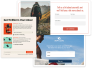
Attract website visitors to sign up
There’re many ways to implement a newsletter signup form on your website. From a pop-up that opens the moment visitors land on your website to signup forms from the side or at the bottom of your page, you can easily create a form that will help you grow your newsletter list. If you’re not sure what is the best decision, you can always A/B test your signup form placement.
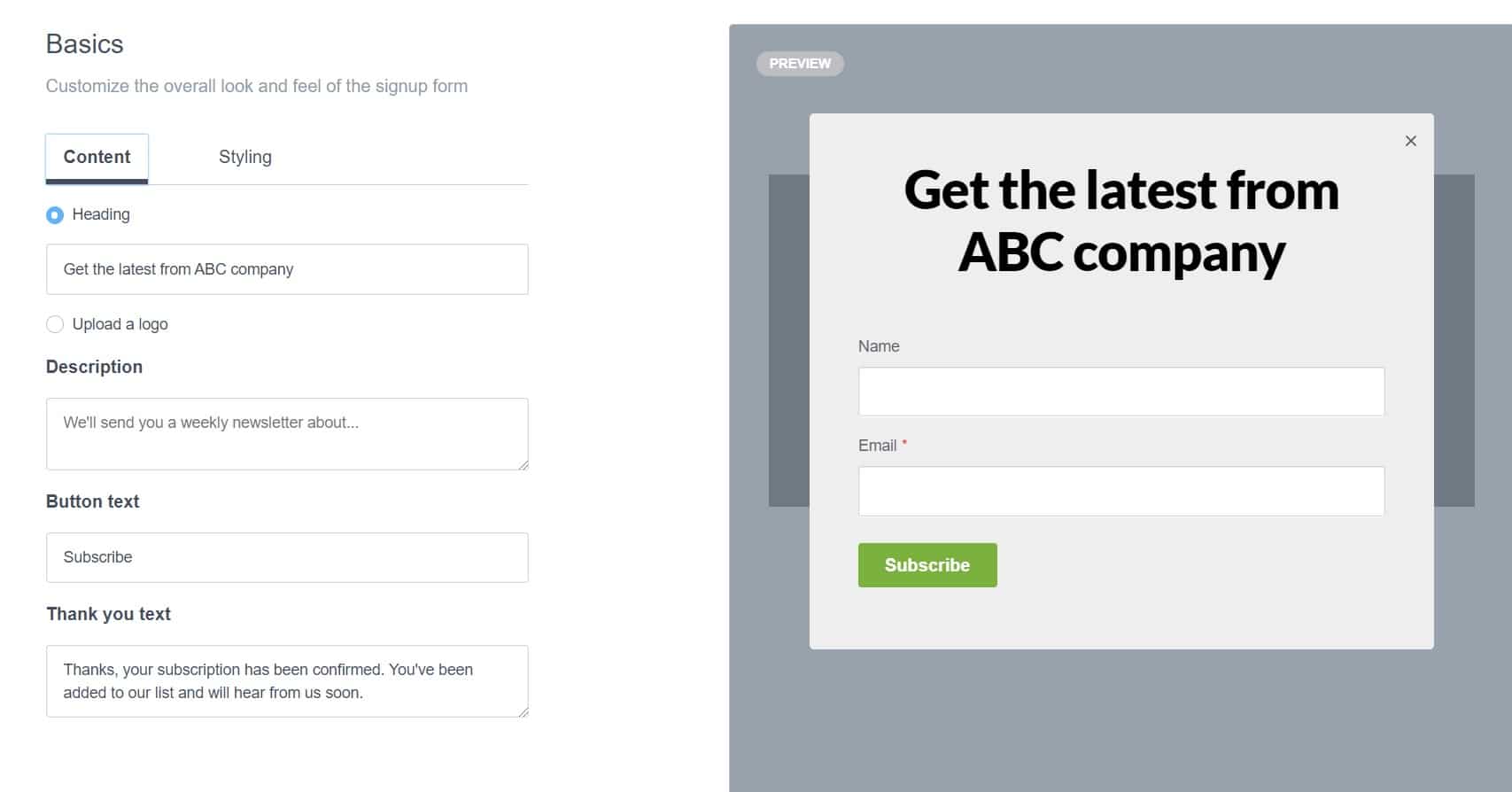
With Campaign Monitor creating a signup form is simple and straightforward, and it doesn’t require any developer skills. You can easily customize the headline, add a logo, change the background color, button text, and decide what fields you want to include. After the basic settings, add a thank you text, and you’re ready to go.
Create a separate page
Signup pages are standalone web pages with a unique URL you can share online or add to an email signature to attract new subscribers. Same as signup forms, you can easily create and customize a signup page with no coding experience. You don’t need a server to host a signup page because Campaign Monitor hosts it for you.
After you customize the signup page using the editing tools, you can click Save and generate a link.
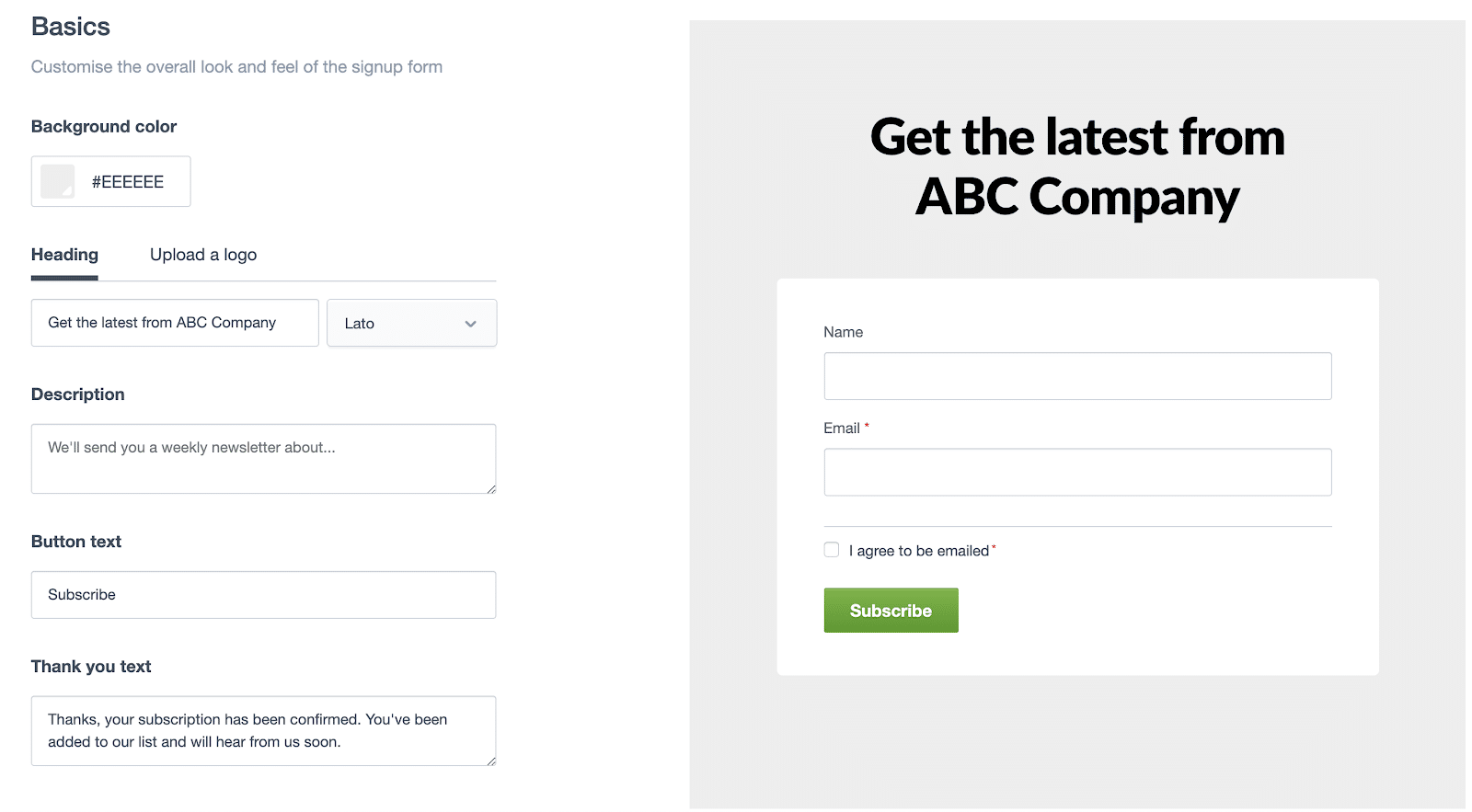
Turn followers into subscribers
Why limit yourself to gathering email subscribers on your website only? If you have significant social media followers, you can use that opportunity to convert followers into subscribers.
With 2.74 billion monthly active users, Facebook is still the most popular social network in the world. You can encourage Facebook fans to sign up for your email list by posting a link to your list’s signup form directly to your Facebook page. Besides this, you can use third-party integrations such as Facebook Lead Ads by Zapier, Leadsbridge, and Integromat to connect your Facebook audience to Campaign Monitor.
Source: SXSW
Get customers to sign up in-store
We live in an omnichannel world. Instead of relying only on digital channels to grow your email list, think outside the box and use your store to engage customers in conversation and ask them for their email address. You can turn a regular iPad into an email collection point and have customers enter their information while the cashier rings them out.

Source: (screenshot from a CM demo)
Best practices for high-performing signup forms (with examples)
Now that you know how to create signup forms in just a few clicks let’s talk about the basic principles that will help you make them more effective.
1. Keep it simple
Clear is better than clever. From the number of fields asking for information to color schemes and even vocabulary, your form should be straightforward without being boring. The fundamental mistake many companies make is trying to get all the information in a single email signup form. Rather than adding too many fields, keep your focus on the goal — getting the email address.
The British jewelry brand Monica Vinader has a simple, minimalist signup form that promises subscribers to share style tips, exclusive sales, and private events in exchange for their email address.
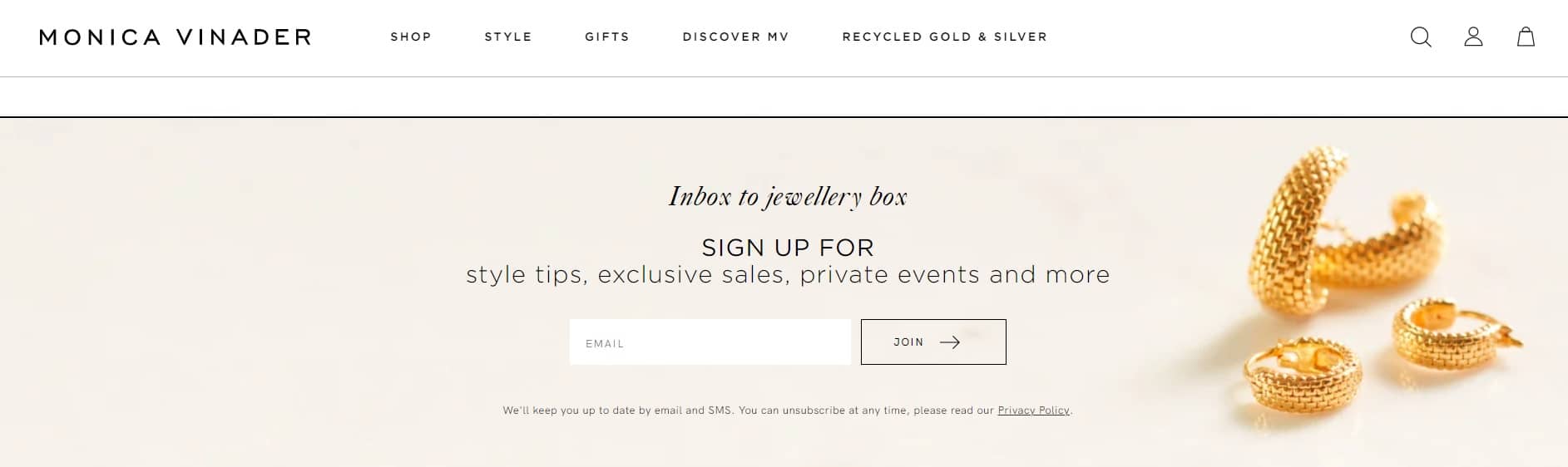
Source: Monica Vinader
2. Get the context right
You would be surprised how many businesses bury their signup pages somewhere on the “Contact us” page or at the bottom of their website. Instead of playing hide-and-seek, place your signup form in the upper part of your website, where visitors can easily find it. Have a clear call-to-action and try not to make it too intrusive.
The coffee roaster and retailer Blue Bottle Coffee uses a simple signup form. It’s the first thing you notice when you open their website, it’s in-line with their brand, noticeable but not intrusive. Visitors can add their email address or decide to scroll without having an unpleasant user experience.
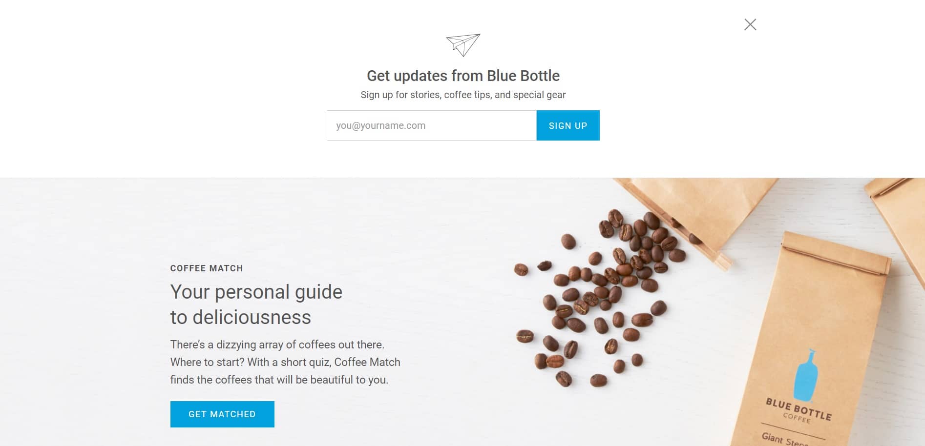
Source: Blue Bottle Coffee
3. Tell them why should they subscribe (and deliver on the promise)
Transparency is a sign of respect. Clearly state what information you’ll be sending out as well as its frequency. Set expectations right from the start and always deliver on the promise. If you want to build a future-proof newsletter list, you want people to subscribe for the right reason. If you promise one thing and then deliver on something completely different, expect frustrated subscribers and a high attrition rate.
The manufacturer and retailer of cool socks, underwear, and swimwear, Happy Socks gives visitors all the reasons they should subscribe. Besides the 10% discount on the first purchase, they promise to share special promotions and early access to new collections.

Source: HappySocks
4. Offer an incentive
People love free stuff, discounts and gifts. It’s human psychology. If you want to grow your newsletter list, offer your new subscribers something tangible for signing up. It can be a discount or a gift. In some cases, it’s free content. From ebooks and guides to checklists and printables — offering something in exchange for an email address can help you grow your list faster.
If you decide to use this approach, make sure to follow up with a strong email nurture program to keep subscribers engaged and turn them into loyal readers (and customers).
The DTC underwear and loungewear brand MeUndies gives visitors a 15% discount if they sign up. The form is simple yet in-line with the playful brand identity, so it doesn’t go unnoticed.
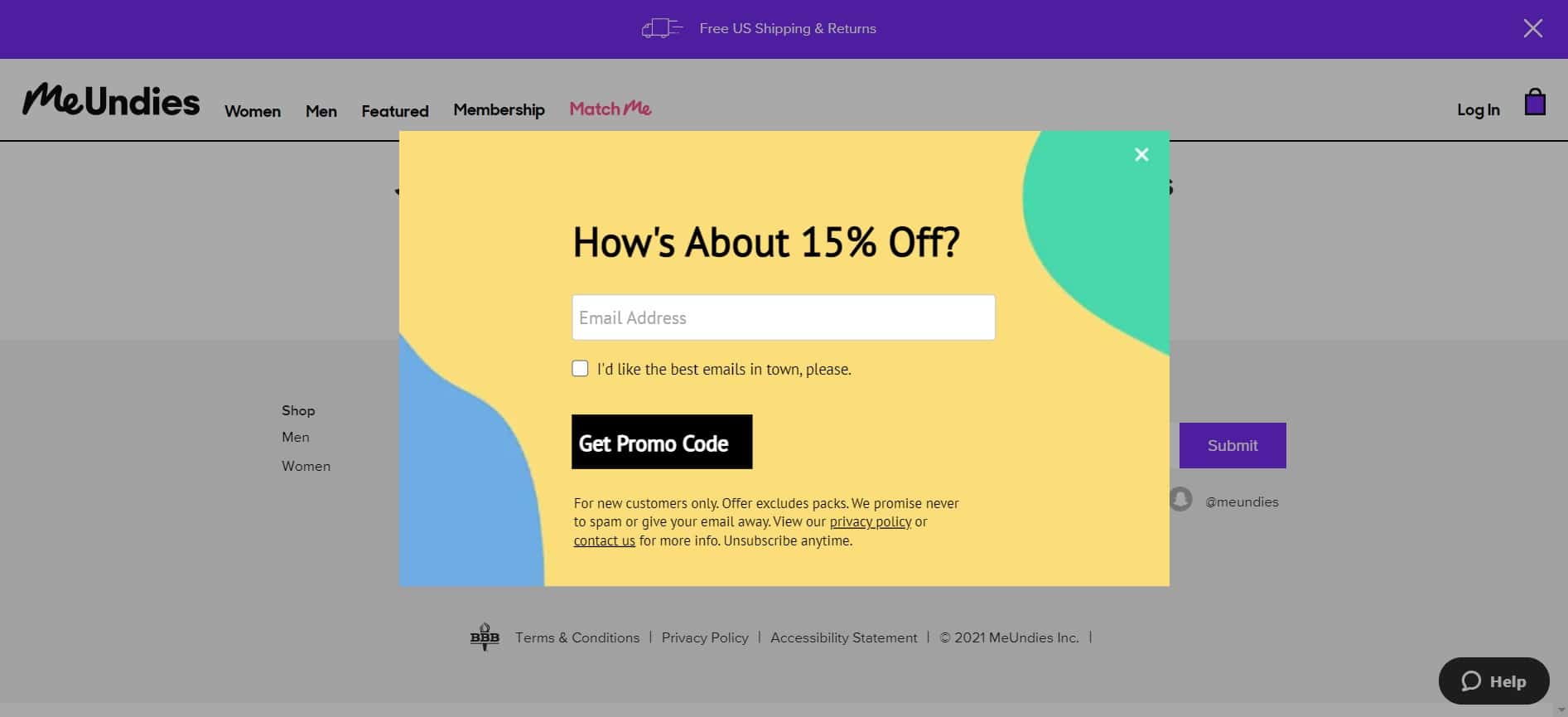
Source: MeUndies
5. Include social proof
The first thing we do when buying a product is navigate to the review section for reassurance. We want proof that we’re making the right decision. The same is true for newsletter subscriptions. Showing that others found value by joining the list or buying the product or service encourages people to do the same.
This behavior is rooted in psychology and the so-called bandwagon effect. In other words, a person’s tendency to adopt some attitude because everyone else is doing it. Being part of a community of like-minded individuals gives people the affirmation they’re constantly looking for.
The project management tool monday.com uses the power of social proof to convince people to join for a free trial. The fact that more than 100,000 teams rely on monday.com for their project management needs can be the spark that will urge people to sign up.
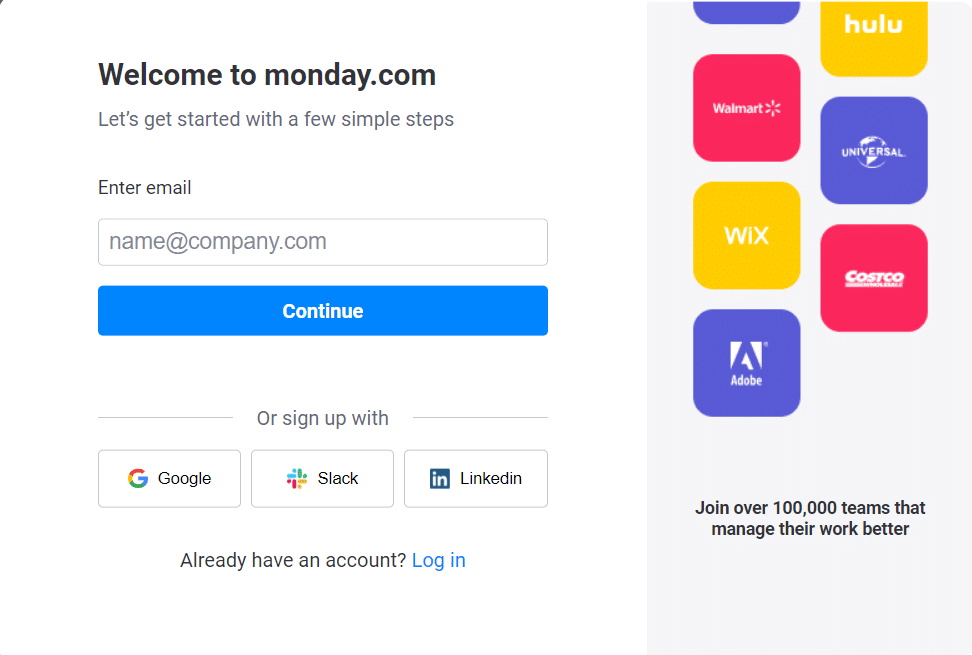
Source: monday.com
6. Use a catchy call-to-action
Standing out from the crowd and getting people to give you consent to email them can be challenging nowadays. You need something catchy. Something to draw visitors’ attention and make them eager for what they’ll receive.
Having a teasing call-to-action intrigues people or makes them laugh. Either way, you reach your goal: a new email address on your newsletter list.
The delicious protein bars RXBAR makes their signup form hard to resist by offering customers an exclusive new offer for signing up. Instead of lengthy forms with unnecessary fields, they focus only on getting the customer’s email address.
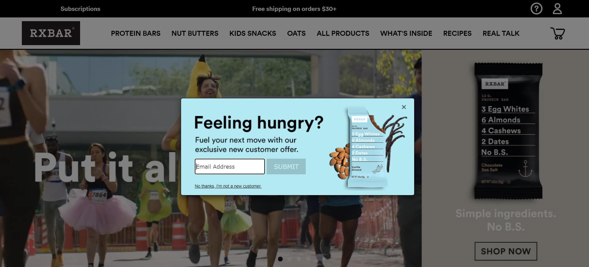 Source: RXBAR
7. Respect user privacy
User privacy is one of the biggest concerns in today’s digital-first world. This is key to building trust as well as following General Data Protection Regulation (GDPR) guidelines for user information privacy and use.
When asking subscribers for personal information, you should be able to answer a simple question: why? Why do you need the information, and how do you plan to use it?
If you visit the website L’Oréal Paris, you’ll notice a signup pop-up form that asks for your first and last name, email address, and birth date. Before entering the details, visitors can read the Privacy policy L’Oréal states that they collect information to provide tailored and personalized content, services, advertisements, and offers to customers.
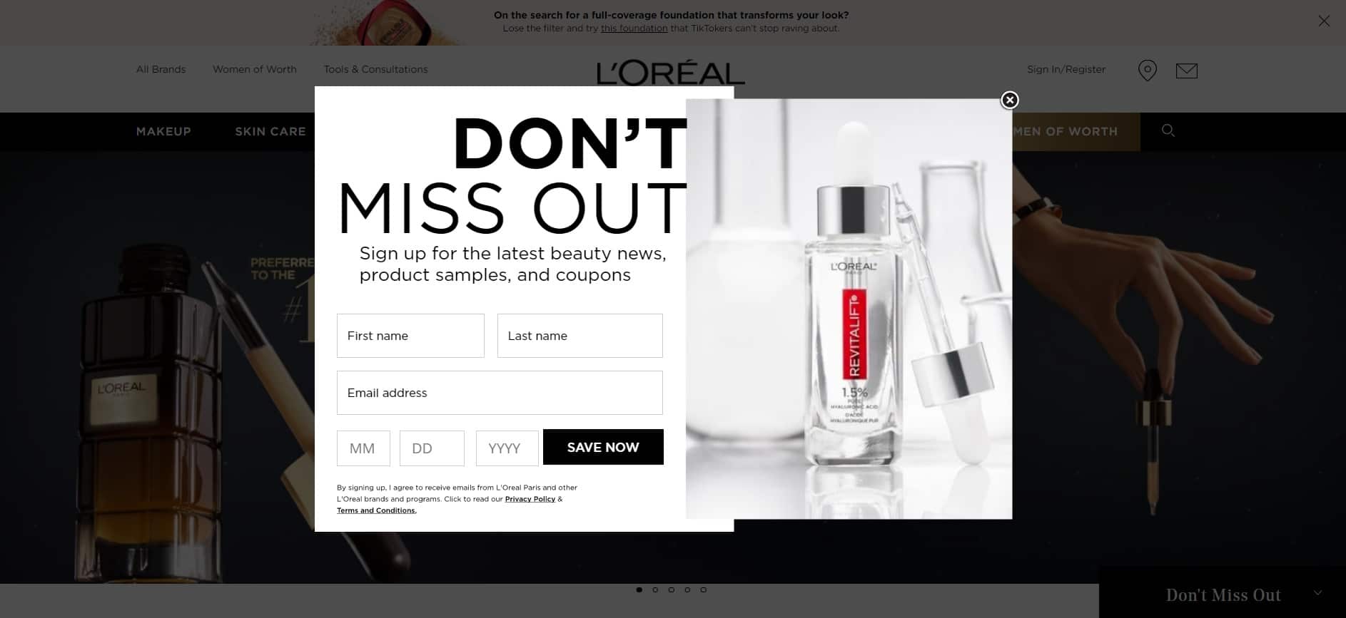
Source: L’Oréal Paris
For more tips, tricks, and best practices to power your email marketing strategy, watch our webinar on how to get the most out of a signup form.
Wrap up
Email marketing is one of the best ways to find customers who are interested in purchasing. In order to effectively reach out and grab the attention of potential subscribers, it’s essential to have a strong email signup form.
Use the tips in this post to create the most effective signup form and set the foundation for future business growth.
You don’t have any more excuses. Create a newsletter signup form and start building your list today.