Chapter 1
Why should you employ email accessibility?
For many years, the internet wasn’t accessible to those with certain disabilities. As tech continues to develop, however, some platforms are becoming more inclusive.
Take YouTube, for example. Just a decade ago, those with blindness, vision impairment, and other visual differences had trouble using the platform. Tommy Edison, a blind YouTuber, sought to change that. He, along with several other members on the platform, have ensured YouTube is now more supportive and accessible.
While YouTube is a massive platform, accessibility isn’t a massive goal. In fact, you can easily employ email accessibility in your next campaign, just by slightly altering your methods.
In order to create email accessibility, you should understand why it’s important. Blindness and other degrees of limited vision are quite common. 285 million people worldwide are considered to have visual disabilities and differences. 36 million are blind, and 246 million have low vision.
Additionally, many people are color blind. Among people with Northern European ancestry, the most common form of color blindness (red-green) occurs in ~1 out of every 12 males and ~1 out of every 200 females. Worldwide, blue-yellow color blindness affects ~1 out of every 10,000 people.
These visual differences are significant, especially when considering how often color is used to convey meaning or actions online.
As you can see, email accessibility is valuable for millions worldwide.
In this guide, co-published by Vision Australia, we’ll largely focus on best practices for designing accessible email campaigns. Specifically, you can use these methods to help those relying on-screen reading devices, including audio prompts (such as synthesized speech) and keyboard-only access.
People spend a lot of time worrying about email clients with 1% usage; accessibility is a much bigger issue
– Mark, Rebelmail
Included are accessibility requirements, practical advice on coding and testing, and a pre-flight checklist for determining your campaigns are accessible, prior to sending.
About Vision Australia
Vision Australia is Australia’s leading national provider of blindness and low vision services. They work in partnership with blind or low vision individuals to help them achieve the possibilities they choose in life.
Digital Access at Vision Australia is recognized internationally as an industry leader in the provision of digital accessibility services, equally addressing the needs of all disability groups. A member of the W3C since 2002, Digital Access significantly contributed to the creation of WCAG 2.0.
Chapter 2
Basic requirements for accessible email campaigns
First of all, what constitutes an accessible email? To meet basic accessibility requirements, an email message must:
- Maintain a logical reading order
- Use heading elements in code
- Include sufficient contrast between text and background colors
- Provide text alternatives for images
- Feature meaningful link text
- Keep your code concise
- Use a descriptive subject line
Many of these points may be unfamiliar to you, so let’s go into each of these requirements in detail.
Maintain a logical reading order
Unlike web pages, HTML email newsletters and templates are commonly coded using tables, as these are the most reliable way to create layouts that work across desktop, webmail and mobile email clients.
If not planned and built thoughtfully, people who rely on keyboard-only access might not receive the content in the order intended. Screen readers, for example, read aloud tabular content from left-to-right and from top-to-bottom.
The image below shows the order in which each text paragraph would be read aloud if assembled in a table of two columns and two rows:
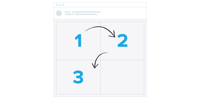
To preserve logical reading order, a better layout would be a table of two columns and one row, as shown in the image below:

This requirement is particularly important to keep in mind when creating responsive email layouts, especially where images and content are repositioned to allow for a comfortable reading experience on mobile devices.
Maintaining a single-column layout on all screens, regardless of size, reduces the likelihood of content being read incorrectly.
Incorrect readings can happen when text is parsed and read aloud by screen readers in an incorrect order or in a way in which the context of the content is unclear. However, when using multiple column layouts, you can change the order in which content columns are stacked by using the align or dir HTML attributes.
Use heading elements in code
HTML heading elements, like <h1>, <table> etc – are critical to ensuring hierarchy is conveyed to screen reader users, who may not be able to see them. Keep in mind that simply styling text to stand out, or look more important is not sufficient when creating a content hierarchy for assistive devices.
Include sufficient contrast between text and background colors
People with moderately low-vision or color differences can be less sensitive to luminosity or color contrasts when viewing text and images in an email message.
Therefore, it’s important to incorporate sufficient contrast between text and the background of an email message. According to a UK study, almost 5% of people were reported to have some form of color blindness, which shows the importance of ensuring you choose colors not only for aesthetic reasons, but for accessibility reasons, too.
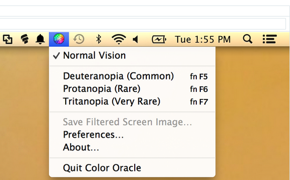
Apps like Color Oracle can be used to simulate a variety of color deficiencies and ensure you are providing enough contrast – not to mention, non-color based cues – for all email recipients to understand your email messages.
Provide text alternatives for images
All informative images must have an appropriate text alternative that conveys the meaning or purpose of the image. Purely decorative images—such as ‘spacer’ images for preserving layouts—should carry an empty or null alt attribute (alt=””). This will inform screen readers that the image is decorative and should be ignored.
For example, a company logo is an informative image and should feature a text alternative. In HTML email code, this can be done using the alt HTML attribute, to convey its meaning to screen reader users:
<img src="logo.png" alt="Vision Australia: Blindness and low vision services" />Feature meaningful link text
It’s also important to convey the purpose of links using link text. This text informs the reader as to what will display when the link is followed and are often used for document navigation purposes by screen reading devices.
As a result, it’s recommended that generic text such as “click here” or “read more” be avoided, as these will offer little meaning, especially when read out of context by a screen reader. Instead, we recommend links in code like:
<a href="https://.../link-recommendations.html">read our recommendations for better links<a>.Keep your code concise
Superfluous and “spaghetti” code can impact load times, as well as produce unexpected results both in email clients and accessibility devices. Tools like HTML Tidy Online (based on the W3C Tidy project) and Dirty Markup can be used to remove empty and unclosed tags, as well as spot common code validation issues.
Use a descriptive subject line
The subject line is the first text people will read, or have read to them by a screen reader. It should be meaningful, descriptive, concise and shouldn’t repeat the sender name. More so than many of us, people with vision impairments rely on subject lines to determine whether an email message is relevant to their needs.
Chapter 3
Testing email campaigns for accessibility
To test email campaigns extensively for potential issues, it’s important to use a combination of both accessibility testing tools and live device tests. In this section, we’ll go through how to test as to whether keyboard access, heading markup and the other built-in accessibility factors work as desired across a variety of email clients, using both freely available apps and services.
But before we get started, what tests should we be running on our email campaigns? We have selected a variety of email-relevant tests, based on W3C’s Web Accessibility Guidelines 2.0 (WCAG 2.0). Here’s how each of the tests maps to WCAG’s Success Criterion:
Reading order1.3.2
| Email Test | WCAG Success Criterion |
| Keyboard access and visual focus | 2.1.1, 2.4.3, 2.4.7 |
| Image alt text | 1.1.1 |
| Headings | 1.3.1 |
| Lists | 1.3.1 |
| Zoom | 1.4.4 |
| Mobile devices | 1.4.4 |
In cooperation with the Web Accessibility Tools Consortium (WATC), a variety of tools to assist with the above tests and make recommendations. While the devices and platforms you focus your testing on should ultimately map to what your email subscribers are using to read your email campaigns, many HTML email accessibility tests can be quickly and conveniently performed in your browser of choice using one of WATC’s recommended tools. Our favorites are:
- Vision Australia’s Web Accessibility Toolbar for Internet Explorer
- Google’s Accessibility Developer Tools extension for Chrome
After installing these tools, you should be able to perform the following tests:

Keyboard access and visual focus
The purpose of this test is to see if it’s possible to reach all email content using only a keyboard. This can be tested in the desktop or webmail clients of your choosing, preferably ones which are used commonly by your email subscribers.
Suggested test methodology
- Open an email message in a desktop email client
- Put your mouse or trackpad aside
- Starting at the top of the email message, move through the email using your keyboard’s Tab key.
- Can you reach all interactive elements (links, buttons, etc.)? Are they reached In a logical sequence?
- In each case, is your location identifiable with a change in appearance such as a dotted border?
- Can you activate links and buttons using the Spacebar or Enter keys?
- Repeat Steps 1 – 4 in a webmail client
Image alt text
The purpose of this test is to make sure that all informational images in an email campaign have an alt attribute. You can test this in your browser of choice using either Vision Australia’s Web Accessibility Toolbar (WAT) for Internet Explorer or Google’s Accessibility Developer Tools extension for Chrome.
Suggested test methodology
- Open the web version of an email campaign in a browser with the Web Accessibility Toolbar or Accessibility Developer Tools extension installed.
- If using the Web Accessibility Toolbar:
- From the toolbar, select Images > Show Images.
- Review the alt text displayed for each image. Decorative images should display alt=””.
- Images without an alt attribute will display “No alt!”
- If using the Accessibility Developer Tools extension:
- In the browser, right-click Inspect Element
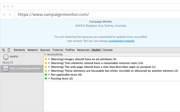
- In the Inspector, click Audit and run the Accessibility Audit
- Images without an alt attribute will be highlighted by a warning
Headings
The purpose of this test is to ensure headings are marked-up according to a suitable hierarchy.You can perform this test using Vision Australia’s Web Accessibility Toolbar, or by visually reviewing the HTML email code.
Suggested test methodology
- Open the email in a webmail client on Internet Explorer.
- Using the Web Accessibility Toolbar, select Structure > Headings.
- Check that heading text is nested in HTML heading tags
Lists
The purpose of this test is to ensure that all lists are marked-up properly. You can perform this test using Vision Australia’s Web Accessibility Toolbar, or by visually reviewing the HTML email code.
Suggested test methodology
- Open the email in a webmail client on Internet Explorer.
- Using the Web Accessibility Toolbar, select Structure > List items.
- Check that lists are identified as ordered (ol), unordered (ul) or definition (dl) HTML list tags, and that list items are each wrapped in <li> tags
Reading order
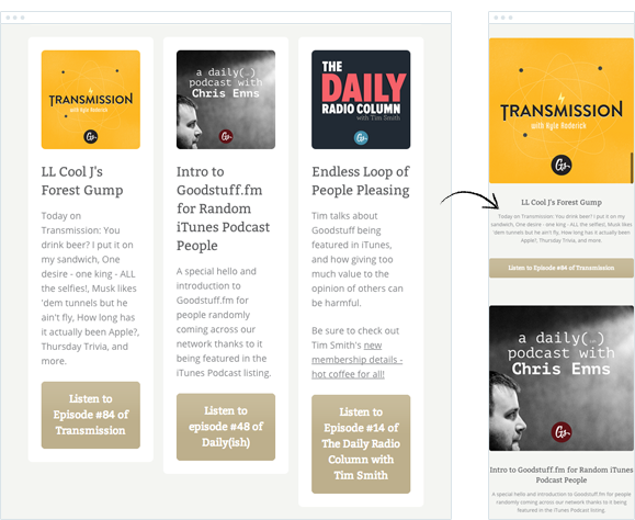
The purpose of this test is to check that screen readers can read the content of the email in a logical order. This can be done either using Vision Australia’s Web Accessibility Toolbar, or the WAI HTML Table Linearizer.
Suggested test methodology
- In a browser, go to the WAI HTML Table Linearizer
- Next to ‘URL of page with HTML TABLEs to linearize’, add the URL to the web version of an email campaign and click Submit
- Check that the content reads in the order you expect
Zoom
The purpose of this test is to ensure that page content can be zoomed to at least 200% without loss of content or function. This can be tested in the desktop or webmail clients of your choosing, preferably ones which are used commonly by your email subscribers.
Suggested test methodology
- Open an email message in a desktop or webmail email client
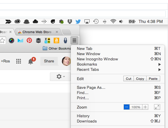
- Increase text size to 200%. For example, in Chrome select Extensions toolbar > Zoom > Increase Zoom to 200%
- Check that all of your email content remains visible and can be read clearly
Mobile devices
Given the popularity of smartphones and tablets, it’s important to check that email campaigns can be read and responded to on these devices. Apple iOS devices like the iPhone and iPad have a in-built VoiceOver screen reader, which provides audio prompts to help read and navigate the device interface and displayed content.
If your email campaign displays as desired in iOS Mail under default conditions, then there are two further tests that we recommend you try. They are that the email is:
- Resizable using the pinch-to-zoom gesture
- Available to screen reader users using Apple VoiceOver (or similar)
Suggested test methodology
Resizable using the pinch-to-zoom gesture:
- Send the email to an address you can check on an iPhone.
- ‘Pinch zoom’ with your fingers to increase text size.
- Make sure you can reach all of your content.
Available using VoiceOver:
-
- Activate VoiceOver on your iOS device via Settings > General > Accessibility > Voiceover:
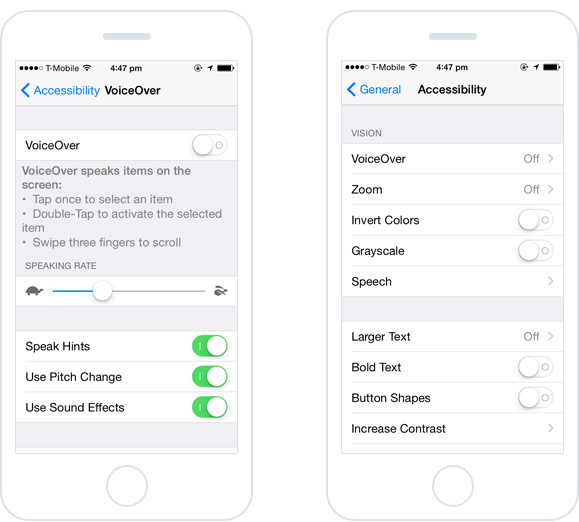
- Read the content aloud by using a swiping gesture across the screen, making sure that all content is read including image alt text
Chapter 4
Checklist: Is your email campaign accessible?
Use the following checklist based on W3C Web Content Accessibility Guidelines to make sure your email campaign is accessible prior to send.
Email Content
Subject line is concise and descriptiveYes
| Check | |
| Tables are optimized to preserve logical reading order | Yes |
| Heading elements used | Yes |
| Text colour contrast is sufficient | Yes |
| Images have suitable alt attributes | Yes |
| Headings summarize content that follows | Yes |
| Link text is meaningful (not “read more” or “click here”) | Yes |
| Images have meaningful alt attributes | Yes |
Desktop and webmail
Email content is zoomable to 200% without losing content visibility or functionYes
| Check | |
| Content is fully keyboard accessible and demonstrates visual focus | Yes |
| All images retain alt text | Yes |
| Headings, lists and structural HTML markup is retained | Yes |
| Reading order is logical and as intended | Yes |
Mobile
| Check | |
| Email content can be resized using a pinch zoom gesture | Yes |
| All content can be read using a device screen reader (e.g. VoiceOver) | Yes |

Press CMD+D to Bookmark this page

Set it and forget it
Try our automation tool, and send triggered emails based on user activity or time of day.
Learn More
Case Study
Learn how Girls Who Code uses Campaign Monitor to change the tech world for the better.
Learn how
The email platform for agencies
We started out helping agencies with email, so let us help you.
