10 minute read time
Which Email Clients Support CSS3?
Article first published April 2010, updated May 2019
You may have seen our guide to CSS support, where we tested both widely implemented and experimental CSS3 properties across 24 popular desktop, web, and mobile email clients. In this article, we’ll be discussing another aspect to CSS3: the email clients that support it. Read on to learn more.
If you’re planning to introduce CSS3 to email campaigns, you’re in luck. We’ve not only got a summary of which email clients display what properties, but observations and hand-picked recommendations for the style-savvy email designer.
Which email clients support CSS3 in 2019?
CSS3 support is a continuing work in progress when it comes to updates and, in 2019, users can expect quite a few changes to the various properties.
New CSS techniques
The Cascading Style Sheets (CSS) is continually being tested and upgraded for users across the globe. This language allows you to add styles, such as fonts, colors, and spacing to a variety of web documents, including emails. The current evolution of the CSS language is known as CSS3.
There are a variety of new additions that’ve been released with the latest updates to the CSS3 language, and they include:
- Making CSS grids responsive
- The use of variable fonts
- The ability to create text animations
- The ability to implement scroll snapping
- Gutters for flexbox
- Initial letter
- Media Queries level 4
All of that and more is being rolled out for CSS3 users.
Which browsers support HTML5 & CSS3
While all these updates are exciting for web designers, it’s still vital to know what works and what doesn’t for certain individuals and programs. This is especially important for a brand’s digital and email marketing teams, because they need to be able to communicate with customers in a way that works for everyone.
HTML5
HTML5 is the latest version of the HTML language. It defines elements, attributes, and behaviors of web content.
So which browsers support HTML5? Here is a list of which browsers support HTML5.
CSS3
Which browsers support which functions of the CSS3 language? Here’s the list.
Which email clients support media queries?
A media query is a functionality in both HTML and CSS that allows the content of a given web page to adapt to the specific type of media that the page is being rendered in.
Media queries help create responsive page designs that allow a page to be viewed on multiple devices, such as:
- Desktop computers
- Tablets
- Cell phones
So which email clients support media queries?
While iOS clients seem to fare well here, Android doesn’t do so well.
The results: CSS3 support across the major email clients
The following chart displays the results of our CSS3 tests for the 7 most popular email clients. For the 24 most popular email clients, download our full guide.
| Text & Fonts | Outlook 2000/2003 |
Live Hotmail |
Yahoo! Mail/Classic |
Outlook 2007/2010 |
Apple |
Apple iPhone |
Google Gmail |
| text-shadow | No | Partial or buggy support | Partial or buggy support | No | Yes | Yes | Partial or buggy support |
| text-overflow | Partial or buggy support | Partial or buggy support | No | No | Partial or buggy support | Partial or buggy support | Partial or buggy support |
| word-wrap | Partial or buggy support | No | Yes | No | Yes | Partial or buggy support | No |
| Color & Background | Outlook 2000/2003 |
Live Hotmail |
Yahoo! Mail/Classic |
Outlook 2007/2010 |
Apple |
Apple iPhone |
Google Gmail |
| HSL Colors | Yes | Yes | Yes | Yes | Yes | Yes | Yes |
| HSLA Colors | No | No | No | No | Yes | Yes | No |
| Opacity | No | No | No | No | Yes | Yes | No |
| RGBA Colors | No | No | No | No | Yes | Yes | No |
| -moz-background | No | No | No | No | No | No | No |
| -webkit-background | No | No | No | No | Yes | Yes | No |
| -moz-background-size | No | No | No | No | No | No | No |
| -webkit-background-size | No | No | No | No | Yes | Yes | No |
| -o-background-size | No | No | No | No | No | No | No |
| -khtml-background-size | No | No | No | No | Yes | Yes | No |
| Box Model | Outlook 2000/2003 |
Live Hotmail |
Yahoo! Mail/Classic |
Outlook 2007/2010 |
Apple |
Apple iPhone |
Google Gmail |
| -moz-box-sizing | No | No | Yes | No | No | No | No |
| Positioning & Display | Outlook 2000/2003 |
Live Hotmail |
Yahoo! Mail/Classic |
Outlook 2007/2010 |
Apple |
Apple iPhone |
Google Gmail |
| resize | No | Yes | Yes | No | Yes | No | No |
| outline | No | No | Partial or buggy support | No | Yes | Yes | Partial or buggy support |
| Borders | Outlook 2000/2003 |
Live Hotmail |
Yahoo! Mail/Classic |
Outlook 2007/2010 |
Apple |
Apple iPhone |
Google Gmail |
| -moz-border-color | No | No | No | No | No | No | No |
| -moz-border-image | No | No | No | No | No | No | No |
| -moz-border-radius | No | No | No | No | No | No | No |
| -webkit-border-radius | No | No | No | No | Yes | Yes | No |
| -moz-box-shadow | No | No | No | No | No | No | No |
| Total Market Share | 28% | 16% | 14% | 9% | 8% | 7% | 6% |
Our observations
There are three reasons why CSS3 doesn’t seem to display properly (if at all) in web email clients: support is partial or buggy, the property is being stripped by the email client, or the browser doesn’t support the property yet.
Support is partial or buggy
For the purpose of our tests, partial or buggy support means:
- The property doesn’t display consistently across our tested browsers/platforms for a given email client;
- The property does display, but the email client is doing something to make it look different from what’s intended, or;
- Property attributes haven’t been implemented yet.
A good example of the latter is text-overflow. Although text-overflow: ellipsis; is fairly well supported, text-overflow: clip; and text-overflow: ellipsis-word; haven’t been implemented in any browser to date.
The property is being stripped by the email client
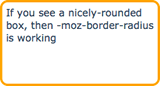
Just as we’ve observed previously, a fair few email clients simply disable CSS properties. For example, it’s well-known that Gmail strips out <link></link> tags, or any styles found within <style></style>. However, this extends to inline CSS3 styles too. Here’s an example of how our test code is altered in AOL Web and Gmail:
| Our test code | … in AOL Web | … in Gmail |
 |
|
 |
| <p style=”-moz-border-radius: 10px; border: 3px solid orange; padding: 5px;”>If you see a nicely-rounded box, then -moz-border-radius is working</p> |
<p style=”-moz-border-radius-topleft: 10px; -moz-border-radius-topright: 10px; -moz-border-radius-bottomright: 10px; -moz-border-radius-bottomleft: 10px; border: 3px solid orange; padding: 5px;”>If you see a nicely-rounded box, then -moz-border-radius is working</p> | <p style=”border: 3px solid orange; padding: 5px;”>If you see a nicely-rounded box, then -moz-border-radius is working</p> |
This specific test were viewed in Firefox, but regardless of browser, no rounded corners in Gmail for you.
The browser doesn’t support the property yet
While testing each web email client in Firefox, Safari, and Internet Explorer, it became quite evident that each browser wasn’t born equal. This is because each browser selectively displays CSS3 properties at this early stage, as reflected by “experimental” implementations (prefixed by -moz, -webkit etc).
These experimental implementations may be permanently added to the browser’s rendering engine at a later date but, for now, they’re prefixed so designers and developers know that they’re still under trial.
Each browser is developed around a rendering engine, which determines how web pages should be displayed. For Safari, this is Webkit (or -web) and for Firefox, this is Mozilla (-moz). So properties like -moz-border-radius work great in Firefox, but not Safari, and vice versa for-webkit-border-radius.
In turn, AOL Web displays -moz-border-radius when viewed in Firefox, but not in Safari or IE. The clever way to get around this is to add both properties to your code (as many folks do when coding for web), which would look something like this:
<p style="-moz-border-radius: 10px; -webkit-border-radius: 10px; border: 3px solid orange; padding: 10px;">Here's a rounded box</p>
If you’re viewing this blog post in Safari or Firefox, you’ll see rounded corners on the rectangle above. IE doesn’t support border-radius (experimental or otherwise, yet), so this example will just display as an orange rectangle.
In essence, CSS3 is a long way from being accepted as standard in web browsers, let alone in email clients. While Webkit-based clients like Apple Mail and Mail on the iPhone were relatively successful in rendering the Webkit-specific elements in our test email, more popular clients like Outlook, Yahoo, and Hotmail sunk.
Perhaps the biggest surprises came from our mobile tests. Whereas web client support was sketchy, at best, the iPhone, Android, and Palm (webOS) flew through the Webkit tests with flying colors.
Keeping in mind that CSS3 is, first and foremost, being developed for the web, it may be a while before we discover practical applications in email for properties like orword-wrap, resize or text-overflow (which hasn’t been fully implemented in any browser). As browsers continue to embrace more and more CSS3, there’s no doubt that designers like us will find creative uses for new properties.
Recommendations
In email, CSS3 is best used for decorative purposes, such as adding a drop shadow or making buttons, that would otherwise be achieved using images. Here are a couple of examples:
Rounded corners using border-radius
Without CSS3 support, these simply display as rectangles.
Drop and inner shadows using text-shadow
Without CSS3 support, text is still displayed (including color, font, style etc).
Conversely, a lot of box-model and layout-specific CSS3 may not be as appropriate in email, given the likelihood for layout-breakage. This goes for-moz-box-sizing, resize and others.
Ultimately, the decision to use CSS3 should be based on how many of your subscribers will be able to view your CSS3 masterpiece. Using our email client reports, you may determine that a lot of your subscribers use Webkit-based clients like Apple Mail. This is certainly a green light to use effects like text-shadow. However, you may think differently if the majority of your subscribers are using Outlook.
Above all, you always want to aim to provide your users with a pleasant experience, while still pushing the coding limits. We want progressive enhancement for our users—an inclusive experience for all customers that also doesn’t punish those on older platforms.
This allows those customers viewing their emails on platforms that support CSS3 to experience their coded masterpiece, but those using Outlook still get a really great experience because of fallbacks. In other words, your email may not look the same on every platform, but it should still look beautiful on every platform.
Finally, just as many of the properties we have tested are considered to be experimental, we encourage you to be experimental too. As more email clients join the fray, CSS3’s applications in email will certainly become wider-reaching than pretty shadows and rounded corners. So take a look at the properties available to you, test it out, and share your own experiences.
Wrap up
CSS3 support is always being edited and updated to suit the wider needs of internet users. It’s vital to understand these changes because it can play a significant part in who sees and engages with your brand’s web pages and email campaigns.
If you plan to use CSS3 in your materials, keep these things in mind:
- Not all web clients react the same to certain functions/properties
- Not every subscriber is using the same web clients, so have a variety of options available
- Always test your material before you send it out to ensure that it’s viewable
Ready to start with building your email marketing strategy and campaigns? Let Campaign Monitor help. Our tools are designed with users in mind, and our team has your back, in case you run into trouble. Contact us today.