
Article first published November 2015, updated April 2019
These days, marketers like you are creating more content than ever before—blog posts, social media posts, email campaigns, landing pages, and websites, and more.
The problem is you’re not the only one increasing your content output. Not only are marketers creating more content, but consumers are producing content at an increasingly rapid pace as well, with over 100 million new photos taken every hour and a new blog created every 0.5 seconds.
So how is a marketer like you supposed to get your message heard above all the noise? And, if you do manage to get people’s attention, how do you convert them into customers in an age of short attention spans and countless distractions?
In this guide, you’ll learn:
- Why beautiful design matters now more than ever
- The 3 principles of beautiful design from a marketing perspective
- How leading companies like Apple, Airbnb, and Xero are implementing the 3 principles to win customers, and how you can too.
This guide also covers the tools leading brands use to create beautiful marketing content and provides some free resources that you can start using right now to get better results from your next website, landing page, or email campaign.
What is beautiful design and why does it matter?
According to research from DMI, design-led companies outperformed the Standard & Poor’s 500—a stock market index of 500 large publicly traded companies—by 228%.
Apple is an excellent example of design being used as a competitive advantage, and the more recent successes of other design-led companies like Xero and Airbnb are offering more proof than ever before that beautiful design yields better results across all departments—from product design to marketing.
But what defines beautiful design?
In a marketing context, beautiful design isn’t just about making content look pretty using nice images and fancy graphics.
Beautiful design brings form and function together to motivate a person to take action, reduce their anxiety towards the action, and provide a clear, easy path to conversion. It includes brand design, brand identity, and even web design.
This definition may be overwhelming, so consider this breakdown of each aspect to help make it a little more clear:
- Motivate a person to take action – Beautiful design will motivate a person to convert by creating desire for your product or service.
- Reduce their anxiety towards the action – Beautiful design will reduce anxiety towards conversion by addressing any fears and concerns a user might have around your product or service.
- Provide a clear, easy path to conversion – Beautiful design will provide an easy path to conversion by making it clear what the conversion action is and removing any obstacles or distractions that may prevent the user from taking the action.
These three principles are the foundation of any great design, and, by incorporating them in your websites, landing pages, and email campaigns, you will get better marketing results.
How do you do that? The next section will take an in-depth look at each principle and show you actionable examples from design-led companies like Airbnb, Apple, and Xero that you can apply to your own marketing.
How marketers can create beautifully designed content
By using the right tools and following these three principles of beautiful design, marketers can easily create beautiful content.
Principle 1:
Beautiful design should motivate a person to take action
To prompt someone to take your chosen conversion action, you must first generate a desire for your product or service.
Advertising legend and consumer psychologist Adam Ferrier claims desire is made up of two key elements: individual incentive and social norms.
Individual incentive is the idea that, at a basic human level, we are motivated to undertake a certain behavior either to gain pleasure or avoid pain. In marketing terms, desire to convert is produced when people can see how your product or service can help them to either gain pleasure or avoid some sort of pain they have been experiencing.
However, humans are sophisticated beings and will not simply seek out whatever creates pleasure or avoids pain with no thought to the consequences. We are inherently social, and are driven to act in a way we believe would be considered “normal” in society. So, when deciding whether or not to conduct a behavior (such as converting), we need to consider the individual incentive as well as aspects like how we will look if we perform this behavior, what the social norms are around this behavior, and whether people we consider influential are undertaking the behavior.
To create desire for your product or service, you need to satisfy both the individual incentive and social norm elements simultaneously by showing people how your product or service will reduce pain or increase pleasure and reassuring them that using your product is a perfectly acceptable behavior to undertake.
So how do you do that with beautiful design? Consider the following examples:
How Shopify creates desire using personalization
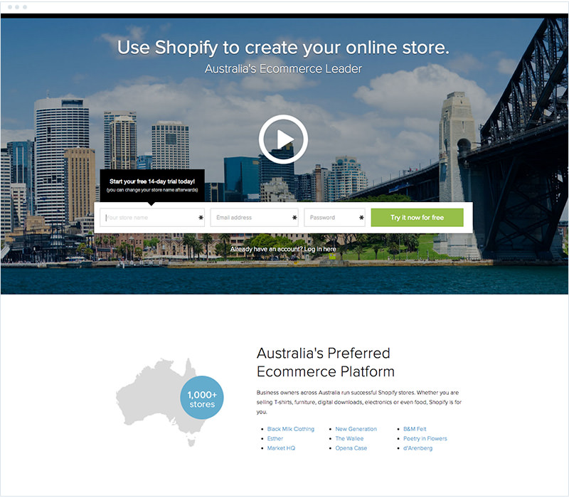

Shopify creates desire for their product by personalizing the homepage experience based on the visitor’s location, presenting them with localized messaging and imagery illustrating that Shopify is Australia’s preferred e-commerce platform.
By doing so, Shopify is creating a social norm that other Australian businesses are using the platform to power their online stores, and reassuring visitors it is perfectly acceptable for them to do the same.
What you can learn from Shopify
The more you can personalize your landing pages, websites, or email campaigns to the characteristics of the reader, the higher your chances of converting them. Use dedicated landing pages and segmented email campaigns to target your messaging and imagery, and create a social norm that other people just like them are using your product to increase pleasure or reduce pain.
Shopify uses personalised landing pages to create a social norm and increase motivation to signup
How Apple creates desire using context
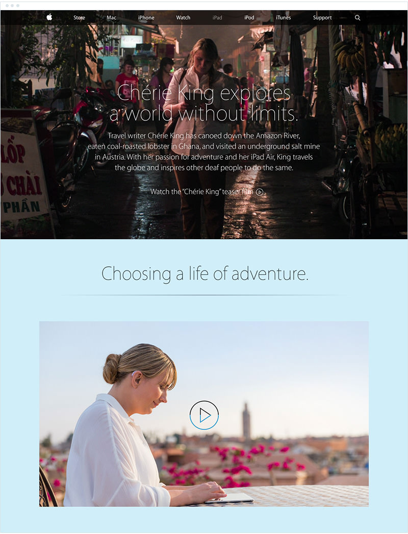

Design maestros Apple create desire for their iPad by showcasing the product being used in context.
In their recent Verses campaign for iPad, Apple created a beautifully designed website that showcases how different people use their iPad in various ways to enhance their lives.
Instead of simply providing pictures of the product itself, Apple creates individual incentive by showing the product being used in context.
Furthermore, Apple creates a sense of social norm by featuring prominent, aspirational figures like travel writer Cherie King. By showing her using an iPad on the go, Apple is proving that the iPad is a perfectly acceptable product for you to use as well.
What you can learn from Apple
When including pictures or screenshots of your product or service in your marketing content, showcase your products in the context of how they will help the user either create pleasure or avoid pain, as this will increase the individual incentive to use your product or service.
Apple creates desire by showing its products being used to enhance people’s lives
Principle 2:
Beautiful design should reduce anxiety
To get someone to take your desired conversion action, you must also reduce any anxiety they may have towards taking the action.
In marketing, “anxiety” refers to any feelings of discomfort or unease towards making a conversion and can be caused by any number of things, including:
- Concern that your offer isn’t worth their time and/or money,
- Worry that your product or service isn’t the right choice for them,
- Doubt that your product or service is reliable or can deliver what you claim it can,
- Fear that purchasing your product is unsecure.
In order to reduce anxiety around your desired conversion action, you must first consider what the points of anxiety may be for your customers and then take steps to reduce those anxieties.
How do you do reduce anxiety using beautiful design? Take a look at these examples:
How Basecamp reduces anxiety with usage statistics
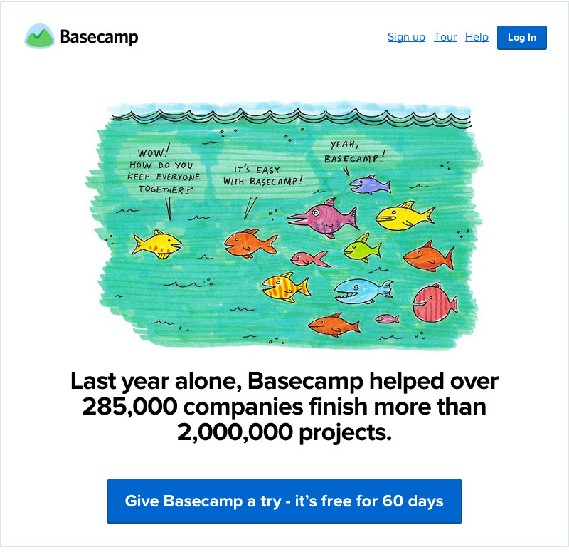

Project management tool Basecamp reduces anxiety towards signup by showcasing the number of successful projects other businesses have completed using their product.
By going beyond just showing customer numbers, Basecamp is addressing people’s concern that the product isn’t right for them and reassuring potential customers that the product can help them achieve what they need to achieve (completing projects).
What you can learn from Basecamp
Showcase the success people are enjoying using your product within the design of your marketing content. Seeing other people enjoying the benefits they want will increase conversions by addressing people’s anxieties that your product may not be right for them or isn’t worth investing their time and effort into.
How Xero reduces anxiety by showcasing customer numbers
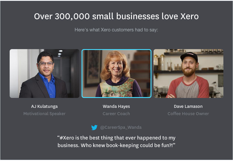

Online accounting software Xero reduces anxiety towards signup by prominently showcasing the number of customers they have using their product.
Xero understands that accounting software in the cloud is a new concept for some people, and they are likely to have some anxiety about whether it is the right choice for them.
By showing the number of other small businesses who are using and enjoying their product for their accounting, Xero is increasing conversions by eliminating people’s concern about whether their product is the right choice for them.
What you can learn from Xero
If you have some impressive customer numbers, incorporate them into the design of your marketing content to address concerns that your product might not be the right choice. However, avoid showcasing customer numbers if you don’t yet have an impressive number. Few people like to be the first to try something and this form of negative social proof could actually increase people’s anxiety.
Xero reduces anxiety by showing the number of other small businesses using and loving their product
Principle 3:
Beautiful design should make it easy to convert
To get someone to take your desired conversion action, you must make it as simple as possible for them to take that action.
Increasing ease is actually one of the most effective ways to increase people’s likelihood of taking your desired conversion action, according to consumer psychologist Adam Ferrier.
He cites a study where researchers compared how many chocolates a person consumed when they were placed on their desk, as opposed to when they were placed a mere 2 meters away. They found that, when placed on the desk, people ate an astounding 5x more chocolates than when they were just a few meters away.
This study highlights the importance of ease in getting people to convert. Even though people’s desire and anxiety surrounding eating the chocolates was exactly the same in both instances, making them easy to access increased consumption by 5x.
How do you use beautiful design to make it easy for people to take your conversion action? Let’s take a look at these prime examples:
How Unbounce makes it easy to convert by reducing choice
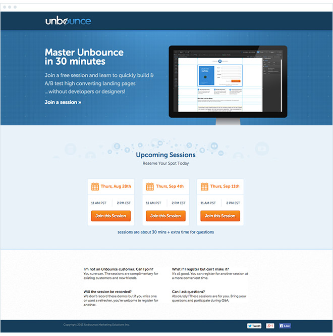

Landing page tool Unbounce makes it easy for potential webinar attendees to convert by limiting the number of session times they offer.
Unbounce understands the paradox of choice and that, when people are faced with too many similar options, they struggle to choose the best one for themselves and actually don’t make a choice at all, instead opting to walk away.
When Unbounce reduced the number of session times they offered from four down to three, they actually received a 17% increase in the number of people choosing a time and signing up for their webinar.
What you can learn from Unbounce
Limit the number of choices you offer people in the design of your marketing content, particularly if the difference between those choices is minimal. This makes it easier for people to choose the best option for them and increases the number of people who will make a decision and convert.
Unbounce increased conversions by 17% by reducing choice and making it easier for people to convert
How Airbnb makes it easy to convert by reducing steps
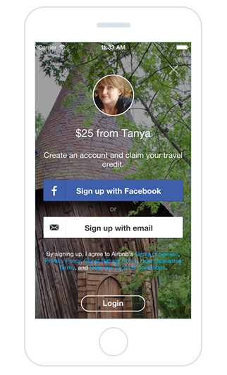

For Airbnb, signing up for an account is just half the journey towards conversion, as a person only generates them revenue once they book a stay at a property.
So, to make it easier for people to convert, they redesigned the signup process for those who download the app via a referral from a friend.
Instead of presenting them the standard signup process, which requires the customer to sign up and then manually redeems their $25 credit, Airbnb created a signup process that automatically detects who referred them and presents a customized signup form. Once the customer has signed up, they are automatically credited the $25 and the referrer is automatically given the referral bonus.
This customized signup process significantly reduces the number of steps a customer has to go through to sign up, redeem their credit, and then book a property, and, as a result, increased the number of referral bookings by 300%.
What you can learn from Airbnb
Every step in a conversion process introduces another point at which people could potentially drop out, so minimize the number of steps people need to take wherever possible. How you actually achieve this depends on your unique conversion process, but the key is to identify what steps are unnecessary and do what you can to remove them.
Airbnb increased referral bookings by 300% by removing steps from the conversion process
Tools to help marketers create beautiful content
Now that you understand the principles of beautiful design and have seen how leading brands use those principles to drive business results, you’re going to need the right tools to start executing.
Tool 1:
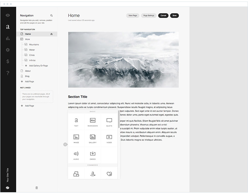
Create beautiful websites
![]()

Overview:
Squarespace is a website creation tool that gives marketers everything they need to create beautiful websites. With built-in functionality to add galleries, blogs, forms, online stores, and more, marketers can create a full-featured, beautiful website with ease. What sets Squarespace apart from other website creation tools is their range of beautiful templates and their incredibly easy-to-use editor, which allows you to edit your site by simply dragging elements around the page, dropping photos and videos in, and more.

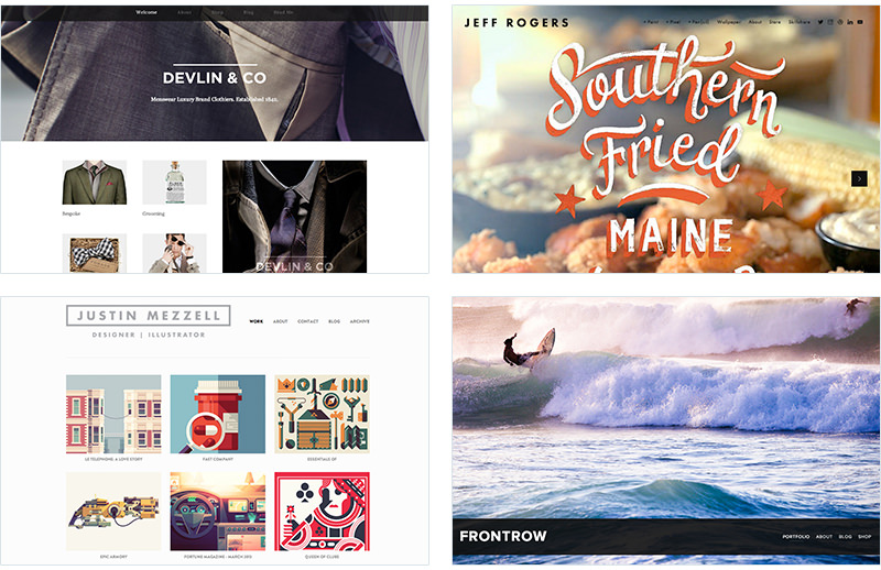
Examples
Below are examples of some beautiful websites created by marketers like you using Squarespace:

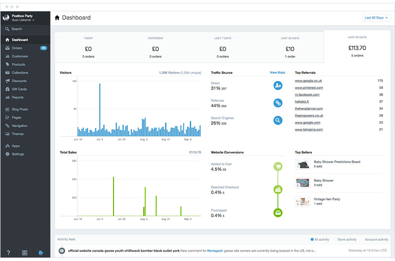
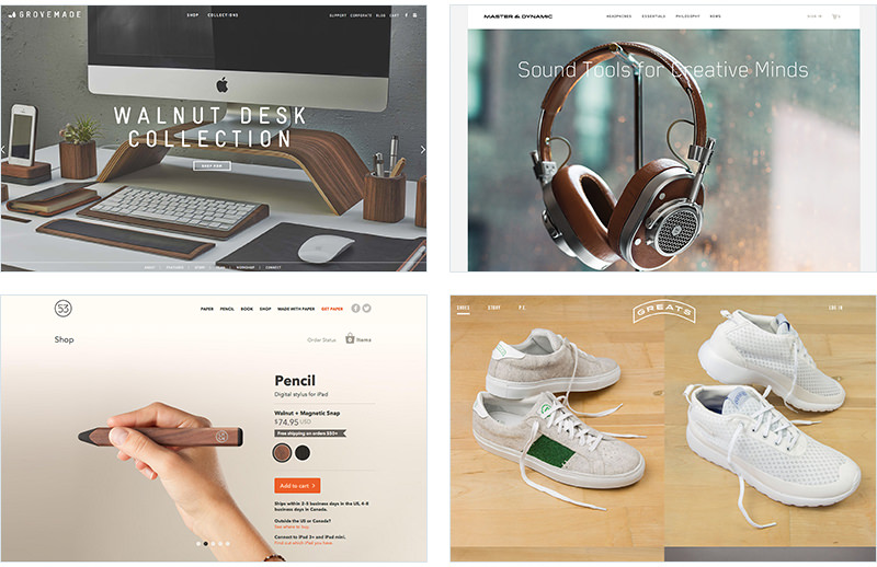
Tool 2:
Create beautiful online stores
![]()

Overview:
Shopify is an e-commerce platform that provides business owners everything they need to create beautiful online stores. With built-in functionality to display products, offer discounts, and accept payments, marketers can create full-featured online stores quickly and easily. What sets Shopify apart from other e-commerce platforms is their intuitive interface and wide range of store templates that make it easy to create a beautiful online store that drives business results.

Examples
Below are examples of some beautiful online stores created by marketers like you using Shopify:
Tool 3:
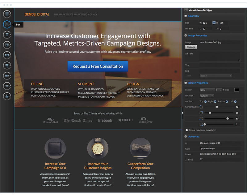
Creating beautiful landing pages
Overview:
Unbounce is a tool that allows marketers to build, publish, and A/B test landing pages without IT. What sets Unbounce apart from other landing page tools is its drag-and-drop page builder, which makes it really easy to create beautiful landing pages that convert. Over 80 conversion-focused templates are available for free to help you get started, or you can build pages from scratch. Unbounce also provides simple stats and A/B testing features, which makes it easy to test new design elements and improve your conversion rates.

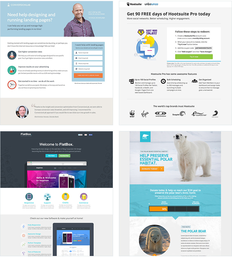
Examples
Below are examples of some beautiful landing pages created by marketers like you using Unbounce:

Tool 4:
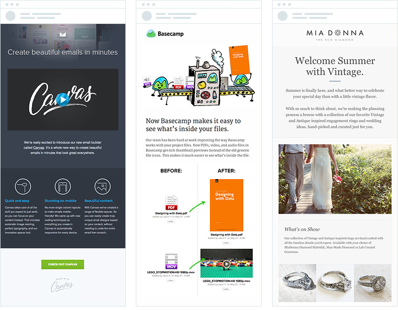
Creating beautiful email campaigns
![]()

Overview:
Campaign Monitor is an email marketing tool that makes it easy to build your email lists, send beautiful emails, and report on the results. What sets Campaign Monitor apart from other email marketing tools is its intuitive email builder, Canvas. Rather than using restricting templates that only allow you to put text and images in predefined positions, Canvas gives you a simple drag-and-drop editor that allows you to move content around and create completely unique, beautiful layouts with ease.
Examples
Below are examples of some beautiful email campaigns created by marketers like you using Campaign Monitor:

Resources to help get you started
Resource 1:
Beautiful stock images to use in your content
There are millions of stock photographs around the web that can be used for free, but not all of them are worth using.
To help you create appealing marketing content, we scoured the web for 5 of the best stock photography websites that contain beautiful (and free) images that you can use to get better results from your next email campaign, website, or landing page.


Founded by self-taught freelance photographers David Sherry and Allie Lehman, Death to the Stock Photo is a subscription service that sends subscribers a folder of 10-12 free, high-quality photos each month, always with a different theme.

Here, you’ll find access to free, high-resolution images and illustrations from the site’s owner Vicktor Hanacek that are also well categorized, making it easy to find what you need.

Hosted on a simple Tumblr account, the images Unsplash offers are stunning. Subscribers to this free resource receive 10 new photos every 10 days in their inbox—all of which are available for any type of project. The minimalist layout and large image display showcase these photos in a unique way that makes for an interesting browsing experience.
Resource 2:
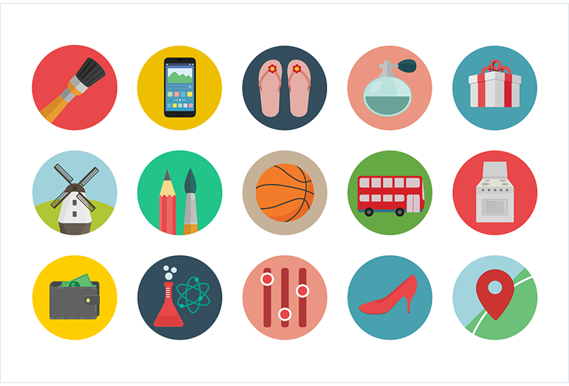
Beautiful icon sets to use in your content
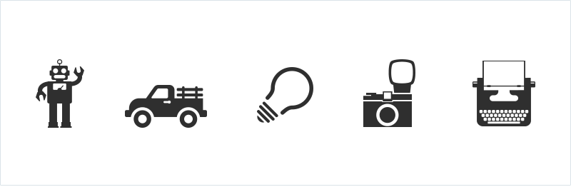
Icons are a great addition to your marketing content. Our brains process visuals 60,000 times faster than text, so the right icon can help get your message across.
We scoured the web to find the 5 best icon sets to help you create beautiful marketing content that gets results. All of these icons are available in PNG format, so you can easily drag and drop them into your next email campaign, website, or landing page.
![]()

This round icon set (with 384 variations) offers a variety of icons in both color and black-and-white format.
![]()

This set of 48 flat design icons will make your marketing content look great and includes everything from social media and tech icons to notepads and mail.
![]()

This set of 12 icons comes in 3 different styles to match your content perfectly. They include everything from charts to pencils, tags, and wallets.
![]()
This set of 22 icons have a real hand-drawn, authentic feel about them. However, they are primarily focused on social networks and technology, so they may not be for everybody.

This set of 60 icons has an attractive animated style that makes them a great addition to your marketing content. Subject matter includes everything from pencils and paintbrushes to shoes and wallets.
Resource 3:
Tools to create custom images
There are times when stock photography isn’t appropriate and you need to create a custom image for your website, email campaign, or landing page.
Tools like Photoshop and Illustrator, while powerful, are generally too complicated for the majority of image creation work marketers do.
Instead, marketers like you need tools that are easy to use but still capable of producing effective images. We recommend the following:
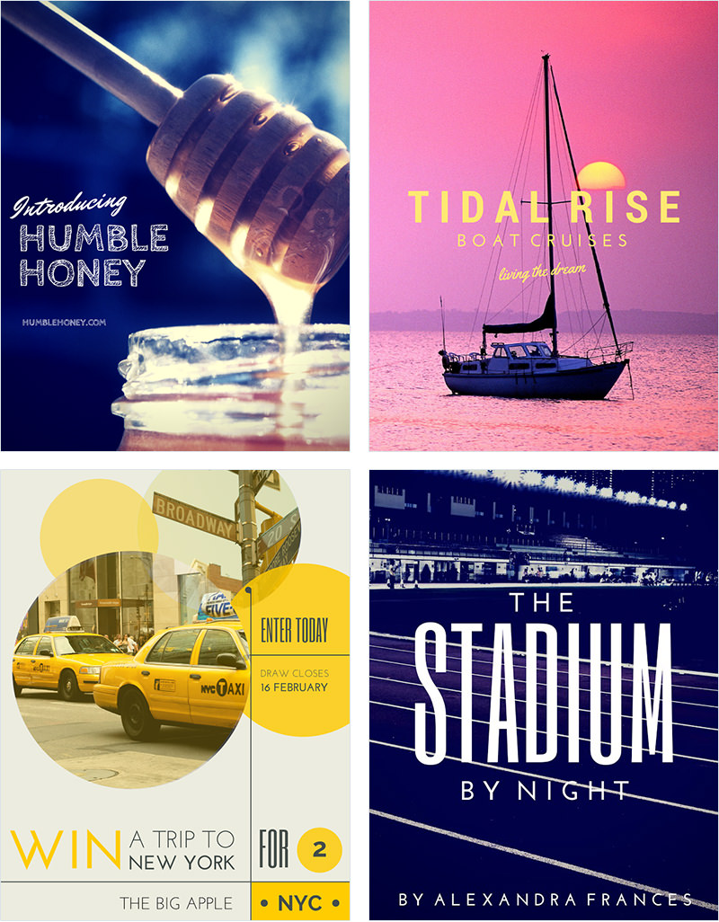
Canva
Canva helps make graphic design simple. The tool contains thousands of beautiful stock images that can be used in your designs, and you can easily add other elements such as text, banners, frames, and buttons as well.
What makes Canva great for marketers is its ease of use. With a simple drag-and-drop editor and thousands of pre-designed elements, you can create great images for your websites, emails, and landing pages by simply choosing the design elements you want and dragging them wherever you want them.
Here are some examples of images that have been created by marketers like you using Canva:

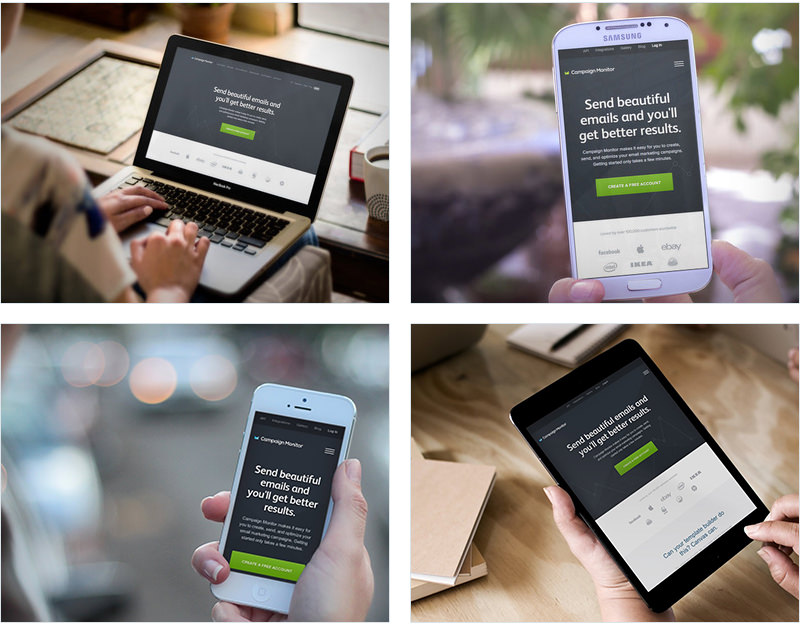
PlaceIt
PlaceIt makes it easy to create appealing screenshots of your website, application, or any other digital product.
You simply type in a URL, and PlaceIt will automatically generate a screenshot and place it inside a device in a particular context, such as an iPad sitting on a desk or a MacBook Pro sitting on a park bench.
Here are some examples of the Campaign Monitor website in various settings created using PlaceIt:

Resource 4:
Design marketplaces
Design marketplaces can be a great resource for marketers when you need more niche objects for your designs, like icons, banners, ribbons, and more.
GraphicRiver
GraphicRiver is a design marketplace where professional designers sell their work, usually for minimal prices in the range of $1 to $10, depending on the size and complexity of the item.
There are over 270,000 design items for sale on GraphicRiver, so you’re likely find the perfect design element for your email campaign, website, or landing page.
However, with so many items, it can be hard to find the best options, so here’s an overview of some of the more useful elements you can find on GraphicRiver.
Icons
Icons are a popular element in design, and can help convey meaning and messages without the need for boring blocks of text. GraphicRiver has thousands of icons for sale on the site, from social media icons to analytics icons. Here are some examples:
![]()
Banners & Ribbons
Banners and Ribbons are also popular elements in design, and can help call out certain elements like sales prices or special offers. GraphicRiver has thousands of banners and ribbons available. Here are a few examples:


Vector Images
Vector images can add some visual appeal to your content and help complement your key messages. GraphicRiver has over 40,000 vectors available for sale. Here are some examples:


The Noun Project
The Noun Project is an online collection of free and paid icons you can download and use in your marketing content.
The Noun Project features a great search functionality that allows you to find whatever icons you need for your content, and a simple search for terms like ‘plane’ or ‘book’ will return hundreds of icons you can use.
Here are a few examples of icons you can find on The Noun Project:
Resource 5:
Browser extensions
Browser extensions are free and easy-to-install tools that give your web browser extra functionality. They can help you with everything from viewing your websites and landing pages in different browser sizes to finding out what colors and fonts a particular website is using.
Web Developer
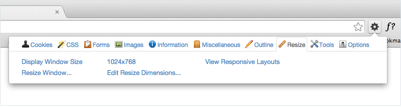

While it’s largely intended for web developers, there are a number of tools in this handy browser extension that make it useful for marketers like yourself, including:
Browser Resize
Web Developer allows you to resize your browser to different screen sizes popular on various devices, such as mobile phones, tablets, laptops, desktop computers. This enables you to see what your content looks like on different screen sizes and make any necessary changes to ensure it looks great everywhere.
Color Picker
Web Developer includes a color picker that allows you to click on a certain part of a website and see exactly what color that part is. You can then use that color in your own marketing designs.
Ruler
Web Developer includes a ruler that allows you to measure the dimensions of a certain element and get the exact height and width in pixels. If you’re creating images or content for a particular size, this is a great tool for working out the dimensions you need to work within.
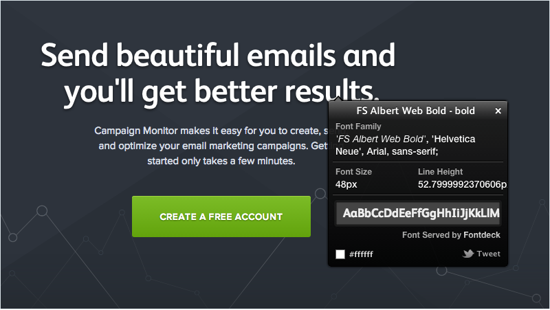
WhatFont
WhatFont is the easiest way to determine what font a particular website is using. With this handy little extension for Chrome and Safari, you simply hover over a font you like and it will tell you the font’s name, family, size, and more. It can even point you in the direction of where to download the font yourself.

Top digital marketing design trends you should take note of
Design plays a big role in engagement and conversions. This means you have to employ the top digital marketing design trends if you want to achieve marketing success.
Let’s take at some of these top design trends that you can borrow from.
1. Retro illustrations
Nothing causes nostalgia better than a fond memory. And nothing spurs engagement more than nostalgia.
When it comes to marketing, you can use the nostalgia effect to your advantage by using retro illustrations in your marketing designs. These are illustrations that feature color palettes from the ‘80s and ‘90s, while sporting some sleek modern lines and semi-flat designs.
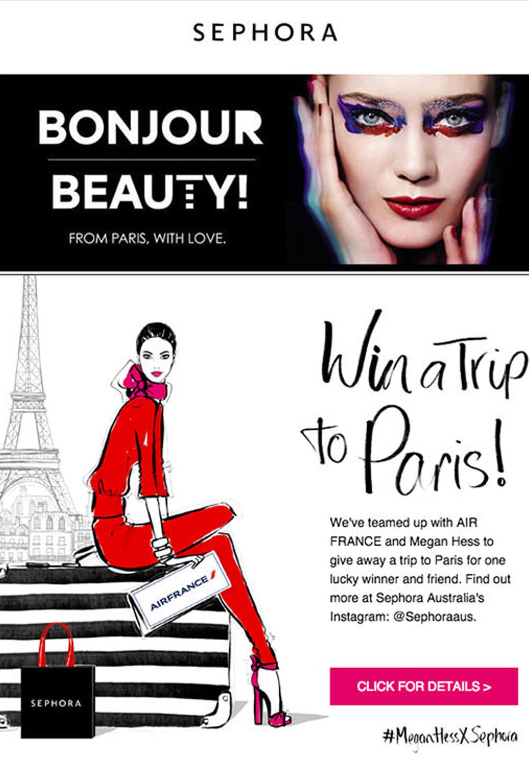
Source: Campaign Monitor
While maintaining its brand identity, Sephora manages to pull off an attractive retro look in the example above. The retro illustration design trend is one you need to implement, not only because it reminds the older generation of the good years gone by, but because it is also appealing to the younger generation.
2. Typography
Typography is the visual element of written media, dealing with font and content design. Designing your own unique fonts is a great way to spruce up the design of your marketing assets. With everyone else using the same familiar fonts, you will definitely grab attention by using a unique font.
Typography does not end at font design. It also extends to the way you combine different fonts to create an artistic look with your written content.
3. Bold colors are hip
Although bold colors were regarded as obnoxious and loud in the past, the current design trends are actually favoring them. Bold designers don’t just stop at these loud colors. They are taking a step further by using clashing colors in their designs.
You will have to tread carefully here, as your choice of color in your brand design is ultimately dependent on your primary audience’s taste.
Top email marketing design trends you should consider following
Design trends don’t just affect websites, landing pages, and printed media. Email design also plays a role in how your subscribers engage with your brand.
The following are some email marketing design trends you can implement in your next campaign.
1. Simple and sophisticated
To facilitate easier consumption, many email marketers are opting for simple yet sophisticated email designs. These are uncluttered and have a clean look that is easy on the eye.
Source: Campaign Monitor
The common drivers for this design trend are
- Low email attention spans
- Most emails are consumed on mobile devices
- The use of GIFs and animations
GIFs and animations are a great way of grabbing attention and, in many cases, keeping it. Our eyes are instinctively attracted to movement and, by utilizing moving elements in your email, you are likely to win the battle for attention.
Not only do GIFs and animations capture attention, but they are a great way of drawing attention to your CTA, if used properly.
3. In-email sound
In order to be all-inclusive, more and more marketers are adopting sound as a way of enhancing the email experience. This is especially helpful for the visually impaired but can also be used to provide a more rich experience in general.
Wrap up
With more and more content vying for your audience’s attention, it is becoming increasingly difficult for marketers to engage potential customers and drive results.
However, with research showing design-led companies outperform their counterparts by 228% and the recent successes of design-led companies like Airbnb and Xero, it has never been more apparent that beautiful design can be the approach marketers need to stand out above the competition, get their messages heard, and drive results.
When creating your next email campaign, landing page, or website, review your new marketing asset using the three principles of beautiful design as guidelines. Ask yourself these questions:
- How could I increase individual incentive or create a sense of social norm to enhance desire for my product? Can I include better photos or add personalization or context?
- What anxiety might potential customers have and what can I do to mitigate it? Can I include testimonials or customer numbers to put people’s minds at ease?
- What could I add or take away to make it easier for potential customers to convert? Can I remove distracting elements or even whole steps from the conversion process?
Great design is within reach of every marketer. By leveraging the right resources (such as beautiful stock photos and attractive icons) and combining them with the right tools (like Campaign Monitor and Squarespace), it’s easy for marketers like you to get better results from your marketing content through beautiful design.
Now that you are equipped with the resources and tools you need, try creating something beautiful today.
For more inspiration, check out our infographic on designing winning emails.