
Using CSS animation can add interactivity, intrigue, and excitement to any email. Whether adding a hover effect to your CTA, or creating a higher resolution hero image that moves, using lightweight CSS code in your email designs can elevate each one to the next level.
Why not use a GIF?
GIFs are great and have their place. But you can animate so much more using CSS animations: Choose when they start, include higher resolution imagery, and add movement with CSS, keeping HTML emails quick to load.
In terms of quality, GIFs only have 256 colors. And, when loading an email, speed and size are vital. With higher quality GIFs—more detailed and better resolution—the file size gets larger.
Although a general rule is not to go above two megabytes in file size for GIFs, to achieve certain effects, I’ve seen GIFs that are seven megabytes (and even higher) that take forever to load—and, in some cases, like with 3G/4G connections or slow WiFi, they never do. So decrease the load time of your emails, increase resolution, and add some interactivity with CSS animations.
CSS animation support in email clients
CSS animation is supported in webkit clients, such as Apple Mail, iOS mail apps, Outlook on Mac, and when viewing emails in a browser.
| Email client | CSS animation suppoort |
| Apple Mail | Yes |
| iOS Mail app | Yes |
| Outlook on macOS | Yes |
| Gmail | No |
| AOL/Yahoo | No |
| Outlook (Windows desktop) | No |
| Outlook.com | No |
| Android/Samsung Mail app | No |
Two types of CSS animation can be used in HTML email: transition and keyframe animation. AMP4Email currently only supports transitions and doesn’t support keyframes.
Transition is used to control the change of an element after a CSS selector, such as when :hover or :checked is used (for example, a hover effect on a CTA to change color or add a border). A keyframe animation controls an element of CSS throughout a timeline and with a set number of iterations (for example, animating a moving image).
Anatomy of CSS keyframe animation in email
The elements of an animation are set within the class or ID targeting an element. This can all be set with the shorthand animation: or each element can be set individually.
Shorthand:
.cta {animation: 1s pulse infinite;}.

class {
animation: [animation-duration] [animation-name] [animation-iteration-count] [animation-direction];
}
Long form:
.cta {animation-name: pulse; animation-duration: 1s; animation-iteration-count: infinite;}

Keyframes declaration:

@keyframes pulse {
0% {box-shadow: 0 0 0 0px rgba(1, 0, 0, 0.5); }
100% {box-shadow: 0 0 0 5px rgba(0, 0, 0, 0); }
}
Properties of an email animation
animation-name
The name associated with the @keyframes property.
animation-duration
How long you’d like your animation to last in seconds (s) or milliseconds (ms).
animation-iteration-count
This property allows you to control the number of times the animation occurs, either infinitely or with a specific number.
animation-delay
You can use this property to set a delay on your animation. The delay is set in milliseconds (ms) or seconds (s), with a default setting of 0s. You can also set a negative delay, for example -1s, and your animation will start one second into its animation.
animation-timing-function
These are preset functions that control the speed of your animation. Find out all the latest information in the Mozilla Developer Documentation. But the most common:
- ease: (default value) – the animation increases in speed from start to the middle and decreases from the middle to the end
- linear – the animation is an equal, even speed throughout
- steps – used to create the number of steps it takes to create an animation, like a cartoon strip
animation-direction
Default value for this is forward, but you can set reverse, alternate (starts forward, then alternates) or alternate-reverse (starts with the animation in reverse).
animation-play-state
Pause or play the animation.
animation-fill-mode
This controls which CSS values are applied before or after an animation. The default value is none—this means, to begin with, the original element before the animation is applied will be shown. Then, as the animation runs through, the CSS declared in the keyframes will be applied until the animation ends, and the element will return to how it looked originally.
There are two other common values:
- forwards – This will retain the last* keyframe’s CSS at the end of the animation.
- backwards – This will retain the first* keyframe’s CSS at the end of the animation.
*This depends on the animation direction.
Keyframes
The timing of an animation is set up within @keyframes {} declaration. First, the keyframes are given an animation name. For example:
@keyframes pulse
Then within curly brackets {} we can set up keyframes of waypoints in an animation. We can choose to have from and to:
@keyframes pulse {
from { }
to {}
}
Alternatively, we can specify steps using percentages:
@keyframes pulse {
0% { }
100% {}
}
You can include as many keyframes or waypoints as you need. Also, if you only stipulate from/0% or to/100% the element will start or finish the animation with its native styles.
Multiple CSS animations on one element
To include multiple animations you can list them, with all the attributes, separated by a comma.
.cta {animation: 1s pulse infinite, 2s shake 1;}
.class {animation: [animation-1], [animation-2], [animation-3];}CSS transitions in email
Transitions are set up to take effect once a user does something, like hovers on an element or checks a checkbox. Transitions affect a CSS attribute of an element, such as width, height, border-color, etc. Using a similar call to action example below, we set a border on a button, then use a transition to change the color of the border:
HTML
<td align="center" style="padding:5px 40px; color:#000000; font-size:16px; line-height:22px; text-decoration:none; font-family: Helvetica,Arial,sans-serif; height: 44px; border: 2px solid #000000; transition-property: border-color; transition-duration: 2s;" class="cta">
<a href="https://www.campaignmonitor.com/" style="color:#000000;text-decoration: none;display:block; text-transform: uppercase;">
Call to Action</a>
</td>
CSS in the head
.cta:hover {border-color: green!important;}</codeCSS transition elements
CSS transitions need two elements to work: a transition property and a duration. In the example above, border-color is the property and 2s is the duration. But there are a few more attributes that can be added.
transition-property
A CSS element such as width, height, etc.
transition-duration
The length of time the whole transition should take.
transition-delay
You can choose to delay the transition set in seconds.
transition-timing-function
The way the timing is controlled for the transition, the speed curve of the transition effect.
Transition timing function
Transition timing has a set of attributes that change how the transition animation behaves, similar to the options in the keyframes animation above. The most common is ease (which is the default), and the easiest to control and understand is linear. Both of these attributes behave as most people would expect. There’s also a more custom option: cubic bezier.
The timing function has six settings:
ease (default)—slow start, speeds up, then ends slowly
ease-in—starts slowly and then speeds up
ease-out—slows down at the end of the transition
ease-in-out—slow start and end
linear—same speed throughout
cubic-bezier—custom setting to create your own timing functions.
Here’s a chart that shows the response to the following property: style="cubic-bezier(0.4,0.5,0.4,0.7);".
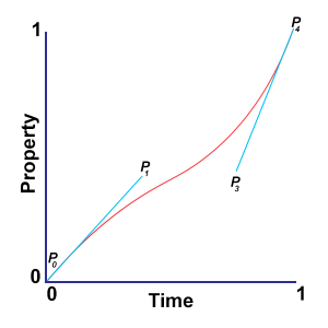

The cubic bezier timing function is a method of plotting different points of a curve on a 1×1 axis. P0 and P3 are set at the start and end of the animation timing – P0 (0,0) and P3 (1,1). Then, using time (x axis) and property (y axis), we can plot points P1 and P2 to control the line’s curve. In the cubic-bezier CSS attribute this is expressed as cubic-bezier(x1,y1,x2,y2);.
The time (x axis) value should be between 0.0 – 1.0. The property (y axis) value can be more than 1.0 or below 0.0 to extend the property and increase animation speed and character—this usually gives the animation a bit more bounce.
Maybe you’ve used Adobe After Effects or similar animation software, or you’re just a math whizz and immediately understand the graph above. But if not, don’t despair!!
Check out these online tools that help create your cubic-bezier, either using preset timings like on Easings or you can visualise the graph and animation using the Cubic Bezier site.
CSS transition syntax
Longform
.cta {
transition-property: border-color;
transition-duration: 2s;
transition-timing-function: ease;
transition-delay: 2s;}
Shorthand
.cta {transition: border-color 2s ease 2s;}

.class {
transition: [transition-property] [transition-duration] [transition-timing-function] [transition-delay];
}
CSS transition animation in email
Using the method above, you can include the transition in line on your elements, like this: <td style="transition-property: border-color; transition-duration: 2s;">.
Alternatively, you can use the shorthand style="transition: border-color 2s;", then, in the head of your HTML email, in a <style> block, you can include how the element will be triggered and how the attribute will change. Since this overrides an inline style, you’ll need to add !important to the style in the head. For example:
<style>
.cta:hover {border-color: green!important;}
</style>
Another way to include transitions to your elements is to include all of the information in the head of the HTML:
.cta {
border: 2px solid #000000;
transition: border-color 2s;
}
.cta:hover {border-color: green;}Setting up CSS animation in email
As you can see above, you can add CSS animation in line or using classes, so choose whichever best fits into your email style.
When creating keyframe animations, it may be easier to assign a class to the element you’re animating and include all the keyframe information in the head of the email. Alternatively, all the email clients that support CSS animation also support linking to external stylesheets, so to save file size, you could include your animations in a linked file.
Pro tip: Linking an external stylesheet—Add this snippet to the <head> of your HTML file and add the link to your CSS file in the href attribute:
<link rel="stylesheet" type="text/css" href="animations.css">
Keyframe animation in email
Here’s a coded out example of keyframe animation in email.
<!DOCTYPE html>
<html>
<head>
<style>
.cta {animation: 1s pulse infinite;}

@keyframes pulse {
0% {box-shadow: 0 0 0 0px rgba(1, 0, 0, 0.5); }
100% {box-shadow: 0 0 0 5px rgba(0, 0, 0, 0); }
}
</style>
</head>
<body>
<table role="presentation" width="100%" border="0" cellspacing="0" cellpadding="0">
<tr>
<td align="center" style="padding: 20px;">
<table border="0" cellpadding="0" cellspacing="0">
<tr>
<td align="center" bgcolor="#400099" style="font-size: 14px; line-height:20px; font-family: helvetica, arial, sans-serif; color: #ffffff; vertical-align: middle; height:44px; border-radius: 9px;" class="cta">
<a href="https://www.campaignmonitor.com/" style="color: #ffffff; text-decoration: none; padding: 10px 30px; display: block; vertical-align: middle;" target="_blank">Awesome email blogs</a></td>
</tr></table>
</td>
</tr>
</table>
</body>
</html>
Here’s a screenshot of what that code looks like in action:

And here’s a live example of that code on Codepen.
Transition animation in email
Here’s a coded out example of what a transition animation in email looks like.
<!DOCTYPE html>
<html>
<head>
<style>
.cta:hover {background-color: red!important;}
</style>
</head>
<body>
<table role="presentation" width="100%" border="0" cellspacing="0" cellpadding="0">
<tr>
<td align="center" style="padding: 20px;">
<table border="0" cellpadding="0" cellspacing="0">
<tr>
<td align="center" style="font-size: 14px; line-height:20px; font-family: helvetica, arial, sans-serif; color: #ffffff; vertical-align: middle; height:44px; border-radius: 9px; background-color: #400099; transition: background-color 2s ease 0s;" class="cta">
<a href="https://www.campaignmonitor.com/" style="color: #ffffff; text-decoration: none; padding: 10px 30px; display: block; vertical-align: middle;" target="_blank">Awesome email blogs</a></td>
</tr></table>
</td>
</tr>
</table>
</body>
</html>
Here’s a screenshot of that same keyframe animation:
And here’s a live example of that code on Codepen.
Email example: CSS, GIF, and static image options
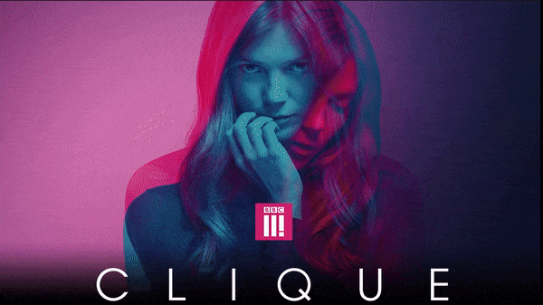

This big hero image of a BBC show called Clique looks awesome, but, due to the size and colors, the GIF was a bit grainy. So I wanted to see if I could slice three high resolution images together and get a similar effect—but higher resolution, faster loading, and bigger impact.
You can see what I was able to do using CSS transitions in my example on Codepen.
Step 1: Set up media queries.
First, I set up some device targeting so the clients that supported CSS animation showed the animation, and so those that didn’t support it were served the GIF version, or, in older Outlook cases, a high resolution static image.
<style>
/* Test to see if device has the ability to have checked */
@media only screen and (-webkit-min-device-pixel-ratio:0), (min--moz-device-pixel-ratio:0) {
#webkitnocheck:checked ~ .fallback { display:none; }
#webkitnocheck:checked ~ div .interactive { display:block !important; max-height:none !important; }
}
/* Specific Yahoo! Detection */
@media screen yahoo {
.fallback { display:block!important; max-height:none; }
.interactive { display:none !important; }
}
/* Specific Samsung Mail detection */
@media screen and (-webkit-min-device-pixel-ratio: 0) {
#MessageViewBody .fallback, body.MsgBody .fallback { display:block!important; }
#MessageViewBody .interactive, body.MsgBody .interactive { display:none !important; }
#MessageViewBody .samsung { display:none !important; }
}
/* Specific Gmail detection */
@media screen and (max-width:9999px) {
u + .gmailbody .fallback { display:block!important; max-height:none; }
u + .gmailbody .interactive { display:none!important; }
}
</style>
After the styles, I added a hidden checkbox, so that if it was supported (checked) then the div with class="interactive" would show, and, if not, the div with class="fallback" would display.
<body>
<table role="presentation" border="0" cellpadding="0" cellspacing="0" width="100%" bgcolor="#000000">
<tbody>
<tr>
<td valign="top" align="center">

<!--[if !mso]><!-- --><input type="checkbox" id="webkitnocheck" name="webkit" checked="checked" style="display:none;max-height:0;visibility:hidden;"><!--<![endif]-->

<div class="fallback"></div>

<div class="interactive" style="display: none;"></div>
</td>
</tr>
</table>
</body>
Now onto the animation.
Step 2: Animate the keyframes.
In an email, we can only change background-image with different source URLs dynamically, since the CSS tag content isn’t supported. Therefore to animate a changing image, use keyframes to choose when each image should show, noting that you get a smoother animation if you start and end on the same image.
@keyframes clique {
0% {
background-image:url('https://arcdn.net/bbc/2018/clique/html/images-css-test/clique-2.png');
}
20% {
background-image:url('https://arcdn.net/bbc/2018/clique/html/images-css-test/clique-1.png');
}
70% {
background-image:url('https://arcdn.net/bbc/2018/clique/html/images-css-test/clique-3.png');
}
100% {
background-image:url('https://arcdn.net/bbc/2018/clique/html/images-css-test/clique-2.png');
}
}
The first image and last image are the same—set at 0% and 100%—then, by altering the percentage difference in between, you can add any number of images. In this case, I wanted to add two more. The first came on at 20% of the animation duration, the next at 70%.
After creating the keyframes, I added an id (#clique_animate) to the head with all the other animation information: animation-name: clique, animation-duration: 4s (4 seconds), and animation-iteration-count: infinite.
#clique_animate {animation:clique 4s infinite;}Step 3: Designate the GIF and static fallbacks.
Next we need to set up the HTML, starting with the fallback. Using the technique I wrote about on the email design review blog, you’ll place the GIF and static image together in the same <td> and using mso conditional comments, you’ll hide the GIF from Outlook and show the static image.
<div class="fallback"><table role="presentation" class="wrapto100pc" border="0" cellpadding="0" cellspacing="0" width="800">
<tr>
<td align="center">

<!--[if !mso]><!-->
<img src="https://image.e.bbcmail.co.uk/lib/fe9013727761077872/m/21/clique-1-v1_02d.gif" width="800" height="448" alt=""/>
<!--<![endif]--><!--[if gte mso 9]>
<img src="https://arcdn.net/bbc/2018/clique/html/images-css-test/clique-1.png" width="800" height="448" alt=""/>
<![endif]-->

</td></tr></table></div>
Next, set up the HTML in the interactive div. Using a transparent GIF that’s the same size as the background image, you can create a blank space for the images to animate inside. This means the image can also be responsive if opened on a smaller screen. Just assign the <img> tag the id="clique_animate" and the animation will show inside this container.
<table role="presentation" class="wrapto100pc" width="800" border="0" cellspacing="0" cellpadding="0">
<tbody>
<tr>
<td align="center">
<img id="clique_animate" src="https://arcdn.net/bbc/2018/clique/html/images/spacer.gif" width="800" height="450" class="wrapto100pc">
</td>
</tr>
</tbody>
</table>Wrap up
Culminating in that last example, we’ve covered all levels of client support, from the lowest animation support on Outlook 07/10/13 with a designated high resolution static image, then on to GIF support to show movement in the email, and finally on to email clients that support CSS animation, transitioning high resolution images to create a slideshow type effect.
Looking for more tips on CSS and animation? Dive into our comprehensive CSS guide.