
The latest updates to the Apple Mac operating system, Mojave, iOS 13, Windows 10 and Android Q have enabled a large audience to try out Dark Mode. How does this affect email marketers, designers and coders, and what do you need to do about it?
What is Dark Mode?
Dark Mode inverts the colors on your device to decrease the amount of light on your screen, most commonly, inverting a white background and black text to a black background with white text. The benefit of Dark Mode is the ease of strain on your eyes, especially at night or in dark conditions. There are numerous articles on the web dispelling Dark Mode as good for all day use, whilst others sing its praises.
What we now know as Dark mode used to be how a computer display looked originally.

With Cathode-ray tubes, this was the best display you could get. The first modern use of Dark Mode was in the app Pocket in 2012—designed to help users save tidbits from around the internet to read when the user had time, which made sense, as a display with a black background and white text is much easier on the eyes when in darker rooms, like when reading in bed. This flowed into Pocket’s website and other apps soon followed, with Twitter enabling night mode in 2016.
In the last year, big operating systems such as Mac OS and Windows 10 all made apps default to the systems color choice. So if a user chose to work in Dark Mode, all apps would be made dark by default. The developer documentation gives details on how to stop this from happening in your app’s user interface, but you have to actively choose to not switch to Dark Mode. Unfortunately, email clients don’t publish documentation to help email developers.
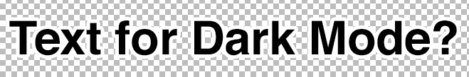
Dark Mode


Light (default) Mode

With preliminary analytics from a range of email senders, around 13% of openers in the native iOS 13 mail app use Dark Mode. With Outlook.com, Outlook app, and Gmail already offering a dark mode as well as Apple Mail and Outlook on Mac, Windows Mail and Outlook on Windows 10, a significant number of your recipients could be reading your emails in Dark Mode.
Can we keep serving the same email to people and assume they’ll put up with it?
Well, you could, but imagine staring at a desk screen and you go to your emails. Then all of a sudden a bright light shines at you—you’re more likely to close it quickly or skip to the next email. Not the outcome marketers want.
Where can users enable Dark Mode?
Operating Systems with Dark Mode
Mac Mojave
Windows 10
iOS13
Android 10 (Q)
Email clients with Dark Mode
Outlook macOS
Outlook Windows 10
Outlook.com – Webmail on all browsers
Outlook app iOS13
Gmail app iOS13
Apple mail macOS
Apple mail app iOS13
Orange Webmail
Coming soon
Gmail app Android: Rolling out
- Gsuite blog had rollout in 15 days from September 2019, but users are still waiting.
Outlook 365
- Report from Windows Central
- Microsoft Outlook blog
UI – Dark theme (no change to emails)
Yahoo Mail (App & Webmail)
Gmail Webmail
How does this affect email designs?
You don’t need to design a completely different email especially for Dark Mode if you don’t want to–and I don’t think anyone plans on doing that.
The first step is to get your hands on a device or email account that has Dark Mode enabled. The easiest way to do this on any computer is to sign up for a free outlook.com address, then send a test email through your ESP to check how your emails look. If they all look fine, you don’t need to do anything after all.
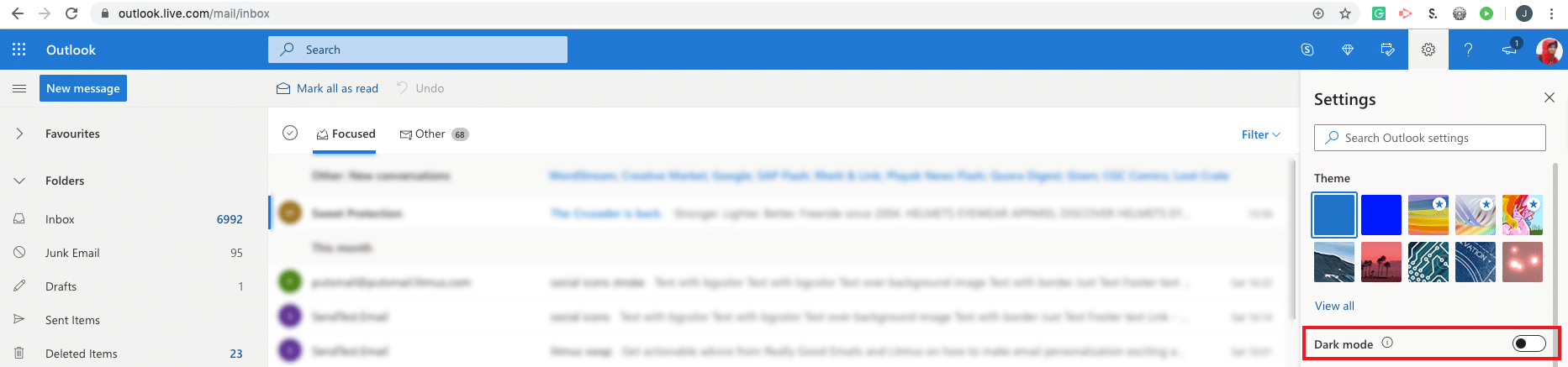
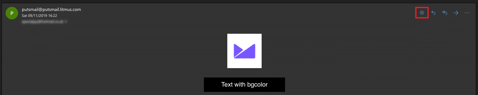
Turning on Dark Mode on Outlook.com
Create a free account and log into Outlook.com. In the top right, find the ‘Gear’ icon for settings:


Next find the Dark Mode toggle:

Toggle the Dark Mode on and your interface and emails should now all be in Dark Mode:
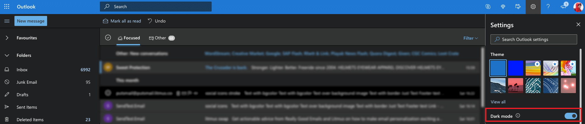

One great thing about Dark Mode on Outlook.com is the Night/Day switcher button whilst in your emails:


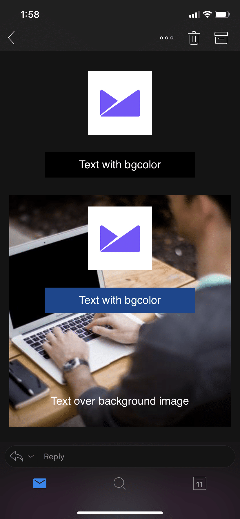
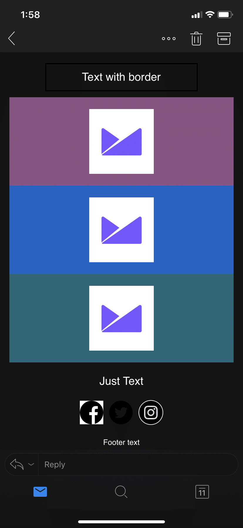
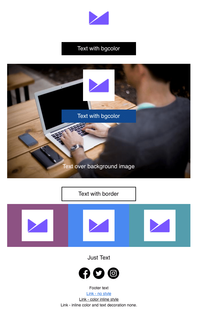
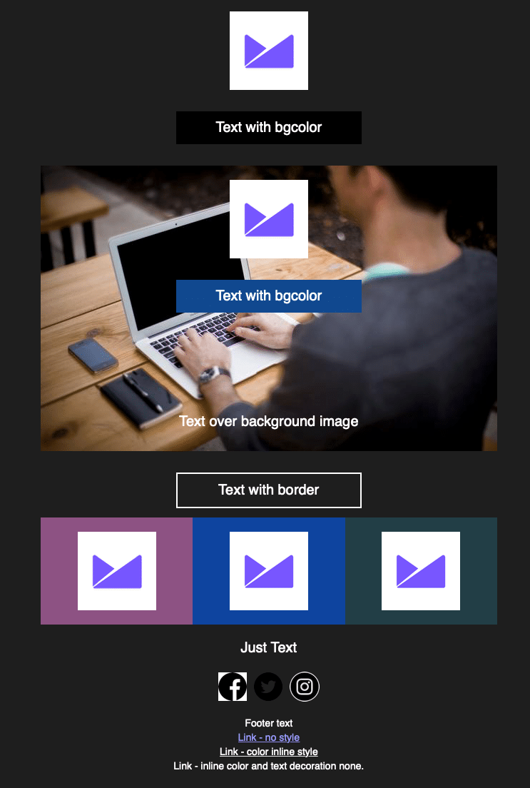
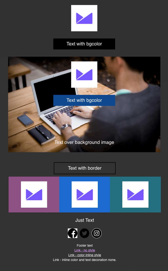
Example email screenshots in Dark Mode
The below images have not had any dark mode CSS or adjustments:
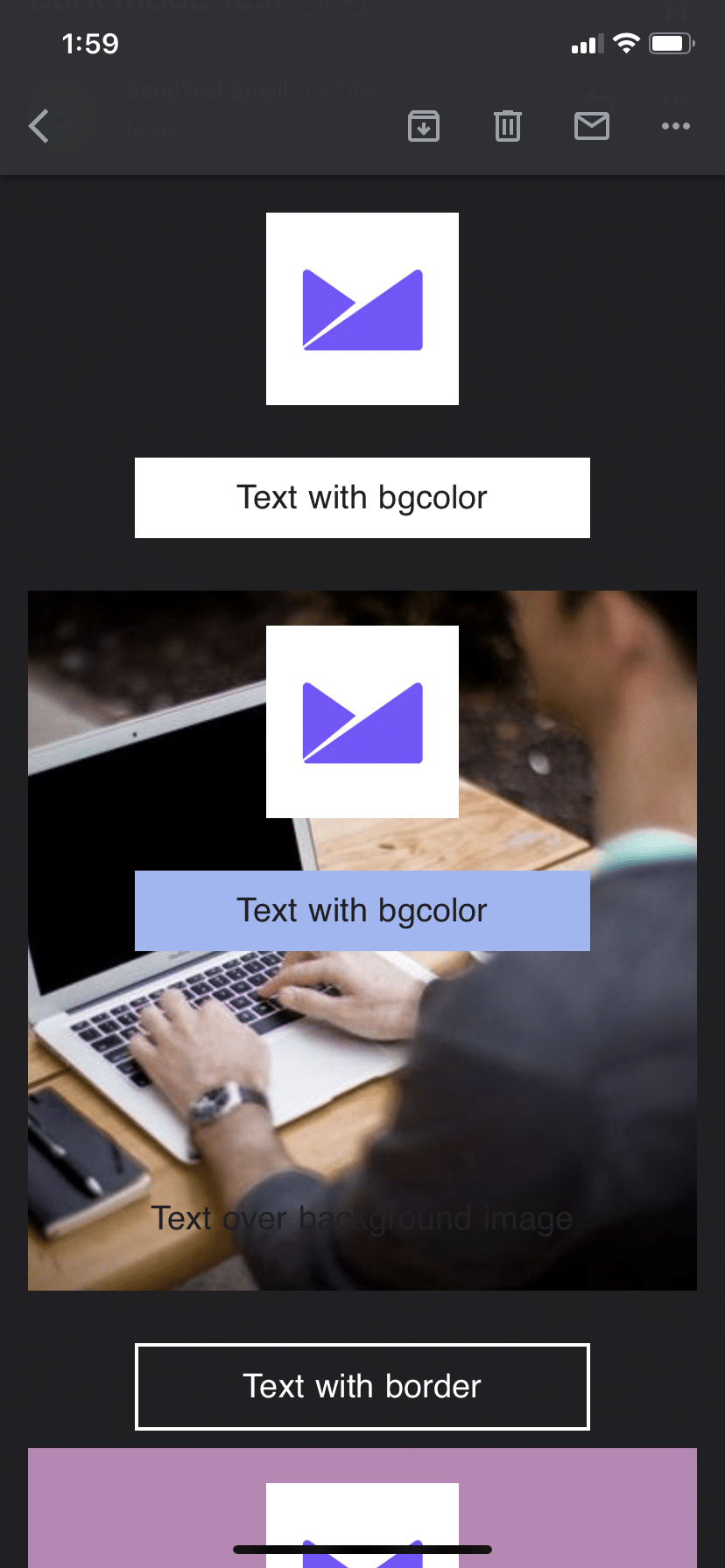
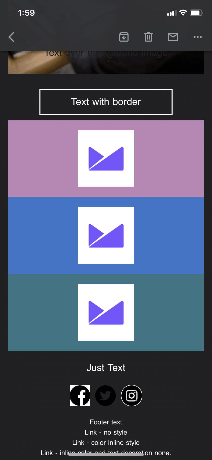

Gmail iOS
- Images—PNG/GIF/JPG—are not affected.
- Text over background colors are inverted but contrast is checked.
⚠️ Gmail iOS warnings
- CSS and HTML colors are altered throughout the email.
- Text over background images are inverted and the contrast is not checked.
- Links with no css are inverted and no inline added.
- White and black are inverted.
Outlook iOS
- PNG/GIF/JPG are not affected.
- Text over background colors are not affected.
- Text over background images are not affected.
- Background colors in CSS are not changed.
⚠️ Outlook iOS warnings
- Border colors are not inverted.
- White and black are inverted if on a body background color of black/white.

Apple Mail iOS
- No change.
⚠️ Apple Mail iOS warnings
- You may want to set up Dark Mode specific css to make the email more user friendly in Dark Mode. Apple Mail does support
@media (prefers-color-scheme: dark).

Apple Mail Mac OS
- No change.
⚠️ Apple Mail Mac OS warnings
- You may want to set up Dark Mode-specific CSS to make the email more user friendly in Dark Mode. Apple Mail does support
@media (prefers-color-scheme: dark).

Outlook Mac OS
- PNG/GIF/JPG are not affected.
- Text over background colors are not affected.
- Text over background images are not affected.
- Background colors in CSS are not changed.
⚠️ Outlook Mac OS warnings
- White and black are inverted.

Outlook Webmail Chrome
- PNG/GIF/JPG are not affected.
- Text over background colors are not affected.
- Text over background images are not affected.
- Background colors in CSS are not changed.
⚠️ Outlook Webmail Chrome warnings
- White and black are inverted.
- Border color is not affected.

Windows 10 Mail
- PNG/GIF/JPG are not affected.
- Text over background colors are not affected.
- Text over background images are not affected.
⚠️ Windows 10 Mail warnings
- White and black are inverted.
- Background colors in CSS/HTML are affected.
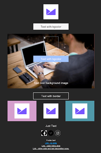
Images: designing for Dark Mode
Almost all HTML emails will have some sort of image. Dark Mode currently doesn’t edit images in any way or alter them, which can cause some designs to not look as they were designed.
Dividers
Using HTML and CSS as much as possible to code dividers and separators will allow them to also switch colors to stay consistent with the design. Try to avoid using images that match the background color in the html and instead use transparent PNGs.
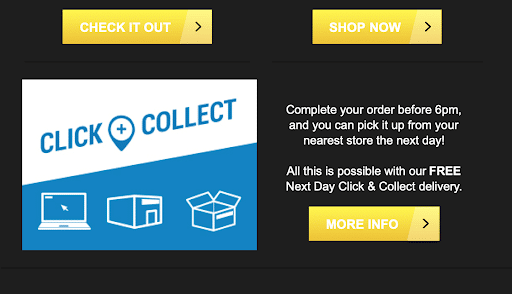
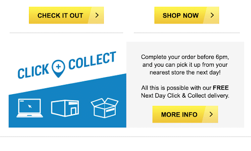
Decathlon: Online sports brand
This diagonal divider is an image. In Dark Mode, the colors in the HTML and CSS have been changed, leaving the divider to look out of place.


Within the same email, the line dividers are lost in the dark theme and the “Click + Collect” image doesn’t blend in as well with the design.


The above horizontal spacer lines could be achieved or granted more control with the <hr> element. You can use an empty <td> with a background color if it’s the full width of the element or a nested table with a smaller width. The below HTML can be used on all email clients:
<tr>
<td align=”center”>
<table role="presentation" border="0" cellpadding="0" cellspacing="0" width="200" align="center" style=”width: 200px;”>
<tr>
<td bgcolor=”#000000” height=”2” style=”font-size: 2px; line-height: 2px;
height: 2px;” > </td>
</tr>
</table>
</td>
</tr>Specifying the width and height of the table and td will keep the divider the correct size when opened in Outlook 120 DPI.
Logos
Logos and branded images can be tricky to design for compatibility with Dark Mode and Light Mode. If your company colors are very close to black, using a PNG as your logo image in email could cause the image to be lost. Like Flashpoint’s logo below:
![]()


In this case, the image could be saved with a stroke around the logo that matches the background color in light mode but helps the logo stand out in Dark Mode, like below:


Alternatively, we can target Dark Mode and swap the images, as most brands have a logo design specifically for dark background colors. We describe this technique here (link to code can be found here). Litmus does this very well simply by swapping the color of the word litmus:


Social media and small icons
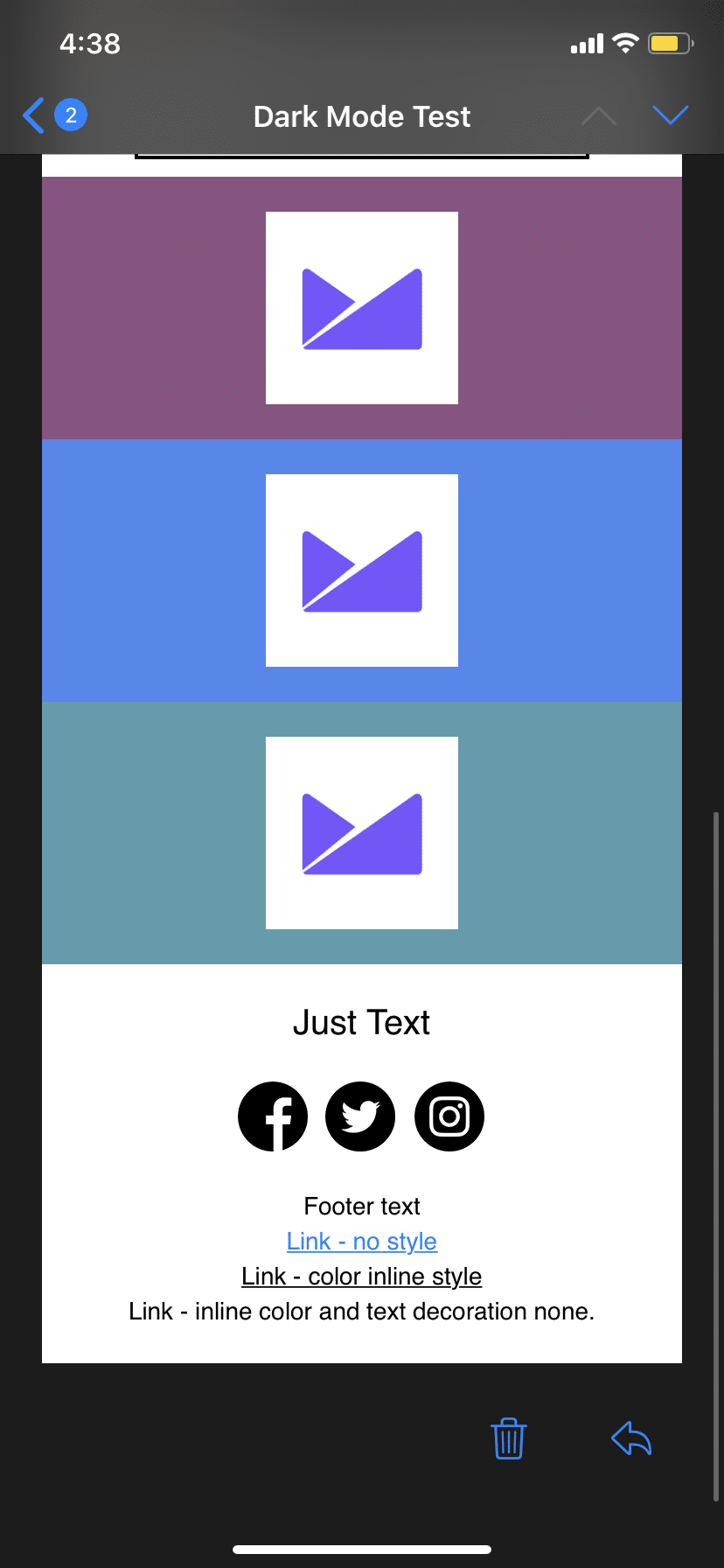
Small icons and in particular social media logos are often dark colors in the footer of emails and can be lost in Dark Mode. In the example email we show the three ways they could be designed and saved out: with a white background, as a transparent PNG, and with a stroke around the edge.


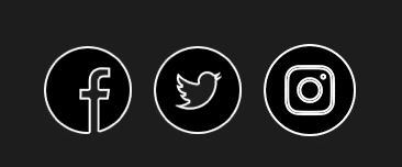


In this example, the central Twitter logo is lost and if all three were transparent PNGs, it would be lost even further. The white background is quite striking in the design, but the images with the 2px stroke added around the edge are a good compromise.
Filters and contrast
Should you consider Dark Mode users and add a filter with brightness and contrast adjustment in your CSS to stop really bright images from startling the reader or to make images blend in more with a darker background?
The image below on the right has no filter while the image on the left has the filter below applied (Applemail):
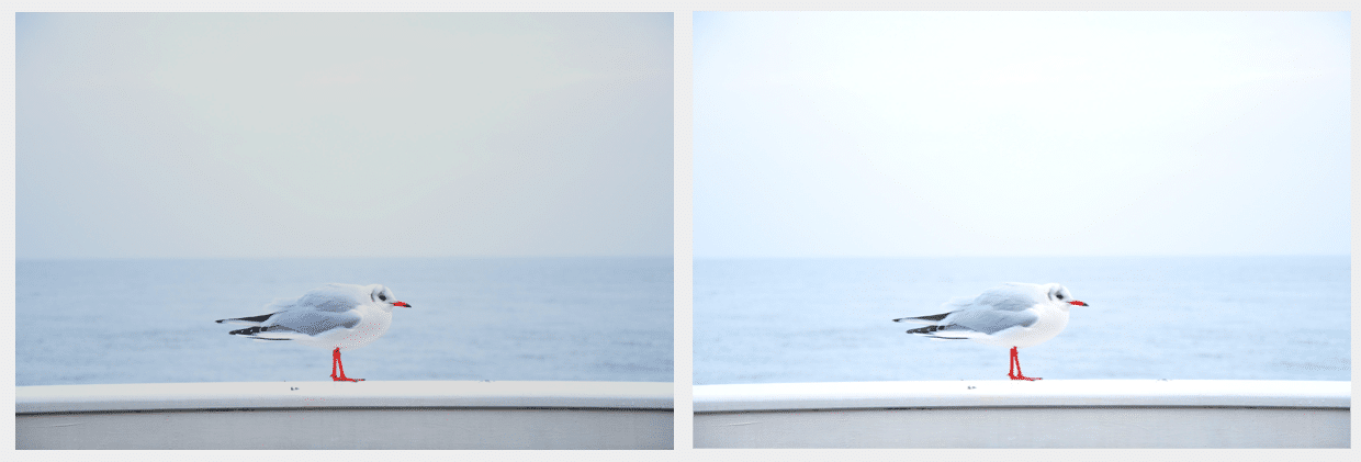

img {filter: brightness(.8) contrast(1.2);}
The above CSS within the prefers-color-scheme: dark media query outlined below adds the filter to all <img> tags. Instead, you could add a class that could be applied to certain images if they were particularly bright or wanted them to fit better with a darker background.
Takeaways for your images in Dark Mode email design
- Use transparent PNG images that can show the background color from the HTML/CSS.
- For smaller images, logos, or text as images, and anything with thin dark lines, consider adding a stroke around the design to enable it to standout on a darker background.
- Consider how the email will look if the background color just changed—by adding
bgcolor=”#000000”to your<table>and<body>tags or change the background to black at the design stage to see how it could look. - Apply a CSS filter to change the brightness and contrast of your images to better fit with Dark Mode.
Creating images for Dark Mode
The best solution to cover all bases with important images—such as logos—is to create two versions.
A light version with a stroke:


This ensures that, in the default (light) mode, the image will blend in with the background color and fit with the design:
![]()

The stroke will make sure that if the email client doesn’t support a Dark Mode media query or fix, the image will still stand out:

For the second version of your image, you can tailor the image to look good on dark backgrounds, such as turning the image all white:

Designing text for Dark Mode
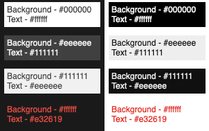
Using live text rather than text in images is best for accessibility, deliverability, and is easier for most email workflows. But as this is HTML- and CSS-based, the colors are subject to change when in Dark Mode, as you can see by the examples above.
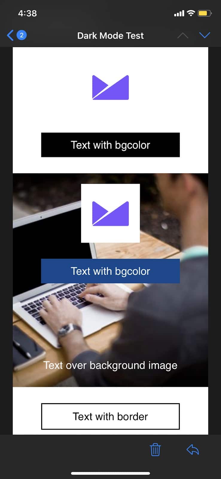
The main takeaway with text is that using pure white or black text will get swapped in Dark Mode. The hex code #FFFFFF and #000000 will get swapped in almost all instances. You need to be especially careful with text over images, such as in the Decathlon yellow button examples, or the white text over the background image in Gmail on iOS. The color inversion has made them more difficult to read and lowered the contrast.
Dark Mode on the left, default (light) on the right:

You can have some control over the color of text using the prefers-color-scheme: dark media query outlined below. However, some colors default to inverted, no matter the CSS you have inline or with !important stated.
If you choose to use black text on a white background as an image, it is best to use a transparent PNG with a stroke around the text to match the background in the default light email:

But we would always advocate for live HTML text.
Email examples for Dark Mode design


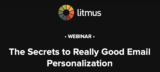
Source: Litmus
The Litmus email above has been designed to work in Dark Mode. First, the logo swaps when in Dark Mode and changes from black text to white. The CSS colors for buttons and bullet points are altered, but the text still contrasts and the image in the center has a white outline to help it stand out in Dark Mode.
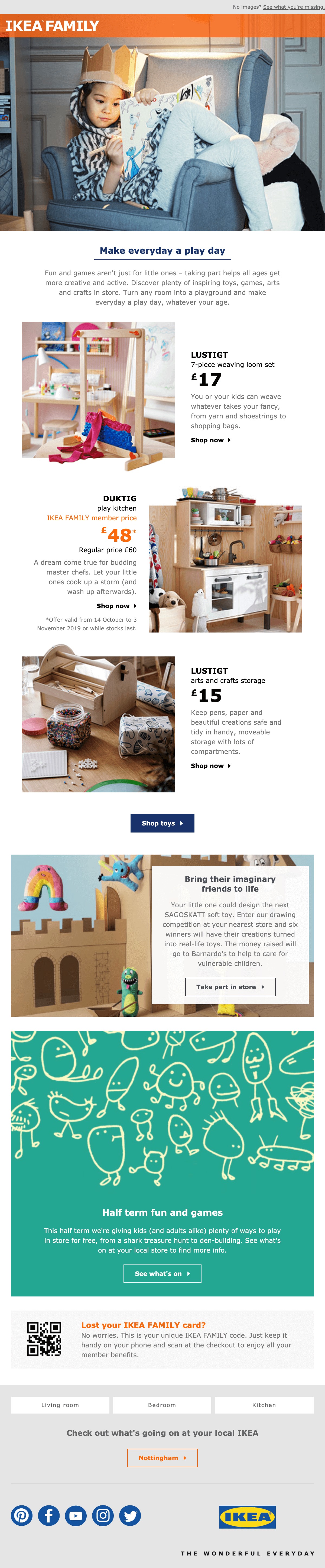

Source: IKEA
This IKEA email is an example of a campaign that, with a few small tweaks, could display well in Dark Mode.
The social icons at the bottom of the email could all have a consistent background color, or, in this case, would stand out as transparent PNGs. The logo in the footer with the strap line, “THE WONDERFUL EVERYDAY,” is unreadable in Dark Mode. By adding a stroke or background color around the strap line, or using the Dark Mode media query, they could swap the image to a Dark Mode-specific logo with white writing.
Targeting Dark Mode in email clients
All of the techniques below require adding new meta tags to your emails. The meta tags are used to tell the user agents’ (operating systems, browsers, email clients) style sheets what to load or not load.
The meta tags color-scheme and supported-color-schemes are used to highlight whether the HTML supports light and dark themes.
The media query that some email clients support is @media (prefers-color-scheme: dark)—all of the styles in this media query in conjunction with the meta tags will allow email designers to control the look and feel of the email in dark mode.
<meta name="color-scheme" content="light dark"><meta name="supported-color-schemes" content="light dark">
Clients that support @media (prefers-color-scheme: dark)
<meta name="color-scheme" content="light dark">
<meta name="supported-color-schemes" content="light dark">
<style>
/* Normal styles */
@media (prefers-color-scheme: dark) {
/* Dark mode styles */
}
</style>
Find an example email with all the code to control text and swap images on codepen.
Dark Mode image swap
A common use case for this code is to swap a logo so it looks best in Dark and Light Mode.
First, ensure that the correct meta tags are in the head of your html document:
<meta name="color-scheme" content="light dark">
<meta name="supported-color-schemes" content="light dark">
Following the meta tags, but still in the head of the email, we need to add our media query specific to Dark Mode. This can sit inside your normal style block or in separate <style> tags. Also, as Gmail doesn’t support this media query currently, you could host these styles on an external stylesheet and link to it in the head.
CSS
<style>
:root {
color-scheme: light dark;
supported-color-schemes: light dark;
}
@media (prefers-color-scheme: dark) {
.lightimage {
display: none !important;
}
.darkimageWrapper,
.darkimage {
display: block !important;
}
}
</style>
The first thing we do in the style tags is declare that this email supports the users choice of interface. And on supported email clients, using :root will let the email client know how to show your email without having to run through all of the styles. The tags color-scheme: light dark; and supported-color-schemes: light dark; tells the email client that this HTML document has both light and dark versions.
Note: There is one school of thought to put supported-color-schemes: light; or color-scheme: light; at the start of your email if you don’t have any Dark Mode-specific CSS. This won’t stop Dark Mode changes in email clients, so these tags may only be web-specific or may be supported in the future.
Next we can start the CSS for Dark Mode by opening the media query and stating these styles target Dark Mode: @media (prefers-color-scheme: dark) (and all of our dark mode specific styles will be in here).
Inside the media query, we need to hide the light image. In the HTML we have given the light version of our image class=”lightimage” and we give the styles in the CSS
.lightimage { display: none !important; }.
As before with the darkimage above, we want to now hide the lightimage, but to override its inline style of display: block; we need to add !important in the CSS in the head.
Next, we have the .darkimagewrapper and .darkimage styles. We set these to display:block!important; to ensure the dark image is displayed. Within the HTML, we need to wrap the light image with a <div> to make sure it’s not visible on Outlook. After these styles, we make sure to close the media query curly brackets }.
HTML
<td>
<img src="lightimage.png" width="600" height="auto" style="display: block; height: auto;" class="lightimage">
<div class="darkimageWrapper" style="mso-hide: all; display: none">
<img src="darkimage.png" width="600" class="darkimage" style="display: none;">
</div>
</td>
In the HTML above, the <td> is placed in the usual <table><tr> structure. Within the <td> you first place your light image. In the above HTML, we first have the image source followed by the width set at 600, then the height set to auto, all within HTML attributes. Then, to make sure the image is displayed correctly, the style has the CSS display property with the block value, followed by height: auto to ensure the HTML attribute is also followed in Outlook. Lastly we give the <img> class=”lightimage” so we can hide it in Dark Mode.
Immediately after the light image in the same <td> we open the <div> element and give it class=”darkimagewrapper” so we can show it in Dark Mode. We also include the inline styles mso-hide: all; which is an Outlook-specific style to ensure it’s not shown on older desktop Outlook clients and also the display:none property to hide it when not in Dark Mode.
Next we set up the dark image in exactly the same way as the light image but with class="darkimage" and style=”display:none;” instead of display: block.
You can find the complete CSS and HTML which works in browser for hiding and showing an image in Light or Dark Mode on codepen.
Wrap up
With some small changes, email designs can be compatible with email clients in Dark Mode without any need to change the HTML and CSS. Consider how your images will display and whether or not you have any text over background images in order to design emails that render perfectly in Dark Mode.
However, by adding a small amount of CSS and HTML, you can ensure the important images that are included in every email—such as logos, social media icons, or styled text images—are visible and fit within your designs.
As more email clients adopt Dark Mode and fixes or targeting are developed, we will keep this article up to date.