
Updated July 2019
Making marketing efforts seamless on mobile is a challenge for businesses of all sizes. Unfortunately, businesses tend to resist the call of mobile for far too long because they don’t fully understand what it means to “go mobile.”
That’s because mobile is an umbrella term that covers a wide range of tactics, trends, and strategies. Many of tactics are already being performed by your business in some form, while others may remain a challenge.
Why mobile email marketing is essential
Mobile email marketing is becoming critical as our technology moves further away from desktop computers and gets more involved in the use of portable devices and technology.
What percentage of Internet traffic is mobile?
When it comes to overall mobile internet traffic, the numbers vary by country. For example, in the United States, in the first quarter of 2019, mobile internet traffic made up a total of 40.61% of all internet traffic. As for the rest of the world? Here’s the breakdown.
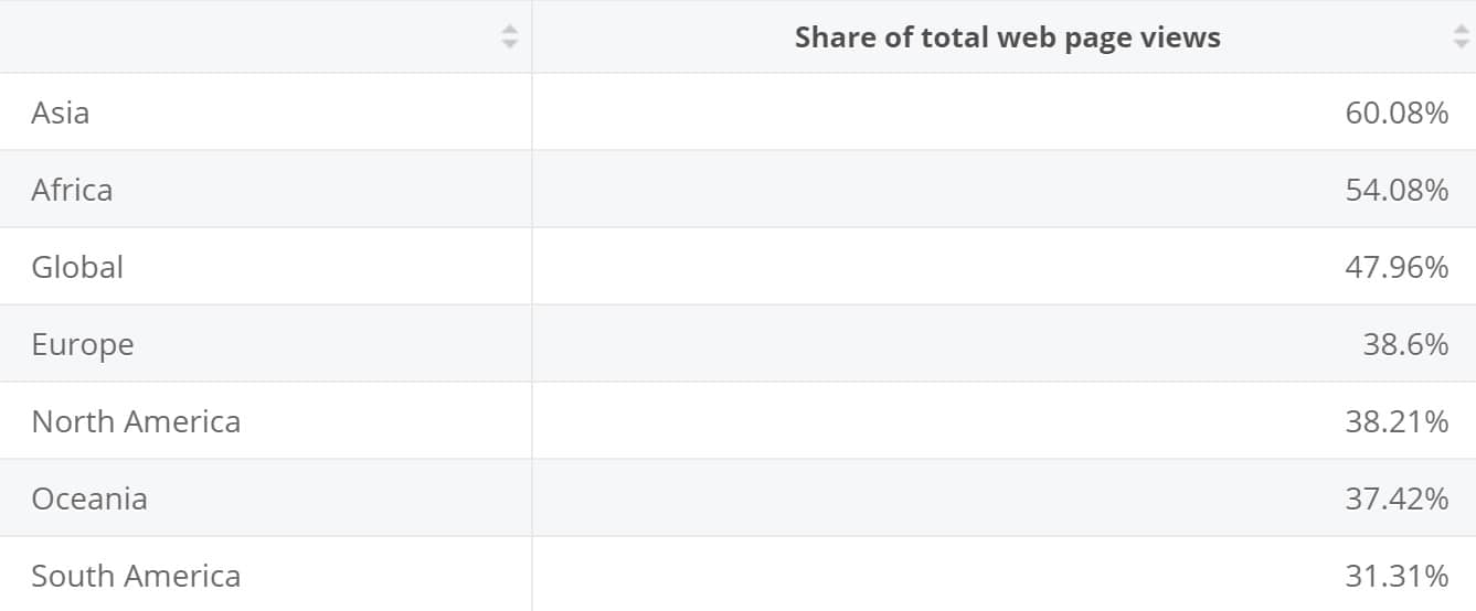
Mobile internet traffic as a percentage of total web traffic in February 2019, by region.
Source: Statista
7 mobile email marketing stats to make you think
Mobile’s impact is undeniable, and email is one dimension of your marketing strategy that is affected by it. The impact is a positive one, but getting the most out of these new technologies means accepting mobile. It’s no longer a question of if and when you should incorporate mobile, but how.
Mobile email is a great place to start. If you’re still avoiding mobile or don’t understand how it can impact your company, you’re already behind the game. So, read fast, take notes, and begin rethinking mobile email immediately with these key statistics.
1. Emails that display incorrectly on mobile may be deleted within three seconds (Adestra)
Poor formatting is the number one complaint about mobile email. If an email displays poorly, no matter how good the content is, it’s likely to be deleted in under three seconds (in >70% of cases). As many as 15% of users will even unsubscribe, instead of delete. All in all, that’s an 85% drop in potential customers on mobile.
What qualifies as poor formatting for mobile email?
- Oversized or out-of-place images
- Too much text without enough breaks
- Multiple column layouts (without a responsive template)
- Lack of alt text (for when signals are poor)
So, how do you make sure that your emails are formatted correctly and won’t be doomed to immediate deletion? Get a responsive email template, then test it.
Even with an email template, you’ll still have to watch your image sizes and make sure to break up your text appropriately. Additionally, it’s a good idea to use buttons for your CTAs instead of links. Links are hard to tap on and frequently require a user to resize or zoom in.
2. 37% of in-store retail sales are influenced by a shopper using a mobile device (Deloitte)
Customers are loud and clear when it comes to mobile and shopping. Even when consumers make purchases in-store, there’s a high chance that some form of mobile or digital interaction influenced the final decision to buy.
In addition to mobile influencing spur-of-the-moment purchases, it can also be used to spark planned purchases. In a survey of roughly 2,000 American shoppers, 38% reported buying a product they had first seen or read about in a marketing email on their mobile phone. 45% of those purchases were in-store.
Three of the most common reasons people use their smartphone while shopping in a physical store are:
- To perform more extensive research on that particular product and products like it to find the absolute best fit for their needs
- To search for any deals or coupons offered by the store or to compare with online prices
- To see if the store provides self-checkout through a mobile device (a relatively new option for some stores that is gaining traction)
3. Emails are now opened more on mobile than desktop (eMailmonday)
How many more emails are opened on mobile varies depending on certain factors, like the age of the email recipient, type of email (direct sale, newsletter or otherwise), type of product or industry and so on. While open rates are affected by a lot of factors and different sources report a range of mobile email open rates, there are a few overall conclusions we can draw:
- Almost every report on email open rates concludes that mobile is responsible for at least 50% of all opens
- Mobile email open rates are significantly higher among younger generations than older audiences
- IT, B2B, and wholesale companies have the weakest mobile email opens, while TV/radio/film, events, and real estate are some of the highest benefactors of mobile email campaigns
The impact of mobile on email marketing is evident, especially if the intended target audience is on the younger side (i.e., under 34-years-old).
4. Mobile users check their email 3x more (Google)
Mobile users spend the majority of their time on mobile devices inside apps. More than 70% of people read their email in a mobile app, with most checking their email in the morning.
What does this mean for you? First, it means you need to make sure that your emails are formatted for mobile, so test your emails before sending and make sure they look good on multiple screens.
Next, time your emails right. Yes, the highest rates of email-opening on mobile occur mid-morning. However, if your information is time-sensitive, mobile users are still likely to be the most receptive group.
Nearly three out of four people will check their inbox many times a day (or as new emails arrive). The majority of desktop users, as a group, tend to check their email once a day or less.
5. Mobile email traffic is more valuable than desktop clicks (Yesmail)
With more customers buying products on mobile, it’s no surprise that mobile conversion rates are up. What is surprising is exactly how much more valuable they are than desktop clicks. In the span of a year, email conversion rose, across the board, as much as 70% for mobile email. During the same period, desktop traffic reported slightly lower conversion rates across the board.
6. 52% of customers are less likely to engage with a company because of bad mobile experience (Wow Local Marketing)
This statistic sums up the impact of mobile and why you should rethink your mobile strategies immediately. Essentially, half of your potential new customer will walk away if you offer a bad mobile experience.
By putting mobile on the backburner, you not only run the risk of engaging fewer new customers, but you indirectly encourage those potential customers to turn to your competitors instead. Moreover, once displeased with your mobile experience, it can be incredibly hard to re-engage those users, even once you’ve fixed your mobile woes.
7. 73% of companies surveyed prioritize mobile device optimization of emails (Smart Insights)
A many as nine in ten businesses are developing a strategy to optimize for email marketing, though some report that a lack of resources may prevent them from implementing it. With nearly three in four businesses currently providing that experience, it’s perfectly reasonable for your customers to expect that your business will too.
This result is also 14% up from the previous annual survey, showing that marketers are placing an increasing priority on mobile optimization across many industries. Whereas just a few years ago email optimization for mobile was a rare event, lack of optimization is now an anomaly.
What’s more, without an implemented mobile or “omniplatform” optimization strategy, it can be hard for a business to move on to the emerging trends in email strategy, such as interactivity, segmentation, and personalization.
Designing for mobile in 2019
With the number of smartphone users worldwide continuing to grow, reaching around 257 million in 2018 alone, it really comes as no surprise that more email marketing teams are looking for ways to design emails for mobile users. However, before diving into our tips for creating mobile-friendly emails, let’s talk mobile-friendly email design vs. responsive email design.
Mobile-friendly emails vs. responsive emails: What’s the difference?
While many people use the terms interchangeably, there is a difference between mobile-friendly and responsive email design.
Mobile-friendly emails
These emails go by a variety of different names, including:
- Mobile-first
- Scalable
- Mobile-aware
Mobile-friendly emails are some of the simplest to design because they rely on a single-column layout. This ensures that the email is still easy to read when scaled up or down in size, depending on the device being used to view it.
Responsive emails
Responsive emails rely on CSS media queries that can change and modify an email based on a defined set of rules. These emails adapt to not only fit varying screen sizes but also allow for email components to change depending on the device as well, such as font sizes, colors, and content order.
When it comes to preferred mobile email designs, many marketing teams would rather go with responsive design because they can easily be set up in a template and changed as needed, while still performing well for most major email clients.
Tips for mobile email design
When it comes time to design your email to fit mobile devices, there are several tips that you should keep in mind, including:
- Keeping subject lines short and to the point: Mobile devices cut down the number of characters seen in the subject line. The same can be said for your preheader text as well.
- Keep your message concise: Remember, your readers want to know the important information right away, and because they are viewing this on a much smaller screen, they don’t want to be scrolling to find the valuable stuff.
- Keep your CTAs front and center: Readers don’t have the best attention spans, so give them your call to action early on and make it as clear as you can so they know what you are expecting of them.
Testing your emails across multiple devices: You won’t know what works until you test them out. Many email service providers allow you to test your emails prior to sending to see how they will look across different devices, including Campaign Monitor.
Source: Campaign Monitor
Wrap up
Your target audiences are using mobile more and more, and they expect you to do the same. It’s time to meet the mobile demands and expectations of your target audiences so that you can give customers the experience they deserve.
Want more advice on how to design for your mobile email users? Check out these 7 tips to creating mobile-friendly emails for your readers.