
Updated March 2019
The following is a technique discovered while we were working on Canvas. While it didn’t make it into the final product, we think it’s worth sharing anyway.
Getting responsive emails to look nice in the Gmail app is a never-ending challenge due to its infamous lack of support for media queries. I’ve previously blogged and written about ways to get a fluid email to look great in the app, but it comes at a design cost; you have to keep one column fairly narrow so that the other column will be wider than a mobile viewport and, thus, when viewed on a mobile screen, take up 100% of the screen.
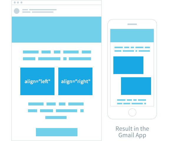
But what everyone wants is equal-width columns that stack. Often, this is achieved by using the align attribute to ‘float’ one table to the left and one to the right, but, when viewed in the Gmail app (especially on larger mobiles), these aligned tables retain their positions, with undesirable results:

The solution that we discovered is to use display:inline-block in combination with text-align:center to get your elements to behave as if they are floating but centered. This just takes a little bit of fiddling to your overall template to get this to work.
Start with the fluid method
You need to create a table that is 100% wide with a max-width of your desired size on desktop.
<table class="container" width="100%" cellpadding="0" cellspacing="0" style="max-width: 600px;">
	<tr>
		<td>
		</td>
	</tr>
</table>
Then, to appease Apple Mail, which doesn’t respect max-width, create a media query to limit that table’s size on desktop:
@media screen and (min-width: 601px) {
	.container {
		width: 600px!important;
	}
}
And wrap the whole table in some conditional code to appease Outlook, Lotus Notes and clients that render with IE:
<!--[if (gte mso 9)|(IE)]>
<table width="600" align="center" cellpadding="0" cellspacing="0" border="0">
	<tr>
		<td>
<![endif]-->

(your table here)

<!--[if (gte mso 9)|(IE)]>
		</td>
	</tr>
</table>
<![endif]-->
Our secret weapons:
Using text-align:center and display:inline-block
Add the following styles to the TD of the ‘container’ table:
<td style="text-align: center; vertical-align: top; font-size: 0;">The text-align: center is simply to get the contents of the cell to be centered (our desired effect), and the vertical-align property is your choice of value. The font-size: 0 is to fix a spacing bug where space can sometimes appear between inline-block elements, which we’ll be placing inside.
Now we need to start another table for Outlook/IE inside this cell. We’ll add another conditional table the same as our first:
<!--[if (gte mso 9)|(IE)]>
<table width="100%" align="center" cellpadding="0" cellspacing="0" border="0">
	<tr>
		<td>
<![endif]-->
Now, inside our cell (and our conditional cell), we’re going to place some divs with a display: inline-block property. As inline-block elements, they’ll obey the text-align property on the containing cell (text-align affects all inline or inline-block elements in a container).
<div style="width: 300px; display: inline-block; vertical-align: top;"></div>The most important things are to set a width (no more than half the width of the container) and to set the display to inline-block. The vertical-align is up to you depending on your layout.
Then inside this div, you can place your content inside a table.
<table width="100%">
	<tr>
		<td style="font-size: 12px;">
			Hello!
		</td>
	</tr>
</table>
You will need to apply a font-size to your table contents because we set it to zero on the container cell.
In between each of these divs, we’re going to pretend to Outlook that we’re closing our conditional table’s cell and opening a new one:
<!--[if (gte mso 9)|(IE)]>
</td><td>
<![endif]-->
Then repeat your div to create another column. In our case we are creating two, so we’ll add one more.
Finally, we’ll close our conditional table
<!--[if (gte mso 9)|(IE)]>
		</td>
	</tr>
</table>
<![endif]-->
Now you have multiple blocks inside a cell that will reflow to fit the viewport. You can add as many inline-block divs as you like, but if you add multiple rows’ worth, you will need to start a new conditional row for our Outlook table by inserting this code:
<!--[if (gte mso 9)|(IE)]></td></tr><tr><td><![endif]-->Magic!
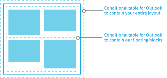
The example below shows how to visualize our conditional design:

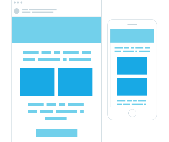
And now you’ll have centered blocks in the Gmail app, as well as other apps that don’t support media queries, such as Outlook.com app and the Yahoo! mail app. You can then add media queries (for those clients that support them) to make the divs 100% of the width of the viewport.
What is a responsive email design?
At one time, email design was built around the content itself. When more devices began making their ways into the hands, homes, and offices of users, email design had to become more responsive.
Platforms, browsers, and apps may render the same content differently if specific measures aren’t taken.
Responsive email design is built around the reader. Wherever they prefer to read the content, the creator (or poster) must optimize accordingly. With responsive design, different views are tested to ensure optimal performance in all instances.
The benefit of this approach is that a user is less likely to encounter common problems. Instead, responsive email design is built around avoiding these issues. They include:
- Optimal Aspect Ratio: Problems with aspect ratios can be frustrating, but responsive designs adapt to whatever dimensions are applicable on their platform.
- Full View of All Elements: Modules and page elements being cut off or warped are common when compatibility issues occur. Responsive designs ensure all your elements, modules, and content are fully viewable, regardless of the device.
- Optimization for Engagement: Contact buttons and links need to be fully usable, regardless of how a person is reading the email. Responsive designs are more conducive to clicks and engagement.
Your email’s best chance of success is to be properly optimized for the viewer. Even a well-crafted email can improve its chances of success with responsive design.
While some email specialists may wonder if it is their content’s style, focus, format, or CTA that need tweaking, in many cases, it’s simply a matter of building a responsive design that can reach users where they are.
Which email clients support media queries?
It’s good to know how to create centered, responsive designs for your emails without media queries. But it’s also good to know which platforms support these queries, just in case. They include: iOS, Android 4.x native client, Kindle Fire native client, Android Outlook.com app, Windows Phone 7.5, and Blackberry OS6, OS7, and Z10.

Source: Campaign Monitor
Whether you’re looking to stick to single-column design or make a mobile responsive creation, queries can be extremely helpful.
Media queries support can be very valuable for certain projects and tasks, as are HTML email templates. Having a good knowledge of how to create centered designs—both with and without queries—is always valuable.
Wrap up
Platform tools and conveniences have made it possible to create great emails and great design. This is possible with or without coding knowledge. We see the process here, and the strategies necessary for making centered designs that deliver great experiences beyond the boundaries of devices.
If you’re lucky enough to be using a client that does support media queries, you may have an easier time. Those situations where queries aren’t an option don’t have to be a worry—you can still achieve responsive design. Remember:
- Not all platforms support queries
- Centered design is possible with a little coding knowledge
- Responsive design is more conducive to engagement
Responsive design doesn’t require the user to zoom, stretch, tilt, or manipulate their device to get the full experience. A responsive email template and design can take your email much further.
Responsive email design delivers the content, the character of the brand, and the call to action, regardless of where users view it.
Learn to craft the expert emails that bring engagement—whether it’s in the form of a purchase or a subscription.