
Article first published in September 2013, updated March 2019
You can send people all the information you want, but, if they don’t do anything with it, your efforts go unnoticed.
You may need a few call-to-action (CTA) buttons to help generate more interest in what you’re offering.
Usually, CTA buttons are implemented on websites to enhance user experiences, but they are also used in emails to get people out of their inbox.
Read on to discover how you can create thoughtful CTA buttons in your email newsletter.
What is a CTA button in an email?
A CTA button is a sentence that shows readers where to click.
These sentences can be anywhere in an email newsletter, but they show readers that, if they’re interested in what they’re reading about, they can find more information or take action on it by clicking.
A few examples of strong CTA buttons:
- Click here to ____
- Read the rest of ____ here
- Get ___% off
- Add to store
Do CTAs have to be buttons?
No, CTAs do not have to be buttons.
CTA can be links, phrases, or images. Emails primarily use CTA buttons because they can be seen more easily and they encourage clicking. Readers know that they’re meant to push buttons.
As long as you are using phrases that encourage readers to complete an action and the delivery resonates with them, the platform isn’t important when creating CTA buttons for email newsletters.
Examine the following examples of CTA phrases, images, and links.
Source: Really Good Emails
Source: Really Good Emails
Why CTA buttons are better than other formats
CTA buttons encourage higher click-through rates because of the psychology associated with buttons.
Humans want to push buttons, and images or links just don’t hold this same appeal.
Physical and virtual buttons were invented to a provide a result after they’re pushed, so humans want to push them, especially if phrases are telling them to do so.
CTA button best practices
You can use buttons throughout your email campaigns, but there are a few different ways to create a CTA button.
Thoughtful CTA button practices include:
- Fixed positions
- Bright colors
- Action phrases
What is the best placement for CTA?
CTA buttons are best placed where they can easily be seen.
Almost every day, we see web-inspired ideas being translated for email, like this novel fixed-location call to action (CTA) by Diamond Resorts International.
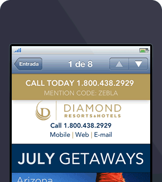

This is where a fixed-location CTA comes in handy. By adding a simple line of CSS, it’s possible to feature an attractive call-to-action that sticks to the top of the email message while the reader scrolls. Here’s an abridged snippet of the code:
@media only screen and (max-width: 768px) {
   [class=fixed] { position: fixed; top:0; left: 0; right: 0; }
}

...

<div class="fixed">
   <a href="tel:+x-xxx-xxx">Call Today</a>
   <div>Mention Code: xxyyzz</div>
</div>
Source: Medium
Position: fixed, has been used to ensure the CTA remains at the top—not unlike what you would see in a regular browser window. The rest of the email content simply slides underneath. This same technique can also be used to pin the CTA to the bottom of the message (using bottom: 0; instead of top), which may be better in some scenarios.
When not featured at the top of the email message, the CTA is hidden and located near the footer of the email message when viewed in desktop and webmail clients.
What colors are best for creating CTA buttons?
CTA button colors are important.
Different colors encourage different responses based on psychological responses from readers.
CTA buttons that are the same colors as your brand will help connect the response you’re requesting from readers to your brand. Use the brighter version of your brand’s colors to catch readers’ attention early on. Complementary colors are also found to increase conversions rates.
Some of the best combinations are:
- Purple and orange
- Red and green
- Blue and yellow
Examples of CTA button colors:
Source: Really Good Emails
Source: Really Good Emails
What are the best phrases for CTA?
When creating CTA buttons, it’s important to use action phrases that give the readers direction on how they need to proceed.
Using words that tell readers what to do, they start to think about the situation outside of their inbox, and how they need your service/product to enhance their life.
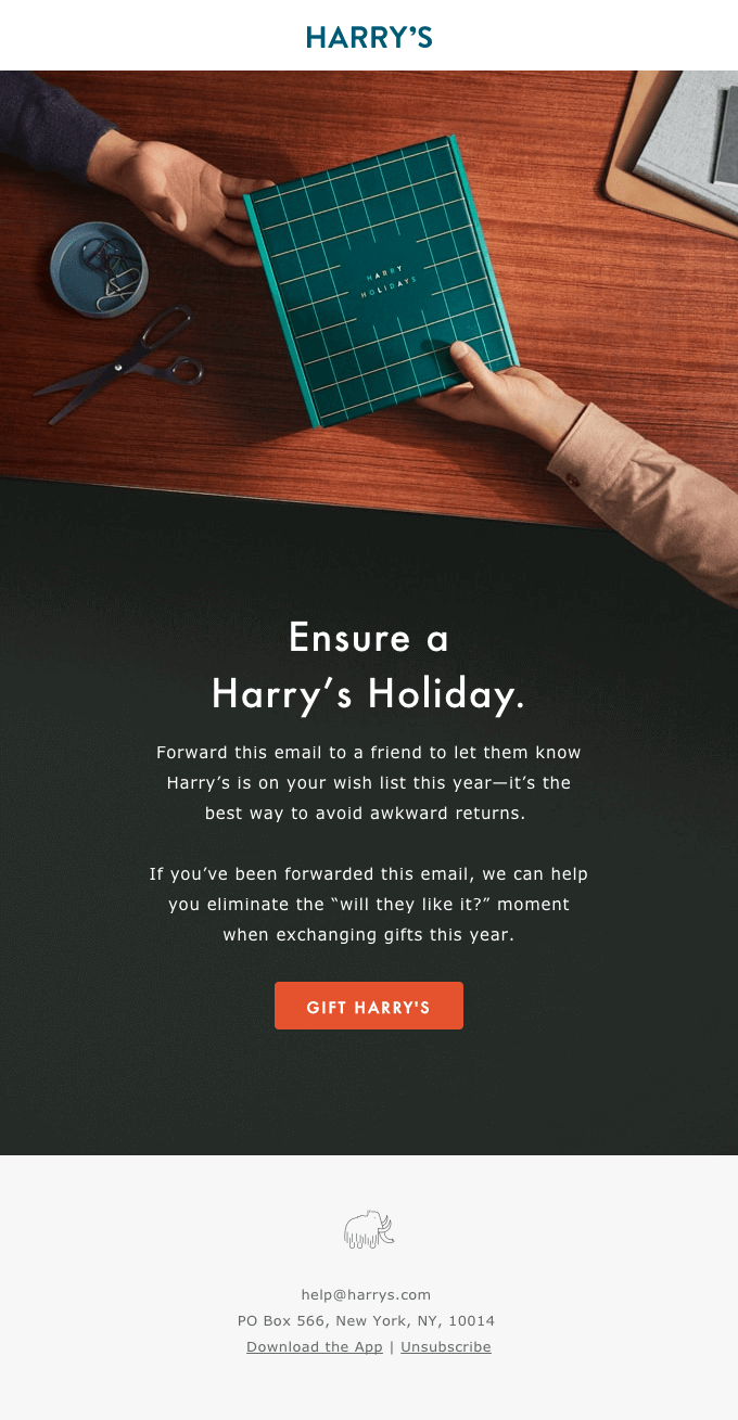
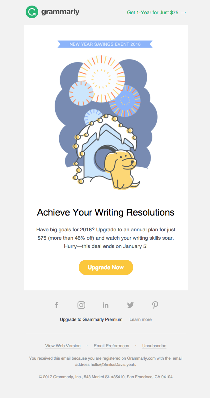
For example, this email below uses several actions and options.

Source: Really Good Emails
Some thoughtful action phrases you can use are:
- Get vs. click
- Read vs. enter
- Try vs. submit
Think about the words you’re using in your email campaigns. Are they giving your reader direction on what to do next, or are they just acting as words on a screen?
Final thoughts on CTA buttons
Your email campaigns can have a higher click-through rate simply by implementing thoughtful techniques when creating CTA buttons.
Remember to experiment with and explore:
- Verb-focused phrases
- Bold colors
- Placement
Start updating and implementing thoughtful CTA buttons in your email campaigns and let us know how they’re doing.
Leave us a comment below and let us know how you’re using thoughtful characters for your CTA buttons.