
As you build email marketing campaigns, you want to choose images that best represent the brand voice and values of your business. There are numerous ways to find what you need when including images in email. You may take your own photos, illustrate your own graphics, hire a professional, or utilize stock imagery.
Should your business dictate which of the above methods you use? Yes, the images you choose should provide insight into the values and pursuits of your business. Images can strongly affect your brand’s identity and even your sales and customers.
In this guide, we’ll discuss the following:
- The types of images you can use
- How images can help you build out your brand
- The style of images you should use
Read on to learn about the thought process behind images and what makes them so vital to your campaign.
The power of images in email
Implementing imagery into your email is more than cosmetic—it’s a way to support your customer-base and brand, as well as attract new users.
Consider for a moment if your magazines were void of any imagery, or if social media existed without designs or photos. What if the billboards you passed lacked images of any kind?
If this were the case, a crucial part of the visual storytelling would be missing. Plus, all that text would feel a little dry and boring, to say the least. The same is true for your email. Perhaps this is why marketers consider visual images to be among the most important content for their businesses.
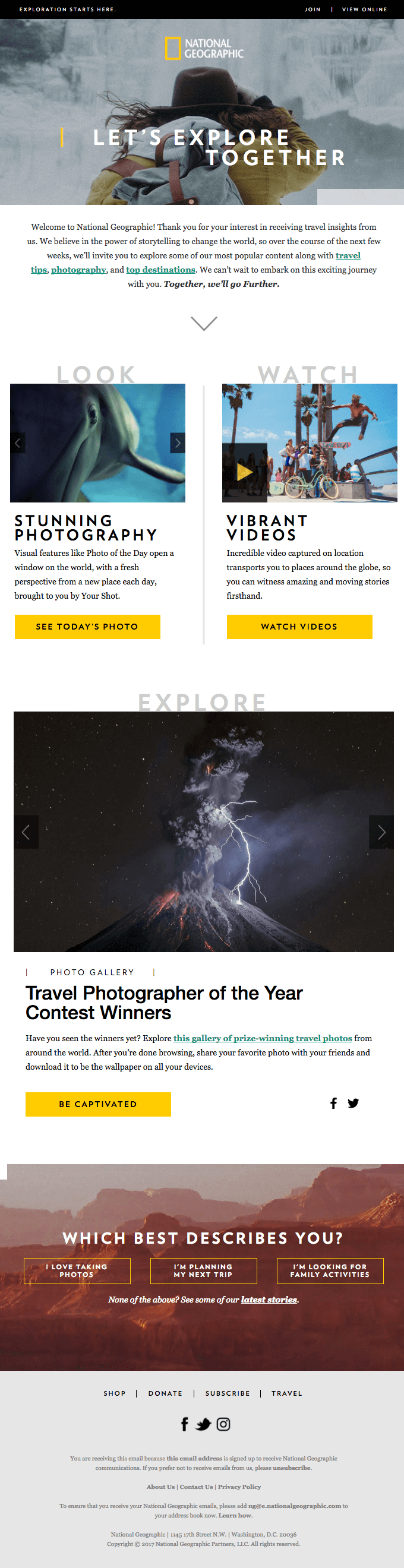

This applies to businesses of every kind. Visual content is vital for new brands as well as classic, household names. We can clearly see this with National Geographic, which is known for capturing crisp, journalistic snapshots throughout the world. Photos are a major part of National Geographic’s professional, earth-conscious personality. With the wrong images, the serious tone of this magazine could be negatively affected.
Images not only supplement our reading, but they also break the monotony. They’re visually interesting. Images make chunks of text more palatable and words easier to remember. Because of this, it’s essential you know which images to use.
How to choose images for your email
If you’re not sure what types of images to include in your email marketing, remember, people like seeing faces. In fact, photos with faces get 38% more likes on Instagram than those without.


This means you may opt for photos of people rather than simply implementing images of products, as long as it makes sense with your brand.
Graphics and infographics are another great visual choice for your emails, as 41.5% of marketers cited graphics as the most engaging visual content in their marketing.


And don’t feel bad about employing some stock images, too. Marketers said stock images and original graphics account for over half their visuals.
Infographics may sound dull, but they don’t have to be. Just look at this food-blog content infographic from LinkedIn Marketing Solutions.


The infographic includes visual information, yes, but it’s unique and interesting to look at, too. Plus, with its use of serious tones (including the LinkedIn navy blue), the infographic still fits within the LinkedIn persona.
Establishing a brand identity with images
As you can see, images can affect your brand’s identity—from supplementing your existing identity to defining a new one, images are a major part of the way users “see” your brand.
Before you choose images to accent your brand, it’s important to decipher your brand’s identity without imaging. First, who is your audience? What is your mission? If your brand had to be defined by a personality, what would it be?
These are not questions to be answered overnight, but it’s important that your decisions—creative and otherwise—are made with an element of brand identity in mind.
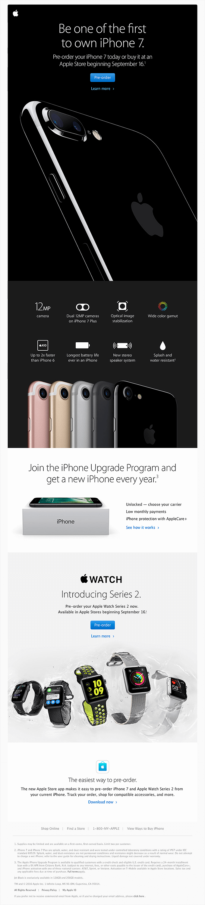
While brainstorming your own brand identity, consider familiar companies. For instance, Apple has a definite tone, look, and personality. With sleek, minimalist design, Apple’s identity is somewhat futuristic. A
pple seeks to be a leader in innovation, and therefore, appeals to a huge demographic—those who want a user-friendly, streamlined approach to technological advancement.

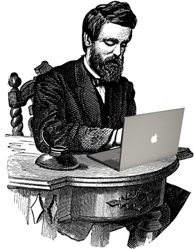
Alternatively, a brand like The Art of Manliness serves a much more niche audience, and does so with a completely opposing style. The art of manliness is a blog-based brand designed for modern men who appreciate self-improvement.
The brand utilizes a vintage, traditionally masculine aesthetic. This appreciation of the past is very different from Apple’s progressive, futuristic approach.

However, both businesses, even with their very different brands and products, have each embraced a particular style to guide their image choices and copy.
How photos can define your brand
Your visuals will often be a direct representation of your audience. Therefore, the photos you use should mirror the customers you want to land. This is of course why children’s clothing brands feature children, or why animal-centric brands feature pets.
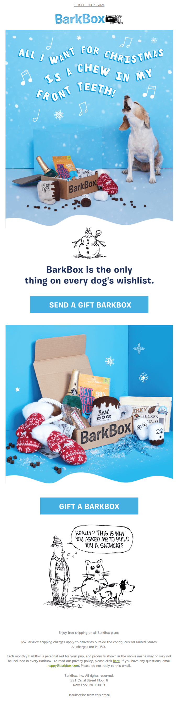
Take the example below, from Barkbox. The email doesn’t just feature the product, and it doesn’t feature dog-lovers, even though that’s who the brand is targeting.
The email features dogs, because Barkbox is staying on brand with their imagery. Barkbox’s main customers are dogs; they just happen to need a little financial help from humans.

Mirroring your target audience may come across as common sense, but there’s another element that can easily be overlooked when building an image identity: diversity.
As you choose photos for your brand, consider the importance of representation and how it can open your brand’s possibilities.
For instance, a Maltesers campaign, which prominently featured a disabled woman, showed an 8% increase in sales during its run.
This success with the Maltesers campaign is not isolated, either. Studies show companies that pursue diversity as an initiative experience increases in profit and success.
Of course, diversity in advertising is more than just implementing diverse images. Because of this, consider how photos can do more than represent diversity. Consider how your images can represent your company’s values.
The importance of thoughtful branding
As we discussed above, inclusive imagery is not simply enough. You also need thoughtful imagery.
In other words, consider how your images will make people feel. This may include the clothes models are wearing in your images, as well as the copy around the photos.
Despite a focus on inclusion, many companies still experience PR nightmares. Good public relations are vital to your company’s mission.
With social media as viral as it is, even an honest mistake can damage your brand’s image within hours.
With this in mind, consider the images you use, the way copy correlates with those images, and if your brand is considering the public.
If your brand does undergo a “PR nightmare,” consider how imagery can resolve the issue.
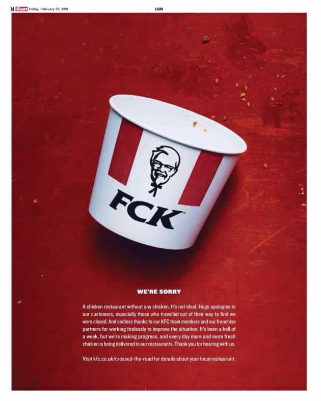

KFC brilliantly adjusted their recognizable acronym logo when British restaurants of the franchise ran out of chicken.
The imagery guaranteed recognition from customers, but it also admitted a massive mistake by alternating the acronym just slightly.
KFC sought to apologize while also being funny, and this campaign successfully did just that by playing with the public’s perception of the classic KFC imagery.
How graphics can define your brand
KFC isn’t the only brand known for its graphics. In fact. you may have noticed many companies—some of them pretty big—utilize graphics and illustrations for their branding much more than photos.
Companies like Facebook and Dropbox have a strong focus on illustration. But why?
According to creative director Steve Peck—whose work spans across multiple tech companies—businesses can do more with illustrations. Peck believes businesses can offer a more fluid and interpretive message by using illustrative branding.
It’s worth noting, too, that many companies with this style of branding aim to appeal to a broad user-base. Perhaps this is because animation feels accessible for a variety of ages.
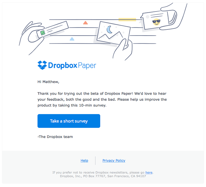
Below you can see an example of Dropbox’s traditionally graphic style. The illustration is light and relatable.
As a user, it’s easy to look at the image and relate to its message. Plus, this illustration is pleasing to view with its light colors and fluid style.
This easily allows Dropbox to target a wide user-base in a simple, family-friendly way.

Consider if your brand is trying to do the same. Does your business offer something for virtually everyone? Do you want to appeal to all ages?
If your brand is seeking global appeal, or you want to emphasize a level of family-friendliness, graphics may be a strong contender in terms of your company’s branding.
Wrap up
Developing a brand is complex, and images hold a special place in that developmental process. You may choose to utilize photos, graphics, infographics, or some sort of combination in your email messaging.
Ultimately, the most important element to your choice is the brand itself. Do your visuals match the personality of your company?
Images can do more than supplement your brand—they can elevate it. Images further convey the message you’re trying to send. Because of this, the way in which your company communicates is essential.
Is your branding thoughtful? Are you engaging with diverse imagery and values? If not, you could be ignoring members of your audience, as well as potential customers.
Consider how images can express your company’s mission. Your subscribers want to see themselves in your campaigns, which will ultimately determine the photos or graphics you use.
Let your company’s purpose and messaging guide your visuals, and your brand will be better for it.