9 minute read time
3 Tips to Design Images for Your Email Campaigns

This is a guest post by Mitt Ray of Social Marketing Writing.
Do you want to immediately increase your email click-through rates? If your answer is yes, you should use images in your emails, as emails with images get a 42% higher click-through rate than those without.
But you won’t automatically start getting more clicks by adding any image you want. You need to follow a well-planned process and create unique images for each and every email.
This will ensure that you not only get more website visits from your emails, but higher conversion as well.
Read on to learn some of the top tips to design images for your email campaigns. Give them a try to get more clicks and conversions.
1. Follow the principle of conversion scent.
Before you create your images, the first thing you must do is take time to understand the principle of conversion scent, as you need to get this principle right every time.
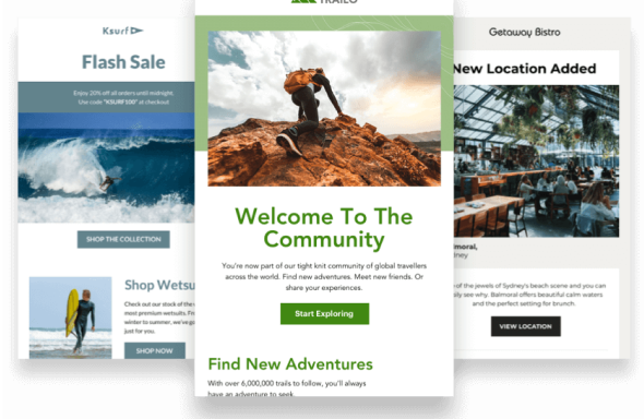
Conversion scent—also known as message match—is the relationship between an ad and the landing page. In this video, Rand Fishkin explains that, in order to convert better, the landing page should appear similar to the ad that is promoting it.
You should use the same image and copy already present above the fold of your landing page in your ad, too.
This will boost the visual cohesiveness between your ad and landing page. And it will ensure that, when someone visits your website through your ad, they’ll feel a sense of familiarity. Therefore, the conversion rate will be higher, as they’ll be certain that they visited the exact webpage that was advertised and not somewhere else.
You need to follow this important rule, whether you’re promoting a blog post, a landing page, a video, or any other medium. If you can’t make the landing page look exactly like the image you plan to use in your ad, at least make the header image on the landing page/web page similar to the one in your email.
This is something anyone can execute very quickly by using a designer tool aimed at beginners, like Crello. You can first set the dimensions depending on your web page’s dimensions and design your image.
After you finish designing this image, download it and add it to your page.
Next, if you’re using Crello, you can go to the top right corner of your dashboard and click on “Resize.” Then go to “Covers & Headers,” then choose “Email Header,” and click on “Resize.”
This will automatically resize the image for your email header and you can add it to your email. Now the header image in your email and landing page will be the same, and conversion scent will be strong.
If the image on your landing page isn’t too big, you can actually just directly add it to your emails and copy and paste the rest of the components so that the messages match too.
You can simply download the image that is already present on the landing page and add it to your email (it should be small). Then you can copy and paste the headline, as well as some of the description, and design a similar call-to-action button. Make sure you use the same font as well.
These simple steps might not involve designing a new image, but they’ll ensure that the conversion scent remains strong because the image, headline, and description are the same.
Designing effective emails with a strong conversion scent will be simpler if you use the same design style throughout your website.
If you’re using an email service provider like Campaign Monitor, you can pre-design a custom template with the same design style and palette. After that, all you will need to do is make some minor modifications, depending on the page you want to promote.
2. Keep your design simple.
The tips you learn here can be used to create images for your emails as well as everything from your social media posts to your blog posts and landing pages.
The key to designing effective images for your emails is to keep everything simple. Using too many colors, multiple unique fonts, overcrowding the image with too much text, can make your email difficult to scan and digest. It’ll likely also make for an ugly email.
This is why, instead of overcomplicating things, just keep it simple.
Here are 3 things you can do to keep your design simple:
Use only colors that work well together.
One of the places people mess up the most while designing images is the color. They use too many strong colors in their images and they end up looking very unprofessional.
This is why you should be very meticulous when choosing colors to work with. An easy way to find colors that pair well together is by using a tool like Coolors. The site displays palettes of colors that look good together, and you can generate your own combination.
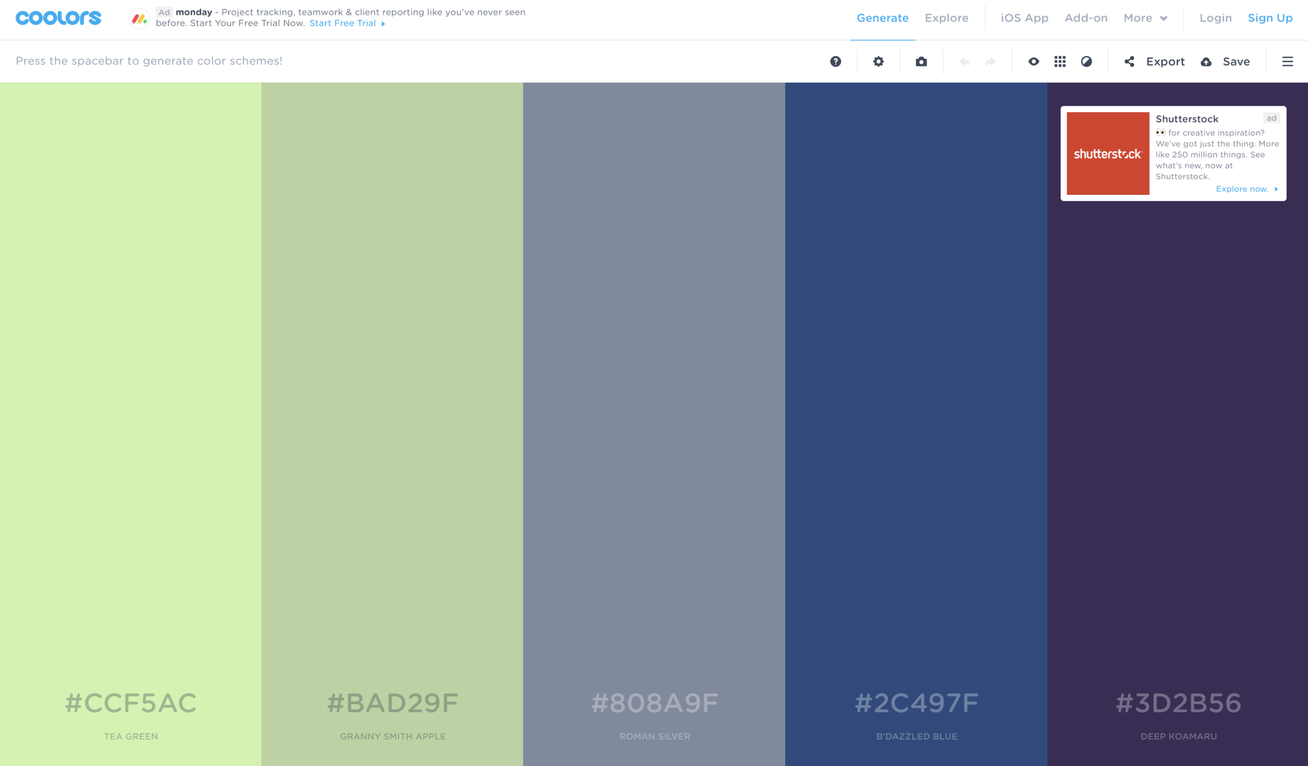
Designers can also upvote the colors they use the most on this site. They do this by loving them or favoriting them, so the best ones are pushed right to the top, making it easy to find the right palettes.
So browse through the top and pick the one you like most, then use the colors in this palette. The only extra colors you can add in are white, as it’s a neutral.
An example of a well-designed email in which they kept colors simple is this one from Pret.
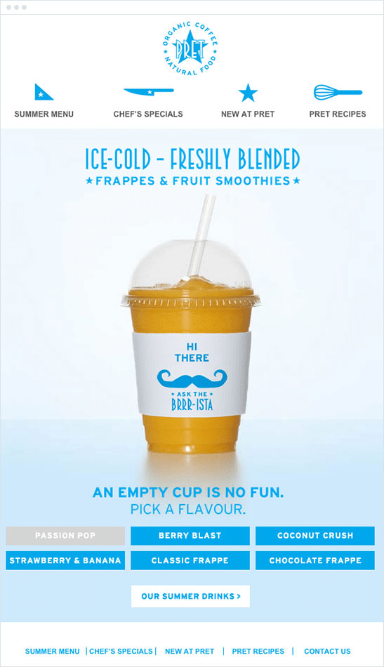
They only used blue and yellow chiefly for the images in their email, as they pair well together, and it looks beautiful.
Use a simple font.
It is easy to find sophisticated-looking fonts like this one called Ginga.
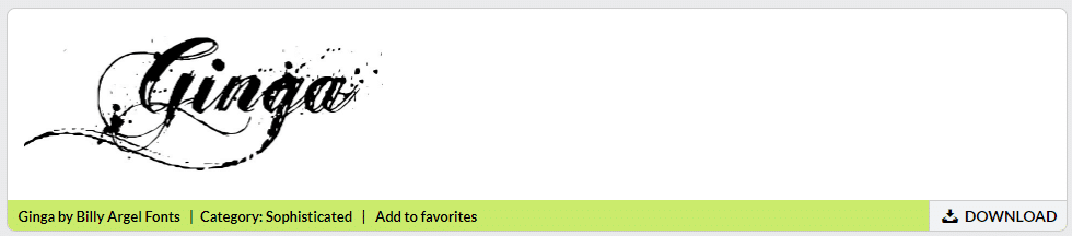
They look very unique and beautiful and can work for many types of images, but they are probably not the best option for creating images for your emails because fonts like these aren’t always easy to read. If it takes the reader too long to read the font, they might lose interest and place their attention elsewhere.
And, as you know, attention is an important resource in online marketing. This is why copywriters keep their copy simple when writing sales material. When it is simple, more people will read through the message swiftly and completely, without losing interest.
Therefore, when you design your images, you need to use a simple font that is easy to read and make sure the font is a neutral color or one from your color palette.
When it is easy to read and blends in well with the colors in the image, more people will read the rest of the email and click on the call to action and visit your website.
Also, if you plan to use more than one font in your image, make sure you use a tool like Fontpair to find fonts that look good together.
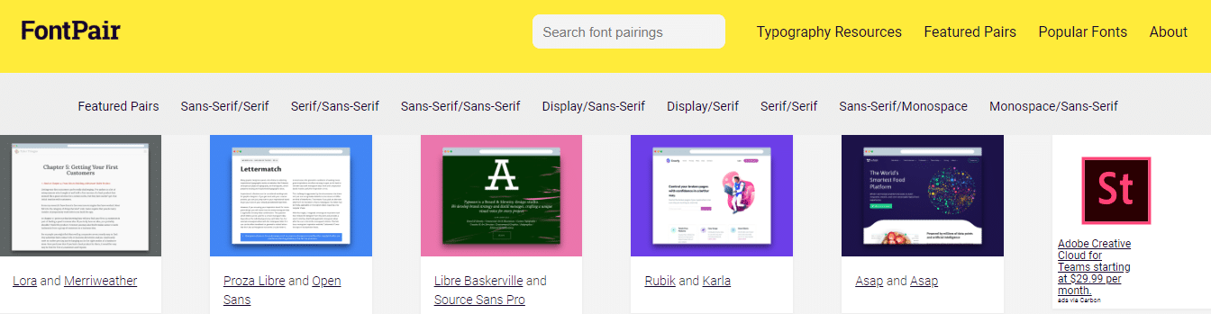
Limit the number of fonts to 2 to 3. Again, using too many fonts will only complicate things.
Make sure there’s plenty of negative space.
Negative space is the empty space present around the important components of the image, like the text and icons. When you have more negative space around, it makes the important components stand out.
So, instead of overcrowding the images with a lot of text and illustrations, use them very sparingly and leave a lot of negative space, especially around the text. This will make the message you want to get across more visible.
An example is this email from Casper. All they did is add the text using a simple font and made it big. And they made sure to leave plenty of white space around the text.
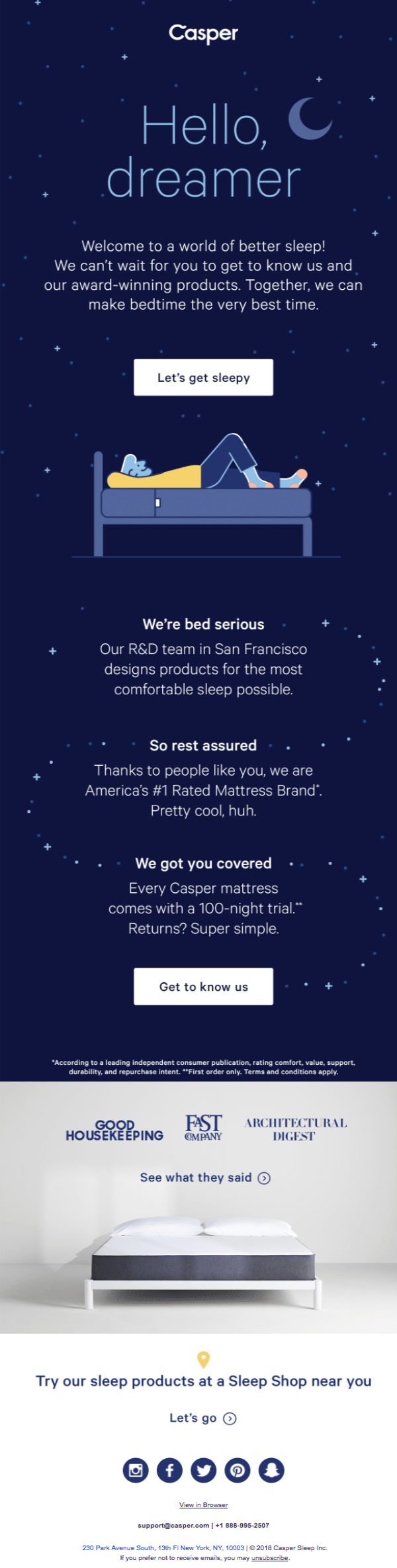
This gets the main message they want to express through the image to stand out.
3. Optimize for both mobile and desktop.
If you follow the above steps, you should be able to design a beautiful image for your email that will drive the result you are looking for. But, after you add it to your email, don’t just immediately send it to your subscribers.
Test it out by sending yourself an email to make sure the image and the message present in it are easy to read. Read the email both on your desktop and your mobile devices, because 62% of opens are made on mobile devices.
Insert image: more email opens on mobile
If your email looks good on mobile devices too, more people will get the message and you will get better results.
So, once the image is ready, be sure to send test messages to your own email address and check it on your laptop, tablet, and mobile phone to make sure it looks good.
Once you are sure the images look good on all devices, you can send the email to your list of subscribers.
Wrap up
Remember these top 3 tips for designing images for your email campaigns:
- The design of your landing page should be similar to the design of the image in your email.
- After that, you can design the image following the basic design principles. When the image is ready, you can add it to your emails.
- Finally, email the test version of your email, along with the images, to yourself and check it on both desktop and mobile devices to make sure it looks good. If everything is fine, you can go ahead and email it to your list.
These tips will help you create images that emphasize your branding so your subscribers will know you and your brand at a glance. And good branding means you stay top-of-mind when your customers are ready to buy.