
Article first published July 2013, updated March 2019.
Over half of all emails are opened on mobile devices, and people spend the equivalent of an entire day on their smartphones each week. Responsive email design is crucial for getting your campaigns opened and making it easier for your subscribers to take action.
How to Maximize Your Responsive Email Design Efforts
In this post, we’ll go over best practices, provide some responsive email design tips, and share one of our favorite classic case studies with you.
Email: Responsive design best practices
Smartphones and email client technology update and change constantly. While it’s impossible to predict each scenario, you can follow these general email responsive design best practices.
1. Opt for a single-column layout.
Multi-column layouts might look stunning on desktops but, on mobile devices, they often end up smashed or elements may get resized in unattractive ways. A single-column layout keeps your content clean, easy to read, and compatible with multiple devices.
This email from Trunk Club uses a single-column layout so it looks great on every device.
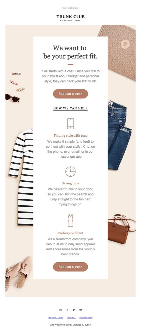
Source: Pinterest
2. Choose clean, bold fonts.
Skip the cursive, delicate, or thin fonts. Anything that looks small on a desktop will end up even smaller on mobile. Subscribers won’t bother straining their eyes; They’ll just delete your email and possibly unsubscribe.
3. Don’t crowd links.
Most of us have experienced the frustration of trying to click a link that’s too close to another hyperlink. Don’t put your subscribers through that. Keep your text large, make good use of whitespace, and leave adequate room between unique hyperlinks.
4. Or don’t even use links at all.
Instead of using text hyperlinks, use buttons with bright contrasting colors when linking to your landing pages. Take the minimalist route in regard to your links, as including too many options to click can overwhelm readers, causing them to “freeze” and not click anything at all.
This email from Outdoor Voices uses bold text, lots of whitespaces, minimal copy, and a bright CTA button.

Source: Really Good Emails
5. Consider images.
Readers tend to prefer full-width high-resolution images over small thumbnails. Make sure your email templates will resize your beautiful images and multimedia correctly for each screen so they don’t end up smashed or stretched on your subscribers’ end. Also, make sure your large images won’t take too long to load or eat up your subscriber’s data.
Switching to a responsive email template
After switching over to a responsive email template, how soon is it before you start seeing results? In the case of The Fetch, just a few short weeks, it seems. In a blog post, they revealed what they noticed following their newsletter redesign. Could “going responsive” give your newsletter a well-needed lift too?
So, the story begins like this:
“It would be great if our two columns could be one on mobile devices. We need a designer!”– @thefetch
When our good friends at The Fetch tweeted that they really needed a responsive email template, we couldn’t let the call go unanswered. The Fetch is a newsletter that helps professionals discover events across the globe. It’s curated by a grassroots team of volunteers and we subscribe to it. So there was just a little self-interest involved when we decided to put a little time and effort into redesigning their template.
Another thing that motivated us was that this provided a rare opportunity to observe what benefits could come from a responsive redesign, without the added variable of having the responsive template change considerably overall.
In many cases, going mobile-friendly has coincided with a serious re-think of the entire newsletter, from branding to layout and content hierarchy. There was no need to completely overhaul the visual appearance of The Fetch, so, chances are, only subscribers reading the updated newsletter on a mobile device would notice that there had been any change at all.
The results
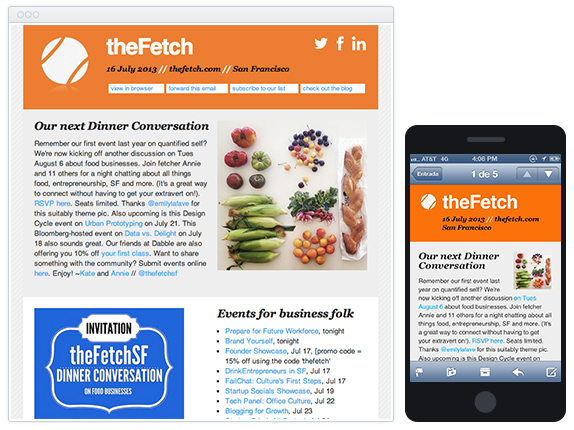
The team behind The Fetch’s San Francisco guide was delighted to receive a hand with their email template . Here’s what the final views looked like:

A couple of weeks into switching to this new responsive email template, the results have been encouraging. From the aforementioned blog post:
“It’s also been interesting to see how our metrics have altered in a short period of time. Our unsubscribe numbers (which are already < 0.5%) appear to be going down and trackable forwarding of the emails has gone up. My conclusion is that readers are more likely to switch off, disengage and remove themselves when they can’t absorb what’s in front of them.”
In addition, there’s been a real improvement in overall usability on mobile devices…
“Before, The Fetch involved a bit of pinch and zooming to be legible on a mobile and due to the amount of links included, could look overwhelming. The forward to a friend/coworker link was also hard to locate pre-responsive days and now it’s nice and clear.”
… not to mention, many positive comments about the new design.
While this hasn’t been a highly controlled, scientific study, noticeably less unsubscribes, more forwards, and a better experience for The Fetch’s San Francisco subscribers aren’t insignificant improvements from just a few hours’ work.
Many thanks to Kate Kendall and The Fetch for sharing their experiences on their blog.
Have your newsletters undergone a responsive redesign? What have you observed? Let us know in the comments below.
Responsive email design: Is it still worth it?
Absolutely. After clicking that subject line, your subscribers shouldn’t have to put forth any effort to read and engage with your campaigns.
Although there are never any guarantees, following email responsive design best practices is your greatest failsafe for avoiding major coding and layout blunders that could render your email unpleasant or unreadable.
A poor user experience equals low reader engagement, which also means bad ROI.
Wrap up
While it’s important to track which devices and email clients your subscribers use so you can design appropriate campaigns for their emails, many subscribers will likely open emails on multiple devices or switch seamlessly between mobile and desktop. Don’t break your back coding specific emails. Instead, opt for a responsive email template and follow these responsive email design tips to make sure your campaigns always look beautiful.
Are you ready to take your responsive email design to the next level? Campaign Monitor offers beautiful customizable templates that we’ve optimized and pre-tested to look amazing across dozens of clients and devices.