
Article first published November 2011, updated April 2019
Having emails that are mobile-friendly is extremely important.
According to Adestra, “Emails that are displayed incorrectly, will be deleted within three seconds.”
So what makes a perfect, mobile-optimized email campaign? Is it using a massive @media query to rework your layout? Clever image resizing? Some new device hack?
How to design perfect responsive email design
When getting caught up in the code, it’s easy to forget that good mobile email design means providing a great experience for recipients.
Below is an example of a transformation of a desktop-email campaign into a mobile-friendly email:
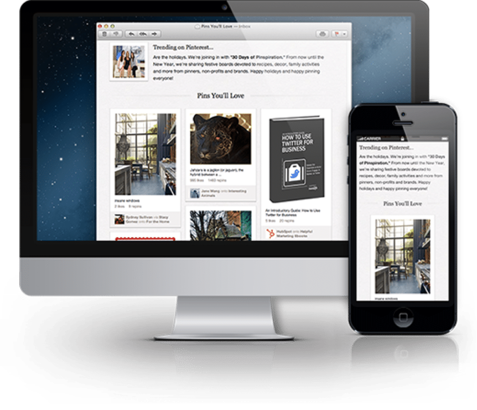
Source: Litmus
Early days of creating perfect mobile-friendly emails
Mobile-friendly emails were first invented because users were complaining about not being able to access information efficiently.
From 2010 – 2015, emails opened on mobile devices were increased by 30%.
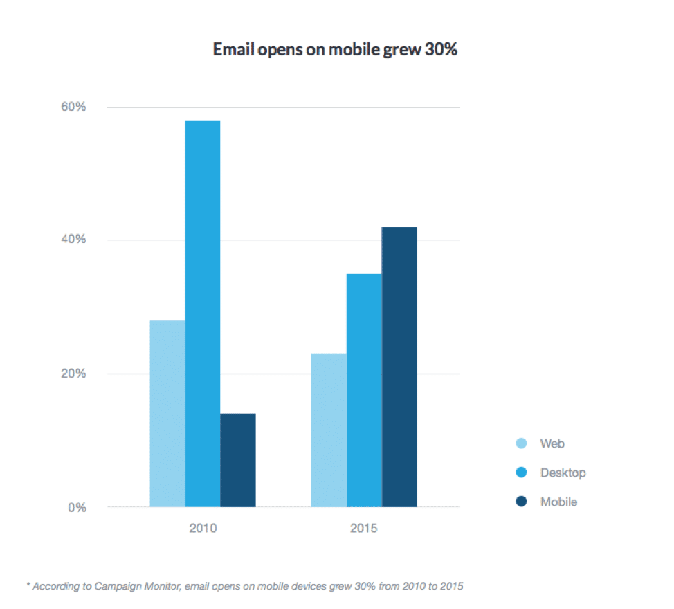
Source: Campaign Monitor
Mobile-friendly device email designs flow from usability decisions, like ensuring that links are large and spaced out enough to be tapped by big fingers, or the call to action is immediately obvious and requires no scrolling to be seen.
Real-world early mobile-friendly device examples — Litmus
Litmus summarized these mobile design guidelines and more in their recent post on the “Anatomy of a Perfect Mobile Email,” featuring an extremely helpful infographic. Also listed are common mobile email pitfalls, like choosing a color palette with poor contrast.
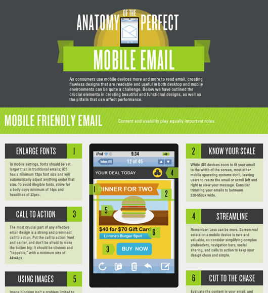

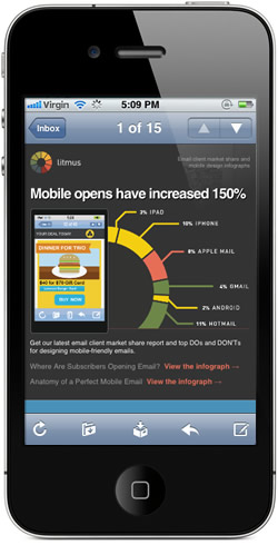

We usually put top-notch email newsletters into our email design gallery. This time, however, we wanted to highlight how they translated the aesthetics of their infographic into email form while never relying too heavily on images to do so. The code is worth a look because, instead of using a @media query, they’ve paired a simple, one-column layout with large fonts to produce a design that is almost foolproof on any device. At the top of the email, the “Email client market share and mobile design infographics” summary text also ensures that the email’s purpose is made clear in Gmail’s inbox, on the iPhone, and on other mobile clients.
The perfect email design in 2019
Eight years later, the original structure of mobile-friendly email marketing design still exists: stick to single-column designs, use images, large call-to-action buttons, responsive email design, etc. But a few things have changed since 2011 when Litmus’ infographic was conceived: personalization, automation, dynamic content, fallbacks and more.
Personalization and dynamic content
Advancements in email marketing have shown that people want personalized and customized emails. In fact, 74% of marketers say targeted personalization increases customer engagement, while 20% of personalized emails increase overall sales.
Personalized and dynamic content use personalized information that subscribers associate with their inboxes or provide with your email preference centers. Today’s HTML email templates use personalized and dynamic content coding to address every subscriber personally.
Some HTML email template coding or personalization tags will look something like this:
- [email]
- [dateofbirth]
- [firstname]
- [firstname,lastname]
If subscribers don’t associate personalized information with their accounts or with their subscription services, it’s not a bad idea to include fallback information.
Fallback information
Fallback information is similar to personalization tags in the sense that they address the subscriber as more than just a subscriber, but, if the recipient doesn’t provide information, the tag doesn’t know what to say. Fallback information acts as a backup plan to still give recipients a personalized experience without having to ask them for information.
An example of a fallback information code would look something like this:
[firstname,fallback=fashionista]
In practice, a fallback code would look like this:
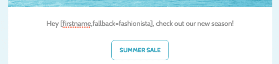

Source: Campaign Monitor
Email automation
Many email advancements since 2011 use a great deal of automation to interact with subscribers. In fact, companies that use email automation have seen conversion as high as 50%.
For example, when subscribers first sign up for email campaigns, they all receive a “welcome” email that, depending on the company, is personalized to make them feel welcomed into receiving discounts, promotions, and event details.
You can also use email automation to increase product and sales feedback. After every product sale, have an automated email sent out to customers that ask them about their experience and if they’re interested in a specific discount
Consider the following examples of email automation:
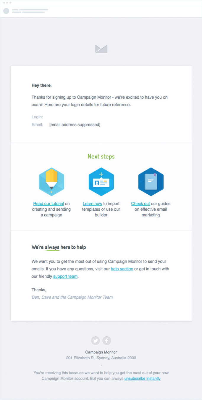
Source: Campaign Monitor
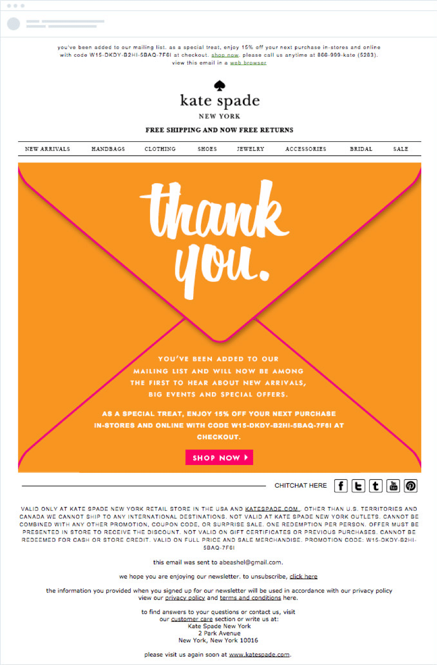
Source: Campaign Monitor
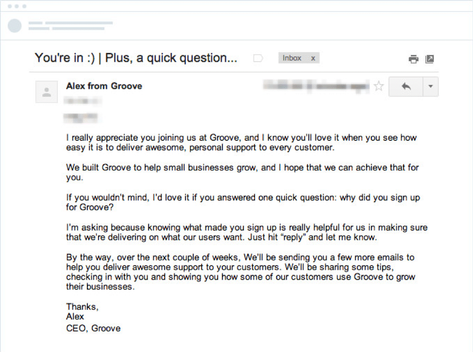
Source: Campaign Monitor
Wrap up
Responsive email designs are an essential part of your business. If you’re not optimizing your email for mobile-friendly users, you’re missing out on 53% of your subscribers.
Even if you’ve started using mobile-friendly email designs, be sure you’re continuing to update your responsive email designs as time progresses because trends change over the years.
Have you started optimizing your responsive email design? How’s it going? To keep you on track with the right email marketing practices, check out this complete email marketing guide (cheat sheet included).