
The mobile revolution demands that digital marketers today rethink their email marketing strategy to account for where, when, and how people are engaging with the email campaigns they send.
What is mobile email marketing?
The explosion of iPhone, Android, and tablet devices means that businesses must adopt a “mobile-first” mentality or risk losing the clicks, opens, and conversions that deliver revenue back to the business.
If you continue to build your email marketing strategy for the desktop computer era, it’s quite possible the audience you’re trying to reach will never open or read your email marketing campaigns. This guide will show you how to build beautiful, professional emails that look great on the devices your audience is using today.
The digital world has experienced a mobile transformation over the last decade. In the first thirty years since the birth of email in 1971, people viewed and interacted with electronic mail on desktop computers exclusively, until now.
Embrace the mobile era – what percentage of emails are opened on mobile?
In 2019, people are using their mobile devices more frequently and for longer periods of time than their desktop computers. A great majority of Americans alone (95%) now own a cellphone of some kind, with 77% of them owning a smartphone. According to Pew Research, this is up from 35% back in 2011.
As people continue to shift away from desktops and towards mobile, the way they receive and consume email campaigns naturally shifts with them.
In fact, in 2019, 60% of email campaigns are being opened on mobile devices, compared to 10% on desktops and 29% on webmail clients.
What are the benefits of mobile marketing?
With the number of new smartphone subscriptions growing by 20% each year, it’s no surprise that mobile email marketing is becoming ever more important to the overall marketing strategy for any business.
Source: Campaign Monitor
The explosion of the mobile era demands that today’s marketer completely rethink their email strategy. Optimizing your campaigns for mobile is central to driving opens, clicks, and revenue for your business.
If you don’t lead with a “mobile-first” email strategy, it’s very likely that the audience you’re trying to reach will not receive your messages.
Know your mobile devices
Technology is constantly changing, so it is essential to keep up with the latest devices to adapt your mobile email marketing strategy.
The good news is that most mobile technology is adapting to the consumer, especially considering the vast majority of individuals who turn to their mobile device for everything from calendars, viewing the time, and even making purchases on various platforms.
Latest iPhone technology: iPhone X Series
In 2018, 44.6% of smartphone users in the United States were iPhone users. This number is predicted to increase slightly to 45.2% in 2019.
Marketers need to keep in mind that these devices are designed with display in mind, meaning Apple wants eyes on the screen, and they are doing everything they can to get consumers to do just that.
Key iPhone X specs
- Super Retina HD display
- 5.8-inch (diagonal) all-screen OLED Multi-Touch display
- HDR display
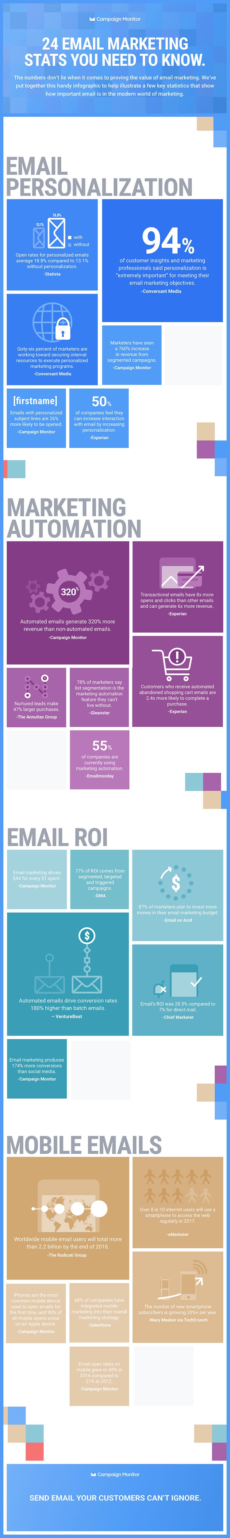
- 2436-by-1125-pixel resolution at 458 ppi
- True Tone display
- Wide color display (P3)
- Support for the display of multiple languages and characters simultaneously
Latest Android technology: Samsung Galaxy S10 Series
When users aren’t favoring the Apple iOS system, they are going for the Android OS. In 2017, studies show that Android accounted for more than 80% of all smartphone sales worldwide.
Arguably one of the most popular Android devices is created by Samsung, with their latest Galaxy series having released in March of 2019. Much like Apple, the focus is on the display and drawing the consumer’s eye to the infinity screen.
Key Samsung Galaxy S10 specs
These specs are strictly for the S10, not the variations including the 10e or S10+. However, these specs are relatively close when compared to the other variations in the S10 series.
- 6.1″ Quad HD+ Dynamic AMOLED Infinity-O Display (3040×1440)
- 550 ppi
- HDR10+ certified
Why this information is essential for mobile email marketing
E-commerce sales worldwide are predicted to almost double between 2016 and 2020. A 2017 survey showed that 40% of internet users in the United States claim that they made online purchases multiple times per month, with 20% of them saying they made weekly online purchases.
Also worth noting is that around 42% of US consumers say they have researched their purchases online before buying and 14% said they prefer searching online before purchasing in store.
Mobile devices allow consumers to do their research and make their purchases in a matter of seconds. Knowing this, email marketers need to make their email campaigns more mobile friendly.
How to optimize your email campaigns for the Mobile Era
Consider the following 8 steps to ensure you’re delivering email marketing campaigns that will be opened, clicked, and converted in this mobile era:
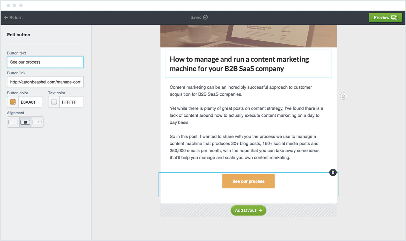
1. Use mobile-ready templates
To maximize your open and click-through rates, it’s critical that your campaigns look great in all environments, and the best way to do this is to leverage email templates that were built for mobile.
For example, for Campaign Monitor customers, the first step in building an email marketing campaign is to select an email template that has already been built and designed to look great across every inbox and every mobile device:
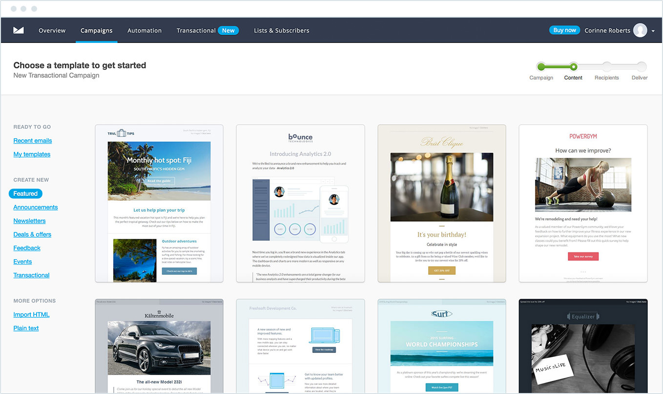

If you have coding skills (or a member of your team does), you can always opt to code your email to be mobile-ready, but this requires valuable time and skill, which many lean marketing teams simply don’t have. If you’re interested in testing one of Campaign Monitor’s email templates for yourself, please visit our public template library.
Displayed in the image below, Virgin utilized a template from the library, which enabled them to focus on selecting the right images and copy instead of worrying how it would render on every iPhone model. They can see a preview of what the email will look like across desktop and mobile before they even click “send.”
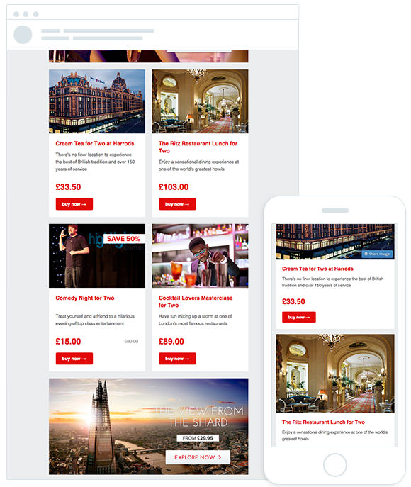

Because the template is optimized for mobile, the content tiles containing the various offers stack on top of each other when viewed on a smaller screen. This setup ensures the text and buttons remain a consumable size and make it effortless for subscribers to read the content and click-through on the calls to action.
2. Shorten your subject line
When it comes to writing a compelling subject line, there’s a much smaller amount of space to experiment with on a mobile device than what you’re probably accustomed to on a desktop.
While many desktop clients will display upwards of 80 characters of the subject line, our testing shows that subject lines over 30 characters will get cut off when viewed on mobile devices.
On most devices, the subject line uses a darker, heavier text in an attempt to make it stand out among the other details in the email.
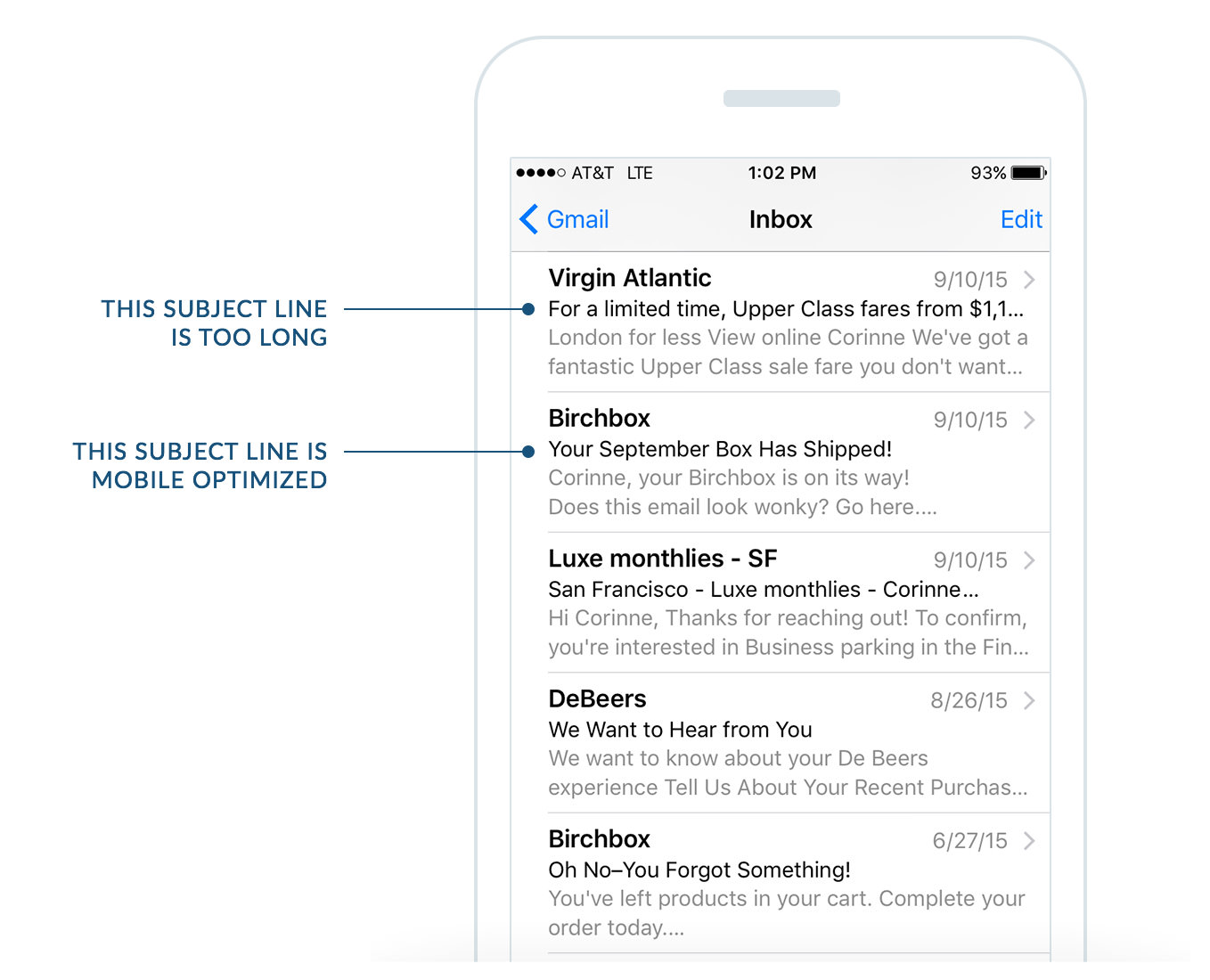

30 characters isn’t a lot of space, so be sure to write a concise, compelling subject line that will intrigue your audience enough to open the email.
3. Write compelling preheader text
The preheader is the summary that follows the subject line when viewing an email from the inbox.
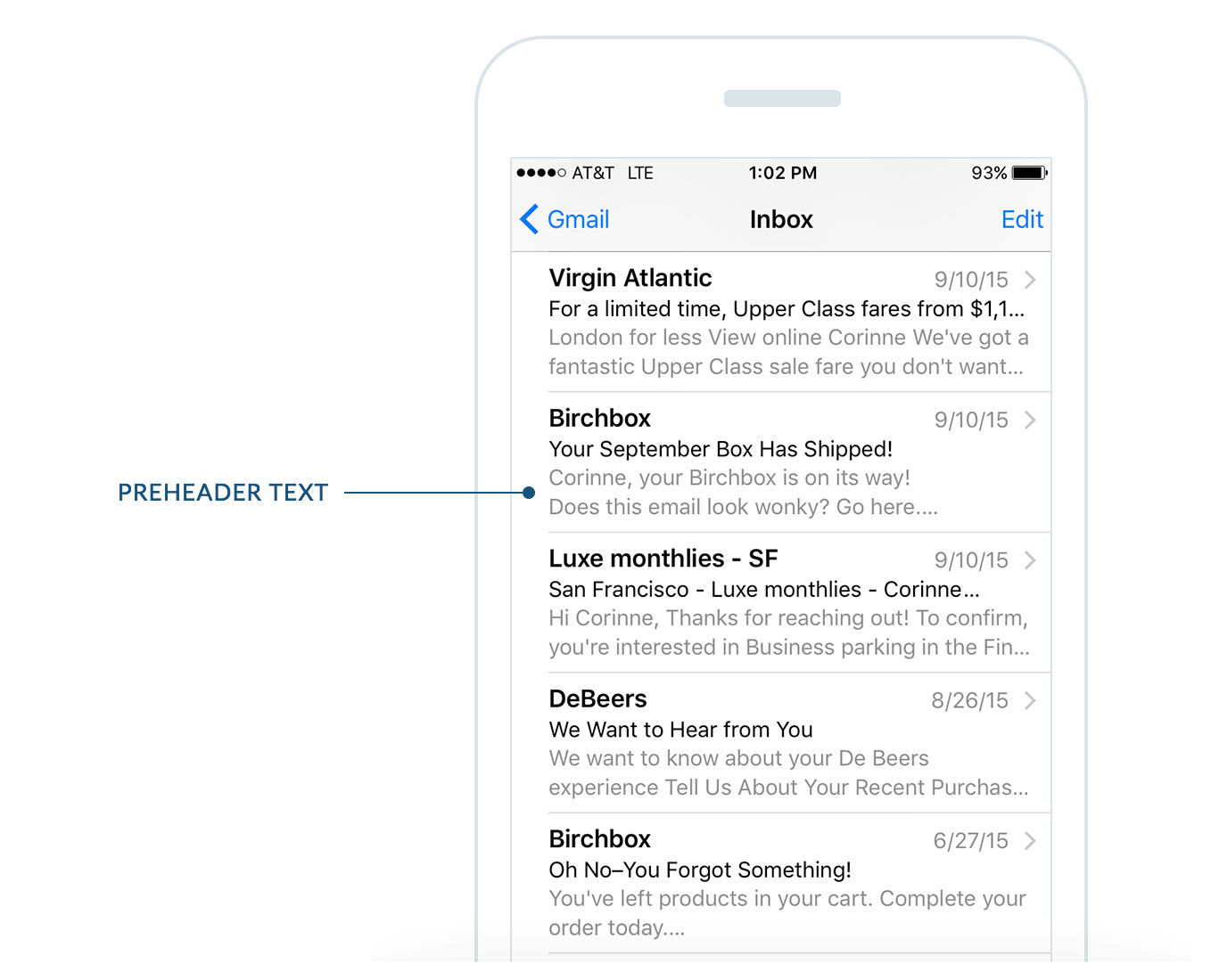
The pre-header text is a critical component your subscribers consider when deciding whether or not they open your campaign and engage with your content. This text is a valuable opportunity to “sell” why your subscriber should open and read your email.
How can you optimize your preheader text for mobile devices?
The first step is to understand exactly how much space you have available. According to research by Litmus, the following devices will display varying amounts of your preheader text:
| Device Name | Number of Characters Displayed |
| Android Native Email App | 40 |
| Android Gmail App | Varies based on length of subject line |
| Android Yahoo App | 45 |
| iOS Native Email App | 90 |
| iOS Gmail App | 50 |
| iOS Yahoo App | 50 |
| Windows Mobile | 40 |
Although it varies based on device and screen orientation, keeping your preheader text around 40-50 characters will help maximize its “selling” power.
It’s also important to think strategically about how the pre-header text appears in relation to the subject line and “From” name in the inbox.
Popular marketing blogger Derek Halpern does a great job of this in his announcement campaign for his latest webinar.
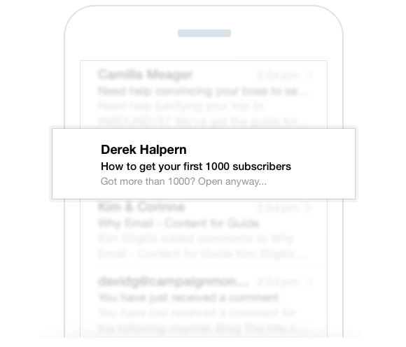

The subject line talks to a very specific audience (people who don’t yet have 1,000 subscribers) and, while it makes the email appealing to those people, it does limit its appeal to others.
So he counters this by using the preheader text “Got more than 1000? Open anyway…” to address the other recipients who do have more than 1000 subscribers already.
By using the subject line and preheader text together, Halpern makes the email appealing to a wider number of recipients and increases the chance they’ll open the email and click-through.
4. Optimize the ‘From’ Name
The “From” name is one of the most prominently displayed elements of your campaign when viewed on mobile devices. On most devices, it’s displayed with a larger text and heavier font to help people quickly identify who sent the email.
Given its prominence, it’s not surprising that 68% of Americans say they base their decision to open an email on the “From” name.
So how do you optimize this critical part of your campaigns? The key is matching it up with your audience’s expectations.
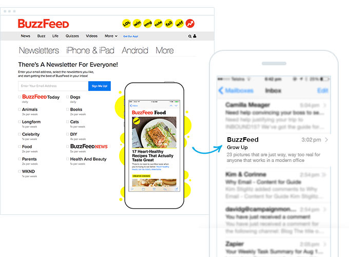
For instance, imagine you subscribed to an email newsletter from the BuzzFeed website. Would you expect to receive emails from ‘BuzzFeed’ or from ‘Dan Oshinsky’? Given that you’ve signed up for these emails from the BuzzFeed website, chances are it’s the former, even though it’s actually Dan who is creating and sending their campaigns.

On top of matching the “From” name to subscribers expectations, it’s also important to consider the number of characters you include in your “From” name, as most devices have a limit to how many they display.
| Device Name | Number of Characters Displayed |
| iPhone 6 | 32 |
| iPhone 5 | 23 |
| iPhone 4 | 23 |
| Samsung Galaxy S4 | 32 |
Although it varies based on device and screen orientation, keeping your “From” name under 23 characters will likely mean it will display in full, regardless of the device or the screen orientation the recipient is using.
5. Balance image size & text
Research shows that the average time spent reading a newsletter after opening it is only 51 seconds.
Given this short attention span, and the fact that the human brain processes visuals 60,000 times faster than text, using compelling images and visuals in your email campaigns can be an effective way to deliver your message.
However, when using images in your campaigns, you need to consider how they will look when resized to fit on a small mobile screen.
Consider this campaign, for example:
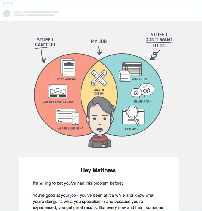

When viewed on the desktop, the image shows at the size it was originally intended for and does a great job of getting the message across.
However, when viewed on a mobile device, it becomes almost impossible to read.
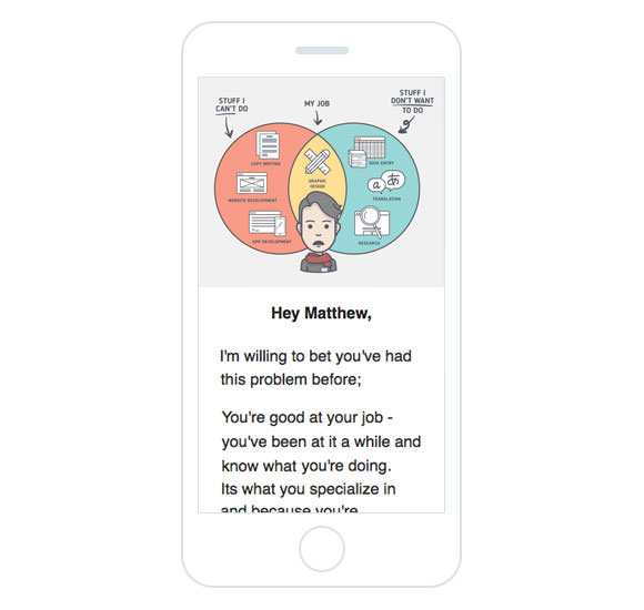

Because they’ve included a significant amount of text in the image and it has been shrunk to fit the mobile screen, a majority of the text has become unreadable.
So, while including images in your campaigns can be a great way to get your message across, you need to consider how they’ll look on a mobile device if you want them to have maximum impact.
The above example also reinforces the importance of using a minimal amount of copy in the email body itself. There is so much text that it becomes nearly illegible on a small screen.
Too much text in your email campaign can make it go on too long, particularly when viewed on a mobile device, and you’ll likely lose your subscriber’s interest. Assume your reader will scroll once, maybe twice, before moving on to the next email.
Instead, try emulating the approach Freshbooks took for the announcement of their Expense Import feature.
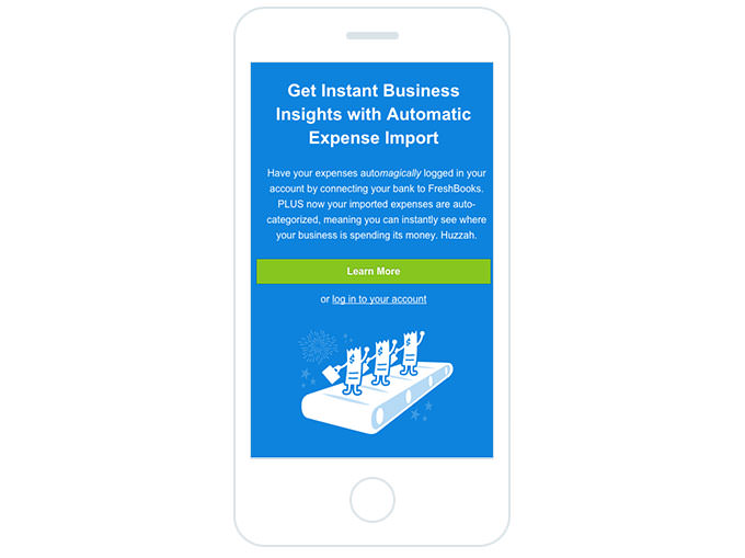

Instead of sending a long, text-heavy email detailing all the capabilities of the new feature, they sent a short announcement campaign with a brief overview of the announcement and a call to action to learn more.
The call to action will lead subscribers to a page on their website that contains further information on how the feature works and how people can get started.
By keeping the amount of copy in the email short, Freshbooks was able to get the key point across quickly and easily, while making it easier for those who want more information to click-through and obtain it.
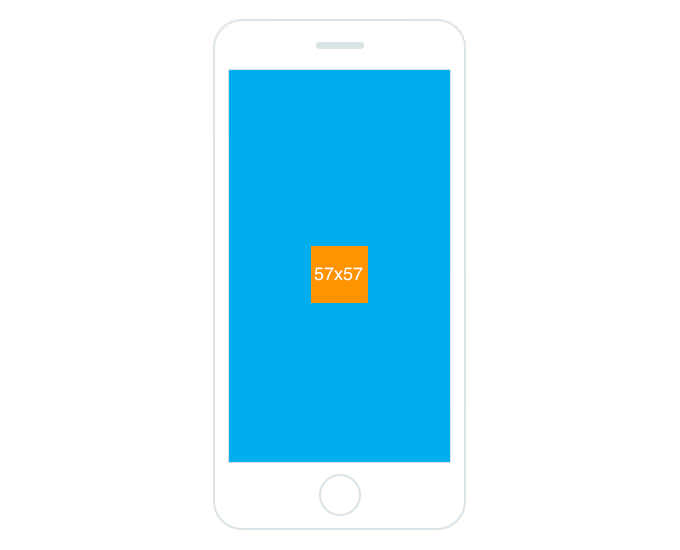
6. Big buttons for big fingers
According to a recent MIT study, the average size of an adult index finger is between 1.6cm and 2 cm, which translates to between 45 x 45px and 57 x 57px on a mobile device.
Here’s a visual representation of that:

With your readers’ fingers taking up a significant amount of space on the screen, the worst thing you can do is make them try to click a tiny link in your email to convert.
Instead, add big, well-contrasted call-to-action buttons to your email campaigns to make it easy for subscribers to click-through.
Litmus does an excellent job of this in their emails:
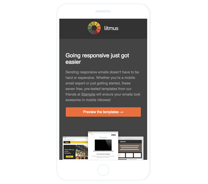

The call to action button they’ve used here is large enough that it’s easy for readers to click, and the fact that it’s set away from any other clickable elements helps ensure people won’t accidentally click the wrong link and be taken somewhere they don’t intend to go.
If you’re a Campaign Monitor customer, you can simply drag and drop buttons into your email and customize them with whatever text and colors you desire.
7. Use mobile-ready landing pages
Getting someone to click-through on your email is only the first half of the process. You normally want that person to proceed with making a purchase, reading a blog post, entering a competition, etc.
To do that, you need to ensure the page they land on when they click-through to your website is also optimized for mobile.
Rip Curl, for example, does a great job of this with their announcement campaign for the new SearchGPS watch.
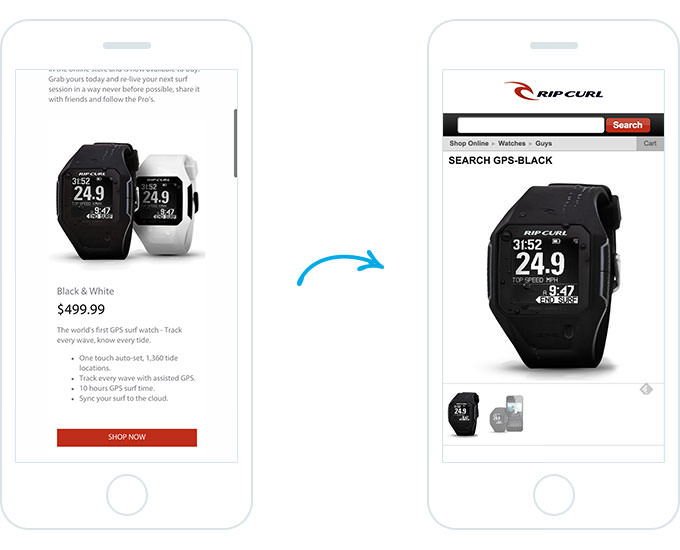
The mobile-optimized email campaign features a big call-to-action button that directs readers to a mobile-friendly online store where they can learn more about the product and purchase it straight from their device.
The streamlined, mobile-optimized experience that Rip Curl has created makes the process—from receiving the email to purchasing the product—incredibly simple and increases the chance their recipients will make a purchase and drive revenue.
8. Track email client usage
Modern email marketing tools like Campaign Monitor offer comprehensive reporting on your campaigns, including telling you how many people have opened and clicked your campaigns and on what devices.
If you’re a Campaign Monitor customer, the Email Client Report is where you will find this data.
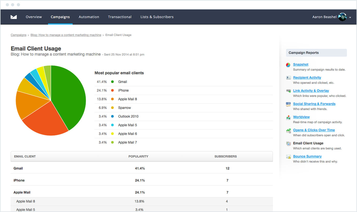
This report will show you all the devices your subscribers are consuming your campaigns on, and allow you to see what the most popular devices are.
With this information, you can further optimize your campaigns to ensure you are getting the best possible results from your email marketing initiatives.
Wrap Up
With mobile usage growing every day, more and more people are viewing your email campaigns on mobile devices.
Ways to ensure that your email campaign is mobile friendly include:
- Shortened subject lines
- Eye-catching preheader text
- CTAs are large buttons for easy clicks
- Landing pages are mobile friendly
Take the extra time when creating your campaigns to make sure they are optimized for mobile devices, as it could lead to a significant increase in opens and click-through rates that drives results for your business.
Ready to start building your next mobile-friendly email campaign? Let Campaign Monitor get you started!