
Updated May 2019
With 68% of email campaigns being opened on a mobile device, email with a mobile-friendly design is no longer just nice to have, it’s a must-have.
Read on for seven essential tips to creating mobile-friendly email campaigns.
Why are mobile-friendly emails so important?
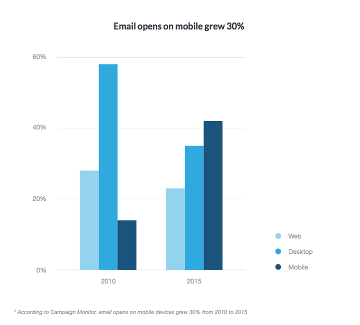
As marketers, we used to worry about how our emails would look on several email clients. But the explosion of devices and email clients has created a challenge. From 2010 to 2015, email opens on mobile devices increased by 30%.

If your emails aren’t mobile-friendly, you could be missing out on the opportunity to engage your subscribers and drive results. So let’s examine seven simple, yet essential tips that any marketer can use to make their emails more mobile-friendly right now.
7 tips to make your emails more mobile friendly
1. Watch your subject line length
A typical desktop inbox displays about 60 characters of an email’s subject line, while mobile devices show just 25-30 characters, according to a post by Return Path. And, after analyzing over 2 million emails from 3,000 senders, they discovered that most subject lines were between 41-50 characters.
Before you go optimizing your subject lines for mobile, though, it’s good to have a basic understanding of what percentage of your subscribers will open your email on a mobile phone vs. tablet vs. desktop, so you determine the best subject line length.
Depending on what email marketing tool you use, you can likely get this information from your email reports. Campaign Monitor customers can find this information under the email client report.
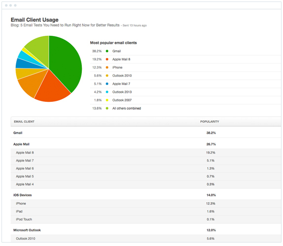

The report shows exactly what email clients your subscribers are using to view your campaigns.
If you find that a good portion of your subscribers are opening on an iPhone or Android device, then it would be worth keeping your subject lines under 25-30 characters so that they look great on those devices.
2. Use pre-header text
Pre-header text is often ignored, left out, and just plain overlooked, but it can be very useful when it comes to mobile-friendly emails.
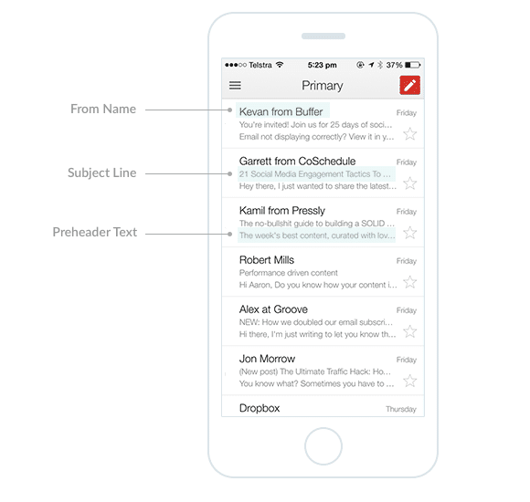
If you’re unsure of what pre-header text is, it’s the first line of copy in your email and serves as a support to your subject line, providing more context to entice your reader to open your email.
Here’s an example from Gmail on an iPhone 6. You can see the preheader text and the other elements. People can adjust their settings to display additional pre-header/preview text but, for the majority of those who use default settings, this is what they’ll see:

Preheader length will vary by both email client and by device, so try different lengths and see what works best based on what you know about where (mobile, tablet, or desktop) your subscribers are opening your email campaigns. Then design your email campaign accordingly.
3. Keep your copy concise
When you write copy for mobile-friendly emails, it’s crucial to keep it short and concise. Create short, scannable, and consumable chunks of content (i.e., bulleted lists, short paragraphs) that make it easy for your reader to digest your copy and understand the action they should take with your message.
The folks at Litmus also advise, “Overall screen size is small when it comes to consuming email content on a mobile device, and consumers are more likely to be multitasking when they get your message on mobile. It’s more important now than ever to engage the user as efficiently as possible; limit the amount of copy you include, and make sure it is easily scannable by using headers, bullet points, and short paragraphs of text whenever possible.”


This newsletter from InVision is a great example. The copy is short but compelling enough to entice you to click through and read the article, and it’s directly related to both the image above and the button copy below.
4. Give thought to your images
Not all mobile devices display images by default, so it’s best to plan for an “images off” experience and make sure your email will still make sense if your images don’t show. Web Marketing Today says, “Blocked images remain a challenge for image-heavy emails. Descriptive body copy has to do the heavy lifting. It’s useful to think of images as optional, supporting the surrounding text, rather than the reverse.”
5. Keep CTAs front and center
When creating emails for busy, on-the-go readers, you want to get to the point quickly and tell them what you want them to do right up front.
Place your call to action near the top of your email to make it the most mobile-friendly. To ensure maximum clickability, make your CTA buttons at least 44 x 44 pixels.
Check out this example from Freshbooks:

6. Leave breathing (and clicking) room
When creating your mobile-friendly email, remember to make it click-friendly, by leaving enough white space around links and CTAs to make them clickable. You can see this in the example from Freshbooks. They leave plenty of room around the CTA button, so it’s easy to click without accidentally clicking something else by mistake.


Don’t stack links on top of each other, as that makes it challenging for your mobile reader to click and take action.
7. Test your emails across multiple devices
Before you schedule and send your email, make sure you test it across multiple devices and email clients to ensure that it looks the way you intended. Campaign Monitor customers can send a test of their email and see how it appears in over 25 different email clients.
Beyond the Basics
Now that you’ve been apprised of the basics when it comes to creating mobile friendly emails, it’s time to delve deeper into the best tips on developing these emails. The consequences of not taking the time to create responsive emails are dire. Customers can open your emails on their mobile phones only to find an unsightly assortment of content rendered almost completely disorganized. In the worst cases, the email can’t even be used because the distortion has stripped it of its potential value.
You need to invest in creating every email as a responsive HTML email. These emails will blend with almost any mobile device. Responsive templates can match literally thousands of models and platforms, making it almost impossible for your emails to get garbled from incompatibility issues ever again.
What are responsive email templates?
A responsive email template is a total time-saver. These templates take the guesswork and a lot of the prep out of the production of responsive emails that’ll display seamlessly on mobile devices.
The advantages of using a responsive HTML email are that you’ll never have to worry about if your newsletters show up correctly in inboxes across different platforms. That means you’re free to concentrate on what’s really important.
Email formatting aside, the core of email marketing always has been—and always will be—your content. Dressing it up and making it look great on mobile devices is an essential, yet secondary concern. With responsive templates, you don’t have to spend as much time optimizing your emails for different formats and can focus on making your content stand out like never before.
Always remember the importance of mobile-friendly email, as the number of mobile users continues to grow, and you don’t want to fall behind the trend. There’s no excuse for losing business due to falling short on mobile-friendly email in today’s mobile-driven market.
How do I make my email mobile-friendly?
Responsive email design is one of the most important aspects of email marketing today. In previous years, it was a Windows world, in which compatibility wasn’t as much of a concern. While today is a different story, that doesn’t mean that email marketing has to be more difficult.
Much to the contrary, with the right email service provider, you can get sophisticated features that allow you to drag and drop content into responsive email templates. The responsive email templates make it possible for your marketing emails to display perfectly on almost any OS.
Another option is to build your own template using tools provided by your email service provider. Building your own responsive template gives you unmatched convenience, flexibility, and freedom. The freedom to design your own template ensures that your content will still be fresh, unique, and inimitable. The best part is, with tools from industry leaders like Campaign Monitor, you can assemble fully functional, responsive email templates in less than a minute.
Responsive email templates are effective, easy to use, and affordable, making them perhaps the best way to make your emails mobile-friendly.
With these tools, you can send engaging emails that’ll show up just as perfectly on mobile as on a desktop.
Wrap up
These seven essential, easy-to-implement tips should have you on your way to creating mobile-friendly emails that your on-the-go readers will love to open and take action on.