
Every major email client, from Outlook to Gmail to Apple Mail, is set up by default to send in HTML format, and comes with a bunch of tools and options to format HTML.
How to use HTML to optimize your email design
So if the tools to create and format HTML email are so simple and widely accessible, why would you even want to involve a designer in the first place? Here, we’ll explore the implications of beautiful email design.
Why design matters
One of the main reasons why designers have historically been against the very idea of HTML email is the poor quality of the emails they’re used to seeing.
“Look how ugly they are!” designers proclaim, and promptly vow to never support HTML email. Unfortunately, their valiant stand fails to create a turning point; email software manufacturers won’t take away their users’ cherished fonts and colors. Refusing to design HTML emails doesn’t stop them being sent; it just ensures that they’ll remain eyesores.
It’s important to have design input into emails, as far as publication-type emails like newsletters are concerned. We can all be part of the solution to this issue. A well-designed email is more readable, attractive, and effective at relaying information.
Designing plain text email
You don’t have to be sending fancy emails to benefit from design skills. Even plain text, the base format for written communication, needs to be designed.
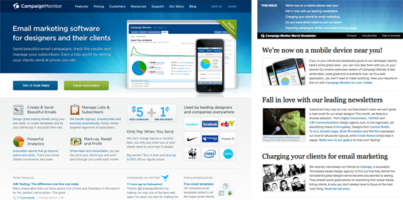
Have you ever received plain text newsletters? An excellent example is this Highrise newsletter by 37 Signals:


Notice how those typographic characters are being used as borders? This is a common approach: using asterisks, equal signs, or underscores to simulate the kind of design elements that books and magazines use all the time.
Even print books that are 100% text undergo the design treatment. Typography is well worth studying as a web designer, and there are some excellent resources online from which to start.
Though many maintain that plain text is all you need for an email, a large block of unformatted text can be very hard to read. Look at what’s missing:
- Ability to control text size for headings
- Ability to emphasize text through bold or italic type
- Possibility of using a display font to draw attention to a subtitle
- Control over margins and padding to increase clarity and allow the email to be quickly scanned for the most important information
Thoughtful senders use a variety of techniques to work around these limitations, like the character borders above. Ultimately, though, these are often little more than clever hacks, using characters differently from what they were designed for in order to improve the readability of a limited medium.
How to add plain text version to HTML email
Despite this, it’s important to learn how to make plain text email as clear and readable as possible. Even if you’re planning to send only HTML emails, you should always provide a plain text alternative.
Most email newsletter programs will send a multi-part email consisting of both an HTML version and a plain text alternative so that the recipient’s email client can show either, according to its capabilities and settings.
Many email marketing service will provide tools that can meld plain text with HTML or even take your HTML email and create an entirely plain text version.
Guidelines for a readable plain text email
- Use lots of whitespace to avoid having a huge gray blob of text. Leave space between paragraphs and after headings, and aim for paragraphs of four to five lines.
- Use short URLs wherever possible. Again, longer URLs can break up and become hard to click on, or copy and paste.
- Make your copy easy to scan by dividing it with clear headings.
Text wrapping vs. line breaks at 60 characters?
Traditionally, the advice given to those creating email newsletters has been to add line breaks every 60 characters to preserve readability in email clients. This was done mostly for the benefit of legacy clients, some of which allow text to run unreasonably wide before wrapping it. However, we’ve now revised that advice, given that:
- In iPhone Mail, line breaks at 60 characters make plain text messages look raggedy (pictured)
- The most popular email clients, Outlook ’07/’10/’13 ignore these line breaks
- Modern email clients tend to have preview panes that prevent lines of text from running too long and/or can be resized to taste.


For these reasons, we recommend that you don’t put the extra time and effort into adding line breaks every 60 characters or so. Instead, let the paragraphs in your plain-text email campaigns run free.
The plain text version of the Modern Henchman newsletter
Our Modern Henchman newsletter will have a plain text version; this is to benefit subscribers whose platform (whether legacy or mobile) prevents them from viewing HTML email, or who simply opt for plain text as a personal preference.
Taking the content from our plan, here’s how the plain text version will look:
You are receiving this email as a subscriber to Modern Henchman magazine, or because you signed up at modernhenchman.com
|
You are receiving this email as a subscriber to Modern Henchman magazine, or because you signed up at modernhenchman.com
_________________________________________________________
Modern Henchman
_________________________________________________________
In this issue:
* Don't let him get away again!
* Henchman to supervillain?
* Hot Hats for Henchmen
* Lair Maintenance for Beginners

DON'T LET HIM GET AWAY AGAIN!
We uncover the 10 most common tricks superspies use to escape even the most fearsome of death traps. You'll never let the boss down again.
Visit https://modernhenchman.com/stories/getaway
___________________________
HENCHMAN TO SUPERVILLAIN?
Take your henching career to the next level with our easy stepby-step guide to a brand-new you. Can you make it?
https://modernhenchman.com/stories/henchman2supervillain
___________________________
HOT HATS FOR HENCHMEN
Stand out from the crowd with this year's selection of henchmen headwear that's both attractive and functional. Available in a range of fashion colors, and perfect for the balding baddy.
Beware, not every head can handle a hat, so take our hat quiz before you buy.
Meet the milliner at https://modernhenchman.com/stories/hothats
___________________________
NEVER OUTSHOOT THE BOSS!
Henchman Etiquette Expert Aunty Blake answers your tricky questions about showing up the boss in a fire fight.
https://modernhenchman.com/columns/auntyblake
___________________________
DIARY OF A HENCHMAN
Finally, the explosive anonymous revelations of a henchman who has worked with some of history's greatest villains. You won't believe what goes on when the giant death ray is turned off.
We have advance copies for every new subscriber to the print version of Modern Henchman, so don't delay, subscribe today.
https://modernhenchman.com/subscribe
___________________________
LAIR MAINTENANCE FOR BEGINNERS
The boss has captured his arch enemy for the third time, but the laser mounts keep slipping off the sharks and the aquarium guy can't come until Saturday! No need to panic——just follow our simple illustrated guides and you'll be indispensable.
https://modernhenchman.com/stories/lairmaintenance
___________________________
Do your henching colleagues need some tips? Why not send this email to them.
https://modernhenchman.com/r/l/2AD73FFF/ojlttu/l
If you're not interested in being the best henchman you can be, please unsubscribe.
https://modernhenchman.com/t/r/u/ojlttu/l/
The Modern Henchman logo and design are trademarks of Hench International Pty Ltd.
Now we have a readable and effective plain text email template that we can use for all our future newsletters. This presents a challenge: if our readers can obtain all the information from this plain text version, why bother with an HTML version?
The case for HTML email
Just because we can send HTML and CSS in an email doesn’t mean we must. The fact is that there are some clear benefits to an HTML email.
Have a glance at the emails shown in Figure 3.3. Here we have the same email in two different formats. Which one jumps out at you more? Which is faster for you to read? What’s the most important information in the email?
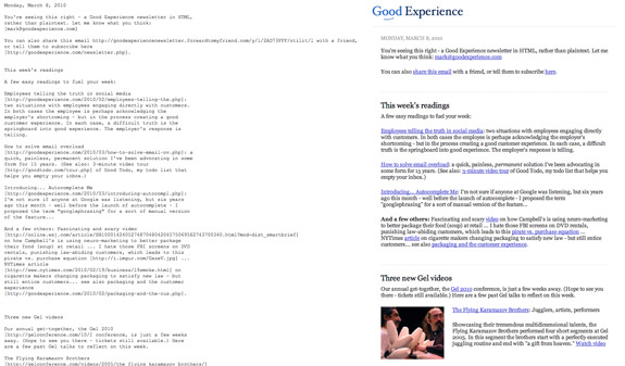

Figure 3.3. Plain text (left) and HTML (right) versions of the Good Experience newsletter
Mark Hurst, the founder and sender of this newsletter, made the decision in March 2010 to send this HTML version as well as the plain text for the first time. He immediately received this comment from a subscriber: “The email is much more pleasant to read and the links are easily visible and inviting.”
The HTML version is still mostly text, but it’s HTML-rendered text. Look at how much easier it is to spot what the sender considers the key information.
Some simple font control and margins create an instant visual hierarchy that plain text struggles to establish. Even the most hardcore anti-HTML email campaigner wouldn’t get upset about this.
As this illustrates, it’s possible to design HTML for email in a way that’s actually helpful, and better than the alternative.
SaveSave
Designing HTML email
If you can agree that, in principle, well-designed HTML email is possible, the question we need to answer is, “What does a well-designed HTML email look like?” We’re going to try to answer that in the rest of this post.
Along the way, we’ll think about how the concepts we’re learning can be used to help design an HTML email for Modern Henchman magazine.
The design environment for email
Isn’t designing an email just like designing a small, one-page web page? In many ways, it is. We do use the same design tools and technologies to produce the final result. And the same general design principles are still in play: contrast, repetition, proximity, and alignment are all important.
Any competent web designer already has the capabilities to design an HTML email. There are some important differences, though, and understanding these will make the difference between a tiny web page jammed into your inbox, and a valuable and readable email.
If we compare web design to email design, we can come up with a few core distinctions. Read on to examine them one by one, and see what lessons we can draw from them.
Your subscriber may not read the email
The very first element of design that goes into an email isn’t strictly “design” at all. It’s copywriting. Your email can fly through spam filters and make its way successfully into the inbox, but then remain unopened.
This is because, unlike a web page—which visitors can arrive at via links from other pages or search engines—an email is only ever opened when the user decides to open it, and they’ll often make that decision based on the subject line.
Crafting an appealing and informative subject line is the first step in a successful design. We’re unable to make any visual design changes to a subject line but, as designers, we should be involved in ensuring that it represents what’s in the email, and that it’s recognizable and helpful.
If the subject line fails in its job, your beautifully crafted design will never be seen. There’s plenty of information out there for help on improving subject lines, as well as research on what makes a subject line succeed or fail.
Design Guideline 1:
Write a subject line that is …
- Informative (mention some of the topics)
- Short (or at least has the most important information at the start)
- Recognizable (so that it’s consistent with other emails from your client)
Looking through the rectangular window
Assuming we’ve done a decent job with our subject line, our email may be selected from the inbox and displayed in a shortened form. For desktop email clients like Outlook and Apple Mail, the default preview pane is a tiny rectangle of space taking up less than 20% of the screen, as illustrated in Figure 3.4.
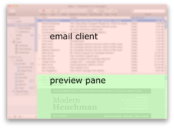

Figure 3.4. Sample screen showing preview pane size
Imagine walking through a mall. Every store has a sign out the front, but all the windows are blacked out except for a square letterbox-sized peephole.
To decide whether you want to go inside, you need to peek through that slot to see what you can see.
That’s what the preview pane is like: a limited view of your design and content. For that reason, it’s really important that the top of your email is informative.
If all the reader can see is 300 pixels of your background color or an unrecognizable logo, they have to be really interested to continue reading on.
When we come to design our Modern Henchman email newsletter, we’ll make sure that those first few hundred pixels at the top (and, more specifically, the top left) communicate useful information.
Design Guideline 2:
Find out what your email looks like in a minimal preview pane
What copy is located in the top few hundred pixels of the email? Does it entice people to read on? Is your header too big?
Image blocking
If you’ve used any email program that renders HTML, chances are you’ll have opened up emails that looked like the one shown in Figure 3.5.
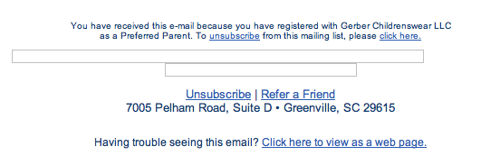

Figure 3.5. All-image email with images blocked
Instead of words or pictures, there’s a stack of blocks of various sizes. Most of the major email clients, including Outlook, Lotus Notes, and Outlook.com, will not display images by default. Instead, they display a broken image icon or an empty rectangle.
The reason image blocking is so common is related to the invasiveness of email that we discussed earlier. When emails arrive without you having taken any action, featuring any content imaginable, it’s easy to see how it all can go horribly wrong.
Nobody wants to have to explain to their boss why their screen is full of images unsuited to the workplace. To avoid this sort of situation, the email programs insert an extra step in the viewing process to make the reader specifically request to see images.
Email software programs differ in the way they handle images by default, whether using a global setting or showing images only from your known contacts, or on an individual email-by-email basis.
In some cases, embedding the images as MIME encoded attachments can avoid the image blocking, which is worth knowing.
However, sending images as attachments creates a greater risk of being filtered, slower download speeds, and more complex processes. And you can bet that, if spammers start embedding all their images as attachments, the email clients will respond and start blocking those as well.
The take-home message for us as email designers is that we cannot simply expect our readers to see the images.
Added to that, many readers are unaware that images are missing or don’t know how to enable them, so they may just assume the email is meaningless or broken, and throw it out if it contains no content other than images.
So what are we to do? Avoid images entirely? You could, and, in many cases, a well-formatted HTML email without images can be highly effective and achieve all your goals (see the section called “Almost Image Free” in the Gallery at the end of this post for examples of this sort of email).
That’s not always true, though, and, inevitably we’ll have clients or bosses who really do have valid requirements for images.
The answer is to always design knowing that your images cannot be relied on. Make sure that, if they don’t load, the email is still readable and recognizable.
Design Guideline 3:
Always check your email with images turned off
Does the email still have useful, readable content? Consider especially what the preview pane looks like when there are no images. Do you have visible text in the preview area?
Horizontally challenged
When it comes to email design, your emails are probably being read in a very narrow window or frame.
Most people don’t open emails in a full-screen window; instead, they scroll through a preview pane or viewing column that takes up only a portion of the screen.
Added to that, consider the poor people using mobile email clients who, at best, have a few hundred pixels with which to work. Web surfers have overcome their fear of scrolling vertically, but horizontal scrolling is still rare.
As a result, our email designs will generally be quite narrow, built to work in a limited screen space. Most commercial emails seem to be about 600 pixels wide, at the most, which can feel almost claustrophobic when you are used to your 24-inch desktop monitor.
This width restriction will naturally lead to certain design styles, such as restricting the number of columns and splitting the elements vertically more than horizontally.
Design Guideline 4:
Keep email designs reasonably narrow
A good maximum width to aim for is 600 pixels.
Essential elements of an effective email
With our design guidelines in hand, we’re almost ready to start creating our email. In the same way that most websites have headers and footers and contact pages, commercial emails tend to share a basic structure.
The elements we will discuss below can be implemented in many ways, but they’re almost always present in newsletters and marketing emails.
You may not be legally required to have them all, but each one adds to the credibility of your message and the likelihood of it being read.
Permission reminder
There are many different laws that apply to commercial email according to where you’re located in the world. One rule that applies almost everywhere is that you absolutely must have permission to send people bulk email. In most cases, it also makes sense to remind people about how they gave you that permission.
It’s common for people to forget that they signed up, especially if you only send emails rarely, or they only joined because of a competition or special offer. A short message at the top of your email can help people remember, and make them more likely to read on.
Recipients want to know why their address is on your list and how it got there. The more specific you can be, the better. In the case of our Modern Henchman newsletter, we know that people are on the list for one of three reasons:
- They bought products from the website recently.
- They filled in the signup form on the website.
- They are paying subscribers and this is part of their purchase.
So a simple permission reminder will be something like: “You are receiving this because you are a current subscriber, have bought from us (thanks), or signed up on our website.”
Working with your client to write a permission reminder can also be a good way to check that the client does have permission to email their list.
It’s much better to find out before you send the email that your client has a very different understanding of permission than you do (or than your email service provider does). You can then work with them to pare the list back to people who are more likely to receive it positively, and who meet your email service provider’s rules.
Storing information about how each person signed up (perhaps as a custom data field in your list) can make it simple to create personalized permission reminders. If you know this person bought from you in May this year, you can remind them of that right up front, making them much more likely to respond well to your email.
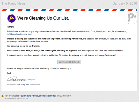
Panic sent a very attractive and cleverly designed email, shown in Figure 3.6, but it was the addition of the line “You signed up for our list via [product name]” that helped them avoid complaints.

Have recognizable sender details
Studies on email open rates have found that trusting the sender is the single most important factor in whether an email is opened or not. That means it’s critical to choose an effective and consistent “From” name and email address.
You need to choose a name or title that will be recognizable to your readers. Often, that will be the company name or perhaps the product or service people have signed up to learn about.
Some companies have a well-known leader (bgates@microsoft.com) and, if your client is among those, you might be able to use their name. Once you’ve picked an address, it’s important to stick with it, because email clients are less likely to filter emails from known senders.
Your subscribers may also have manually whitelisted your sending address (which you should encourage), and changing the address will mean losing any whitelisting benefit.
Legal compliance
Depending on where you and your clients live, there may be also legal requirements for any commercial email you send.
The most famous of these laws is the CAN-SPAM Act (2003), which applies to US senders of “email whose primary purpose is advertising or promoting a commercial product or service, including content on a website.” Processing emails (such as order confirmations and the like) are mostly exempt.
The CAN-SPAM law requires that your emails must:
- have accurate “From” and “To” addresses, email headers, and routing information that identifies the sender
- avoid deceptive or misleading subject lines
- contain an unsubscribe or opt-out mechanism
- identify itself as a commercial email and contain a valid physical address for the sender
The main impact of this law for designers is the need to include the physical address in the design, typically in the footer. Find out more about CANSPAM at the FTC website.
Outside of the USA, there are plenty of similar pieces of legislation, so make certain you know what applies to the emails you’re sending. For a head start on finding out laws relevant in your area, visit Mark Brownlow’s helpful list.
Unsubscribe link
Even if there’s no legal requirement to have a method of unsubscribing, it’s usually a good idea. Giving subscribers a clear and simple way to say “I would like to stop receiving your emails now” is the best option for all sides.
It helps you as the sender, because you avoid the cost of sending an email to a recipient who is only going to trash it anyway. And it leaves your subscriber with a positive experience of your company or service because you give them control in the relationship.
If a person doesn’t want to receive your email, they will not read it anyway, and, by irritating them and making it difficult, you’re just increasing the risk of them reporting it as spam. So make your unsubscribe method easy to see.
One Campaign Monitor customer ended their email with “Every person who unsubscribes makes us cry a tear, but if you must: click here.” Another email for a nightclub showed some honesty: “If you signed up while drunk you can unsubscribe here.”
A person who knows it’s super easy to unsubscribe is far more likely to resubscribe later on if they need your information or services again.
Now that we’ve familiarized ourselves with the design constraints that apply to HTML email and a few key components to remember, we’re ready to begin the actual job of designing the email. But where to start? Fortunately, almost all email designs can be based on an existing website design.
Adapting a Website Design into an Email Design
The typical email design project will be associated with an existing brand, and you’ll almost always have a website design in place from which to work. Making your email design feel like it’s from the same company—or website—is extremely important.
A 2006 survey from Return Path showed that the biggest influence on whether emails were opened was “knowing and trusting the sender.” If the email uses recognizable colors, titles, and imagery, the subject line and preview pane will remind the recipients about the sender of the email, providing the confidence to act.
An email that’s visually disconnected from the site it links to will be jarring, even if it does convince some recipients to click a link.
Don’t try to replicate the entire website in an email, though. Your design should take the essential feel of the brand and translate it into what will work for an email.
Campaign Monitor’s own email newsletter template is one example. Compare the current Campaign Monitor home page to the newsletter, both of which can be seen in Figure 3.7.

Structurally, the email is much simpler, consisting of a single column. The email header ties in to the sunburst effect from the website header, but the content has been reordered.
At a glance, the two images look strongly related, but not identical. This is the level of similarity to aim for: an email that feels as though it’s a natural extension of the website.
It should stand on its own as a well-designed and readable document, but clearly be part of a bigger design.
Figure 3.8, Figure 3.9, and Figure 3.10 are the current home pages of some other popular services (on the left), and their newsletters (on the right).


If you see an example of a great newsletter, make sure you click through to the home page of the company or sender and compare them.
You’ll learn exactly what the designer thought were the key elements of the website design and brand by what they chose to include and what was left out.
Layout possibilities
Even in 600 pixels, there are plenty of ways to lay out content. How do designers usually approach an email layout?
Figure 3.11 shows some the most popular block-level email layouts, as taken from a typical day of email campaigns sent through Campaign Monitor.
Two-column layouts (with about an 80/20 split) are, by far, the most popular layouts, which was true for websites ten years ago as well.
The idea of interspersing two-column blocks with full-width blocks is very popular, and gives the email a more dynamic feel if it’s done right. It’s also very flexible, and allows you to use a variety of different content types.
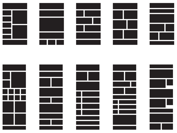

Figure 3.11. The most popular layout variations sent through Campaign Monitor
It’s very rare to see more than three columns, and that’s hardly surprising, given the design constraints discussed in the section called “The Design Environment for Email.” For our example client, you’ll remember we came up with this core content list:
- Information on the featured product of the day
- Featured article (building our reputation for knowledge)
- Link to send the email on to a henchmate
- Henching tip of the week
The primary content, then, will be a couple of articles and probably a featured photo. This could easily be achieved in several different layouts, so we have some design flexibility here.
If our articles are more than a paragraph or two, it makes sense to give them the biggest chunk of screen space.
For the first issue, we’ve opted for the layout depicted in Figure 3.12.
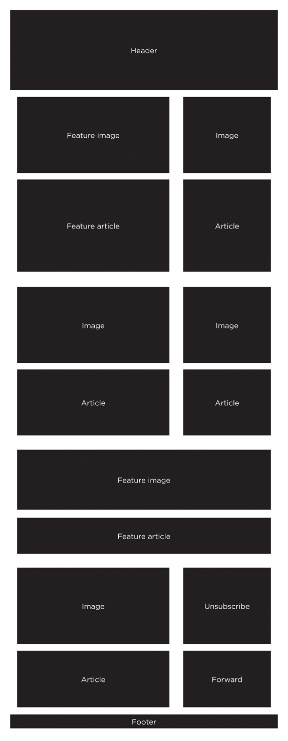

Figure 3.12. A wireframe of the layout for the Modern Henchman newsletter
This layout gives the main content visual weight and room to be easily understood, but also has a few obvious spots where we can fit in our other promotions. As a basic template, this will work from month to month, without requiring a complete redesign.
Broad consistency is helpful for your readers to recognize the email and grow used to reading it. It also saves time and lets the content creators focus on the actual writing and editing, rather than reworking the layout with each issue.
If you have a client that sends several different types of content, you can create many design variations to suit, but you’d still want to make them recognizable as being from the same sender and on the same topic.
Remember that the actual content could be shorter than what we were planning on, longer, or more varied month by month. So our design needs to be flexible enough to hold together over time.
Some designers like to create a more detailed mockup at this point, slotting content sections in wherever they fit. You might find the mockup a useful document to show your client before you commit to particular color schemes or layout sizes.
Designing to Meet Business Goals
We can adapt the tone and look of our email from existing materials, if any, and come up with a practical layout for the content. What we need to do now is work out how to put it all together in the most effective way. But what does it mean to have an effective email?
Refer back to the example in which we completed a client brief for Modern Henchman magazine. The brief laid out what our client was expecting to achieve from their email newsletter investment. Taking that brief, we suggested a primary goal: generate at least $400 in sales directly from newsletter subscribers in the first week after each email is sent.
How can the design of the email help meet that goal? Here’s the five-second test to see if an email has a clear goal. Glance at the email for just a moment, and answer this question: “What does the designer of this email want me to do first?”
You might answer “read this article” or “look at these photos.” More often, though, you’d wind up saying “I have no idea.” Let’s start with a fairly obvious example, shown in Figure 3.13.
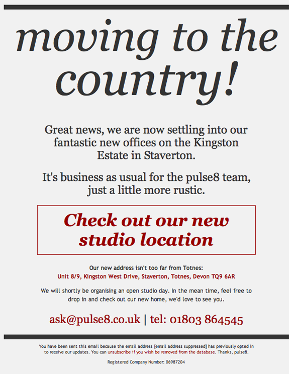

There’s no guessing required here; the person who sent you this email wants you to check out their new studio location. This might seem obvious, but so many emails obscure their main goal with huge headers, waffly introductions, and dozens of links to less important pages.
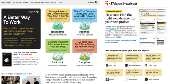
Another example, from the always-discerning Basecamp, is shown in Figure 3.14.
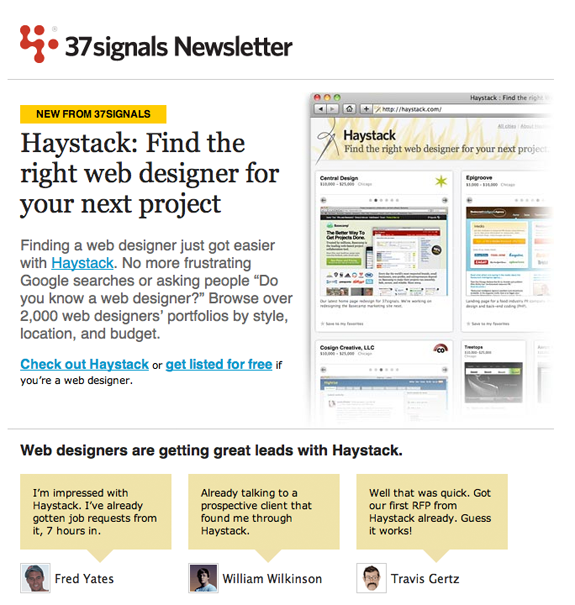

Figure 3.14. Basecamp Haystack announcement
This email is clearly intended to introduce Haystack (since renamed Sortfolio), yet there’s no need to read the whole email to find out what Haystack is about. Even if you just glance at the email for a few seconds, it has already accomplished its primary goal: you’ve been made aware of the new service, and you know what it’s all about.
Referring back to the example of Modern Henchman: they want to sell $400 of product as a direct result of their email. What does that goal look like in an email? We’re going to have to make sure the email lets people know what they can buy, and gives them reasons to actually do this. Here are some ideas of how we can go about accomplishing these goals:
- Use a promo photo of the products we’d most like to sell.
- Use direct language; for example: “Purchase the hat-brim blade today.”
- Avoid confusing the message by having too many other links.
A quick glance at the email should have people saying to themselves, “That looks cool, I wonder what it is?”
In addition to the content, our goal could be addressed right in the subject line. Compare these two options:
- Modern Henchman newsletter, May 2010 edition
- Weapons on sale: Modern Henchman magazine
The second subject line is far more precise, and the reader knows exactly what to expect when they open the email.
Fortunately, no guessing is required as to which one would perform better. Emails are highly measurable. A simple A/B test (where part of the subscriber list receives option one; the rest, option two) would quickly show which variant resulted in more opens, clicks, or even purchases.
Before testing, we’ll rely on the briefing and goals to decide which options are most likely to be effective. Once the email has been sent, the test results will help to refine the design for the next campaign.
SaveSave
The 'Modern Henchman' newsletter design
Finally, it’s time for the design work. For some people, this is the point to fire up their copy of Photoshop or Fireworks.
For the Modern Henchman magazine newsletter, we have taken the layout we put together above and inserted some photography from the website. We’ve also chosen fonts and colors that match those on the website. We had the writers from the website provide us with the content that will be going into the first issue, so we have some subject matter to design around.
The resulting mockup is shown in Figure 3.15.


Figure 3.15. The Modern Henchman newsletter mockup
That’s just one example of an HTML email. And, while it accomplishes the client’s goals admirably, it might not be the sort of design best suited to your particular project. So, to help get your creative juices flowing, the next section is a gallery of some of my favorite HTML email newsletters from which you can draw inspiration.
SaveSave
Gallery of HTML emails
Scan through these screenshots of some top-notch HTML emails, and think about what they’re trying to achieve. They’re categorized for convenience, but many of them would fit into multiple categories.
Clear call to action
These emails are very clear about what they want the reader to do. Giving your reader one obvious option will significantly increase your click-through rate.
The bgroup creative agency’s newsletter, shown in Figure 3.16, draws attention to an already giant button with a comical character.


Figure 3.16. bgroup creative newsletter
The Scrapblog sales email in Figure 3.17 has a call to action that isn’t a button, but is very compelling, drawing the reader in to learn why they should be ordering before this date.


Figure 3.17. Scrapblog sales email
The email from Xero, shown in Figure 3.18, uses a more conventional call-to-action button. It’s highly effective because of the strong color contrast with the otherwise monochrome theme of the rest of the email.


Structure and layout
Here are some designs that show how flexible even an environment as limited as email can be.
The email shown in Figure 3.19 for a Belgian design conference makes excellent use of typography and layout to clearly separate its various sections.


The email from Dekalb Tire, shown in Figure 3.20, also makes excellent use of layout. It uses a few different line thicknesses and textures to delimit sections without making the email appear cluttered.


Unlike the previous two examples, Figure 3.21 shows an email that uses text as its primary design element, but still manages to create a clear structure through clever use of a three-column layout.


Typography
Although fonts based on Flash and JavaScript are unavailable in email clients and, as we’ve mentioned, it’s best not to rely on images for your content, it’s still possible to produce beautiful typography in an email.
For a fantastic example, take a look at Figure 3.22, from cabedge.com. Using just a few fonts in varied sizes and colors, combined with a clever idea, the email really catches your interest and relays its message.


Figure 3.23 illustrates another great typography-centric email design. Frost Design use a single-column layout very effectively thanks to strong separations.


Even though the email in Figure 3.24 consists mostly of a large image file, it makes the image subservient to the primary content. We talked about using typographic characters as design elements in plain text emails, but Reconsider Design provide an excellent example of how this technique can be applied equally well to HTML emails: the two slash characters (//) that precede each heading provide a strong visual cue, tying the design together. Even better, they work independently of images being enabled.


Special purpose
Although most of this guide is focused around regular email newsletters, there are plenty of other uses for HTML email. Have a look at these standout examples. Unlike newsletters, these special-purpose emails have even greater freedom to center on a single key message or idea.
Figure 3.25 shows a great example of an invitation email. All the key information is presented in a single column, with an interesting theme tying the design together.


Figure 3.26 shows a holiday greeting card sent by cabedge.com. Notice how the graphic at the top reinforces the holiday theme, while also serving as a subtle arrow that draws the eye down the message, which is short and sweet.


The reminder email from DHL Express shown in Figure 3.27 has a lot of positive features: it uses an image as a supporting element rather than for core content; it has a clearly stated, personal message; and it has an obvious call to action.


(Almost) image free
Just because you use HTML doesn’t mean you have to use lots of images. These emails employ striking design without relying on images being downloaded.
This example in Figure 3.28, an invitation to attend an organizational meeting by the Greater Houston Partnership, consists almost exclusively of blocks of text. Yet it uses the features of HTML to make that text clear and readable, conveying its message as simply and directly as possible.


The product announcement email from Huge Paper in Figure 3.29 makes excellent use of a simple color scheme. By combining this with a clear layout and plenty of whitespace, it’s a strong design without relying on images.


We’ve already seen part of the pulse8 email presented in Figure 3.30 in the section called “Designing to Meet Business Goals”, so of course it has a strong call to action. What’s even more impressive is that it relies on no images at all, and still conveys its message powerfully.


SaveSave
Email design trends for 2019
When coming up with excellent email template design, it’s important to make sure your designs are trendy and tap into the public consciousness.
Whether you’re using an HTML design template, email design software, or are writing your own code, here are some of the trends that are making the best email designs in 2019.
Personalization
Personalization has been proven to get up to an 82% increase in email open rates. That’s a hard number to ignore.
When using email HTML code, personalization can take many forms, including dynamic links, which allow you to display links only for individuals of your choosing.
You can also set up image mapping, which allows users to click on a specific part of an image. In application, this could be used as interactive content, such as a personality quiz or a game, that takes the user to a specific product page.
When it comes to plain text personalization, it gets a bit more difficult, as you may have to send out specific emails to achieve personalization. That said, there are ways to frame plain text that make it sound more direct and less impersonal.
Short videos
Interactive content, such as videos, is quickly gaining ground in the email design space. However, this doesn’t mean you should be putting 30-minute videos in your emails, as they’re unlikely to retain the attention of the users.
Users are far more likely to interact with short-form videos, which could even include GIFs. Not only is this type of content popular, but it’s conducive for certain products that need to be seen in action.
HTML allows users to embed videos from other sources into their emails. This is great if you already have a short video on YouTube or your Instagram page and want to share it.
When not using a drag-and-drop email creator, you’ll have to link to videos, as there’s currently no way to easily insert a video into an email as you would an image. However, you can create a thumbnail with a play button graphic and link that to a video.
If you’re strictly a plain text person but have ever wondered, “What does HTML mean in email?” then videos are your answer. Using HTML, you can embed videos from YouTube into your email.

Source: Pretty Good Emails
Encourage customer creativity
Email marketing is no longer a one-way street. In fact, customers enjoy interacting with the brands they love. It creates a connection between the two that transcends the typically cold, business-like relationship between brand and consumer.
Often, this takes the form of contests. Imagine you put out a photo contest on Instagram. You can then display the winning photos by using HTML to embed the photos in your next email.
Using plain text, you can send out instructions for contests or put out a call to action for users to take up a particular hashtag.
More places for email design inspiration
Sign up for as many newsletters as you can (use a folder or special email address so that you can easily separate them from your regular email). Reading the actual emails in your own inbox is a different experience than seeing a screenshot in a gallery, so I highly recommend it as a way to immerse yourself in the design language of HTML email.
Even so, there are a few great collections of email designs that are well worth browsing. As you browse, try to work out what the design was intended to achieve.
- Campaign Monitor free templates
- Themeforest templates
- Campaign Monitor gallery of great designs
- SpamMeltdown email gallery
- Beautiful Email Newsletters Gallery
- Inspirational Newsletter Designs Flickr Set
Beyond the design galleries, the Web is full of smart discussion about what makes emails actually work. Start here to learn more: