
You’ve built a ton of websites, you can write HTML and CSS in your sleep, and you have a big poster on your wall of Jeffrey Zeldman.
So how hard can it be to build an HTML email?
Well, with all the web browsers and email clients out there today, it’s harder than you may think.
What’s so hard about coding HTML emails?
In the broader web design world, we’ve been through the browser wars where Netscape and Internet Explorer fought each other to introduce competing ways to code just about everything. Thanks to the Web Standards Project and associated efforts, modern web browsers are much more consistent than they were ten years ago.
Unfortunately, while that war was being fought, email clients like Outlook and Lotus Notes were nowhere to be found, hiding out in some corner, left behind in the advance.
Even worse than not trying to improve their HTML and CSS rendering, some email clients have actually gone backwards. Thirteen years ago, Microsoft decided Outlook 2007 would stop using Internet Explorer to render HTML emails. Before you get all excited, they were replacing it with Microsoft Word. Yes—Microsoft Word: the word processor. In one version, Outlook went from being decent and understandable, to downright terrible at displaying HTML emails from anyone except other Outlook users.
Outlook still uses the Microsoft Word rendering engine in all it’s Windows Desktop apps, with each iteration being given a version number (except the latest: Outlook 2016 and 2019 are the same, much to our dismay).
And Outlook is still a hugely popular email client, but that introduces even more problems: Building HTML for email means you’re dealing with more than four or five major web browsers, and 12 to 15 different email clients, each with solid market share. Litmus once posited that if you count every iteration of email client/browser/product model, it would be 15,000 different possibilities!
Some of them are great, like Apple Mail. A design that works in Safari will be perfect in Apple Mail. Some, like Outlook, cause stress and anxiety for every email developer. Gmail currently has the highest market share (see the rest of the breakdown on the Email Market Share site by Litmus), and Gmail has its own intricacies. In between are a whole slew of different rendering constraints, quirks, and inconsistencies.
Needless to say, there’s a challenge for web designers: How do you take your 2020 web design skills and apply them to email clients with last millennium’s capabilities?
Don’t despair, because it’s possible to succeed with a little bit of knowledge and willingness to test. You might even save your hairline.
Building an effective HTML email template
If you’ve been building websites for long enough to remember the glory days of GeoCities and Angelfire, you probably built your first websites using tables for layouts. Building an HTML email today will take you back to those heady times, although with rather less use of the <hr> tag.
Go ahead and stick a bookmark in this section, because you’ll want to come back to it every time you start building a new email template. We’ll cover the tips and tricks that make it possible to attain good results for as many of your—or your clients’—readers as possible.
The only client that still needs HTML tables is Outlook for Windows Desktop, so until that is deprecated, you’ll need to understand how email clients render tables, even if it is just to fallback to table layouts for Outlook.
But first, it’s important to know who you’re sending to.
Identify your audience’s viewing habits.
The first step in building a successful HTML email is to know how it will be read. If the subscribers are all going to be reading your email on their company Outlook email, for example, this might point you toward using plaintext.
In most cases there’ll be a mix of email clients in use, but there are a few ways to find out. Campaign Monitor publishes some overall statistics for email client usage that give a broad overview, albeit with some limitations. Or you can take a look at Litmus’ Email Market Share site.
There’s no guarantee that these reflect your audience, though. Campaign Monitor and a variety of other email service providers will give you a report for each campaign, listing the email client for each subscriber where available.
What you’re looking for in these reports is your lowest common denominator. If there’s 30% using Lotus Notes 7, for example, you’ll need to make sure you specifically test in that client before sending. A particular version of an email client might be relevant—Outlook 2003 will cause you far fewer headaches than Outlook 2007, and in some cases, your list might only use one version.
If you’ve never sent to this list before, you might just have to test in every client you can find, and make some educated guesses about the kind of audience with which you’re dealing. Are they likely to be using mobile phones to read email, or locked-down corporate servers? Maybe they’re all individuals using Outlook.com and Yahoo addresses, which are at least easy to test in. Whatever you know about your audience, make yourself some notes about what email clients you want to check most every time you send.
It’s worth remembering that over the past few years the number of recipients reading email on their mobile devices has grown to 50% of the time. In some markets, more than 70% of emails are read on mobile. Making sure your emails are responsive will give a better client experience, especially as mobile email consumption only continues to rise.
Lean on tables—and not just for data.
The single most important guideline for HTML emails is that CSS layout just doesn’t work. The major email clients either offer no support at all, or mangle it in a myriad of frustratingly different ways.
Using CSS instead of tables was the battle cry of the web standards war, but coding HTML emails means raising the white flag and giving in. Unless you’re building an extremely simple email, or your whole audience is using a more modern email reading tool, it’s back to those all encompassing <table> tags.
Gmail, Outlook, Lotus Notes, and no doubt many more all have big issues with floated elements, and are even wildly unreliable with margins and padding. You’ll want to set up some structural HTML tables to make sure you end up with an email that at least holds together well.
There are some problems using tables, too, as learned the hard way by many designers. Here are a few tips for dealing with tables in an email.
1. Set widths in each cell rather than on the table.
The combination of widths on the table, widths on the cells, HTML margins and padding, and CSS margins and padding can be chaotic. Simplify your code, and your life, by setting only on each cell:
<table cellspacing="0" cellpadding="0" border="0">
  <tr>
    <td width="150"></td>
    <td width="350"></td>
  </tr>
</table>
Email clients are unreliable when it comes to deducing the correct width of a cell, so it’s safest to explicitly set one. Pixel widths are the most reliable, as using percentages can give you some wacky results, especially when using nested tables.
To set your cell padding, either set it once on the whole table with the cellpadding parameter, or use CSS to set padding in individual cells. Mixing the two is likely to cause problems, and is best avoided.
2. Nest tables for consistent spacing.
Even when margins and padding are supported by most email clients, results will be inconsistent. If the spacing is critical to you, try nesting tables inside your main table instead. It’s old school, but it’s tried-and-true.
3. Set a background color on a container table.
Some email clients will ignore a background on the <body> tag, or one that’s set in your style sheet. Having a wrapping table around all your content and setting a bgcolor attribute on it will work around this issue.
4. Whitespace matters.
Theoretically, whitespace in HTML files should be ignored. But in practice it can cause all sorts of rendering quirks—especially if you have whitespace between table cells. Make a habit of removing any spaces between the closing tag of one cell and the opening tag of the next to avoid unsightly gaps and layout problems.
Use inline CSS.
This is where the C for cascading in CSS comes in handy. Applying a style in line gives it priority over styles further away (such as webmail client styles), and also works around the email clients that strip out CSS from the head or external CSS files.
Currently, the only major email client that strips all other types of CSS, embedded <style> tags in the head or body, and externally linked stylesheets is the Gmail app with non-Gmail addresses (commonly referred to as GANGA).
Gmail doesn’t support external stylesheets or the <style> tag in the body of the email. It also strips any CSS in your <style> block or inline style=. It’s also common for other email clients to misinterpret CSS that is not valid. For peace of mind, you should run your CSS through a validator, such as W3C.
Here’s a quick refresher in case you’ve not used inline CSS for a while (or ever, if you started web design after 2000).
Inline CSS: the basics
A style applied to p elements in a separate style sheet or in the head of your HTML page might look like this:
p {
  line-height: 1.5em;
  margin: 0px 0px 10px 0px;
}
These styles will apply to all paragraphs in your page, but if the style is stripped out, the paragraphs will be styled according to whatever default styles the email client uses, or the webmail client’s own style sheet.
Applying the style in line means styling each individual p element throughout your content:
<p style='line-height:1.5em;margin:0px 0px 10px 0px;'>Lorem</p>You’ll achieve more consistent results if you apply styles in this way for every element in your HTML email.
When you start doing this, you’ll quickly realize that it’s tiresome work repeating the same styles over and over in your HTML (a lot like <font> tags used to be). Lucky for us, there are a few ways to save time when applying inline styles for emails:
- Don’t inline your styles until you’ve finished the coding. Develop the entire design using a
<style>tag in your head, and only once you’ve made final adjustments should you apply them in line. This saves having to go back and edit 20 instances of the same style. - Use an email service or tool that will automatically inline your CSS for you. Campaign Monitor, for example, has tools to take styles from the head or an external file and automatically apply each style to the appropriate elements in line when you import the campaign.
There are several tools that will take an HTML page and style sheet, and then spit out your page with the CSS all inlined. You can use the Campaign Monitor CSS Inliner, or another favorite of ours, Premailer, which will also give you useful advice about unsupported CSS.
There are certain styles that perform poorly inline—you’re unable to specify :hover states for links, as an example. It’s generally worth keeping the styles in the head as well as in line—the extra download size is outweighed by the benefit of covering all your bases.
Avoid relying on images for your HTML template.
Do you remember the web designer term slicing? This was when websites used to be constructed by designing a page-sized image and cutting it into little sections, which were then reassembled into tables and placed on a page.
Slicing used to be a very common technique for working around browser inconsistencies. Sadly, the same technique lives on in many email designers’ toolboxes, and even the biggest companies send out HTML emails that are nothing more than a collection of images.
While it certainly reduces the time spent developing the email, the benefits end there. Unlike web browsers, email clients routinely block images from downloading until the reader clicks a special button or link, as shown in the image below.
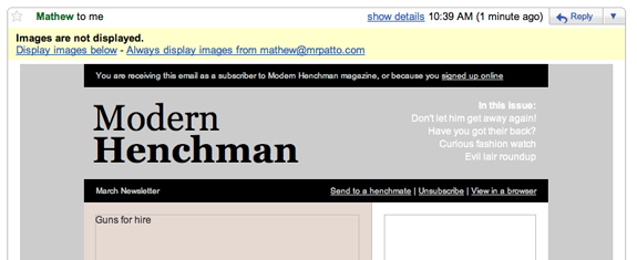

Research over the last few years has shown that a significant percentage (some estimate up to 40%) of email recipients never enable images at all. Add to that all the people who fail to realize they could show images, and you have a huge chunk of recipients who will not see your logo or header image—much less the rest of your email if it’s entirely image-based.
The default image blocking settings for various email clients are shown in the table below. We’ll explain what the last column (Trusted sender img display) means in the next section. For now, just pay attention to the second column: this shows whether images are displayed by default in each of the clients.
Default image blocking in email clients
| Client | Default img display | Trusted sender img display |
| Yahoo Mail | Yes | No |
| Yahoo Mail Beta | Yes | Yes |
| Windows Live Mail | No | Yes |
| Gmail | No | Yes |
| Outlook.com | Yes | Yes |
| AOL Web | Yes | Yes |
| Apple Mail | Yes | No |
| Thunderbird | Yes | Yes |
| Outlook 2007 | No | Yes |
| Outlook 2003 | No | Yes |
| Outlook Express | Yes | No |
| Eudora | Yes | No |
| Entourage | Yes | No |
| AOL Desktop | No | Yes |
Unless you know for sure that your audience is only reading email in Apple Mail, for example, you need to assume that a decent number of people will not see your images (since a number of popular clients, including Gmail, Outlook.com, and Outlook 2019, and Windows 10 Mail block images by default). So that beautiful sales newsletter will just show up as a bunch of empty squares.
You can imagine the impact that will have on the success of your campaign! So, what’s the alternative? There are actually a few ways to work around image blocking.
Tips for navigating blocked images
1. Become a known sender.
Most email clients allow recipients to automatically display images when a message is from a known sender (senders appearing in whitelists, contact lists, or address books). The final column in the table above shows which clients will allow recipients to override their image blocking setting for trusted senders.
You’ll want to encourage your subscribers to add the “from” address you use to their whitelist. You can have a note right on your signup form that asks them to do this. Or, better yet, include instructions on whitelisting or adding the address to their contacts in the subscription confirmation email or your first welcome email. This ensures images will show, and will also boost your deliverability.
In your actual email campaigns you can do the same. To be more helpful, put a page on your site with instructions for how to add an address to the whitelist for different email clients, and link to it.
2. Live without images.
There will always be people who—whether by choice or chance—never enable images for your campaigns, so the design needs to take that into account. Follow a few simple guidelines to improve your results:
Don’t use an image as the first item in your email. Remember that many email clients will use a small preview window, and if the only element that fits there is an undisplayed image, the email might as well be blank. Instead, make sure to start the email body with some preheader text to give a proper preview and entice more opens.
Use alt attributes. Just like you do for a website, make sure to have useful alt attributes for each image. In some cases, they’ll show up when the image is blocked, and can provide a good backup. They won’t always be displayed, or may not be displayed in full. You can see how common email clients will handle alt attributes in the table below.
Alt attribute support by email client
| Client | Renders alt | Comments |
| Yahoo Mail | No | N/A |
| Yahoo Mail Beta | Yes | Applies CSS font styling to alt attributes. |
| Windows Live Mail | No | N/A |
| Gmail | Sometimes | Contingent on text length. |
| Outlook.com | No | N/A |
| Apple Mail | No | Replaces alt text with question mark icon. |
| Thunderbird | Yes | Applies CSS font styling to alt text. |
| Outlook 2007 | Sort of | Replaces alt text with security message. |
| Outlook 2003 | Yes | Applies CSS font styling to alt text. |
| Outlook Express | Yes | Applies CSS font styling to alt text. |
| Eudora | Sort of | Replaces alt text with URL to image. |
| Outlook Mac | Sometimes | Contingent on text length. |
Use captions for important images. If you have an image that contains important content (as opposed to being a decorative element), use a text caption to describe it. That way, even if the image is not displayed—and even if the alt text isn’t shown—readers will have access to the message.
Always have text and images. If you have a balance of HTML text and some images, then the email is useful even without images. If the email entirely consists of images that are blocked, the email is a waste of time and might draw some unsubscribes.
Consider whether you need images at all. Sometimes imagery is essential. For a great example, see the FontShop newsletter, which displays samples of new fonts. Without the images, it’s a lot less useful—so they’re definitely worth including. The FontShop audience is also more likely to be displaying images at all times and using more progressive email clients.
For some cases, though, imagery is unnecessary. Consider a transactional email like an order confirmation. It needs to be clear and able to be scanned, but images aren’t going to contain vital content.
Use a recognizable logo for those who’ll be able to see it, but avoid relying on the images to make your point for you. Ensure that part of your campaign sending process is viewing the email without any images loaded to see how a number of your recipients will be seeing it.
Dissuade clients who want all-image emails. Web designers often say that they personally know better than to send purely image emails, but their clients want everything to look perfect. Here’s the point—it’s the job of designers to show clients why that’s a bad idea. Show them what their email will look like without images, and ask them, “Would you click through on this blank page?”
Remind them that perhaps 30% of people will be seeing exactly that, which could equate to hundreds or thousands of people who might trash the email (or unsubscribe) and never bother loading those images.
One more reason to avoid all-image emails
Yes!Spam filters often use the ratio of images versus text as a flag to gauge whether an email is legitimate. All-image emails are more likely to be marked as spam versus mixed content emails.
CSS support in email clients
There are some designers who will tell you that you have to use <font> tags because CSS never works in email clients. That’s just not the case, and there’s a significant body of tests that confirm it.
While you can safely leave the <font> tags in the bottom drawer with your Pogs and Tamagotchis, there are a lot of cases where you can’t use modern CSS techniques. In our CSS Support guide, we outline which CSS selectors and properties are supported and which are not across popular desktop, mobile, and web email clients.
You can view the Ultimate Guide to CSS Support in Email here.
You’ll want to refer to this resource when building templates as a quick way of seeing which selectors and properties are safe to work with, and which ones you need to watch. Even trickier, you’ll see inconsistent support for some elements, which will work in certain combinations but not in others. So what works in one email might fail in another.
There’s no avoiding the testing process, but the CSS support charts will cut out a lot of the frustration for you. Once you’ve built a few templates, you’ll start to know from memory the quickest way to achieve a solid result.
Webmail clients can be a special case when it comes to HTML email rendering. For example, Gmail comes in at least two different versions, and in Campaign Monitor’s testing we’ve seen variations in how the same email appears depending on which version you’re working in.
Modern internet technology in email
Modern websites contain a lot more than HTML, CSS, and images. JavaScript, audio, Flash, video, animations, and forms are all part of a designer’s toolkit. Which of these work in email clients? This section outlines the current state of play.
Even if you can use a certain technique or medium, you might not want to. People typically go to your website by choice. They go when they want to and with an understanding of what to expect.
An email is an entirely different environment from a website. Having sound or video playing inside an email is more likely to irritate than entertain. For some emails and some subscribers it might be okay, but be very cautious about disrupting your readers’ expectations.
Let’s see how modern internet tech may or may not disrupt those expectations.
JavaScript in email
When it comes to scripting, we can make a somewhat overarching statement: Scripting is unsupported in emails.
This is hardly surprising, given the obvious security risks involved with a script running inside an application that has tons of personal information stored in it.
Webmail clients are mostly running the interface in JavaScript, and aren’t keen on your email interfering with that. And filters on desktop clients often consider JavaScript to be an indicator of spam or phishing emails.
Even in the cases where it might run, there really is little benefit to scripting in emails. Keep your emails as straight HTML and CSS, and avoid the hassle.
Flash in email
In the web browser market, Adobe Flash is almost ubiquitous, but in the email client world, Flash is barely existent. In most cases it’s completely absent, and even the fallback image you can select won’t show up.
Using Flash in your emails should be avoided for the present, as it just doesn’t work. Unsurprisingly, this has a considerable influence on the effectiveness of video in email, which is our next topic.
Video in email
Video can be a very persuasive medium, portraying action rather than just showing a static photo or text description. Whether people actually want to be watching a video in their email rather than on a website is an open question.
As of 2020, there are a lot of different ways that video theoretically could be included in an email message, but, in practice, most of them won’t work for the majority of recipients. Campaign Monitor has tested the following techniques and formats for live video in an email: Flash, QuickTime, Windows Media, animated GIFs (streamed and embedded), Java Applets, embedded MPEGs, and streamed HTML5 video. The detailed results are shown in this guide.
As you’ll see, animated GIFs have solid support, although they’re still subject to image blocking just as much as static images. In addition, Outlook on Windows will only show the first frame of the animation.
It may be wise to still take a simpler approach: Use the thumbnail of the video or capture a screenshot of the player (ideally with a play button present), and put that into your email. Make it link to the video on your website (and link up a caption underneath it, too). It’s one additional click, but it’s guaranteed to work for everyone.
Forms in email
Having an email contain a live form is a great idea. It’s easy for your readers to fill in some details, RSVP, or answer a survey. Unfortunately, the support for forms in email clients is quite inconsistent. Some clients will put up scary-looking security warnings when the reader tries to use a form, and others will just disable the form so it’s unable to be sent.
A lot of people might be able to use a form, but the rest will see a form that does nothing at all—which is a fairly bad experience. The recommended approach is to link to a form on your website, where you know it will work. The level of form support in common clients can be found here.
Testing your HTML emails
If you learn just one lesson from this guide, let it be this: Always, always, always test your emails before you send them out.
The sinking feeling after hitting send and then spotting a typo in the very first heading is terrible. And the bigger the list, the bigger the pit in your stomach.
Once an email has been sent out, it’s impossible to take it back. A website can be updated in a moment, but emails live out their separate lives in a million different inboxes, beyond reach.
There are quite a few methods and elements to test. Obviously, you’ll have all the copy proofed and rechecked by another person. But when it comes to the design and build, testing can be a bit time consuming. With so many different email clients to look at, versions of those clients, and platform differences, it can be overwhelming.
Fortunately, there are a few great services around that take a lot of the pain out of checking your email in multiple email clients:
- Litmus email testing
- Email on Acid email testing
- Campaign Monitor design and spam testing
Each service will take your HTML email and give you back a series of screenshots showing how your email renders in a number of different email clients. You can typically scroll through the whole email, see it with images blocked or images loaded, and gain a fairly good idea if there’s a problem you need to fix.
Given more time and access to all the many email clients already set up, it would be better to physically interact with each one. But, in practice, these testing services are a huge time saver and well worth the cost.
In the quite likely case that something is not working right (content being cut off or displayed in the wrong place, or any number of quirky behaviors), the troubleshooting process begins. If you’re lucky, the problem client will be one like Gmail or Outlook that’s easy to get your hands on.
Then you can tweak and test a few times to make it work again, and perhaps run another full design test to make sure nothing else broke during the fixes.
Sometimes it will be a more difficult client, such as a particular version of Lotus Notes. These can be tough to troubleshoot, and you might need the help of a reader or colleague who can run some tests for you.
This process can be quite a long one. But once you’ve gone through robust troubleshooting for your template, it can be reused over and over for future campaigns, and often adapted to suit multiple designs. So the time will be well spent.
Building the Modern Henchman newsletter
In the final part of this chapter we’ll look at the code required for the Modern Henchman newsletter, which has been developed and tested according to the guidelines we’ve covered.
You can download this template for free with the code archive for this book13 and use it as a base for your own designs, if you like.
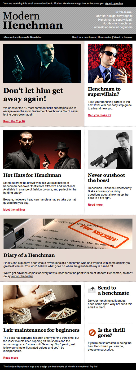
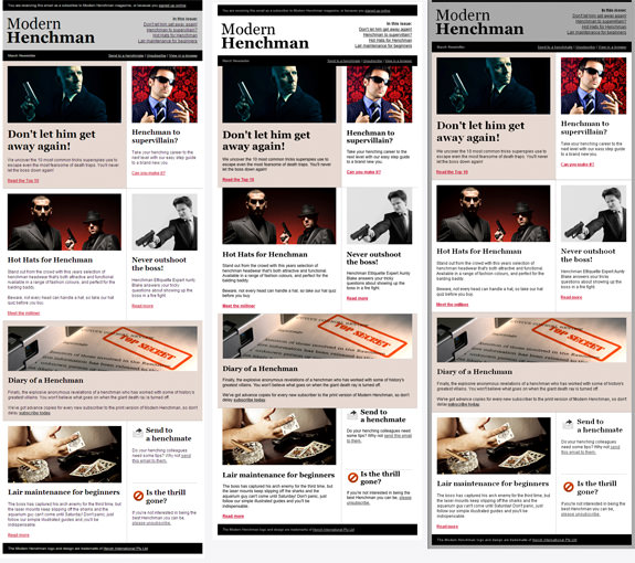
For our client, the Modern Henchman magazine, we’re trying to create a solid template that will be reused each month without requiring stacks of extra time in design or testing. So we need to develop an email that has a structure that can handle longer or shorter content without breaking apart. Figure 4.4 shows a reminder of what we want the final product to look like.
Building the framework
Beginning from the top, we have an introductory section that should show in the preview pane for most readers. It will contain a simplified list of contents for the email and a reminder of why people are receiving the newsletter.
Even with images turned off, that text will be visible, and it’s a great opportunity to convince people to read on. We’ll also put an unsubscribe link right up top, for those who are no longer interested. As we’ve discussed, it’s much better to let them unsubscribe easily than to force them to mark it as spam.
Below the introduction is the masthead, which is 580 pixels wide. That’s narrow enough to be readable without horizontal scrolling for most email clients. Obviously some mobile readers will struggle, but since our main goal is to promote the product of the month, and we want to use a big photo, we can’t go too much smaller.
When you’re designing for your own client, you may be able to use a flexible column width, but remember to consider your goals and prepare to accommodate different content.
The layout for the body content is fairly simple—essentially a two-column structure, but with a least one section that spans across the full width for the product promo.
We already know that CSS floats won’t work, so to build this layout we’re going to use tables to hold the content. To ensure that we can put a background color and image (at least for some email clients) in place, we start with a 100% width container table:
<table width="100%" cellspacing="10" cellpadding="0"></table>Whitespace
Yes!I mentioned earlier that several email clients can be sensitive to whitespace in your HTML. In the examples that follow, I’ve laid out the markup for maximum readability, and it still works well in the clients I’ve tested. However, this can be unreliable, so if you are adapting this template and run into any weird spacing issues, you should try removing the whitespace to see if that helps.
Inside that is our main content container with a fixed width of 580 pixels:
<table class="main" width="580" cellspacing="0" cellpadding="0"
border="0">
You’ll notice that we’re using HTML attributes rather than CSS here for the best results. Nesting tables gives a more reliable layout than we could otherwise achieve, especially with email clients like Outlook and Lotus Notes.
When you’re building your own templates, it’s a good idea to test in Outlook 2007 (if you can) and Gmail as you progress, so that you find any major layout problems early—these two clients are both common and frequent causes of problems.
Fill the table cells with a block color and add some CSS borders so you can see how the layout is holding together as you work on it.
Adding the content
Handling the full-width masthead and introduction section is straightforward—they can be added as simple full-width rows to the content table:
<tr>
  <td class="blackbar">
    <table width="100%" border="0" cellspacing="0" cellpadding="0">
      <tr>
        <td align="left" valign="middle" class="left">
          <p>You are receiving this email ... </p>
        </td>
      </tr>
    </table>
  </td>
</tr>
<tr>
  <td height="115" align="left" valign="top">
    <table width="580" border="0" cellspacing="0"
        cellpadding="0">
      <tr>
        <td width="290" align="left" valign="top" class="logo">
          <h1>Modern</h1>
          <h1><strong>Henchman</strong></h1>
        </td>
        <td width="290" align="right" valign="top" class="issue">
          <p><strong>In this issue:</strong></p>
          <p>Contents listing</p>
        </td>
      </tr>
    </table>
  </td>
</tr>
<tr>
  <td class="blackbar">
    <table width="100%" border="0" cellspacing="0"
        cellpadding="0">
      <tr>
        <td align="left" valign="middle" class="left">
          <p>Month Name Newsletter</p>
        </td>
        <td class="right" align="right" valign="middle">
          <p>Send to a henchmate | Unsubscribe | ... </p>
        </td>
      </tr>
Below that, the two-column layout begins. This looks like a job for yet another table. Nesting another table lets us create consistent padding and margins around the body copy:
<tr bgcolor="#FFFFFF">
<td align="center" class="dotsHoriz">
<table cellspacing="0" cellpadding="0">
<tr align="left" rowspan="3" valign="top">
<td width="15" align="left" valign="top" bgcolor="#e6d9d2">
<p> </p>
</td>
<td width="330" align="left" valign="top" bgcolor="#e6d9d2"
class="mainbar">
<p>Article photo</p>
<h2>Article title</h2>
<p>Article copy</p>
<p>Read more link</p></td>
<td width="15" align="left" valign="top" bgcolor="#e6d9d2"
class="dotsVert">
<p> </p>
</td>
<td width="15" bgcolor="#FFFFFF">
<p> </p>
</td>
<td width="190" align="left" valign="top" bgcolor="#FFFFFF">
<p>Article photo</p>
<h3>Article title</h3>
<p>Article copy</p>
<p>Read more link</p></td>
<td width="15" bgcolor="#FFFFFF">
<p> </p>
</td>
</tr>
</table>
</td>
</tr>This looks more complicated than it is. We create the two columns, again setting explicit widths. As I’ve mentioned before, letting the email clients try to work out how wide an element should be is never a good idea, as the results will vary widely.
The secret to this so-called “two-column” layout is actually more columns, hiding around both sides of the content to create the gutter and margins.
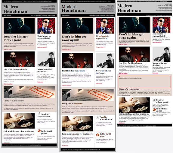
Figure 4.5 shows the content block with borders turned on. I have used the Web Developer Toolbar extension for Firefox to display a border around all table cells, which makes it easier to understand what’s going on. If you’ve never worked with table-based layouts before, or have banished them from your mind, this extension can help you make sense of them as you develop your email templates.
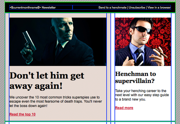

As you can see, we’re using a total of six columns for our two-column layout. I know, it’s ugly and old-school, and makes you feel a little bit ill just to look at it. We all feel that way the first time we go back to table layouts.
The nausea will pass eventually, and you’ll be left with a two-column layout that displays reliably in all the major email clients. The code for the full-width content block is very similar, except that it uses only three columns: one for each gutter and one for the content area.
When you need to split a content area further, all you need to do is nest another table. In our example, the “Send to a friend” and “Unsubscribe” blocks at the bottom of the email require nesting another one-column table, like this:
<td class="sidebar" align="left" bgcolor="#ffffff"
valign="top" width="190">
<table border="0" cellpadding="0" cellspacing="0" width="100%">
<tbody>
<tr>
<td class="dotsHoriz" align="left" bgcolor="#ffffff"
height="180" valign="top">
<h3><img src="images/forward.gif" alt="" align="left"
height="38" width="40">Send to<br>a henchmate</h3>
<p>Do your henching colleagues need some tips? ... </p>
</td>
</tr>
<tr>
<td align="left" bgcolor="#ffffff" valign="top">
<h3><img src="images/unsubscribe.gif" alt="" align="left"
height="40" width="40">Unsubscribe</h3>
<p>If you're not interested in being ... </p>
</td>
</tr>
</tbody>
</table>
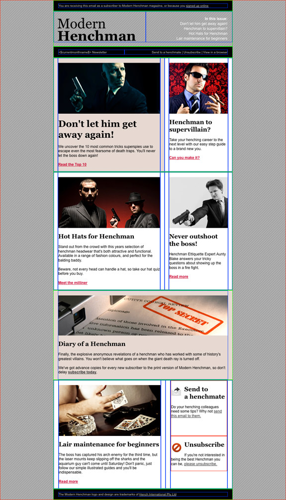
</td></code>The complete layout is depicted in Figure 4.6.

Granular testing for every email client
In building any HTML email template, you’ll reach a decision point. Given that the columns are in place, and will hold together well for almost everyone, we could stop pandering to email clients at this point.
If you and your client are okay with some minor visual variation between email clients, you could revert to more modern techniques for the actual content. Just fill in the headings and paragraphs, style them in your CSS, and let them be rendered according to the email client’s own quirks.
Most of the time your readers are not going to be comparing the email in different programs, so unless something is really broken they’ll be oblivious to minor differences. This is what I’d suggest most of the time, although of course there’s still plenty of testing to be done.
If your client is more demanding, or the design really needs to be consistent, you can continue on with further nested tables for individual content chunks. That way you’ll have a lot more control over spacing around headings, for example, and control over consistency to let you line up elements with each other.
Here’s an example of the effort required to create a consistent heading block:
<table cellspacing="0" cellpadding="4" bgcolor="#000000">
  <tbody>
    <tr>
      <td>
        <h2>The actual heading</h2>
      </td>
    </tr>
  </tbody>
</table>
This is all the code required just to make sure that the <h2> is displayed at the same size, and with the same surrounding space across the big email clients.
Think carefully before you go to these lengths, because it may well be a waste of your time. It’s still good to know that it can be done.
Testing the Modern Henchman layout
Figure 4.7 and Figure 4.8 illustrate how our sample edition of the Modern Henchman newsletter looks in a few common email clients. These screenshots were generated using the Campaign Monitor testing tool, but you can achieve similar results from other services.

It might be difficult to make out in the screenshots, but there’s still some variation from client to client. What you can see is that the overall design is quite close, and certainly doesn’t look broken in any of these clients (even though one of the images has failed to load in Lotus Notes 6.5).
The lesson you take away from this should be that you don’t need to use only images to achieve consistent results with HTML email. Coding your emails the way I’ve outlined might require a bit more effort up front, but they will be more effective, so you’ll reap rewards in the long run.
Wrap up
Creating a truly client-proof HTML template is a work of art. As you can see from this guide, it’s not a quick process—but it is straightforward when using best practices. And, as stated multiple times, you’ll see the rewards over time as these tried-and-true templates will glean engagement and real results.
The web is chock-full of design galleries, and CSS galleries seem to be sprouting up like mushrooms in every corner of it, but there are relatively few HTML email template galleries.
Keep these sites bookmarked for the next design you need to code up, because you can save a ton of time:
- Free templates from Campaign Monitor
- The gallery at Really Good Emails
- ThemeForest templates
There’s no shame in taking a tested template that’s freely available and adapting it to your needs.
Your client has no interest in paying you to fight a battle to the death with Lotus Notes 7—they just want an email that people can read and that achieves their goals.
Over time you’ll build up your own knowledge and a set of working code that you can reuse, which will save you time that’s better spent on the design and business goals.
Using Campaign Monitor, you can import your own HTML for custom email designs, inline all your CSS, and even make templates that clients or team members can quickly edit in the future. Sign up today for free and give it a shot.
This guide was originally published in April, 2010 as an excerpt from the book Create Stunning HTML Email That Just Works! by Mathew Patterson. This guide has since been updated in May 2020.