9 minute read time
How to Structure Your Email Marketing Campaigns for “Scanners”

Article first published September 2014, updated May 2019
How do you read email marketing campaigns that land in your inbox? Do you meticulously read every single word? Or do you scan them looking for things that might be of interest to you?
I subscribe to a lot of email lists as part of my role here at Campaign Monitor, it’s a vital part of my job. However, when I have an inbox full of them each week I tend to process them quickly, scanning each one and only diving in to read more detail if I find something that piques my interest.
When I was processing a particularly large batch recently, I started to think about my behaviour. Does everybody do this, or is it just me? And if it is a common behaviour, how do you create an email campaign that catches people’s attention and gets them reading your content properly?
In this post, I wanted to share some statistics and research about how people read email campaigns, and a few tips on how to structure your campaigns to appeal to scanners like me.
How people really read email campaigns
People consume online content very differently than print or other media.
Rather than reading an email like a book, left to right, word by word, research shows that the majority of people scan email campaigns in an F pattern.
Very few people will read every word, instead skipping over introductory paragraphs and scanning the body of the content looking for items that attract their attention. If they find a particular section that looks interesting, they’ll dive into reading that part.
Your window of time to capture their attention is short as well, with 51 seconds being the average time people allocated to an email campaign after opening it.
How to structure your emails to be read by scanners
With so few people reading your campaigns word for word, how can you create an email marketing campaign that gets your key messages read and remembered?
The key is structuring your email to appeal to scanners, using elements like headlines and images to capture their attention as they scan and draw them into reading your copy in more detail. Here’s a few tips to make it happen:
Break your email into chunks
Rather than having one huge block of text (which can appear very overwhelming), break down paragraphs into smaller, more easily consumable chunks. These lesser sections are much more welcoming and visually appealing for the scanning reader.
What are some best practices for breaking sections into chunks?
- Each chunk should address 1 single point – Don’t try to accomplish everything in each paragraph. Simplify each chunk to communicate one clear and concise point. This helps scanners glean pieces of information in each separate section and cuts down on reader disinterest that happens when messages are disorganized or repetitive.
- Each chunk should have its own headline – Headlines draw scanners in to reading your email. By creating eye-catching headlines in each section, you’re essentially creating a roadmap for your audience. As a person scans your email, your headlines basically say, “Information on X is here!” and help guide the reader to information they are interested in. Make it easy!
- Each chunk should have a supporting image – Nielsen’s study also showed that images are one of the most viewed pieces in an email newsletter, so be sure each chunk has a corresponding visual element to draw in the eye and support the message.
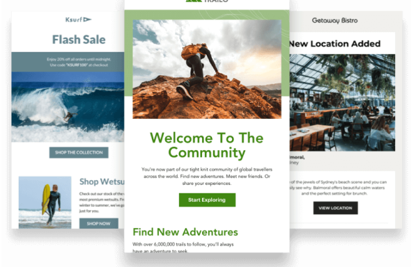
This Freshbooks campaign shows how small chunks of text with their own headline and supporting image make for easy reading.

Prioritize your messages
Think your messages should be placed (in chunks) from most important to least important? You might want to reconsider. The serial position effect, a finding of research by German psychologist Herman Ebbinghaus, shows the first and last messages in a series are the ones we remember.

Based on this information, try these tips when structuring your messages:
- Put your most important message first – The primary effect indicates that readers best remember the first pieces of information in a series. When considering how to organize your email messaging, put the most urgent and important point in the number one spot of your list—it’s likely to get remembered.
- Use a P.S. line – The same study also showed that recall was high at the end of a series—so placing your second most important piece of information in the P.S. line increases the likelihood of being retained. Direct mail marketers know the success rate of the P.S. line as well (and have been referencing it for years.
- Filler in the middle – Your reader might look at the middle body of copy as secondary information, but you can still draw them in by incorporating images, using bullet points, including numbered lists, and keeping copy simple. Your loyal readers still need more than a beginning and an end.
Consider the copy design
We’ve talked about the structuring of email marketing campaigns for scanners in regard to general formatting and information order, but there’s also the element of the copy itself (i.e. font choice, spacing, sizing, etc.) Yes, words have design elements to consider, too.
When structuring for scanners, think about how the appearance of the words themselves help increase readability and comprehension.
- Font choice – When we’re talking about fonts for email campaigns, the key question to address is, “How easy is this font to read?” This study found that simple, clean fonts like Courier and Verdana were winners when it came to perception of legibility, and that Arial and Verdana were chosen by the readers’ for general preference.
- Word spacing – Breaking information into chunks helps with overall spacing, but you’ll need to look at spacing between headers, body text, and bullet points as well. Appropriate word and line spacing makes your content easy to read and will keep your subscribers engaged.
- The bold narrative – If you’ve included bolded text within your email marketing campaign, read through the story your reader sees when only bold text is read—and make sure that story is strong. Ask yourself, “Will the reader achieve the information goal if they were to only scan through and read my bolded copy?”
Getting down into this level of detail in the word structure, you’ll gain deeper control of your email copy as a whole. Don’t be afraid to test new techniques and find out what’s most successful with your unique audience.
Examples of scannable emails
When it comes to email length best practices, it comes down more to the scannability of an email, versus the overall length, at least, in most cases. Earlier, we mentioned that many readers scan an email campaign in an “F” pattern; however, that isn’t the only pattern worth noting.
Now, it comes down to the reader, but another noteworthy pattern is the inverted pyramid. This pattern takes the reader and guides them from the top with a bold header or image down the email to a “point” or top of the pyramid, which generally guides the reader to the call to action.

Source: Campaign Monitor
Below, we’ve listed a few other examples of scannable emails, some of which make use of the inverted pyramid, while others make use of a left-right zig-zag pattern and even the “F” pattern.
Vimeo Top 18 of ‘18
This email by Vimeo is an excellent example of a quick left-right scannable email. With the different color boxes and short snippets, it does a great job guiding the reader’s eyes in a traditional reading pattern. Thanks to the bolded subheadings in each box, the reader can quickly see the topic of each section without having to take too much time to read through it.

Source: Really Good Emails
Takeaway: Make use of colors, subheadings, and different typefaces to help guide the reader’s eye in a traditional left-right pattern.
Jaybird
This email by Jaybird does an excellent job of using “F” scannability pattern for readers. With the sharp left alignment and imagery used in varying alignments, the user can quickly move between the headline, text, CTA, and images of the product.

Source: Campaign Monitor
Takeaway: Alignment of both images and text can help guide the reader’s eye where you want it.
Highlights from Connections
This campaign by Connections uses that left-right pattern; however, it allows for more whitespace in between sections, making it easier on the reader’s eye. In fact, when compared to the Vimeo example above, this email by Connections is actually easier to scan, thanks to the additional whitespace between each body of text and the accompanying image.

Source: Really Good Emails
Takeaway: Spacing is key—don’t be afraid to make use of some extra whitespace to give the reader’s eye a break.
Freshbooks
Finally, this email by Freshbooks does an excellent job of using the inverted pyramid pattern. Not only that, but they also aren’t afraid of using pure whitespace to make the email easy on the reader’s eye, while still providing them with valuable content in a quick manner.

Source: Campaign Monitor
Takeaway: Simplicity goes a long way with readers looking to make quick work of reading an email.
Wrap up
Unfortunately for us marketers, people are so overloaded with information these days that they do in fact scan emails, blocking out the stuff that isn’t of interest and only consuming what is.
However, by breaking down your messages into smaller chunks, prioritizing your information, and being mindful of how the words look within your message, you can create email marketing campaigns that accommodate scanning readers and increase your chances of getting your key messages read and remembered.
Have you found a formatting trick that helps make your emails more successful? We’d love for you to share it with the community in the comments below!
Want to improve your email marketing?
Join over 20,000 other marketers & designers who get tips on improving their email marketing delivered directly to their inbox.