8 minute read time
Best Practices for Image-Heavy Emails in 2019

Every time you turn around, it seems like email clients change the requirements for including images and graphics in your emails. And there’s nothing worse than sweating over the details of your email design, painstakingly ensuring that every word and image is perfect, only to realize your email isn’t rendering the way you thought it would after you hit send.
While we can’t help with all your resolutions this 2019, we can provide everything you need to know in order to optimize your images every single time, every single email. From file size to file format and everything in between, we’ve got your image-heavy emails covered.
We’ve created a checklist filled with the details you need to double check before you hit send. So next time you want to add images to your email, check here first to make sure your images will render beautifully across email clients and across devices.
2019’s best practices for image-heavy emails
Read on for the ultimate image checklist to consult before you hit send on your next image-heavy emails:
1. Are your images high-quality?
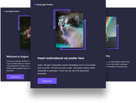
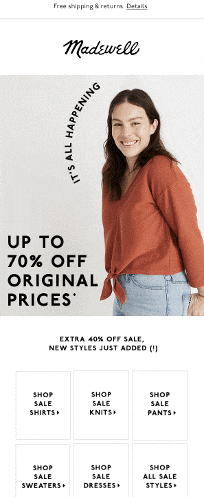
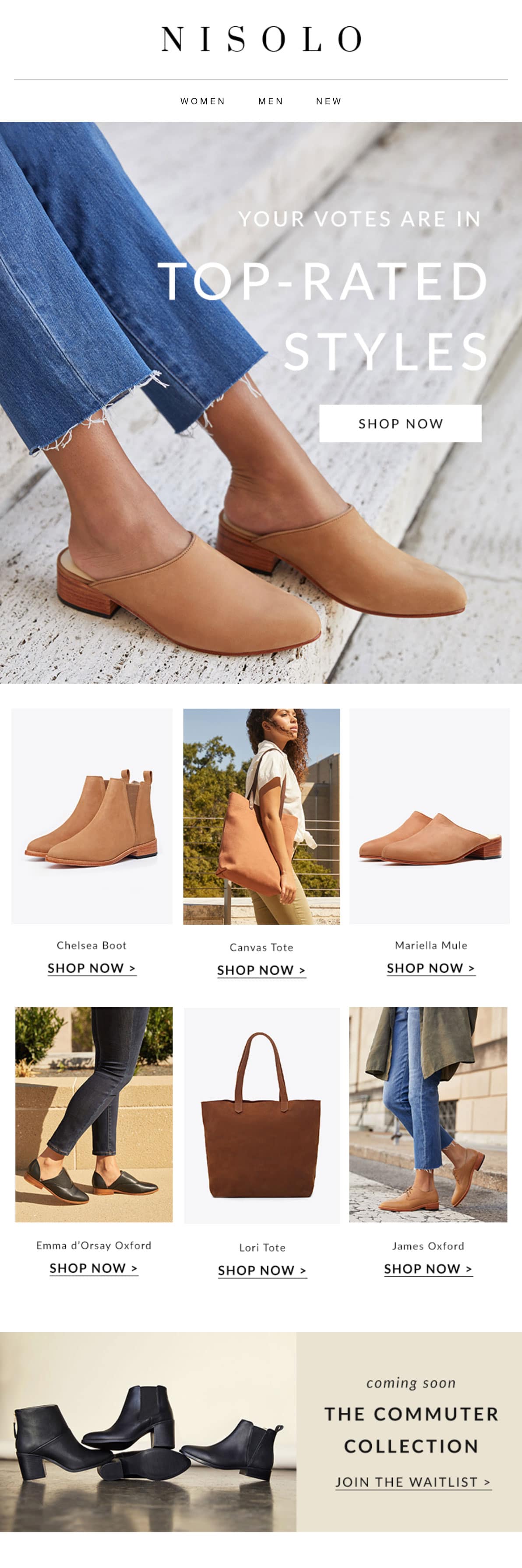
The most important thing when you get ready to send your emails is to make sure your images look great. If your subscribers receive an email with blurry images or images that have been cropped strangely, it looks like you just threw something together and didn’t care enough to do the bare minimum.
In order to make sure you’ve only included high-quality images, we recommend setting your images to the maximum quality with a resolution of 72 DPI, or high dots per inch, and increasing the dimensions of the image in order to give the high-DPI displays more image data to work with. In fact, blurriness is caused when displays have to extrapolate pixels, so providing more image data will keep your images looking sharp.
Similarly, your images should be in RGB color values and not CMYK color values, since CMYK color values are meant for print and won’t work online.

How do you deliver the best, sharpest images for retina displays? You should double the size of your image—for instance, we recommend starting with an image that is natively 1280px wide then telling it in the HTML to display 640px in order to scale the larger image down, giving your image crisp, sharp lines.
2. What are your image file sizes?
Having too many large, high-quality images can adversely affect loading times, slowing your emails way, way down. And if your email doesn’t load quickly, odds are your subscribers will just delete it instead of waiting around.
You should keep an eye on your data to see what email clients your subscribers use to open your emails most often—which is good advice for any email you send, image-heavy or not—to help you nail down the specifics, but generally, you should aim to keep your total image data weight between 600-800k.

Once you know how your clients open and read your emails, you can discover what data weight works best and how images affect your open rates.
3. What format are your images in?
You’re probably familiar with JPEGs, PNGs, and GIFs, the three most universally accepted file formats. Of these, JPEGs have the lowest quality: JPEG files will retain color data, but will shrink your image by selectively discarding some data. PNGs maintain a higher quality, and therefore are larger files which will increase the size of your overall email and slow down loading times. GIFs allow for image and animation looping and you’ve probably seen them everywhere lately.
JPEG
JPEG images have the lowest quality, but they’re also the most compressed—AKA smallest—meaning they’ll load faster and take up less space in your email. Often, images still look great as a JPEG and you’ll have the added bonus of faster loading speeds and the decreased likelihood of your email getting blocked by a spam filter.
JPEG images still work best for photographs, as long as those photos don’t contain text. If you do have text, you should consider using PNG images instead.

Your compressed image will be visually pleasing and also improve your reader’s experience.
PNG
PNGs work well when you have an image with sharp edges, need to place an image such as a logo on a transparent background, or if you have a really colorful image. They’re also great for text.
As if file formats aren’t complicated enough, there are actually two types of PNGs: PNG-8 and PNG-24. While PNG-8 only shows 256 colors, the PNG-24 file can display millions of colors.
But as you’d expect, this greater capacity for colors comes with increased file size. In the end, you’ll have to decide how you want to balance file size and color.
GIFs
You’re probably familiar with GIFs, but in case you aren’t, they’re images that loop, creating animation without using a video format. Since many email clients don’t allow video, GIFs can be a great way to work around limited video capabilities. Also, a cinemagraph is a type of GIF that animates only a small portion of an otherwise still image. There are plenty of ways to get creative with GIFs to enhance your subscriber’s experience when they read your email.
Unfortunately, GIFs don’t show nearly as many colors as PNGs or even JPEGs, so they might not be the best option if you want to include sharp, super colorful photos. On the other hand, the fewer colors allow for GIF size to remain pretty small, which can be helpful.
Remember, if you have to change a file format or size, you’re better off going from higher quality to lower and a larger size to smaller. Usually, the loss of quality and size will go unnoticed by your readers, but you’ll run into problems if you try to stretch an image or move from a lower-quality format to a higher one.
4. Did you design for accessibility?
Remember that just because you’ve designed an image-heavy email doesn’t mean that all of your subscribers are going to see it that way. You want to be sure that your emails offer an inclusive experience by designing for accessibility, ensuring all of your subscribers can read it, even those with vision issues.
Alt-text
Many of your subscribers will use screen readers to understand your message, so you’ll need to include a text alternative, known as alt-text, to communicate with these screen readers.
In order to design for accessibility, your informative images—like those that contain images of products or text—must have alt-text that conveys the message of the image. Purely decorative images should have an empty or null alt attribute (alt=””) to tell screen readers to ignore the message.
Contrast
Some of your subscribers will not be able to differentiate colors as well as others. In order to make sure these subscribers can see your email easily, increase the contrast between backgrounds and text or images.
Not sure what’s enough contrast? Great news: There’s an app for that. Apps like Color Oracle for OSX can simulate a variety of color deficiencies so you can see for yourself whether you’re providing enough contrast or not.
Coding
In order to really design your emails for accessibility, you’ll want to be sure you’re using the appropriate code. But don’t panic! This doesn’t mean you have to understand all the intricacies of code. Just be sure that you include a clear hierarchy in your headers instead of relying on stylistic choices to differentiate the separate parts of your email. You’ll also want to descriptive include link text or CTAs other than “Click Here” or “Buy Now” in order to communicate exactly what a link will do.
Wrap up
It’s important to note that some email-heavy images aren’t being opened at the rates they used to be and including too many images in your email might get your message caught by a spam filter.
Some people consider emails with too many images too promotional and prefer emails with more text. The increased text makes it seem like your brand is sending a note to a friend, as opposed to pushing the hard sell.
In order to get the most out of your image-heavy emails, be sure:
- Your images do not distract from the content of your message.
- The images do not slow down the load time and result in a negative user experience for your subscribers.
- The images are balanced with the right amount of text so you don’t come across as too promotional.
- Your images are all high-quality and fit with your overall branding and messaging.
As long as you follow these tips to make sure your image-heavy emails perform to the best of their ability, you’ll be sure to see solid results from your next email marketing send.