When was the last time you redesigned the templates you use to send your email marketing campaigns?
If it’s been a while, you could be missing out on valuable clicks to your website.
This is the story of how we redesigned our blog email and landed a 127% increase in our email click-through rate, and how you can too.
Need help with design inspiration? Check out our Really Good Guide to Email Design. (It’s even got a checklist!)
The old email
Each time we published a new blog post, we were using the RSS to Email feature of our own Campaign Monitor account to automatically pull a summary of the article and send it out to subscribers.
It was great functionally and made it really easy to distribute our blog content to subscribers.
However, the email looked like this:

As you can see, it wasn’t the most visually appealing email and it wasn’t aligned with the beautifully-designed campaigns we usually send to our subscribers.
It also wasn’t optimized for conversion either, and this significantly affected the results we were seeing. This template did fine, but we knew it could do better.
The new email
We decided to use one of the built-in templates in the drag-and-drop email builder to redesign the email and then test the new design against the old one.
Here’s the new email:

The result? The redesigned email had a 127% higher click-through rate than the old one.
Just to make sure, we continued to test the old design against the new design on the next few emails we sent. Every time, we saw a very similar outcome. It became clear the new design worked well.
Don’t forget to design for accessibility. Want to learn how? Read the guide.
But why? What was it that made this new design convert so much better even though the text content and the offer were exactly the same?
Here is our take on what this template perform better (and a few tips that will help you boost your own email performance without much effort on your part):
Visual hierarchy
In the old design, the most prominent element—which makes it the element that readers focused on first—was the large Campaign Monitor logo. But in the new design, the title of the blog post is the most prominent element.
This immediately draws people into reading the content and increases their motivation to click through and read the full article.
Modern design
The typography and layout in the old design were a bit dated and didn’t instill much trust in the reader that the post was going to be high-quality.
On the other hand, the new design features a modern color palette and beautiful typography that reassures readers the post will be high-quality and is worth their time.
A stronger CTA
In the old design, the only link to the blog post was a small text link at the bottom of the email whereas the new design features a large, high-contrast button that draws the reader’s eye.
The strong CTA makes it clear to readers exactly what next step they should take.
Discover more tips for designing high-performing email campaigns.
How you can get a similar result
A lot of businesses set up their email templates once and then continue to send campaigns for many years using the same template.
Yet the environment in which people read email frequently changes. Not only do more and more emails compete for your reader’s time, but your subscribers also consume email on an increasing array of devices.
So in order to get the best results from your email marketing, consider revising the templates you use to send campaigns.
Email marketing tools like Campaign Monitor come with a variety of professionally-designed templates that look great on both desktop, tablet, and mobile devices. Spread across several categories (like newsletters, promotions, events, etc), they’re perfect for the kind of emails your business sends.
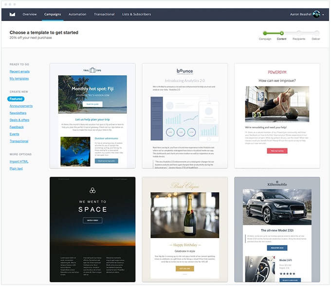
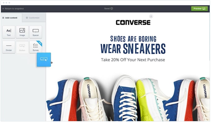
Similarly, these tools also have drag-and-drop email builders that make it quick and easy to add your content and make it your own.
Here’s a screenshot of Campaign Monitor’s builder in action below:
Between the professionally-designed templates and the drag-and-drop email builders that tools like Campaign Monitor offer, it’s really easy to redesign your email template and increase the results you get from your email marketing campaigns.
Wrap up
It took us about 30 minutes to redesign the template we used to send our blog subscribers email, and we more than doubled our click-through rates for every one of those emails we send moving forward.
Not too shabby.
By using the professionally-designed templates and the drag-and-drop email builders available in tools like Campaign Monitor, this kind of conversion growth is within the reach of any marketer today, regardless of business size or years in the industry.
So give it a go today, and maybe you’ll get an even better result than we did! We hope so.
Get a better email template
Campaign Monitor comes with a variety of professionally-designed templates you can use to send beautiful campaigns that get results.