5 minute read time
How (and why) to use an email tester with every campaign

Article first published April 2011, updated March 2019
You have important clients to please. If you want to please your clients, you first have to satisfy your subscribers.
How exactly do you please subscribers? By providing them with valuable content in a format that’s easy to access and read. If your emails don’t look right in their inbox, the interesting content inside them won’t matter.
How (and Why) to Use an Email Tester with Every Campaign
In this post, we’ll explain why routinely using an email tester is so important and how to send test emails for every campaign.
Why you need to send test email for different email clients
Dozens of different email clients exist today. Although you don’t need to test for all of them, you should consider at least testing the top ten.
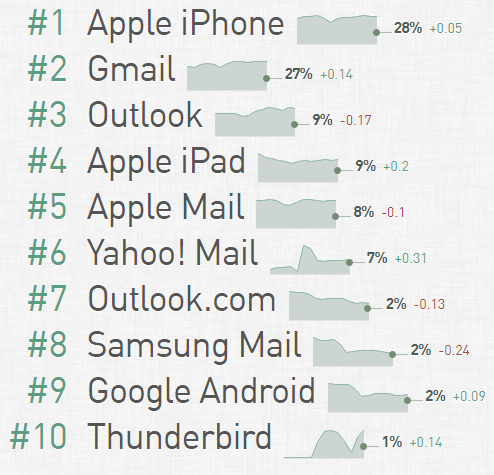
Source: Email Client Market Share
A majority of people prefer Apple iPhone and Gmail for opening their emails. Gmail, for example, has over 1.5 billion active users.
It’s important to send test emails because they will display differently on each client. In some cases, the difference might be negligible, but, in others, it could be painfully obvious. You won’t know until you run a test.
Before designing your emails, it’s worthwhile to analyze data you’ve collected to figure out which clients your subscribers use. Don’t assume that your subscribers use the most popular clients. Older demographics may still prefer Outlook or Yahoo!, while professionals may use niche clients for work.
Keep in mind that over half of all emails are opened on mobile devices. Many shoppers like to read emails on their smartphone first and re-open them later on their desktop or laptop when they’re ready to make a purchase.
How to test your emails
The easiest way to test your emails across multiple clients is to enlist the help of a cutting-edge email service provider.
At Campaign Monitor, for example, our templates are pre-tested to look great on all the most popular email clients. All you have to do is customize the details and hit send. All of our templates also come pre-optimized for smartphones, and our Inbox Preview feature gives you a detailed look at your email campaign across 30 different email clients.
If you’re on your own, you can still run an email tester. Simply create dummy accounts for all the email clients your subscribers use. After you’ve finished designing each campaign, send a test email to your dummy list, and be sure to open the emails on both desktop and mobile. It’s equally important to click all of the links to check their accuracy, load speed, layout, and function.
Don’t forget to enlist the help of an email subject line tester too.
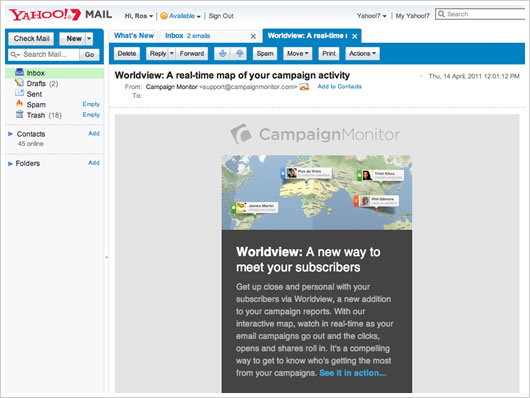
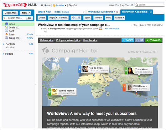
Other email best practices for Yahoo! Mail marketing
Soon after publishing our recent post on Mobile email design in practice, it was pointed out to us that using @media queries to optimize email for mobile devices has a downside. As it turns out, Yahoo! Mail gives precedence to the @media stylesheet, using the CSS styles defined within, over any inline styles in the HTML email.
However, there’s a straightforward solution. It turns out that Yahoo! Mail ignores any styles that use attribute selectors, meaning that you can use these in your @media queries to ensure that Yahoo! Mail doesn’t override existing inline styles with your @media -defined ones. For example, you would change:
.codeblock {
width:500px;
display:block;
padding:20px;
overflow:none;
word-wrap:break-word;
margin-top:20px;
margin-bottom:20px;
background: #ededed;
}
@media only screen and (max-device-width: 480px) {

...

table.table, td.cell { width: 300px !important; }

table.promotable, td.promocell { width: 325px !important; }

...

}
…to the attribute selector format, like so:
@media only screen and (max-device-width: 480px) {

...

table[class=table], td[class=cell] { width: 300px !important; }

table[class=promotable], td[class=promocell] { width: 325px !important; }

...

}
The result for us was a restored-width email newsletter in Yahoo! Mail that displays consistently across the most popular webmail and desktop email clients.
This solution doesn’t affect the display of mobile-optimized email in the iPhone and Android’s respective Mail email clients. However, it does affect how emails render in Yahoo! Mail’s mobile browser client, if that’s a concern to you.
The danger is that Yahoo! Mail will someday support attribute selectors and render this technique useless, so keep testing and hope that they properly implement @media queries well before then.
Many thanks to mobile email design legends Ed Melly and Stefan Velthuys for outlining this excellent mobile optimization for our monthly newsletter. We hope this helps you get your HTML emails close to pixel-perfect in both desktop and mobile email clients alike.
Wrap up
Implementing an email tester every time you craft a new campaign sounds tedious, but it’s worth the effort. It’s hard to justify the effort of designing beautiful emails and writing hard-hitting copy if your emails won’t display properly on your subscriber’s devices.
Need an email subject line tester? Check out these important tips for designing subject lines that get your emails opened.