6 minute read time
6 Free Icon Sets You Can Use to Make Your Next Email Marketing Campaign More Beautiful

This post has been updated as of July 2019 and was originally published in September 2014
Although beautifully-designed email campaigns are something many marketers want, not everybody has the resources to easily make it happen.
So we went searching for resources we could share with you to make your email campaigns more beautiful.
We’re huge fans of icons over here at Campaign Monitor and you’ll see them featured in our newsletter and a lot of our communications, so for this post we pulled together some of the best icon sets from around the web that you can use to make your next email marketing campaign more beautiful.
1. Stylicons

This icon set by Stylicons features 20 icons with a cool cartoon illustration style wrapped in a rounded square border. Subject matter varies from tech through to charts and locks and you can download them for free in PNG format, which makes it easy to drag and drop them into your email campaigns.
2. Flat icons
![]()
This icon set by FreeVector features 18 flat icons Subject matter includes business and social media, and they come in vector format for easy sizing to your email marketing campaigns.
3. More flat icons

This icon set courtesy of Roundicons contains 60 beautifully designed round icons with a great animation style. They all come in PNG format in an awesome variety of sizes, even going as high as 2133 x 2133 for great performance even on Retina displays.
If you do have some graphic design ability, they also come with fully layered PSD files so you can change colors and sizes until your heart’s content.
4. Vector icons
![]()
This icon set from Vecteezy features tons of icons with a very particular style. Given that there are so many icons, the subject matter varies from technology through to people and more.
The great thing about this set is how dynamic it is. You can use these icons for virtually anything.
5. Token icons

This icon set from Brsev features 128 different icons in a simple monotone style. The subject matter is heavily focused on technology with iPods, laptops and cameras all featuring.
6. Minimalist icons
This minimalist icon set from Flaticon features a collection of images with a very minimalist style. Subject matter varies from currency to tech.
If you have access to Photoshop, it’s really easy to change the color of these icons using Layer Styles.
What to consider when choosing marketing campaign icons
Choosing icons for your email marketing is not as simple as it may look. After all, the purpose of the icon is not just for aesthetics. Icons help you communicate your vision, mission, and brand identity.
So, how do you ensure that your icon choice helps you meet all these goals?
1. Choose your colors wisely
When it comes to any visual element of your email, you have to ensure that it matches your brand style and personality. Colors play a big role in your brand identity, hence your choice of colors has to fit in with your brand style.
Research has shown that 80% of customers identify brands by their colors. Changing an element of your color scheme can confuse your readers, leading them to become suspicious of your emails. Your logo should blend in naturally with all the other elements of your email to be aesthetically pleasing and communicate your brand personality as well.
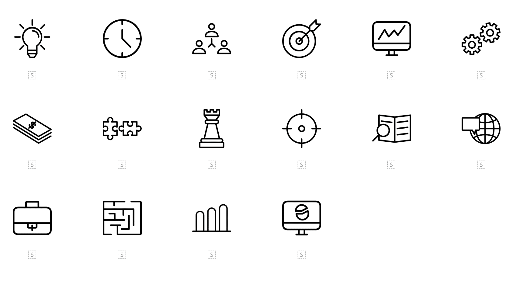
2. Use icons that “speak”
One of the purposes of icons is to help you communicate your message clearly. As such, your choice of icons should be determined by the message you want to communicate. In short, your icons should speak to your audience, expressing your words visually.
![]()
Source: Flaticon
Simply looking at the icon immediately gives you an idea of the message it has been designed to convey. Your customers should not struggle to decode the meaning of your icon.
3. Don’t be afraid to use humor
Icons are meant to lighten the mood and make email consumption more pleasurable. One way to do that is to use humorous icons. Here’s an example of how the Beardbrand uses a marketing campaign icon to help express their humorous personality. Their icons also make an otherwise dry topic more interesting to read.
![]()
Source: Really Good Emails
Creating an icon that is unique to your business is a great way to set yourself apart, and also to set the tone for your content.
4. Keep your marketing icon simple
One mistake some brands make with their icons is overcomplicating them. The point of using icons isn’t clever design as much as it’s simple, digestible design. Failure to keep your marketing campaign icon simple could result in mixed messaging.
![]()
Source: Really Good Emails
Your icons should clearly convey your message so that someone can skim through your email and understand your point immediately. This makes the main points of your email instantly recognizable.
Iconography best practices you should follow
Before you go ahead and adorn your next email with your icons, consider these iconography best practices:
- Make sure your icons are big enough to display well on mobile devices
- Use elements people are familiar with
- Keep your design concept consistent for your icon set
- Avoid using similar icons to convey different messages—each icon should be distinct
Wrap up
As mentioned earlier, we’re big fans of icons here at Campaign Monitor and believe that the right icon can be a great way to both communicate your message and make your email campaigns look great.
When using icons, it’s important to keep your message clear with bold and simple imagery that gets your point across. When used correctly, icons can:
- Organize your content more efficiently
- Express your ideas in a simple way
- Replace heavy images to create email ease-of-use
- Make your email more interactive
So, keep these icons sets handy next time you are creating an email marketing campaign and drop them in to give it that something extra.
Want more icon sets and design resources? Our guide, How to get Better Marketing Results with Beautiful Design, features 15+ resources that marketers like you can use straight away to make your email campaigns, websites and landing pages more beautiful and more effective.