13 minute read time
How to Create the Perfect Call to Action for Your Email Marketing Campaigns

Is your email click-through rate lower than you’d like?
You’re getting everything right. You’re writing great email subject lines, structuring your email for scanners, and writing simple copy that sells.
But, for some reason, people still aren’t clicking through to your website to learn more or take you up on your offer.
It may be that the call-to-action (CTA) button you are using in your campaigns is letting you down.
Read on to see a few samples of outstanding CTAs as well as a few different key aspects that need to come together to create the perfect call to action for email campaigns.
What are CTA buttons and why are they important?
CTA buttons are the buttons you use in your email campaigns that link to somewhere outside of the email, usually to a website or online application.
They are important because they increase click-through rates by making it clear to the reader what their next step should be.
We did a bit of experimentation and found that using a button-based CTA increased our click-through rate by 28% over a link-based CTA.
This result comes from the fact that buttons have a few unique attributes that linked text doesn’t, including:
- Size – Often a button will be much larger than a linked piece of text, catching the reader’s eye.
- Design – Buttons often have design elements that links don’t, such as shadows, gradients, and other effects. Design elements can make them stand out to readers.
- Color – Often, buttons will have a different color to the background and text, and this contrast draws the eye and makes the reader notice them more.
- Whitespace – When a button is set away from other elements in the email, the whitespace around it creates an area free from distraction, leading the reader right to it.
When we look at those attributes combined, it’s clear that a button is perfect for capturing the attention of scanning readers and driving them towards conversion.
What is a CTA in email?
After a reader examines the content of your email and has a better idea of who you are and what you offer, they’ll see that big button at the bottom of the page tempting them to dig deeper. By clicking on the button, they’re increasing your traffic and taking the first step towards a healthy relationship with you, the merchant.
Calls to action in email campaigns test a customer’s trust in your company. If they like what they’ve seen thus far, they’ll want to know more. You convinced them that you’re worth their time and attention, so a click of the CTA button is bound to come next. These buttons also hold a reward for the customer, such as a chance to try your service or products at no cost or at a discounted price.
How do you write a call to action?
To write a perfect call to action in an email, you’ll need to consider what your customers want from you. Are they likely to get excited about a free trial or a chance to test your products at no charge? When the marketer can pinpoint what a customer is feeling or desiring, they can write the call to action to meet those desires.
The best way to understand how to write a call to action in an email is by looking at some solid CTA buttons used by companies that understand their audiences and know how to entice people at first glance.
Dropbox
The CTA button in this Dropbox email is simple and utilizes the many aspects of the brand, such as color scheme, but the button offers individuals a discount, something few people are going to think twice about before clicking. The opportunity to get something or try something at no initial cost is likely to hit home for several people intrigued by a potential service.
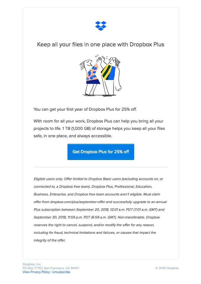
Source: Really Good Emails
Netflix
The online streaming service provides customers with a CTA button that offers them a chance to try Netflix free for a full month.
And utilizing red is a smart idea. According to a Huffington Post article, red is associated with “warmth” and a “call to action,” so the utilization of red for a CTA button makes perfect sense.
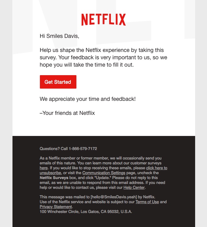
Source: Really Good Emails
Chatbooks
Chatbooks, a company that creates photo books from the pictures on a mobile device, uses their simple color-contrasting CTA button to promote engagement. One of the reasons why this CTA is so impactful is the offer itself. The CTA button showcases a 20% discount offer, which should encourage recipients to leave their inbox and head over to the Chatbook’s site.
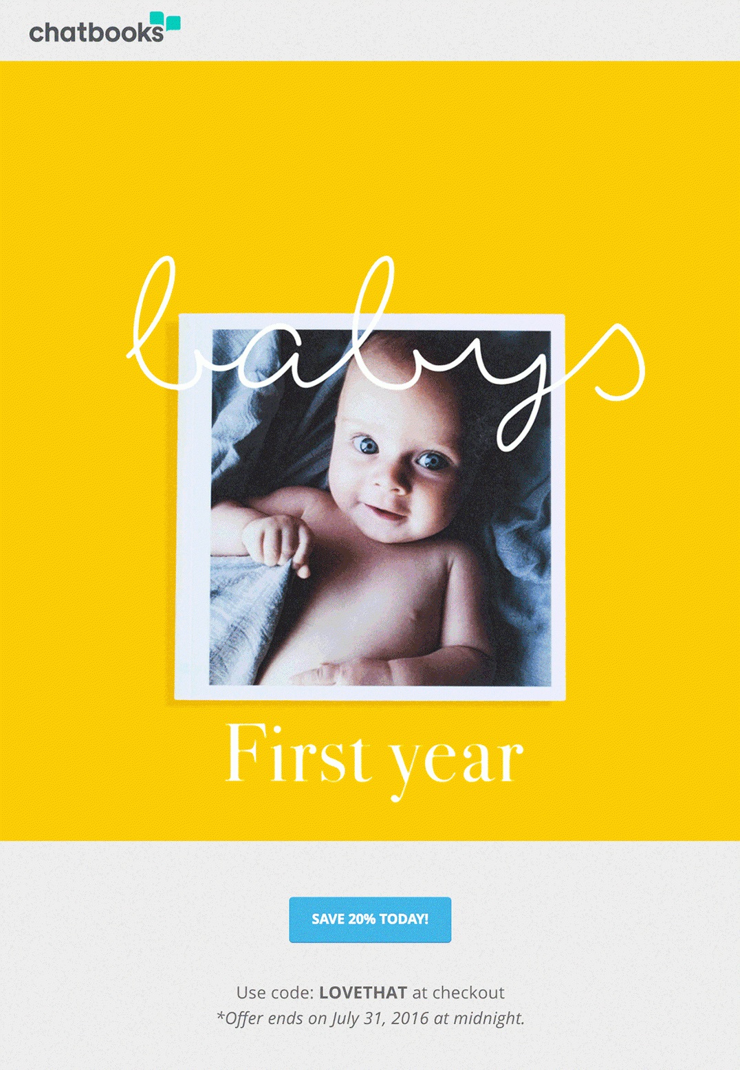
Source: Campaign Monitor
But how do you create an effective CTA button for your next email marketing campaign?
The 3 aspects of effective call to action buttons
An ideal CTA button has three main aspects that work together to create an effective conversion point for the reader. Copy, design, and placement can all have substantial impacts on a call to action in an email.
1. Copy
The words (or copy) on your CTA button are what inform and encourage the reader to act on the conversion. Your copy should compel the reader to act by addressing each of the following areas.
Be specific
As humans, research shows that we innately fear the unknown. We like as little ambiguity in our daily lives as possible, so it’s a good idea to write copy on your CTA button that explains exactly what will happen when the reader clicks on it.
The team over at eWebDesign understands this principle and puts it to good use in their email campaigns. The precise copy they use on the CTA ensures every reader knows exactly what is going to happen when they click it.
Takeaway: When you are writing your next call-to-action button, make sure to be specific about what will happen when the reader clicks the button. It will help reduce any anxiety the reader has towards clicking it and will ultimately lead to more conversions.
Focus on the benefit
People’s time is precious, and you need to promise them a benefit to get them to click-through from your email and take your offer.
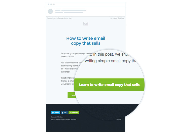
A good example of this is the campaign for our recent post on writing email copy that sells. Instead of using generic button copy like “Read more,” we encourage people to click-through by reinforcing the benefit of reading the post (learning to write email copy that sells).
In the past, we’ve done several A/B tests comparing benefit-focused copy to generic copy and, each time, the benefit-focused copy has increased click-through rates by about 10%.
Takeaway: Instead of using generic button copy like “Read More” or “Buy Now,” use the button copy to reinforce the benefit the reader will get from clicking through from your email.
Be careful of friction words.
Friction words are those that imply your reader has to do something they don’t necessarily want to do.
Common friction words include:
- Download
- Buy
- Order
- Submit
Nobody wants to buy or download something. They simply want the benefits of buying or downloading the item.
So, to reduce the perceived effort of your readers, replace these friction words with frictionless words like “Get” or “Learn” and follow them up with a benefit statement (I.e., “Get your free account”).
When Michael Aagaard at ContentVerve tested this, he saw a 14.79% increase in conversions just by changing one word.
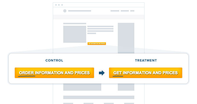
Result: 14.79% more conversions. Statistical Confidence: 95%.
Takeaway: Decrease the reader’s perceived effort in converting by removing words that suggest they need to do something they don’t necessarily want to do, like download or buy.
Instead, replace them with words like “Get” or “Learn” that imply a benefit.
Give ownership
Studies have shown that human beings are far more driven by avoiding loss than they are by achieving gain.
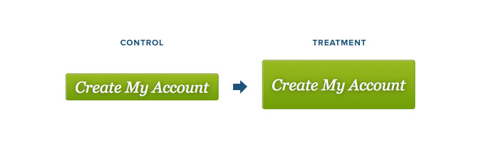
So, when creating CTA buttons for your email marketing campaigns, use the first-person possessive determiners such as “my” to give people ownership of the offer and trigger that sense of motivation that comes from avoiding loss.
When our friends at Unbounce changed the word “Your” to “My” in their call-to-action buttons, they saw a 90% increase in conversions.
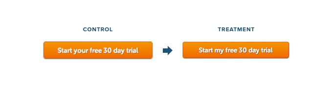
Result: During the campaign, the treatment increased CTR by 90%.
Takeaway: Use the first-person possessive determiners such as “my” in the copy of your CTA button to give people perceived ownership of your offer and trigger their sense of loss aversion.
2. Design
Along with the copy, the design of your button is the other critical element you need to think about, and your button should be designed with these concepts in mind.
Stand out on the page
First and foremost, your buttons need to stand out amongst the rest of your content to ensure they get noticed.
One of the best ways to do this is by selecting a button color that contrasts the other colors used in your email campaign.
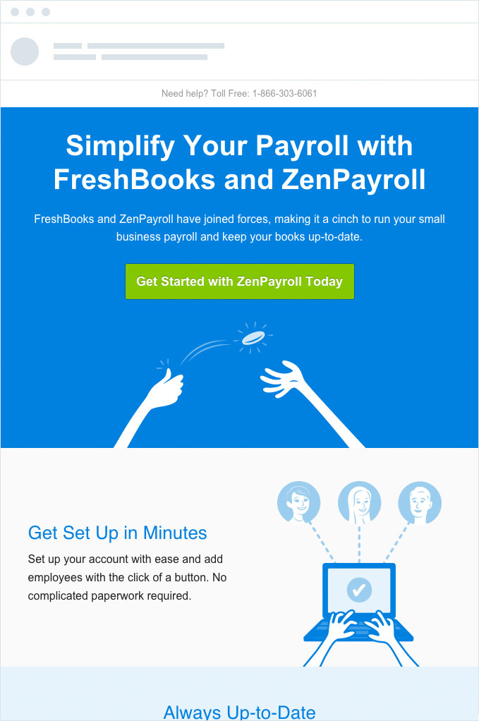
Take this email from Freshbooks, for example. They use a bright green button for the main call to action in the email, which stands out against the predominantly blue and grey colors used through the rest of the campaign.
Takeaway: Use contrasting colors to make sure your CTA button stands out amongst the rest of your content. If you’re not sure, try using the infamous squint test to see whether you’ve made the button prominent enough or whether you need to go back to the drawing board.
Look like a button
There is an old saying in usability design circles that says, “Familiarity breeds usability.” When people are familiar with something, they intuitively know how to use it.
People have been clicking buttons on the web for years, and they intuitively know it’s what they need to do to get to the next step.
So be careful about getting too fancy with your button design, as buttons that don’t look like buttons tend to get clicked less.
This email campaign for our recent guide on How to get Better Marketing Results with Beautiful Design follows this rule nicely.
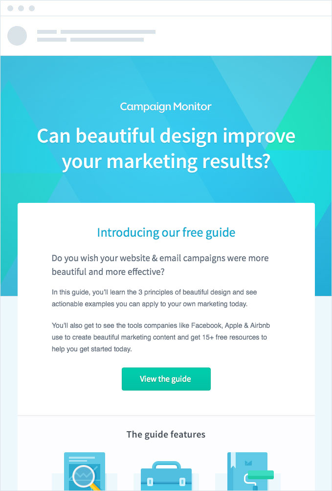
The main CTA button features a rounded square background with a smooth gradient, leaving no confusion in the reader’s mind that this is a button they can click to go ahead and read the guide.
Takeaway: When designing CTA buttons for your email marketing campaigns, avoid the temptation to get too fancy, as people might not realize it’s a button they can click. Use rounded square backgrounds, where possible, and add a gradient or stroke to the button to help it stand out on the page.
Appropriately sized
Although it’s tempting to make your CTA button huge to ensure it gets noticed and clicked, testing has shown that it may not be a great idea.
When ContentVerve tested making their client’s main CTA button extremely large, they actually found that it decreased conversions by about 10%. They hypothesized that the larger CTA button drew the reader’s attention away from the copy and images and presented them with the conversion point before the reader was convinced of the value of converting.
Result: 10% decrease in conversion. Statistical Confidence: 95%.
Takeaway: Make sure the button you create and add to your email marketing campaigns is appropriately sized for the rest of the email. You want people to notice the images and headings in your email as well. Otherwise, if the first thing they see is the CTA button, they will likely ignore it, as they haven’t been adequately convinced of the value of your offer yet.
Surrounded by whitespace
Whitespace (sometimes known as dead space) is the blank area around your call-to-action button.
Adding ample whitespace around your CTA buttons encourages click-throughs by separating them visually from other elements in your email and helping focus the reader’s attention on them at the right time.
A good example of this is the Inside Design series by InVision. By adding ample whitespace around the main call to action in the email, they draw the reader’s attention and make it very clear what the next step should be.
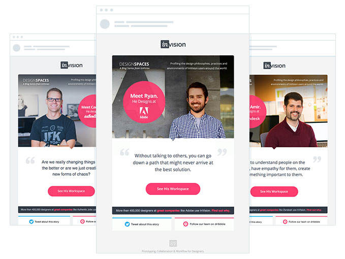
Takeaway: Use whitespace around your main call-to-action buttons to help them stand out from the other elements of your email campaign and get noticed.
However, too much whitespace between elements can give readers a feeling that the two aren’t connected. Use your best judgment to ensure your copy and CTA button are separated enough to stand out, but close to enough that your readers know they are connected.
3. Placement
There has long been debate amongst email marketers as to where the call-to-action button should be placed. Many believe an email call to action needs to be above the fold. However, with people reading email on so many different devices and screen sizes, this can be a tricky rule of thumb to follow.
Here at Campaign Monitor, we believe the ideal placement of the CTA button is relative to the complexity of the offer.
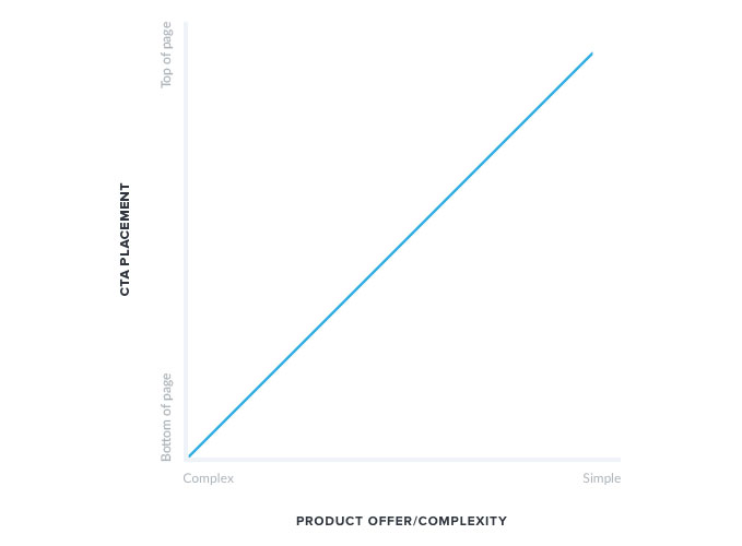
If the product/offer you are making in your email campaign is easy to understand, and the reader would have little anxiety around taking your offer, then positioning the CTA towards the top can increase conversions. A CTA near the top of the content allows readers to easily find and click the button without having to read long paragraphs that try to convince them to do something they are already convinced to do.
However, if the product/offer is a bit more difficult to understand and the reader may have some anxiety towards taking your offer, then positioning the CTA button high in the email will likely reduce conversions, as they will see it before they have been adequately convinced they should be taking the conversion action.
The team at Authentic Jobs understands this and puts it to practice nicely in their email campaigns.
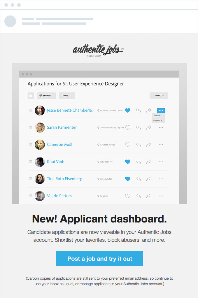
Although the image and accompanying headline push the CTA button well down the email, they realize that the reader needs to be convinced the offer is worth their time first and use a beautiful product image and compelling copy to convince the readers of the value of converting before presenting them the CTA button.
Wrap up
Call-to-action buttons are the main drivers of click-throughs to your website, product, or whatever other destination you choose, so it’s critical to get them right.
Tools, such as Canvas and Buttons.cm, make it easy to create great-looking buttons that work across all devices.
Use the email marketing call to action best practices when planning your:
- Copy
- Design
- Placement
These three aspects are critical in engaging your customers and making your email marketing campaign effective.
Start focusing on these steps to ensure your CTA is as solid and powerful as it can be, learn how to optimize your CTAs here.