7 minute read time
12 Best Landing Page Designs of 2018

Your brand’s website is your best asset because you own it and algorithms can’t affect or shift it without your consent. You want your website to work for you. In order to add value to your readers’ lives and inspire them to take action, you need to deliver a killing landing page for them.
Here we’ll explain how to design a landing page that does the legwork for you as well as the 12 best landing pages of 2018 that got the job done.
How to design a landing page your audience can’t stop drooling over
Figuring out landing page best practices isn’t rocket science but it definitely takes some work. Different market segments will respond to different aspects and features. It helps to keep a few key points in mind before you get started designing your best landing page.
Put your audience first.
At the end of the day, you want to deliver value to your audience and hopefully inspire them to take some kind of action. That’s why it’s so important to focus on your readers’ pain points as you design your landing page.
Really get inside the head of your audience and make things personal. Run surveys. Analyze email data. Look at which CTAs work on your blog posts.
Once you do that, you can develop amazing landing page designs that put your audience’s needs first. It’s really all about them anyway, right?
Focus on benefits.
No one wants to hear about how amazing your product is. They want to hear about how you can improve their lives.
Just like with product descriptions, it’s important to focus on benefits rather than features when it comes to your landing pages. This will let your audience know that you care about helping them instead of just lining your own pockets.
People’s trust in everything, including brands, has reached all-time lows and they can smell a scam from a mile away. Assume consumers will approach your landing page with a skeptical eye.
Consider your goals.
What are you hoping to achieve from your landing page? Do you want readers to view a product page? Sign up for your email list? Purchase a product?
Put considerable thought into your user’s state of mind when they reach your landing page.
Are they frustrated and searching for immediate solutions? Are they performing research or are they ready to buy?
Meet them halfway with a CTA that anticipates what your consumers want from the interaction and you’ll get much better results. You win and they win.
Don’t be vague.
There should be no confusion about what you’re trying to communicate when your customers reach your page. Devote a new landing page to solving specific problems your audience might have. They’ll be more likely to take action if:
- The problem is relevant to them.
- You offer a solution that appeals to them.
Have different pain points to solve? When it comes to landing page best practices, you need a new landing page for each one.
Run A/B tests.
You’re probably not going to get everything right on the first try. That’s totally fine. A big part of understanding how to design a landing page is running A/B tests.
Come up with two different landing page designs that utilize different types of imagery, visuals, words, and color palettes. Keep in mind that people respond to even subtle variances in different ways.
Run one landing page for a week or so depending on your traffic, see how it performs, then run the other landing page. Track your results and you’ll be able to know without a doubt which performs the best.
14 best landing pages of 2018
As a disclaimer, we can’t tell you how these best landing pages of 2018 actually performed but we assume they did pretty well.
Check them out and use them as inspiration for your future designs.
1. Starbucks
Kicking off the list, we have the landing page to sign up for Starbucks Rewards. Note the simple design and subtle use of color. Starbucks gets right to the point with a big and bold CTA. Scrolling down the webpage, visitors can check out some of the benefits if they still aren’t convinced.
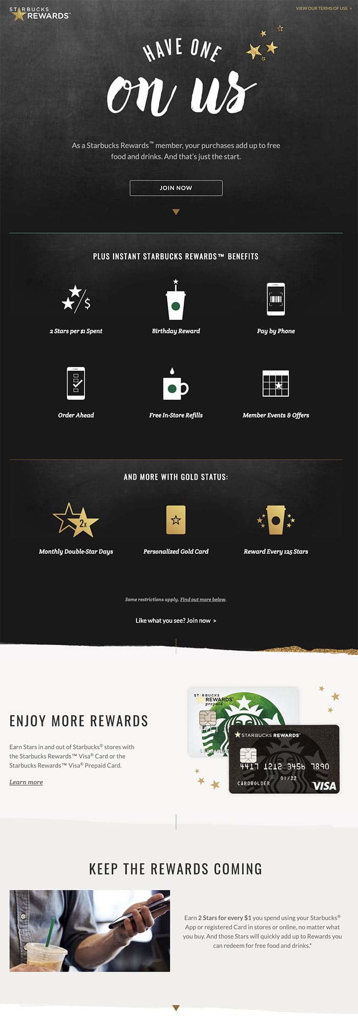
Source: Starbucks
2. HelloFresh
It’s hard to look at this HelloFresh homepage without signing up. The high-quality graphics do a great job of displaying an average product along with the low price of $6.99 per meal.
Scrolling down, readers can check out how the meal delivery service works and browse their broad range of meal choices.
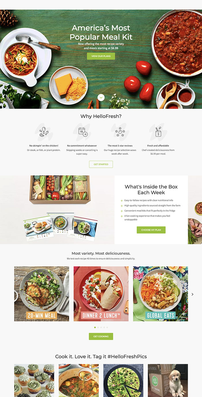
Image Source: HelloFresh
3. Luxury Retreats
This page from Luxury Retreats incorporates a high-quality image that transports the reader to the destination and makes it easy to instantly sign up. When the reader tabs away, the page provides a popup to sign up for future emails.
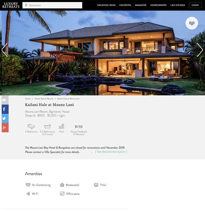
Source: Luxury Retreats
4. UNICEF
UNICEF knows that not everyone wants to get involved in the same way. That’s exactly why the organization’s “Take Action” landing page provides readers with opportunities to donate, volunteer, and work with the organization. Even if readers don’t feel compelled to take any concrete action, the end of the page still encourages them to stay in touch by signing up.
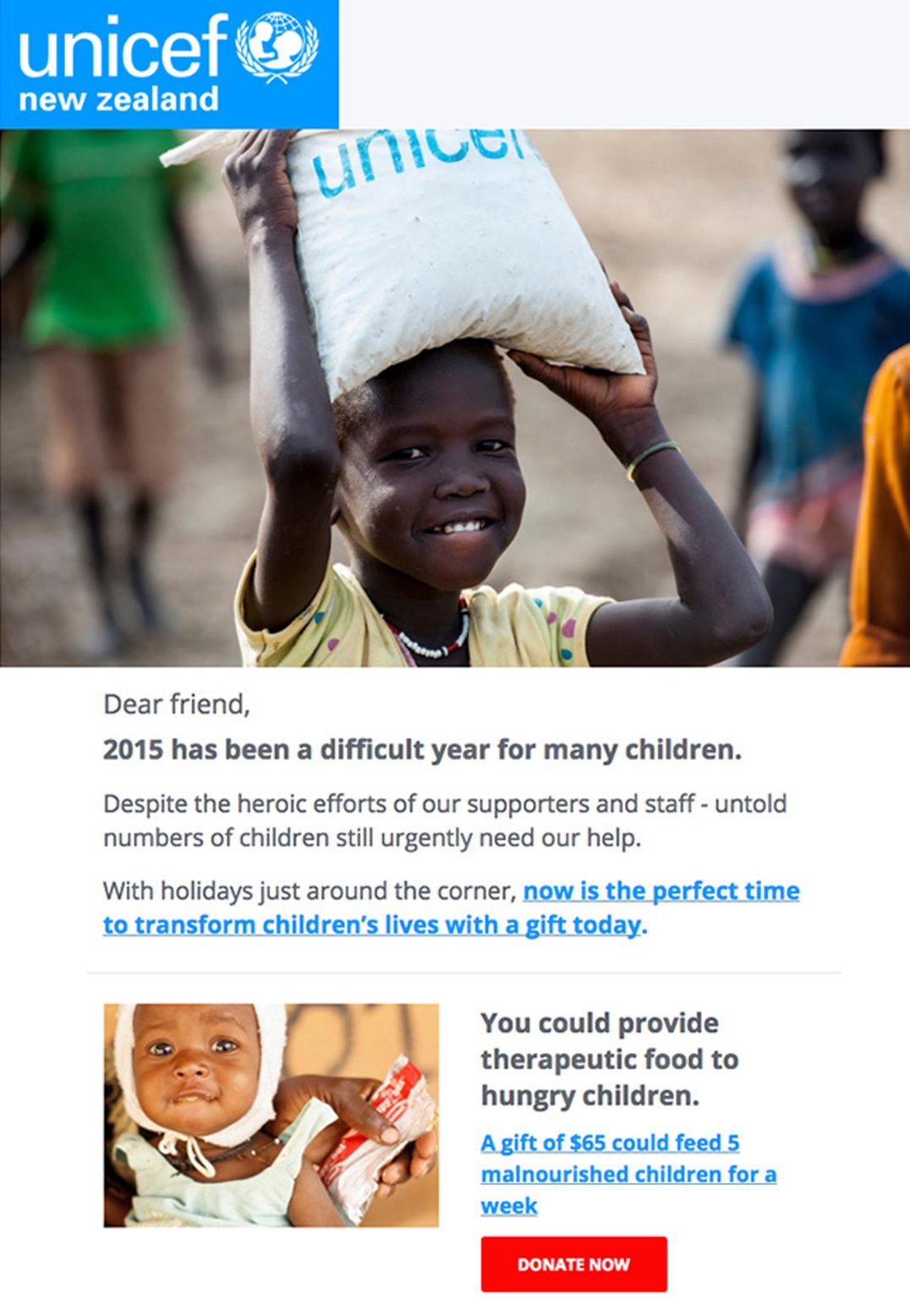
Source: UNICEF
5. Pizza Hut
Pizza Hut’s landing page gets right down to selling with a hot deal and a great image. It’s always a great idea to highlight anything a customer might get for free. The page also provides a big bold button to start your order and browse the menu.
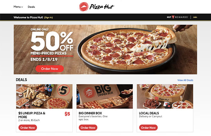
Source: Pizza Hut
6. Casper
While browsing for Casper mattresses, this page offers additional, yet simple, landing pages for various products. Scrolling below, readers can check out various benefits to purchasing a Casper mattress over other brands.
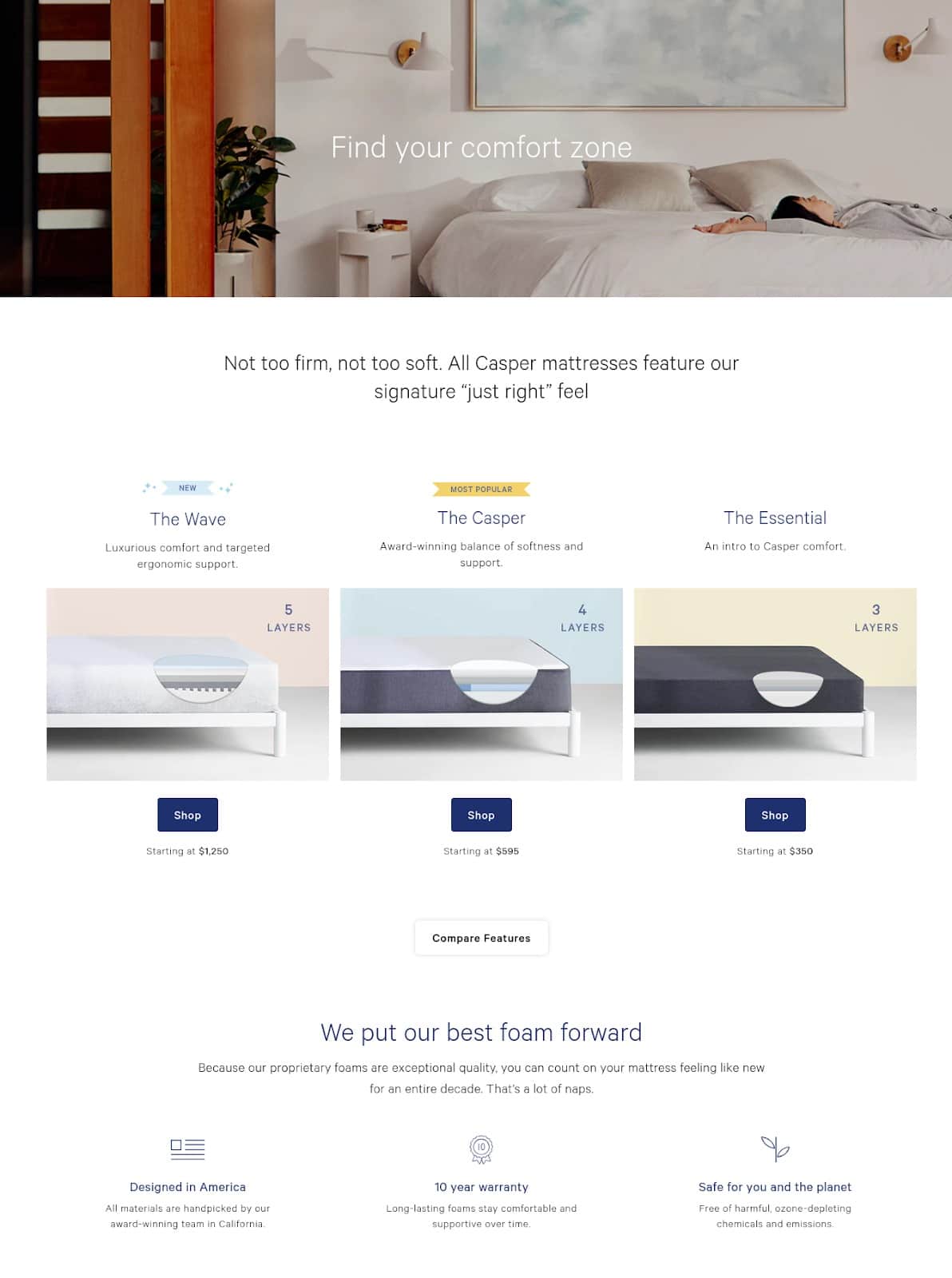
Source: Casper
7. Adidas
This Adidas landing page takes a bold stance by highlighting one specific product with one high-quality image and including an actionable button to shop. Adidas also makes it easy to sign up for their email newsletter without intrusive pop-ups.
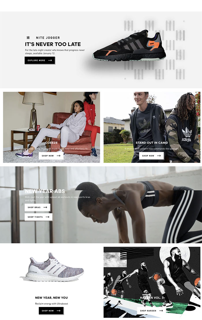
Source: Adidas
8. Huawei
This landing page for Huawei’s wearables collection makes it easy to browse high-quality images of their featured products along with key features without clicking over to any additional product pages. The copy is clear and concise, encouraging readers to make a purchase with actionable “buy now” buttons.
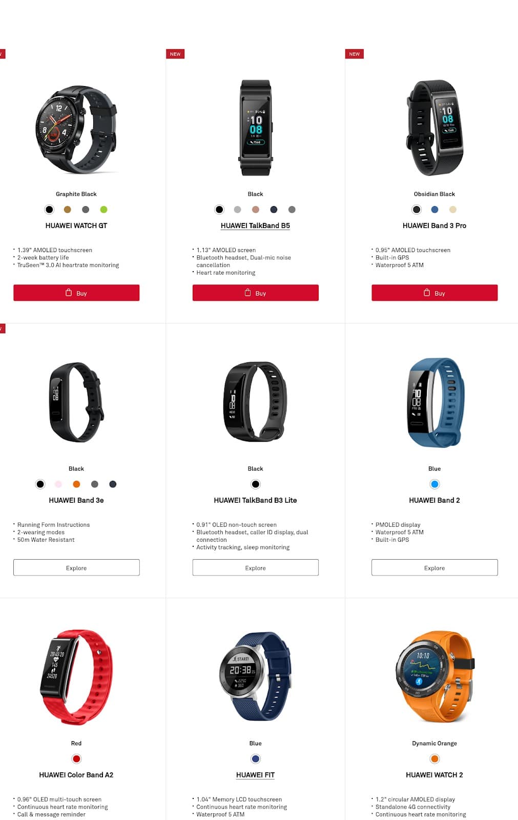
Source: Huawei
9. UberEATS
UberEATS doesn’t actually sell food. Instead, they sell a delivery service. Nonetheless, the company understands the importance of using high-quality graphics of food to get your mouth watering. Their service is simple and their landing page reflects that: Get the app and get your food.
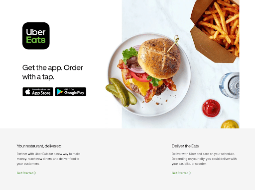
Source: UberEATS
10. MeUndies
MeUndies created a subscription service for underwear. They designed a landing page that highlights their products’ killer benefits, i.e. they’re soft and comfortable. The landing page also includes plenty of GIFs to keep readers engaged and scrolling.
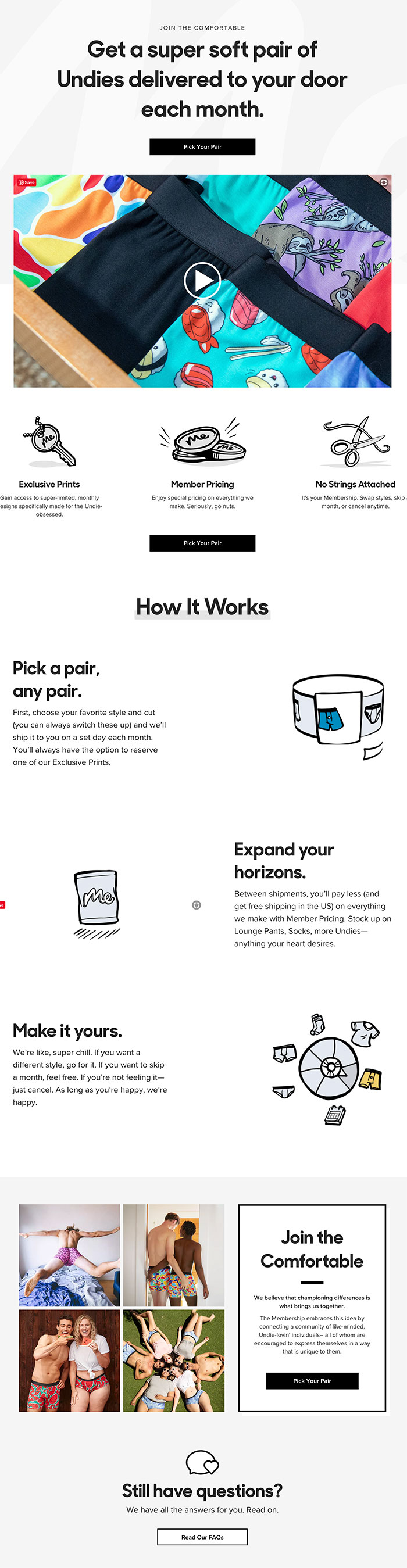
Source: MeUndies
11. Thrive Market
A lot of thought went into the design for Thrive Market’s landing page, but you might not realize that from its simplicity.
First, the landing page focuses on benefits so readers understand that Thrive Market can help them live a healthy lifestyle while saving money. Next, it lets readers choose if they’d prefer browsing products by diet or department. To top it off, Thrive Market uses photos of real people which A/B testing shows can encourage click-through rates.
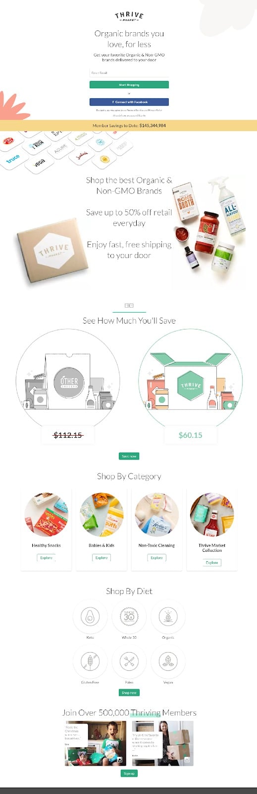
Source: Thrive Market
12. International Committee of the Red Cross
The ICRC does a great job of using photos of real people to form a human connection with their visitors. Highlighting the different locations where they’ve helped allows readers to understand firsthand exactly where their donations are going. The ICRC also provides other landing pages to provide legal support and volunteer opportunities to their readers.

Source: ICRC
Wrap up
Understanding landing page best practices is important, but ultimately, knowing how to design a landing page is all about figuring out what works for your audience. These days, customers expect companies and brands to invest in getting to know them personally. People seek authentic connection everywhere, even in marketing.
You probably won’t get everything right on the first try but by running some A/B tests and listening to your audience, you can create something that inspires your visitors to convert.