9 minute read time
How to Use the Newest Graphic Design Trends in Your Email Marketing

This is a guest post from Ryan McCready at Venngage.
Keeping up with the latest graphic design trends in your email marketing can be exhausting, especially if you aren’t a designer and have other tasks that take priority.
But keeping up with new design trends is the easiest way to signal to your audience that you’re a modern, innovative, forward-thinking company. That’s why so many tech companies have great design—users expect to see a level of newness within their product.
And, while you want to keep your brand looking fresh and hip, it’s hard to tell which trends you should follow and which trends are best left on the Pinterest boards (that’s why Venngage pulled together the top 8 graphic design trends of 2020).
Read on to discover easy-to-manage, actionable ways to incorporate the newest graphic design trends in your email marketing and branding (even if you aren’t a designer).
Want some quick ways to update your look? Our design trends can help
With email being such a direct-to-consumer, instantaneous marketing method, your email design can be a great way to show your audience just how modern and innovative you are.
Plus, if a design trend doesn’t resonate with your email audience, you can easily change it in your ESP.
1. Muted color palettes
Muted color palettes are the first trend on our list for 2020, and is also the easiest trend to incorporate into your existing branding.
If your emails are word heavy with very few graphics, this trend might not be for you. But, if you use graphics and photography to help bring your newsletters to life, you can definitely get on board.
Muted colors refer to colors that aren’t vibrant. You can easily create a palette of muted colors to work with by taking your existing brand color palette and adding elements of black or white to create more toned-down shades.

Creating a secondary palette from your main brand colors is doubly beneficial. Along with automatically updating your look to be completely on-trend, it’s not too dissimilar to the brand your audience already knows and loves.
A complete rebrand can be a polarizing experience for consumers, so, wherever possible, you should focus on small, continuous improvements rather than a complete design overhaul.

2. Color gradients
Much like trend number one on our list, color gradients are a great way to refresh your emails without changing too much. In fact, you may have already seen this graphic design trend in your inbox.
Gradients have been back for a while, but, in 2020, expect to see much more muted, toned-down gradients (sensing a theme yet?). Instead of an all-out background gradient, you’ll start to see them used to enhance elements of designs.

With this trend, less is more, so focus on updating one small element of your email with a gradient. You could update your header with a subtle gradient, or use a gradient inside of block text.
If using the gradient trend, try to keep it as simple as possible. Try to use subtle gradients in small areas, rather than automatically using a bright gradient as a color overlay.
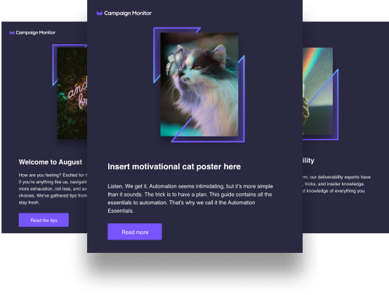
3. Abstract and dreamy illustrations
Now, you need to be a certain sort of company to pull off trend number three, but, if you can manage it, you’ll be leaps and bounds ahead of your competitors.
The phrase “abstract and dreamy illustrations” can scare people off, but if you’re already using a hand-drawn or illustrated style in your branding, this is the trend for you. Plus, it’s one of our favorite graphic design trends to use in email marketing.
By “abstract and dreamy,” we mean un-lifelike drawings. Think strange colors, exaggerated proportions, and absurd situations.

Easily update your email newsletters by replacing stock photography with one of these abstract illustrations, or consider changing up your existing bank of illustrations to be weirder.
The other bonus of creating custom illustrations, alongside them looking great, is they add a special element to your marketing. Anybody can pay for a stock image, but not everybody will go out of their way to commission illustrations unique to their business.
Creating a custom illustration for customers who’ve just completed a sale, or customers who’ve joined your loyalty program can help make people feel special, and like you’re a company who cares about them as a person, rather than just a number.
Illustrations have been popular amongst SaaS companies for a while, but, in 2020, they’ll fully enter the mainstream. Expect to see big-name brands, such as Apple, jump on the trend and use stranger and stranger illustrations.
The one thing to remember with this trend is that you need to make sure the meaning of your illustration is crystal clear.
4. Heavy but simple fonts
One of our other favorite graphic design trends to use in your email marketing? Heavy (but simple) fonts.
In 2020, heavy, simple fonts will be everywhere. With the rest of the design world getting more muted, it’ll be time for the bold fonts to shine.
By “heavy,” we mean fonts that are bold or extra bold, things that don’t look delicate or hand-drawn, which was the trend last year. These heavier fonts create a great contrast with graphics and other text and work particularly well as headers.
This is a great trend to jump on, as it’s so easy to implement. The Drake Hotel does a great job of using heavy fonts in their email newsletters.

Try this trend out by picking a heavy or bold weight to your font and applying it to header text. Increase the size of your header text and even the color, for a really modern look.
5. Beautiful flowing shapes and lines
Beautiful flowing shapes and lines might seem like an odd choice for a top trend, but, when you start to think about it, it makes perfect sense. Alongside more muted color palettes and softer gradients, the shapes used will become softer too.
Like the abstract illustration trend, this one isn’t for every company. But, if you already use geometric shapes or find yourself with too much white space, flowing lines could be the answer here.

I searched through my entire email inbox, as well as the Campaign Monitor email gallery, but couldn’t find any companies using flowing shapes to their full potential yet, so jump on this chance to be the first.
Using these flowing blobs as backgrounds for sections in your newsletter, or separating blocks of text with a wiggly line rather than a straight one, has a lot of potential to instantly upgrade your emails to something on brand and modern.
6. Genuine and neutral stock photos
In case you haven’t noticed a pattern yet, we’re toning things down in 2020, and your stock photos are no exception.
In previous years, stock photography has tended to lean towards the bright, bold, and colorful end of the spectrum. But say goodbye to oversaturated colors and unrealistic-looking compositions.
Changing up the stock photography you use is such a quick and easy way to modernize your emails. When choosing stock photography look for images that seem unposed, think about the sort of content your absolute coolest friend posts on Instagram.

If you don’t use stock photos but do include product shots, you can get involved in this trend too. Arrange products on interesting backgrounds, in natural settings, within a muted color palette for maximum impact.
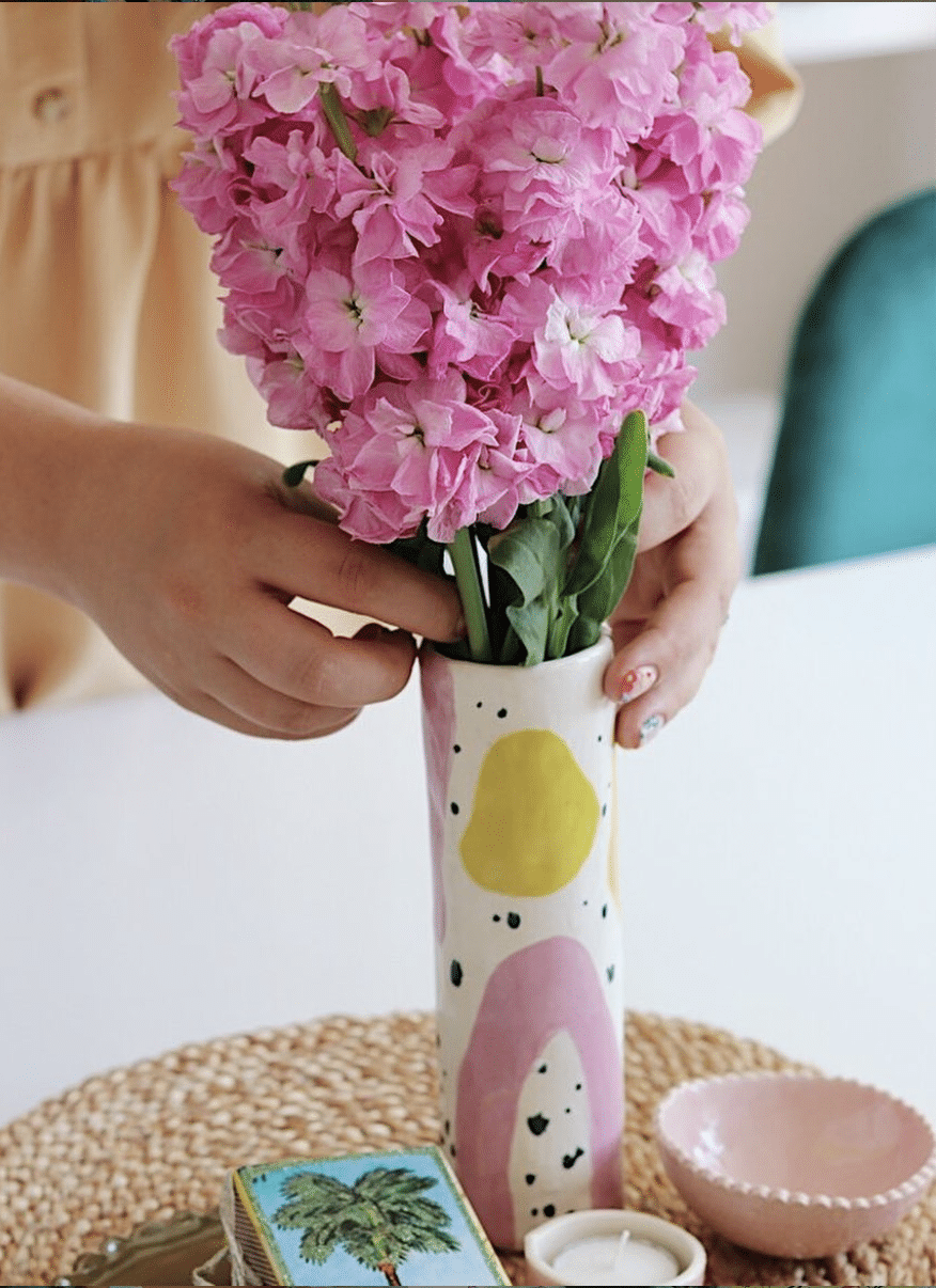
The key to nailing this trend is by embracing authenticity, but changing up the style of photography you use in your newsletters is one of the best design tips you can use in your newsletters.
7. Minimalism
Minimalism is a great design trend for email marketers because it’s simple but effective. Being generous with your use of white space won’t be a new concept for many people, but, in 2020, it’s time to take the trend to the next level.

In this example from fashion brand, Monki, the images are well spaced out, with plenty of breathing room between the pictures.
The CTA button is also in white, but with a simple black border, adding to the calm look. And, finally, the product shots: all the same color scheme, all shot on a white background.
It’s not a boring email at all, but it is a minimalist one.
Try this out with your own campaigns by picking one feature color to sit alongside a plain white background, and don’t be afraid to create extra space in between your text and images.
And don’t stop there; continue the minimalism through to your landing pages to create a cohesive experience for your audience.
8. Better branded animations
You’ve probably seen animations pop up in emails in the form of GIFs. Reaction GIFs are so ingrained in our visual communication that nobody bats an eye when they become part of your marketing.
But how can you stay ahead of the game when everybody’s using the same imagery? Simple: you create your own animations.
By creating your own GIFs, you can produce animations that are highly relevant to your campaign and completely unique to your company.

It doesn’t have to be a complex animation either. In the example above, ASOS has subtly animated the background—enough to add energy to the email, but not so much that it’s overpowering.
If you do decide to bring animation into your campaigns, make sure that the motion you choose never overpowers the rest of the message.
Wrap up
Keeping on top of trends can be an easy and effective way to update the look and feel of your emails, which is why we highly encourage using these graphic design trends in your email marketing.
Especially in crowded markets, standing out from competitors is important—and having good quality, modern, and on-trend emails can be a great way to show your audience that you’re a modern company.
It’s important to keep your brand in mind when using new graphic design trends, as not every trend outlined above will be suitable for your marketing.
Ryan McCready went to the University of Arkansas and graduated with a degree in economics and international business. Now instead of studying the economy, he writes about graphic design, marketing and more at Venngage.