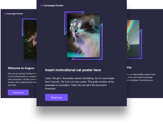
Since starting to use dedicated landing pages with conversion-centered design, Campaign Monitor increased conversion rates by more than 1180%. In this post, we’ll show you how we did it.
One of Campaign Monitor’s main goals was to get more signups to trial accounts from paid traffic, and in turn get more paying customers. The team at Campaign Monitor knew that once users tried out the software for free, they’d be sold on the product.
The team realized the need for help from someone with a dedicated process for Conversion Rate Optimization (CRO) and trusted us at ConversionLab for the job.
We approached the challenge as we always do, basing our strategy on insight, hypothesis, and analysis paired with best practice and experience. We set up A/B tests (also called split-testing), which are experiments where two or more variants of a page are shown to users at random to see which performs and converts better. To design and manage all landing pages we used Unbounce which is a flexible and solid platform.
Not only did we increase the ROI for paid traffic, but we also reduced the cost of customer acquisition. If you’re looking to increase signups with CRO, here are 8 principles to keep in mind.
1. Know that A really is better than B
Testing takes the guesswork out of optimization and enables us to make decisions based on data, but you need to make sure your tests work before confirming changes.
To know for certain that an A/B test is finished, and to know –for a fact– that one-page variant is better than the other, we need statistical significance. Statistical significance is mainly determined by two factors– the volume of traffic through the test and the amount of difference in performance between A and B.
There are some excellent tools out there to help you calculate statistical significance, and we use one from Kissmetrics.
2. Make sure your message is consistent across ads and landing pages
When you want to increase conversions from paid ads, you need to make sure your landing pages match the ads. Landing pages that match the messaging in the original ads convert better.
Just like gorillas search for bananas, your visitors are out hunting for something useful. «The banana» is what triggers the gorilla to click on the ad – and a banana is just what the gorilla expects to find after he clicks.
If you offer the gorilla an entire fruit basket, rather than the banana, he has to search through the basket to find what he’s looking for. This increases the likelihood that he will give up and leave. Offering an entire fruit basket rather than the banana means you’ve wasted your chance to get the conversion.


To make sure our messages are consistent across ads and landing pages, we use dynamic text replacement on the landing pages. In other words, the message or call to action on the landing page automatically changes to reflect the copy from the ad in Google AdWords.
Below you’ll see a test where we tested dynamic text vs. a previously high-performing headline. The result?
The dynamic headline gave a whopping 57% uplift in conversion rate on the landing page. In other words, that change alone gave us 57% more signups to free trial accounts.


3. Help visitors by using visual guides
If you want your visitor to do something, make it obvious what to do, as well as how to do it. A photo of a person looking towards your headline and call to action is a subtle guide, but arrows are more specific.
For example, when we added an arrow on the landing page below we increased conversion rates by 26%.

4. Use a clear and specific call to action
When we made calls to action more specific, we noticed that more people clicked.
In the examples below, the theme of the landing page was newsletters, and we included the word “newsletter” on the button rather than the more generic previous wording, which was “Get started for free.” We moved that text to below the button instead, as trigger-text since it’s still important to highlight.
This change resulted in a 120% increase in conversion rates.

5. Remove anxiety around uncertainty
Friction and uncertainty are barriers that prevent people from doing what you want them to. By making it simple, clearer, and less uncertain, you’ll get more people to convert.
For example, by adding “No credit card required” we increased the conversion rate by 78%. The terms have not changed one bit, as you never needed a credit card to sign up for a trial. But because this was not communicated clearly, it could’ve been a reason for uncertainty.

6. Show your product or service in use
When people visit a website or landing page for the first time, they often ask themselves how the service works. Don’t leave them hanging or have to go through boring copy to understand what you offer.
By using a demo or explainer video, you can explain how your product or services works and tempt more people to sign up. In our experience, the video should be of high quality and not too long (30-60 seconds).
For example, when we added a demo video to a landing page, we saw a 53% uplift in conversion rates.

7. Catch visitors as they’re about to leave
You’ve seen the popups on websites that offer content in exchange for your email address, right? They work.
On our landing pages, we used the kind that triggers on exit intent. In other words, these popups trigger when the visitor shows signs of leaving the page, either by moving the mouse towards the address bar or the back button.
The exit intent overlay converted 271 abandoning visitors into leads in just one month by offering an email marketing guide to users just as they were about to leave the page.

8. Usability matters
They say it’s all in the details, and it’s true. Minor changes can make a huge impact. One way to increase usability is to use discrete visual clues telling your visitors that they are getting nearer to their goal.
For example, we added checkmarks to a signup form to hint at completion, and these checkmarks alone ensured 75% uplift in conversion rate.

Wrap up
In total, ConversionLab performed more than 30 A/B tests across multiple landing pages for Campaign Monitor. Each test was based on a solid hypothesis, which we reached through our experience in CRO.
In combination, these 30 tests resulted in a 1180% uplift in conversion rates. That’s an average of 36% per test. As a result of more signups with the same traffic volumes, we also reduced the cost per acquisition by 64%.
SaveSave
SaveSave
SaveSave
SaveSave
SaveSave
SaveSave
SaveSave
SaveSave
SaveSave
SaveSave


