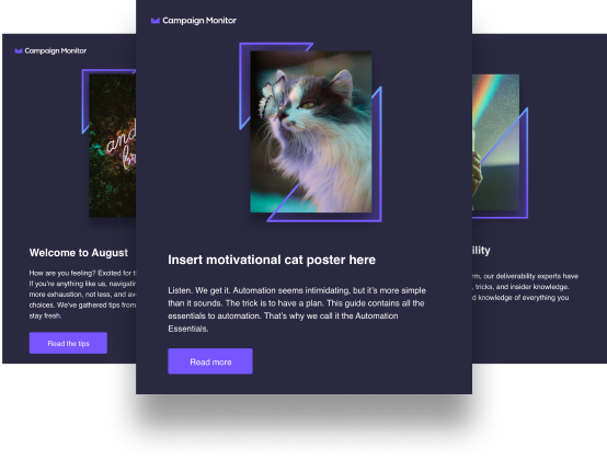
Dark mode: popular with gen Z and hated by old-school designers, modern browsers all enable users (in their own unique ways) to force rendered content to display gray or light text on dark backgrounds. The science appears unsettled, but proponents claim it reduces eye strain and limits blue light which improves sleep. Plus, some of us think it looks pretty sweet.
For designers, compliance sticklers, and unsuspecting email marketers, dark mode can catch us by surprise. I say this as a marketer who uses dark mode, sent an email campaign only to receive the send myself and note the color mismatches. I previewed the email, but should have fired out a test send! Now instead I have a blast with an unattractive color scheme for around 70% of people reading the email on their mobile devices. The result? My note looks less appealing, I get ignored, my campaign metrics tank and I’ve just wasted a precious inbox opportunity.
Should you rely on CSS to switch styles based on preferences? While theoretically ideal, the concept isn’t always sound in practice. Not all clients fully support CSS that switches between user preferences, and this includes some big providers like Gmail. There will always be client by client hacks (perhaps one exists as of this writing for Gmail) but such efforts are probably best redirected.
So should our brand compliance heroes override the will of the users, attempting to force the corporate color palette down their dimly-lit throats? Obviously not, nor should we send email designs that only work for a small percentage of our users. Let’s find the middle ground that gets our content in front of users within color schemes they appreciate.
Content is all about contrast and readability. Don’t set background colors. Test your text color selection in both modes and avoid bright colors because they’ll be painful to read in dark mode. Any logos or icon styled graphics should feature transparent backgrounds instead of solid colors (especially white). Active links, followed links, and CTA buttons should be visible in both modes while contrasting well against the primary text so people know where to gravitate.
The remedies for universal readability are easy enough, but making mistakes is easy too. Send out test versions of your email. Verify the look and feel across clients, environments, and preferences are consistent, legible, and compelling. Dark mode might not always directly compliment your corporate colors but dark mode dollars warrant a little flexibility.


