11 minute read time
Tips to Level Up Your Email Design – Q&A with Noelle and Meghan
How to level up your email design
Tips from Marigold Art Directors – Noelle Grimes & Meghan Sokolnicki
If there’s one topic that unites all of our customers, it’s the desire to learn more about email design. Whether it’s design best practices or tips for getting the most out of the Campaign Monitor email builder, this is a topic that you can’t get enough of, and that’s inspired countless blog articles and webinars – which can be found in our resources hub.
One of the benefits of partnering with Campaign Monitor by Marigold is having access to experts across all areas of marketing. So we thought we’d chat to Marigold Art Directors, Noelle and Meghan, to get insight into the design process they undertake when designing an email. From selecting a layout to choosing an image, read their tips for designing an engaging and responsive email.
Q: What’s the first thing you do when you kick off an email design project?
- Noelle: At the beginning of an email design project, while it’s tempting to dive right into the design process, I take a moment to reflect on the fundamental purpose of design: effective communication. So, the first thing I do is make sure I fully grasp the email’s primary goal and have a discussion about how we’ll measure its success. It’s important to be on the same page with our marketing team because that sets the stage for evaluating what works, what doesn’t, and what we can do better next time. By starting with a clear understanding of the goal, we lay a solid foundation for the project and open the doors to future improvements.
- Meghan: As a designer in the Professional Services team, tasked with bringing to life our customers’ marketing strategy, it’s essential for me to understand the goals and brand aesthetic of each client before starting an email design project. To kick things off I always meet with the client to understand their business and brief myself on the “why” behind the project. Knowing why it’s important to the brand to relay the message and why this information is relevant to subscribers can help drive the focus of the design.
Q: What role does content hierarchy play in your process and how do you balance the most important message with the least?
- Noelle: Once the email’s goal is agreed upon, any content serving that goal takes priority in the hierarchy. The email structure and design elements align thematically to support the goal. The primary message at the top of the email should make a substantial impact. Traditionally, this includes a hero graphic, exciting headline, and a quick description, all paired with a bold and prominently-placed call-to-action (CTA). Design styles and trends may change, but effective structures like the inverted pyramid and zig-zag endure!
In terms of design, I play with font size, color contrast, and spacing to emphasize the main message and distinguish it from the rest. This clear hierarchy guides readers through the email, ensuring they don’t miss the main message while still giving them the option to dig into more details if they want.
- Meghan: Hierarchy is the most important design tool we have when it comes to email. We know we only have a limited amount of time with each subscriber, and hierarchy is key to making sure they can focus on the most important takeaways of our message. I recommend giving visual priority to the most important information and for this to appear as close to the top of the email as possible, which can be done using large/bold headlines and clear calls-to-action. Secondary stories can be given less visual priority through their placement in the design and slightly reducing the size or emphasis on that information.

Q: Do you have any rules you follow when it comes to balancing text and imagery?
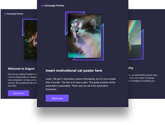
- Noelle: Ideally, the copy provided for an email has been edited down to spicy, concise blocks! In those cases, a thoughtful headline with bold visual prominence and a great hero graphic is all that’s needed. However, in situations where more text is needed, I have a few rules I follow to maintain a good text to image balance. First, I scale down the prominence of hero graphics to allow more space for text. I then explore other ways to add visual interest, for example, I consider using color blocking to break up paragraphs or swapping comma-separated lists into bulleted ones. I also look for opportunities to use icons that support different points in the message. These rules ensure that I strike the right balance between text and imagery, helping the reader navigate the content and take the desired action.
- Meghan: The biggest rule I have when balancing text and imagery is making sure that your most important information is communicated through live text, rather than relying on an image. Images can be great at visually captivating an audience, but in some cases not everyone can see or download an image. For this reason, it’s important to test what the email would look like with and without images. If a large chunk of the message is missing when images are off, it’s important to rethink how live text can be utilized to bring to life your key messages and calls-to-action.
Q: What’s the importance of imagery to your design; are images essential for all emails and what’s your process for choosing an image?
- Noelle: To quote Dieter Rams, sometimes “good design involves as little design as possible.” The decision to include imagery in your email depends heavily on the content and purpose of the message. For instance, if it’s a letter from the CEO, the focus might be on the message itself rather than a typical hero image. In those cases, you can create a visually appealing design by including thoughtfully-placed white space and subtle supporting graphics. Paying close attention to type styles can also help establish the tone and hierarchy of the email, particularly when there are few to no graphics.
When an email calls for imagery, I make sure to select visuals that not only enhance the message but also align with our core brand identity. Consistency is key in today’s consumer landscape, and a cohesive brand presence helps build trust and loyalty. As an in-house creative at Marigold, I’ve developed brand libraries containing photography, icons, and other graphics to ensure our brand is represented consistently across all communications.
By choosing images thoughtfully and aligning them with the message and brand, you can enhance the impact of your emails and maintain a strong and recognizable visual identity. - Meghan: Images can definitely enhance your message and I recommend using them when relevant. When I choose an image, I think through how it relates to the message and how it may be able to visually communicate a tone or experience. Obviously if our goal is to sell a product, we want to show it off through imagery! The biggest trap I see marketers fall into is thinking that they have to use images for every story. If the images you choose don’t relate to your content, they can be a huge distraction and take away from the message you’re trying to convey. Keep in mind that not all messages need imagery, and in those cases you can use other design tools like font size or color blocking to visually enhance the email. Iconography or divider lines can also be a creative way to add visual interest and separate content!

Q: Is there such a thing as too much copy, and what rules should we follow?
- Noelle: In email design, less is (often) more. All content in your email should feel like the “TL;DR” version. On average, we have a short (and somewhat humbling) 8-10 seconds to capture our readers’ attention. So, imagine you have only 8 seconds to make an impact. Keep it short, snappy, and aligned with your brand voice. The primary goal of emails is to get the audience excited and entice them to click and learn more.
If you find yourself with a lot of information to convey, consider directing readers to longer-form content on your blog, website, etc. When planning your email content, always keep those 8-10 seconds in mind and edit ruthlessly to keep it engaging and to the point and then identify where else you’re sending them for more information - Meghan: Again, relevance here is key. And, at some point there is such a thing as too much copy. Email is great for sending relevant, focused information to our subscribers. When we start giving them too much information to process at once, that’s where we can start seeing a drop off in engagement. Be mindful of how many different topics or details you’re sharing at a given time. Also, sharing pieces of information and linking to an url where the rest of the information is hosted is a great way to limit the amount of content you’re sending and gives you data to see which subscriber is engaging with which calls-to-action.

Q: How many call-to-actions (CTAs) can you include in an email, are there any rules?
- Noelle: Too many CTAs can get confusing and dilute the primary goal. Generally, I suggest having a single, clear CTA that aligns with the main purpose of the email. If additional CTAs are necessary, visually differentiate them by using secondary colors and scaling them down. The goal is to guide readers toward the desired action without overwhelming them with too many choices.
- Meghan: A lot of this depends on the type of mailing you’re sending. I usually don’t follow any universal rules for CTAs, other than making sure that you’re not overwhelming the recipient with too many asks. A lot of this ties into the overall content you’re sharing and making sure it’s focused on one or two topics at a time. If a recipient is being asked to read an article, register for a class, and buy a product all in one email that could lead to unwanted choice paradox and limited engagement.
Q: Does your design approach differ for the type of emails you’re creating, for example: newsletter, event invite, deal or promotion?
- Noelle: My design approach differs slightly based on the type of email being created. Certain categories of emails carry distinct tones that require a nuanced approach to hierarchy and style. For newsletters, I pay close attention to clear headings and subheadings to break up sections and make the content easily scannable. Event invites should focus on generating excitement, using fresh visuals and prominently displaying event details. Deals and promotions drive urgency and require attention-grabbing headlines, compelling images, and clear CTAs. Transactional emails, such as order confirmations or shipping notifications, should prioritize providing the necessary information and any next steps, instilling confidence with a clean and straightforward design.
- Meghan: For me the same basic design principles apply regardless of the type of mailing. Having a solid foundation of hierarchy, headline contrast, and negative space is universal to any design. Where the differences would come in would be around the overall styling to match the tone of the content or to speak more specifically to the audience. For instance, my approach to newsletters would be more around organizing or structuring the information, whereas a special promotion or event may focus more around imagery and color to support just a few details and a CTA.

Q: Any final tips for Marigold customers?
- Noelle:
-
- Keep it simple and scannable: Make sure your email is easy to read and understand at a glance.
- Use visuals wisely: Images can enhance your message, but choose them thoughtfully and optimize them for fast loading.
- Nail your CTAs: Make your call-to-action clear, compelling, and aligned with your email’s objective.
- Test, test, test: Don’t forget to test your email design across different devices and email clients to ensure it looks great everywhere.Have a strong brand presence: Use consistent branding elements like colors, fonts, and logos to strengthen your brand identity.
- Meghan: Always test! Every audience is a little different, so it’s important to know who you’re talking to so you can best design for them. Keep in mind not everyone processes information in the same way, so be mindful of accessibility best practices to make sure you’re effective at communicating to as many people as possible.
Need more help with your email designs? Chat to Meghan or another member of our friendly professional services team. In a specialized, one on one session, our design experts can help you create a custom template, provide recommendations for how to improve your emails for effectiveness and accessibility and give you some expert tips on email design. This is just one of many paid services our team can offer you- Chat with our experts.