Now that you’ve created your email, you’ll want to track how successful your email marketing campaign actually is. You need to know which metrics to watch, of course, but you also need to know how to watch them.
Tools like Campaign Monitor make it super easy to see the open and click-through rates of email campaigns, but how do you measure what happens after these people visit your or your client’s website?
And how do you prove the overall ROI of email? You’ll need to know which metrics measure which part of your email campaign as well as what that means for your email marketing goals.
If this sounds intimidating, it doesn’t have to be. Learn everything you need to know about email marketing metrics here before you get started.
For agencies, measuring and reporting on the success of your client’s email marketing efforts can be a little tricky. For the rest of us, it can be equally as tricky to convince your boss or C-suite that email marketing works.
To help you out, we created a free Google Analytics dashboard that you can install in your account or your client’s in just one click. It will show you exactly how many visitors come to your site from an email, how long these visitors are staying, how that traffic compares to other channels (like social & search), and much more.
How to get the dashboard
If you already have Google Analytics set up on your website, follow the 2 simple steps below to install the dashboard in your client’s account:
Step 1: Install the dashboard from our template
To make it really easy to get the dashboard, we’ve turned it into a template that can be installed in any Google Analytics account.
Simply click here to access the dashboard, select where you want to install it, and you’re done!
Step 2: Double check it is set up correctly
If you’re using Campaign Monitor and have turned on Google Analytics tracking in your account, then you don’t need to do anything else.
The dashboard should automatically start showing traffic from your different campaigns, and if you’ve had it enabled for a while, you should be able to use the date picker to see historical data as well.
If you’re looking for an in-depth look at email insight and reporting, read our guide.
An overview of the dashboard
Now that you have the dashboard installed in your account, let’s take a look at how you can use it.
The structure of the dashboard
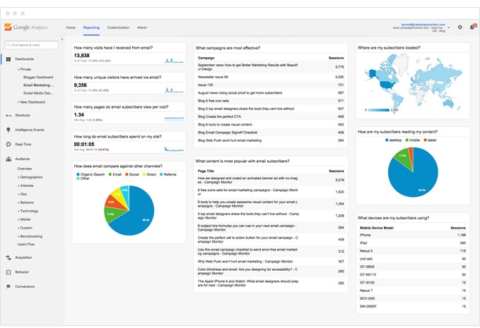 As you can see from the screenshot, the dashboard has been organized into 3 distinct columns, each of which helps you answer a particular set of questions.
The first column features metrics on how email is performing for your client’s business and helps your clients answer questions like “How many visits have I received from email?” and “How does email compare to other channels?”
The second column focuses on your campaigns and content, and helps your clients answer questions like “What email marketing campaigns have been the most effective at driving traffic?” and “What content has received the most visits from email subscribers?”
The third column is designed to help you learn a little bit more about your audience, and helps your clients answer questions like “Where are my subscribers located?” and “What devices are my subscribers using?”
The individual widgets
In total, there are 10 individual widgets on the dashboard that help you answer a specific question your clients might have about their email marketing.
1. How many visits have I received from email?
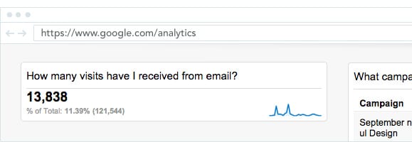
This widget shows how many visits your client’s website has received from their email marketing campaigns.
If you look closely, the widget also shows the percentage of total visits that have come from email, along with a trend line showing how visits from email have changed over time.
You and your clients can use this widget to see how many visitors are coming to your client’s site from email, and how this is improving over time.
2. How many visitors have come from email?
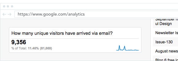
This widget shows how many unique visitors your client’s website has received from their email marketing campaigns.
Again, the widget also shows the percentage of total unique visitors that have come from email campaigns, along with a trend line showing how this has changed over time.
You and your clients can use this widget to report on how many unique individuals are engaging with your email campaigns and clicking-through to the website.
3. How many pages do email subscribers view per visit?

This widget shows the average number of pages viewed in a single visit by people who have come from an email campaign.
The widget also shows a comparison against the site average, and a trend line showing how the pages per visit metric has changed over time.
You and your clients can use this widget to report on the engagement levels of people who come from email, and get buy-in and budget for future campaigns by showing how email subscribers are more engaged than visitors from social media, search engines or other channels.
4. How long do email subscribers spend on my site?
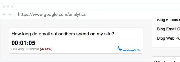
This widget shows the average time people who come from email campaigns spend on your client’s site.
The widget also shows a comparison against the site average (from all channels) and a trend line showing how time on site has changed over time.
Combined with the pages per visit widget, you and your clients can use this to report on the engagement of people who come from email and show its value in creating highly engaged visitors.
5. How does email compare to other channels?
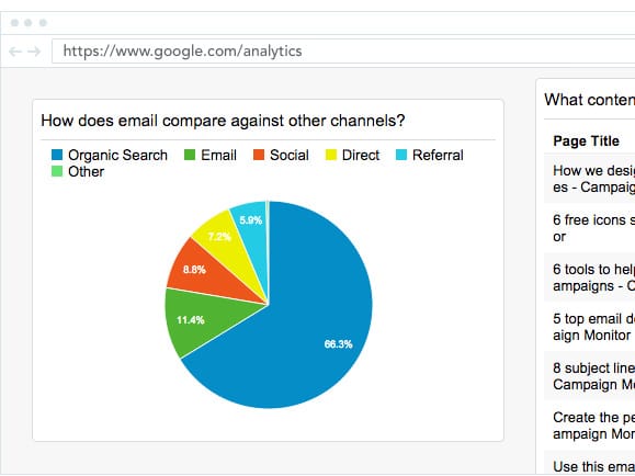
This widget shows how email compares to other channels in terms of driving visits to your client’s website.
If you hover over each segment of the pie chart, you’ll also see the raw visit numbers and percentages for each section.
You and your clients can use the data in this widget to demonstrate the importance of email in the overall marketing strategy, and help drive further buy-in or budget to do more with email marketing.
6. Which campaigns are most effective at driving traffic?
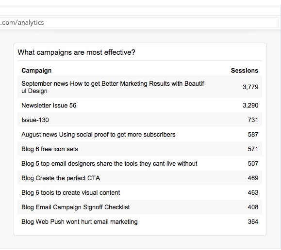
This widget shows all your clients email marketing campaigns, ranked by the number of visits to the website they generated.
If you are or your client are using Campaign Monitor, it will show the unique “Campaign Name” you assign to each campaign you send.
This widget allows you and your clients to see which campaigns have driven the most traffic to the website. You can the use the information to learn what makes your audience click-through and incorporate that into future campaigns to increase results.
7. What content is most popular with email subscribers?
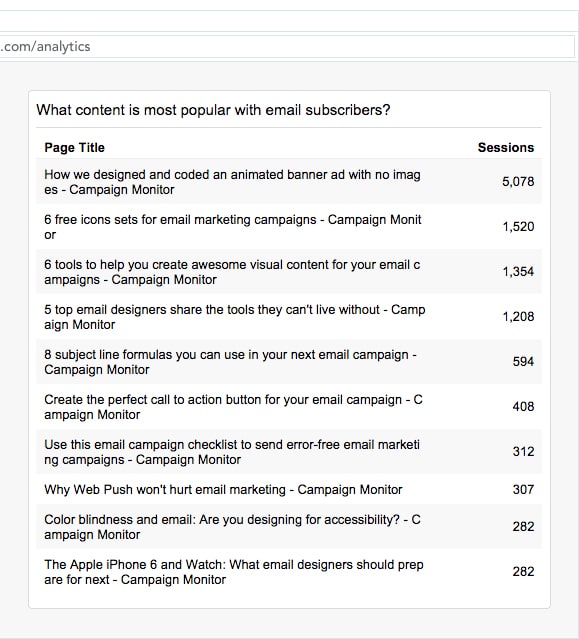
This widget shows the different pages of your client’s website that people have landed on through email, ranked from most visits to least visits.
This information can be particularly useful if your client’s campaigns contain links to multiple pieces of content (like an email newsletter, for instance), allowing you to see what type of content is of interest to subscribers according to their clicks.
8. Where are my subscribers located?
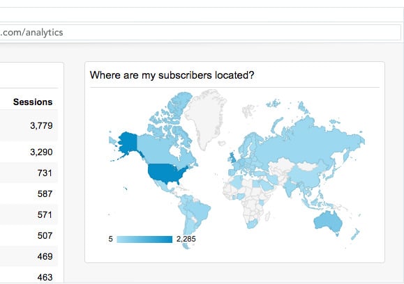
This widget shows you the geographical location of people who have arrived at your client’s website from email, and gives you a good idea of the global distribution of subscribers.
The map is interactive, so if you hover over a particular country it will show you the number of unique users who have come to the site via an email campaign from that particular country.
You can use this to get an idea of where your client’s subscribers are located, and you can experiment with varying send times (or even content) to ensure you are reaching subscribers with the right message at the right time.
9. How are my subscribers consuming my content?
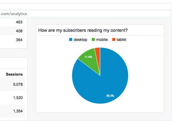
This widget shows the device categories (desktop, mobile or tablet) used by people who have arrived at your client’s website from email campaigns.
The pie graph is interactive, and if you hover over a particular segment it’ll reveal the number of visits from each device.
You and your clients can use this data to get an idea of the different devices subscribers are reading emails on, and optimize your email templates accordingly.
For instance, if you see a lot of people using tablet and mobile devices, then you might want to make sure the email templates you’re using are responsive.
10. What devices are my subscribers using?
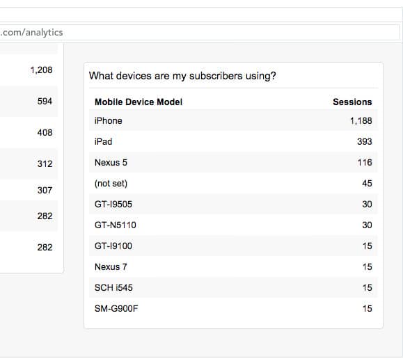
This widget shows you the specific types of mobile and tablet devices subscribers are using to view your client’s content.
If you see a high number of visits from mobile devices like iPhones, then it means your client’s emails are being viewed primarily on these devices and you need to ensure the emails look great on those devices.
If you and your clients are using Campaign Monitor, this should be pretty easy. The email builder ensures your campaigns work on any device and you can even preview the campaign on different devices (such as iPhones, iPads, etc) before sending.
How to customize the dashboard further
Not everybody has advanced Google Analytics functionality like Goals and eCommerce tracking setup, so when we created the dashboard we stuck to the basics to ensure there were no widgets with missing data on the dashboard.
However, if you are able to set up features like Goals and/or eCommerce tracking in your client’s accounts, then you can add some more advanced widgets to the dashboard.
Here are a few ideas:
Add a widget to track conversions
Just like we’ve added a widget that displays the number of visits, you can add a widget to track the total number of conversions (sales, signups, etc) generated from email campaigns.
Add a widget to show conversions against other channels
On the current dashboard, the ‘How does email compare against other channels’ widget shows how email compares against other channels in terms of visits. If you set up goals, however, you can clone this widget and modify it to see how email compares to other channels in terms of the most important metric — conversions.
Modify the table to show conversions for each campaign
On the current dashboard, the ‘Which campaigns are the most effective?’ table shows how each campaign performed based on the number of visits generated. However, if you set up Goals you can modify the table to also include conversions and then see what campaigns are the most effective at driving bottom line sales and revenue for your clients.
Want to learn even more? Here’s another metric you should know.
Wrap up
Google Analytics is a free, powerful and fairly ubiquitous tool that you have likely already installed on your client’s website.
However, by also installing this email marketing dashboard you can make it easy for your clients to see the success of their email marketing campaigns and encourage them to continue working with you to send them.
So install the dashboard in your client’s account today and get measuring!
Start driving results for your clients
Campaign Monitor's Agency Edition makes it easy to create and send email campaigns that get results for your clients.