Introduction
In the past, we wondered how heavily email would be checked on mobile devices. Now, of course, we know email and all other online activities are easily accessible on mobile. But does that mean the days of desktop are over?
Not exactly.
Data from nearly 6 million email marketing campaigns suggests the shift to mobile has made it more difficult to get readers to engage with your content, unless you can drive subsequent opens in a different environment.
This report will help marketers understand how readers interact with email campaigns on mobile devices vs. desktop. It includes benchmarks on open rates across different clients, advice on improving rendering, data on the relationship between opens and clicks by environment, and an overview of behaviors that increase the likelihood of a reader engaging with your content.
Chapter 1
Mobile email trends vs. desktop in 2019
It’s difficult to narrow down exactly how much time the average person spends on their smartphone each day. Combined research from multiple sources points to a figure of at least four hours: over a full day every week.
In fact, mobile traffic now accounts for 52.2% of all webpage traffic worldwide. In the United States, this figure is even higher: 57%.
It’s clear that email browsing, blog reading, purchasing, and other activities will continue to shift away from browsers in favor of mobile devices in 2019 and beyond.
Percentage of emails opened on mobile in 2018
The percentage of emails opened on mobile in 2018 depends on several factors such as age, geolocation, industry, type of email, and many others. Despite these discrepancies, reports always seem to conclude that at least 50% of emails were opened on mobile in 2018.
To further complicate matters, many readers will often initially open an email on their mobile device before opening it again on desktop to investigate more thoroughly later.
For instance, 40% of people 18 years old and under will always open an email on their mobile first. This shows an increase among mobile email trends in young people compared to other generations.
28% of readers between the ages of 19 and 34 tend to open emails on their smartphones first. This number continues to drop until the 56-67 age bracket: Only 8% of readers in this demographic will open emails on their smartphones first. In fact, 55% of this age group claims they never open emails on their mobile devices first.
It’s important for marketers to understand the ages of their subscribers. If an email list contains multiple age groups, marketers should segment their list based on age to account for this difference in mobile email trends.
Source: Email Monday
Mobile and email: Which devices do people use?
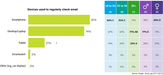
47% of all people across demographics use a mobile application for checking their email. Meanwhile, 26.9% still prefer desktop. When it comes to mobile devices, a whopping 81% prefer to open emails on their smartphones while 21% open emails on their tablets.
In general, younger generations such as millennials and generation Z skew towards smartphones while older demographics make up the tablet statistic.
Mobile email trends by client
It seems that during 2019 and in the years to come, Apple iPhone and Gmail will remain the most popular clients for opening emails.
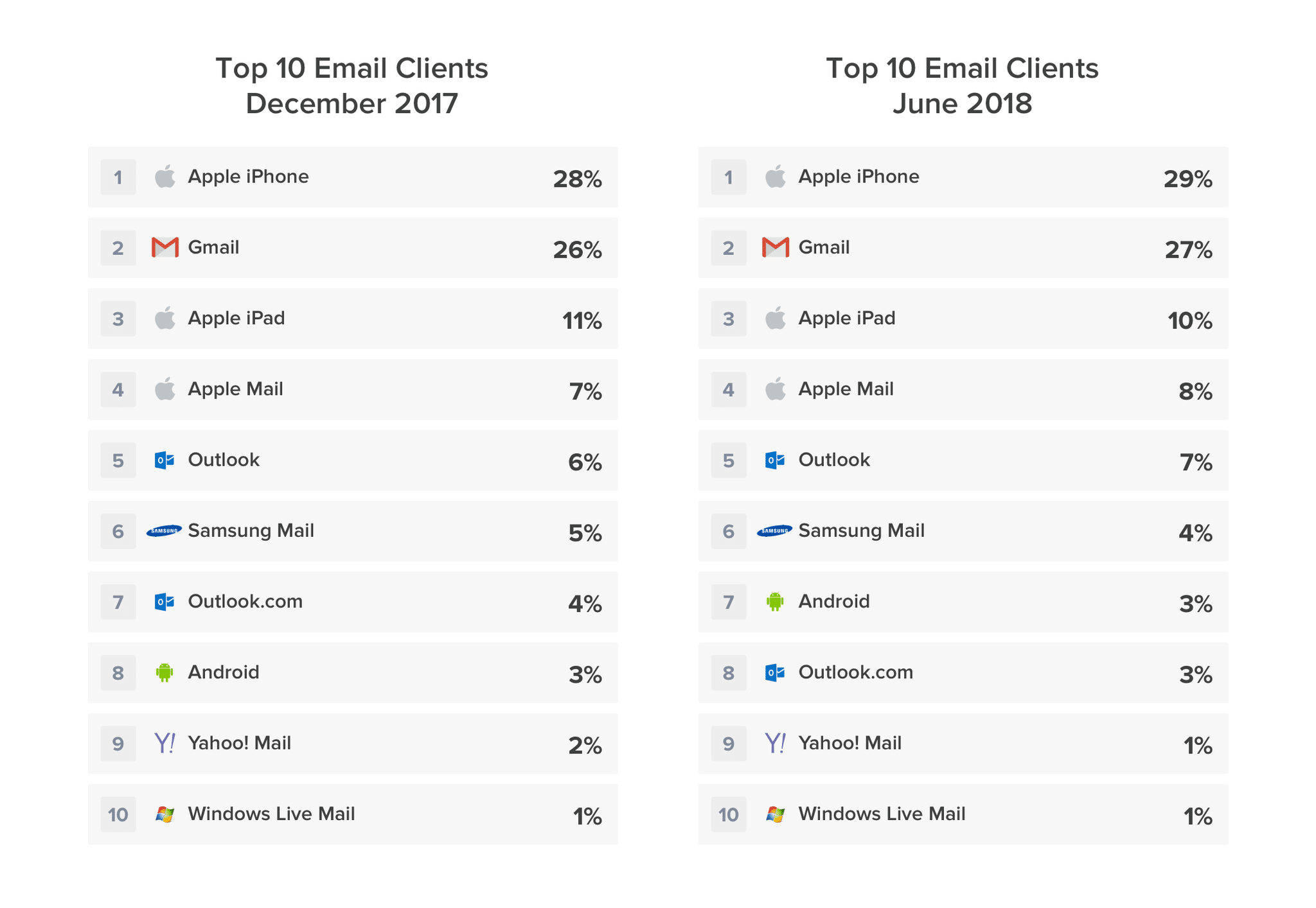
As of June 2018, Apple iPhone was the most popular mobile client for reading emails with 29% of all opens occurring on this platform—up 1% from the previous year. Gmail was a close runner-up at 27%—also up 1% from 2017.
Apple iPad dropped 1% from 11% of all opens to 10% in 2018 but still managed to secure third place. Apple Mail clocked in just under the Apple iPad client with 8% of all opens—up 1% from 2017.
Outlook remained the 5th most popular client moving up from 6% in 2017 to 7% in 2018.
The final 12% consists of small single digit figures of other email apps such as Samsung Mail (4%), Android (3%), Outlook.com (3%), Yahoo! Mail (1%), and Windows Live (1%).
Chapter 2
Open rate benchmarks
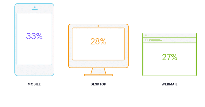
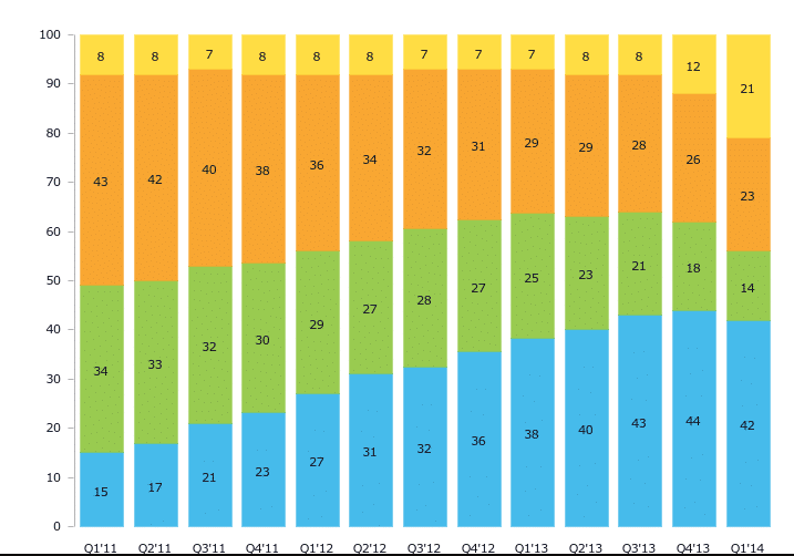
Data for over 1.8 billion opens from campaigns sent in 2013 shows that mobile is the most popular environment for a subscriber’s first interaction with an email.
Opens by environment in 2013
The shift towards mobile has also been rapid. From 2011 to 2013, email opens on mobile phones devices increased by 30%. Mobile first took the lead in the fourth quarter of 2012.
Opens by environment per quarter: Q1’11 – Q1’14
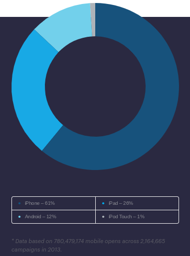
Opens by mobile device
Nevertheless, the overall trend towards opening email on mobile devices is undeniable. The iPhone is the most common mobile device that subscribers use to open their email for the first time. Between iPad, iPhone and iPod Touch, nearly 90% of all mobile opens happened on an Apple device. Marketers should note that this data is likely skewed by the fact that Apple devices will display images by default – thereby automatically registering an open—whereas many Android email clients don’t.
The rapid shift towards—and overall popularity of—mobile means playing it safe with a basic one-column layout isn’t enough anymore. Marketers need to focus on creating the most compelling content possible, so responsive design is no longer a luxury—it’s a necessity.
Check out our Guide to Responsive Design for helpful hints on ensuring your emails render beautifully across all mobile devices.
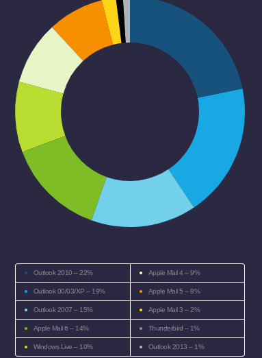
Opens by desktop client
Opens on desktop clients account for more than a quarter of all opens, and the desktop landscape is quite fragmented. Across all editions, Outlook accounts for 56% of all desktop opens and nearly 16% of total opens in any environment.
Unfortunately, the fact that the majority of desktop opens happen in different editions of Outlook doesn’t make life any easier for email marketers. Each edition of Outlook has its own unique rendering challenges, making it notoriously difficult to code for.
In fact, the newer versions of Outlook for Windows are more difficult to work with than older ones: 2000 and 2003 render HTML email using Internet Explorer, whereas 2007, 2010 and 2013 render the HTML using Microsoft Word.
The release of the new desktop client Outlook 2013 will drive a decline in opens on Outlook 2000, 2003 and Express, so Word-based rendering isn’t going away anytime soon. The good news is that Outlook 2013 renders very similarly to Outlook 2007 and Outlook 2010.
So if you’ve already optimized for these environments, no big adjustments to your email templates are needed to support the new client. For the inevitable bugs that do come up, check out our Guide to CSS in Email.
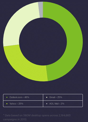
Opens by webmail client
Hotmail was rebranded as Outlook.com in 2013 and together they account for nearly half of all opens that happen from webmail clients.
The rebranding introduced a new set of display challenges for email marketers and coders: most notably, Outlook.com removed support for the margin property—a CSS fundamental.
They also have styling on paragraph and list tags that’s tricky to override. Bottom line—if you’re not careful, you may see your beautiful campaign render in a less than optimal way for 1 out of 10 of your readers on average.
Our Guide to CSS in Email can help email designers navigate the complexities of coding for Outlook and other desktop clients.
Chapter 3
The impact of mobile on click-through rate
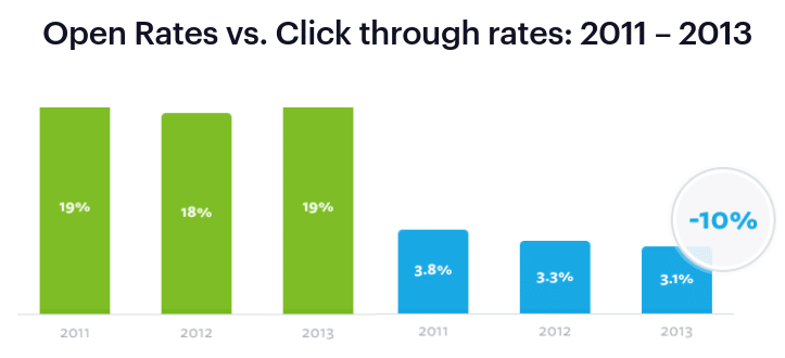
At the same time opens have been shifting towards mobile devices, we’ve seen a correlating decrease in click-through rates—with a 10% decline in 2013 vs. 2012. Aggregate opens rates, on the other hand, have stayed more steady in recent years.
At the same time opens have been shifting towards mobile devices, we’ve seen a correlating decrease in click-through rates—with a 10% decline in 2013 vs. 2012. Aggregate opens rates, on the other hand, have stayed more steady in recent years.
Open rates vs. click-through rates: 2011 – 2013
Clearly, there’s been a shift in email consumption that is more prominently reflected in aggregate CTRs than opens. While there are several factors that may be contributing here—including an increase in the sheer volume of email sent—it’s also worth trying to isolate the impact of the shift to opening email on mobile devices has had.
First off, keep in mind that the most common time to click on an email is when it’s initially opened.
So accordingly, since initial opens are increasingly happening on mobile devices, it is more common for a click to happen on a mobile device than it is on a web or desktop client. In fact, one out of every three clicks occurs on a mobile device today.
Distribution of clicks by environment: Q1’13 – Q1’14
However, when you isolate opens on mobile devices, less clicks are happening on the initial open than when you look across all environments.
And when you go on to compare clicks as a percentage of opens, it’s immediately clear that an open on a mobile device doesn’t hold the same relationship to a click that it does elsewhere.
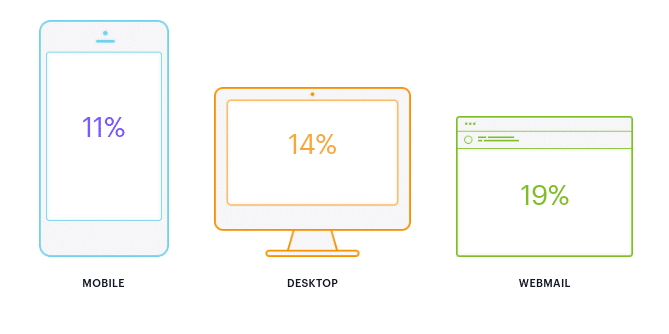
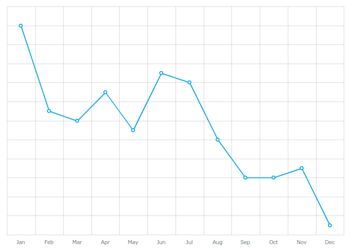
Additionally, the percentage of clicks relative to opens on mobile is decreasing, even as it stays fairly steady in webmail and desktop clients. Though mobile devices are growing in popularity for the first-time opens, the trend suggests it’s becoming more difficult to turn those opens into clicks.
Percentage of clicks relative to opens by month
Chapter 4
Triage: fact or fiction?
From looking at the ratio of clicks to opens alone, we can see that users consume email differently on mobile devices.
But are they in fact “triaging”—or flagging emails to read later on different devices? To answer that, let’s first take a look at the end-to-end behavior of people who first open their emails on mobile devices.
How mobile readers interact with email
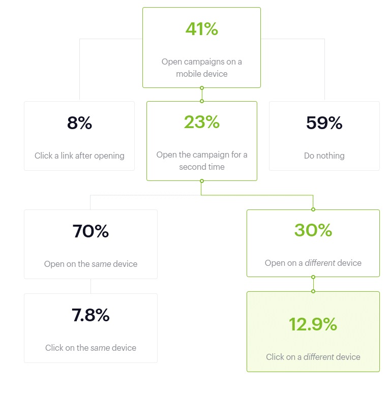
Nearly one-quarter of people who open on a mobile device will open an email again. But it’s still more common for that second open to be on a mobile device than it is on a different device: 70% will stick with their mobile device, and 30% will go elsewhere. So does screen size really factor into the way readers consume content? The data certainly suggests so.
Does that make triage a reality? For a portion of readers, yes. But more importantly, the data suggests that it’s an email consumption habit that’s impossible to ignore because it signifies a greater level of engagement with the content of your message.
The new standard in successful email marketing is not only capturing a subscriber’s attention—but holding it long enough to get them to return and engage with your content.
Chapter 5
Wrap up
- Opening email on mobile devices is more common than opening in desktop or webmail clients. 41% of opens now happen on mobile devices. Marketers need to make responsive design a priority in order to drive the best possible outcome from their campaigns.
- Readers are less likely to click through from mobile devices. 87% of clicks will happen when a reader opens an email for the first time, but only 78% of clicks on mobile devices happen on the first open. As more people consume email on mobile devices, the standard for compelling content is higher than ever.
- If a mobile reader opens an email again from a different device, more clicks happen. Mobile readers who open emails a second time from their computer are 65% more likely to click through. In addition to creating compelling content, marketers need to focus on optimizing their campaigns for both mobile and desktop environments.
Are you ready to take your email marketing to the next level? Check out some of the other Campaign Monitor in-depth resources to get started.

Press CMD+D to Bookmark this page

Connect your favorite tools to Campaign Monitor
Seamlessly connect your ecommerce platform, CRM, website and more.
Browse integrations
Case Study
This nonprofit uses advanced tools and automation to create more emails—and more time.
Learn how
The email platform for agencies
We started out helping agencies with email, so let us help you.
