5 minute read time
New Design Tools to Create the Perfect Mobile Email

Not many of us would be surprised to learn that in 2019, the majority of emails were viewed on a mobile device. Our research has found that mobile and tablet devices now account for 63% of all email open rates.
Emails viewed on a mobile device can range from awesome to awful. While an email newsletter might look great on your desktop, it can become hard to read when squeezed onto a small screen. Narrow columns, small fonts, and broken layouts are all common issues.
That’s why we have been busy creating new email builder tools to give you control and flexibility over how your email design displays on mobile.
New mobile layout options
Some of the best looking emails use columns to display images and text in various combinations. On desktop, this is a great way to break up your content and draw your reader’s eye to the most important message of your email. However, when this content is adapted for a mobile device, multiple columns can either appear condensed, in the wrong order, or simply be confusing to navigate.
To help ensure your email design displays correctly on desktop and mobile, we’re introducing new mobile layout tools. When you select a multi-column section, you can choose between three different options for how this content will display on a mobile device:
- Stack columns (default)
- Stack columns in reverse
- Keep side-by-side
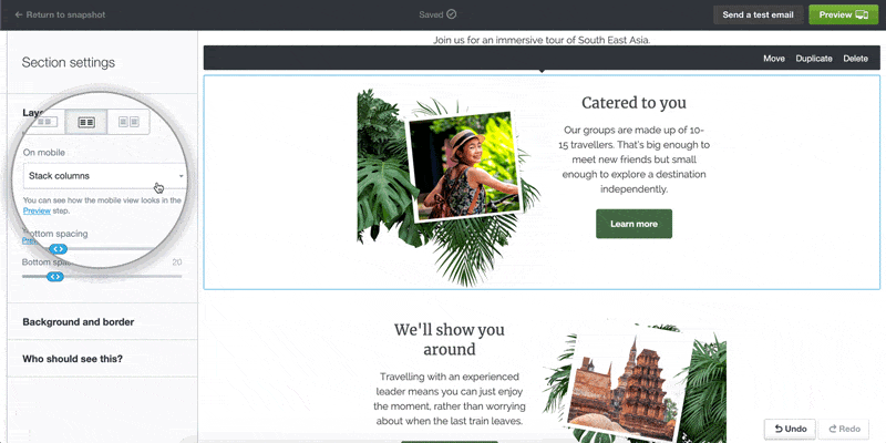
Tip: The ‘stack columns in reverse’ feature can be handy when you have multiple columns with text and images in alternating order. When you select this setting for a particular column section, the order of the columns will be flipped in a mobile view. This allows you to choose the order of the content blocks for mobile display.
To learn more about this feature, check out our help article.
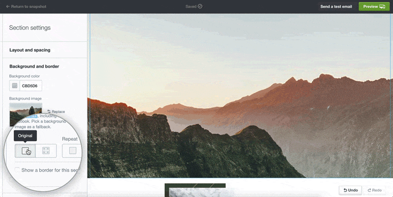
Advanced background image settings
A dramatic background image is a great way to make a statement in any section of your email. However, sometimes background images can be tricky when resized or cropped to fit a mobile screen.
Campaign Monitor now has a solution for this with our new background image settings. When you upload a background image for a particular section of your email, you can choose from two sizing options:
- Original size (default)
- Fit to section (new)
As well as sizing options, you can also now select a focal point. Selecting a focal point will ensure that the chosen section of your image is always in view, even when resized for a mobile device. This is useful when you want to avoid cropping the most important part of the image when it appears in a mobile view.
Check out the difference this tool can make:
To find out more, view the help article.
SMS and phone links
We’ve built new functionality allowing you to add a phone or SMS link to different elements of your email design, making it easy for your subscribers to contact you directly.
When a phone link is clicked, the mobile device will dial the linked number. An SMS link will trigger the text message app to open, with the number prefilled. This is perfect when adding a call to action like “Call us now” or “Text to register.”
To create these new links in the email builder, simply add tel: or sms: in the field, followed by the phone number. Don’t forget the country and area code!
Learn more in this help article.

More tips and tricks
Now that you’re up to date on the latest email builder features, check out our 4 essential tips for creating mobile-ready emails:
- Use a responsive template: A responsive email template makes life a whole lot easier and will ensure your emails display seamlessly on any size screen. With Campaign Monitor, all our email templates are responsive.
- Compose a short subject line: On a mobile device, a subject line over 30 characters can often get cut off. That isn’t a lot of space, so be sure to write a concise, compelling subject line that will intrigue your audience enough to open the email. Check out this blog post for ideas on how to improve your subject line.
- Keep your call to action front and center: Place your call to action button or link near the top of your email to make it mobile-friendly. To ensure maximum clickability on a smaller device, make your buttons at least 44 x 44 pixels. In Campaign Monitor, you can do this by selecting the medium or large button size.
- Preview your email on multiple devices: Before you send, it’s always a good idea to send a test email and test it on multiple devices to ensure the content is formatted correctly.
Wrap up
When creating a new email campaign, it’s so important to ensure it is optimized for mobile devices. Mobile-first email design can lead to an increase in open and click-through rates, driving results for your business. We hope these handy new tools will make it even easier to create mobile-ready emails that your subscribers will love.