7 minute read time
Email Usability: The Science of Keeping It Short and Sweet

Article first published January 2011, updated June 2019.
You’ve probably heard the advice, “Keep your email campaign short and sweet.” Often this phrase is followed by, “because no-one’s going to read loads of copy, anyway.”
As much as this seems like common sense, we’ve all seen clients attempt to cram in as much information as possible, oblivious to reason. I believe this is largely due to another school of thought, which goes along the lines of, “My subscribers have signed up because they obviously want to read all about my brand values and 5-year plan.”
With a lack of hard evidence to the contrary on hand, this can be a frustrating argument to dismiss.
See no email
I was skimming through Jakob Nielsen’s research recently and came across a little gem in the form of an eyetracking heatmap. Based on data collected from recipients of an email newsletter, it denotes the areas where they looked the most in red and the least in blue:
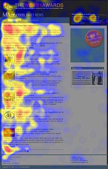
From: ‘Email Newsletters: Surviving Inbox Congestion‘ – Jakob Nielsen’s Alertbox, June 12, 2006
Note the emphasis on reading the first two words of the headlines, followed by diminishing interest in the body copy. As the email extends downward, interest in the content rapidly drops off.
If this doesn’t prove how fickle the average subscriber is, then there’s more. Based on this research, Jakob observed that:
“…the average time allocated to a newsletter after opening it was only 51 seconds. “Reading” is not even the right word, since participants fully read only 19% of newsletters. The predominant user behavior was scanning. Often, users didn’t even scan the entire newsletter: 35% of the time, participants only skimmed a small part of the newsletter or glanced at the content.”
Ouch. Just when you thought you could get away with adding at least a tiny introduction to your newsletter, Jacob throws in the following salvo:
“People were highly inclined to skip the introductory blah-blah text in newsletters. Although this text was only three lines long on average, our eyetracking recordings revealed that 67% of users had zero fixations within newsletter introductions.”
It looks like we’ll be keeping our emails to the point this season, hey?
What can we learn from this?
You’re probably speed-reading this blog post, so we’ll get to the good stuff. Here are a couple of tips for getting the important bits of your email read:
- Keep it short – Interest in the content of an email diminishes as the email extends below the fold (as backed up by this study), so cut the copy and keep the most important points of the message near the top.
- Optimize your headlines – As the first two words of a headline are the most important, keep them informational. For example, a headline like “3 tips for improving email usability and response rates” could be rephrased as, “Email usability: 3 tips for improving your response rates”.
- Get to the point – Most readers will skip any long-winded greetings or introductory text, so decide if it’s worth including. If an introduction is necessary, avoid adding any important information to this section.
- Focus the message – Where possible, avoid covering too many topics and keep the message simple. You’re only going to have the readers attention for a few seconds, so make it count by using a standout call-to-action.
- Make it scan-friendly – Limit body copy to easily-readable paragraphs, preferably under 60 characters in width. Selectively use images to reinforce your message, as images often take less time to understand than words.
- Align to the left – Notice how little attention the right-hand column of the email above is getting? That’s because readers of left-to-right languages (like English) are accustomed to scanning from the top-left first. Keep this in mind when designing two- or more column layouts.
Your email design may only get an average of 51 seconds of fame per reader (if it gets ‘read’ at all). How will you make the most of it?
The best skimmable emails – examples you can swipe
Now you know how your readers scan through your content and why it’s important to design your emails in such a way that they’re easy to skim through. Let’s go ahead and take a look at some examples of emails that are designed to be skimmable.
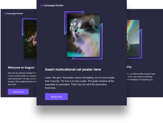
1. On
On is a Swiss running shoe company that sells gravity-defying gear. In other words, On’s shoes help you optimize the way you run. However, that’s not all the company is good at. On is also one of the best examples of optimizing emails for usability and readability.
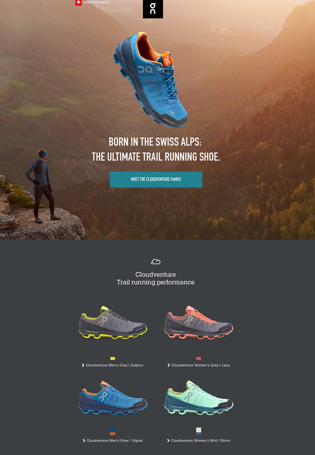
Source: Campaign Monitor
If less is more, On packed a whole lot in this email with the way everything is kept to a bare minimum. From the copy to all design elements, this email definitely stands out.
Here are a few lessons you can take away from this epic email:
- Keep your copy short and focused. While the copy in the email is less than 20 words, it says a lot. By crafting a headline that easily conveys both the unique value proposition and benefits of the shoe, there’s no need to say more.
- Use visual cues. Notice how the main shoe is pointing to the headline and call to action. This eliminates the need for more copy to draw the reader toward the main parts of the email.
- Blank space is your friend. The bottom part of the email employs blank space, more products, and a few words to create a “pyramid.” With the tip pointing to the call-to-action button, it’s difficult to miss it (and resist clicking it).
On’s email design and content is an excellent example of crafting an email that’s skimmable. If there’s one thing you can take away from this email, it’s the fact that you don’t have to say a lot to sell a lot.
2. Jack Daniel’s
Jack Daniel’s is known for fun and witty campaigns. When the company introduced Tennessee Honey Whiskey, they used the email campaign below.
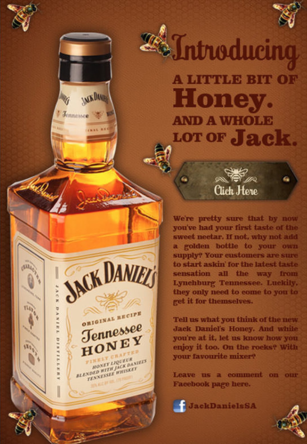
Source: Campaign Monitor
Unlike On, Jack Daniel’s included a lot of copy in the email. That’s because the company knows their fans never tire of a Jack Daniel’s story. Here’s how Jack Daniel’s mastered email usability by making the email scannable:
- Master the headline. Besides triggering curiosity by using the word “introducing”, the headline conveys the whole purpose of the email.
- Left-align your important information. The most important part of the email is the new product being launched. Taking up all the space on the left, you definitely can’t miss it.
- Point readers to secondary information. Besides the hero image being the main object of the copy, Jack Daniel’s used a clever way to point to the product story and description on the right. Notice how the bottle is angled in such a way that it acts like an arrow, pointing the eyes to the rest of the copy.
With such simple yet powerful emails, it’s no wonder Jack Daniel’s is one of the most successful whiskey brands around.
Wrap up
Besides the fact that people’s attention spans are getting shorter, their inboxes are becoming flooded with emails. This means that, for your email marketing campaigns to be effective, you need to craft emails that are short, sweet, and get to the point. If you fail to do that, you’ll lose subscribers fast.
We know how important reader engagement is to every email marketer, so check out these 6 engagement tactics you can use to keep your email subscribers hooked to your emails.