8 minute read time
How We Got a 127% Increase in Email Click-Throughs by Redesigning Our Blog Email

This article has been updated as of June 2019
Campaign Monitor has been doing content marketing before it was even a recognized marketing approach. Looking back over our content, our Founder, Dave, has been publishing blog posts and guides to email marketing since 2004.
So, when I started at Campaign Monitor as Director of Content, I had some pretty big shoes to fill.
One of the opportunities I immediately noticed was the email we sent to blog subscribers when a new blog post was published, so we decided to run some tests on it.
This is the story of how we redesigned our blog subscribers email and landed a 127% increase in click-throughs.
The old blog subscribers email
The old blog subscribers email was being sent automatically via our RSS to Email feature. Each time we published a new blog post, our own Campaign Monitor account automatically pulled the summary and a link to the article from the RSS feed and sent it out to subscribers.
The old email looked like this:
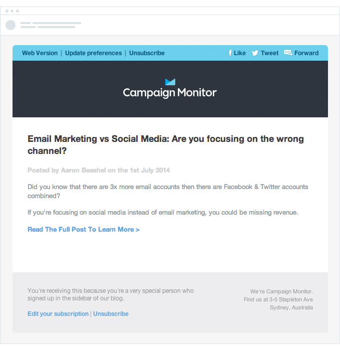
It wasn’t the most visually appealing email and it didn’t align with the rest of our marketing assets, which were all beautifully designed by our fantastic design team.
The new blog subscribers email
Having just launched our new email builder, Canvas, we decided to use one of its new styles to redesign the blog subscribers email and A/B test the new design against the old one.
Here’s the new email:
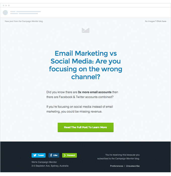
The result? We received a 127% increase in click-throughs on the first test we ran.
Still not completely satisfied with that, we continued testing the old design against the new design on the next few emails we sent. Every time, we saw a similar result. It became clear the new design was working very well.
But why? What was it that made this new design convert so much better, even though the text content and the offer were exactly the same?
Here are some thoughts on why it converts so much better:
Content prominence
In the old design, the most prominent element (and, therefore, the first thing people saw) was the large Campaign Monitor logo. In this new design, the blog title is the most prominent element, drawing people into reading the post summary and increasing their desire to click through to the blog to read the full article.
Better design elements
The typography and layout were dated and tired in the old layout. This fact didn’t instill much trust in the reader and likely had a negative effect on their perception of the blog post’s quality. The new design features modern imagery and typography and increases people’s motivation to click through by subtly reassuring them the post will be high quality and worth their time reading.
Stronger CTA
In the old design, the only link to the blog post was a small text link at the bottom of the email. The new design, however, features a large, high-contrast button that draws the reader’s eye and makes it easy to take the next step and click-through to the post.
Other tests and changes
Given that this is one of the most frequent emails we send (and is a significant driver of blog traffic), we like to run an A/B test each time we send, in an effort to further improve the effectiveness of the email.
Here’s an outline of some of the tests we’ve recently run:
Microcopy
We tested using generic button copy like “Read the full post to learn more” against button copy that was specific to that email, such as “Learn the 3 ways to improve your email marketing.” Each time we tested this, the email with specific microcopy won the test by about a 10% margin.
Heading link
We also tested whether or not having a link behind the large blog post heading at the top of the email improved click-through rates or whether it was better to just have the link behind the button at the bottom. Not surprisingly, it’s better to link the heading text as well.
Subject lines
The majority of the time, we A/B test potential blog headlines against each other using a subject line test. The headline is one of the most critical factors in the success of a blog post, and A/B testing two headlines helps us find the best one for the post. For instance, in one of our recent blog posts that featured a video we got an 18% increase in opens just by including the word “Video” in the subject line.
Through constant testing, we’ve been able to increase the click-through rate of our email campaigns beyond the initial 127% lift. It still varies from email to email, but we can often see 50% click-through rates on our blog subscriber email, and that’s something to be excited about.
How to redesign your newsletter
You’re probably wondering if you can enjoy a higher email click-through rate by redesigning your email. Well, anyone can. However, you need to make sure that your email newsletter redesign is done right. Here are some email newsletter best practices you should be sure to follow:
Keep the new design simple and clean.
One of the biggest reasons for low click-through rates is a cluttered email design. Research has shown that people don’t read emails; they skim.
What this means for your email redesign is that you have to:
- Choose an uncluttered email template. A noisy email template is a sure way to distract your readers from your main goal.
- Keep your content simple and easily digestible. It’s easy to fall into the trap of thinking a lot of written content is the best way to sell. However, people don’t have the luxury of time anymore. So keep your emails short and punchy. Get to the point quickly.
- Favor single-column templates over multiple-column ones, as they’re easier to skim. If you need more columns, limit them to three. More than that, and they won’t make a good experience for those reading on mobile devices.
One of the biggest advantages of keeping things simple is the fact that it becomes easier to direct readers to your CTA. This is crucial if you’re wanting to see an increase in your email click-through rate.
Maintain your branding.
Unless you’ve also redesigned your brand, it’s important to maintain your branding in the new email newsletter. This includes sticking to your main brand colors as closely as possible. Doing this allows your readers to immediately recognize who the email is coming from, despite the changes.
Consider our example above. The design definitely looks fresh and new, yet you can immediately (and easily) tell who the email’s from.
On the other hand, failure to maintain core elements of your branding will result in your readers not being sure if the new look really is you. In these days of data breaches and scams, people are wary of opening emails that look suspicious, let alone clicking on the links.
Bottom line: don’t ditch your identity in the name of redesigning your email newsletter. It’ll confuse your readers and negatively impact your email click-through rate.
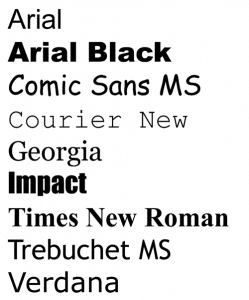
Be careful when switching fonts.
One email design element that can make a world of difference is the font you use. However, as you hunt around for your new font, make sure to go for a font that’s web safe. Not all fonts display the same on different email clients and devices that the email is consumed on.
While you can’t go wrong with common fonts like Arial, Verdana, Georgia, Times New Roman, and Courier, be wary of other newer and fancier fonts that can be tricky to work with.
Source: Ready Artwork
Test before launching.
So you’ve designed an award-winning email and it’s ready for the world to see, right? Not yet.
Before you launch your redesigned email and start seeing a higher email click-through rate, you have to test your email first. Testing will allow you to see the elements that help increase your click-through rate and which element you can improve on.
A/B testing can never be stressed enough, particularly when it comes to making some major changes to your email newsletter.
Wrap up
It took me about 30 minutes to redesign the blog subscribers email using Canvas, and that 30 minutes’ worth of work scored us a 127% increase in click-throughs on our email campaigns. These results held up over multiple tests.
Bottom line: we doubled our click-through rates for every one of these emails we send, with a few small changes that took less than an hour. Not a bad result.
Between Canvas and our A/B testing features, it’s easier than ever to redesign your email templates and test them against each other. So give it a try today, and maybe you’ll get an even better result than we did.
For more tips on increasing your email click-through rate, check out our article 5 Ways To Improve Your Email Marketing Click-through Rate.
This article was originally published in August 2014