11 minute read time
How to Craft Strong Email CTAs that Get Clicked

Article first published June 2018, updated July 2019
Picture this: You crafted a beautiful email with a great subject line, an interesting hook, and a relevant offer. You hit the “send” button and pat yourself on the back!
A couple of days later, you go to check your reports. To your surprise, you see a mere 2% of the people clicked through in your email. You did everything you were supposed to: developing good copy, using hooks, and providing an offer your list would find useful. Why do you have such a low click-through rate?
Here’s what went wrong: you didn’t optimize your call-to-action (CTA). It’s easy to overlook them, yet it’s essential to improving your click-through rates. Today, we’ll explore how you can create email CTAs that will help you increase your email click-through rates.
Start with the end goal of your email
Before you can start designing your CTAs, you need to know what you want people to click on. It’s a basic idea, yet it’s often left until the last moment before sending an email. You don’t want to figure out what your goal is as you write your email; you want to start with your goal in mind before you write anything.
Copywriting legend Joanna Wieber from Copyhackers says:
Every email is a sales email.
Joanna doesn’t mean a welcome email is an opportunity to sell something; rather, she means every email should lead to a final conversion, whether that’s a sale, a donation, or an in-app action. Even if you are “nurturing” a subscriber to build trust in your relationship, the end goal should be the same: taking the subscriber a step closer to a final conversion.
Based on the end goal, you want to establish a call-to-action that will lead your subscriber into the desired conversion. If you check the lifecycle campaigns companies send, you will see they all have a CTA built around the end goal.
For example, Charity Water starts with an email that has CTAs focused on getting their subscriber familiar with their organization.

While having three CTAs is unusual, they purposefully use them to build affinity and trust with their subscribers. After a couple of emails, they send one asking for a donation—which is ultimately their end goal.

Action steps:
- Define the end goal of every email you send.
- Write the CTA before you write any other part of your email.
Focus your email content and design around the CTA
Now that you know every email should start and end with a goal in mind, you need to focus the email that leads to the CTA.
People have hundreds of emails waiting in their inbox. Your email needs to be clear enough so they can understand what it’s about and take the desired action. Otherwise, you risk getting your subscribers confused, which will lead them to ignore your email, or worse yet, delete it.
Every email should lead to the next step in the subscriber’s lifecycle. To do so, every element of your emails needs to correspond with that final step. It builds your case in the subscriber’s mind before they get to the final CTA and emphasizes why they should click when they get there.
You saw how Charity Water welcomes their subscribers with an email that has three CTAs. This works for a welcome email when the company is trying to get subscribers to know their brand. But if you check their second email, which focuses on the donation, you see they built the whole email with that goal in mind. They used the subject line, the message, and the image around that idea, which makes it easy for you to act on it.
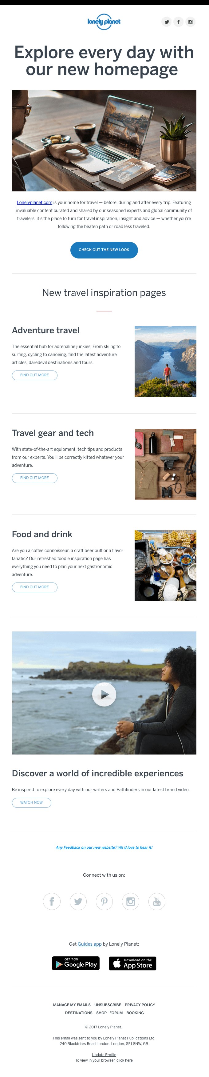
J.Crew designed the following email to lead their subscribers to the “25% off” offer. The typography size, the background gradient, and the copy together take you from a position of being interested in their brand to taking action upon their offer.

Artifact Uprising does a similar job with their survey email, but in this case, they give a very original twist to it.

In this email, the telephone and the color gradient visually lead you to the CTA. What’s more, the copy above the CTA entices people to take the survey thanks to its $10 discount code.
The action that you can lead the subscriber goes beyond making a purchase. For example, Kabbage, the small business finance company, looks to re-engage with the users who have signed up but haven’t applied for a loan yet to fill in a survey.

Such an action would allow Kabbage to qualify the user and refine the next set of emails, one of the key ideas behind behavioral marketing.
Zoom, the video conferencing tool, looks to have people sign up to one of their webinars. They do a great job of focusing the message by creating a sense of urgency. This adds a level of exclusivity that makes the CTA more effective than the commonly used “Sign Up” copy.

Action steps:
- Focus your CTA on the goal you defined in the previous section.
- Reverse engineer the email based on the CTA, building every element of the email—subject line, hook, images, and storyline—to lead to it.
Match the message with the CTA
Now that you know the goal of every email and how to structure the message around your CTA, you need to match the former with the latter.
Previously you saw the great job J.Crew and Artifact Uprising did by creating a coherent email that made both the message and the CTA fit. Banana Republic does a similarly outstanding job in the email below:

What makes this email so good is that they picked a color scheme—lemon yellow—that relates to the main idea: getting fresh. They also use the keyword “fresh” twice, once in the title, and another one in the CTA, making the whole email more cohesive and effective.
In the following example, Madewell does a great job of playing with the idea of selling boots, with the image and the CTA:

Action steps:
- When writing your next email, think how every element relates to the message and the CTA. Play with different variations until you can find the one that makes the email more powerful, like in the examples you saw above.
Use copy that converts
While the goal of the CTA and the focus of your emails around it matter, the CTA copy can have a significant impact on the click-through rates. It’s easy to either go with the standard text (e.g., “Click Here”) or overcomplicate it with too much text that distracts the user.
Since you have so little space in your CTAs, you can’t get too original with your copy. It’s better to take your time to develop a great hook and storyline, and then use your CTA as a way to close the message than focusing on the CTA alone.
While you can’t add much copy to your CTAs, you can always rely on a specific set of time-tested keywords known as “power words,” which tend to evoke emotion and trigger curiosity in the user’s mind.
Some of the most commonly used power words for CTAs include:
- Create
- Enter
- Explore
- Find
- Free
- Get
- Join
- More
- New
- Now
- Off
- Save
- Show
- Start
- Stop
- Try
- Upgrade
- % or $ signs
While none of these words have anything particularly special about them, what matters is how you use them. Adding a bunch of these power words together won’t make any difference if they have nothing to do with the message and desired action.
In the following email, VRBO, the home rental site, matches the idea of spending your next vacation in dream home with the CTA, which is focused on finding the home. They don’t want you to book just yet, that’s why the CTA says, “Find a Vacation Home.”

If they were sending an abandoned cart email, they could use something like “Book Your Vacation Home,” as it’d match the previous action and intent of the subscriber. In this email, however, the idea of “finding” a home perfectly fits the intended goal.
J. Crew once again pulls out a great email with a somewhat unconventional CTA:

They start with an intriguing offer, and they finish the email with the idea of “revealing” it if you click on the button. Using the word “reveal” isn’t something often seen, yet J. Crew used it because they knew that word had a powerful connotation in that context.
Using these “power words” is ultimately about creating copy that compels your subscribers to click your CTAs.
Action steps:
- Take a look at the previous list of power words. Think how you could use them in your next email.
- Stumped? Use Thesaurus.com to find other words that help you communicate that value of your CTA.
Writing a seamless CTA boosts customer satisfaction
So, you have your killer end-goal strategized, and you lead up to it using cool graphics and power words. But what happens when a customer wants to act upon a CTA in email marketing? How fluid is their transition from the CTA to their action?
Use a CTA button in your emails
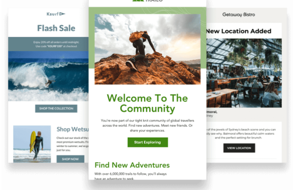
Like all the examples, we have witnessed in this blog post so far, they all have one thing in common: call-to-action buttons.
 Source: Really Good Emails
CTA buttons are the first step to making sure your customer has a smooth transition from email to the company destination—whether that’s a donation landing page, an e-commerce store, or a website.
Including CTA buttons within your marketing emails is useful to your customers for one reason only. It keeps the customer on task. Plus, choosing a button over a hyperlink for your CTA can boost conversion rates up to 28%.
Be sure to design your call-to-action button in a contrasting color to your email. You want the button to stand out and scream “click me!” before your customer moves on to their next email.
Always use similar branding and language
The keyword here is seamless—and your color schemes, images, and language throughout your customer’s entire experience should be seamless.
You never want your CTA to sound spammy. The overall goal is to make the customer believe in your brand and associate your logo, lingo, and language with your company.
If your brand colors are pink and white, your action button needs to redirect to a page that is pink and white as well. If your language and tone are friendly and conversational, then keep it that way.
Take the marketing champion of toilet products, Poo-Pourri, for example:

Source: Gmail
This is an ad for Poo-Pourri’s new summer product. When the customer clicks on this image, it redirects them to the Poo-Pourri store and shows this:
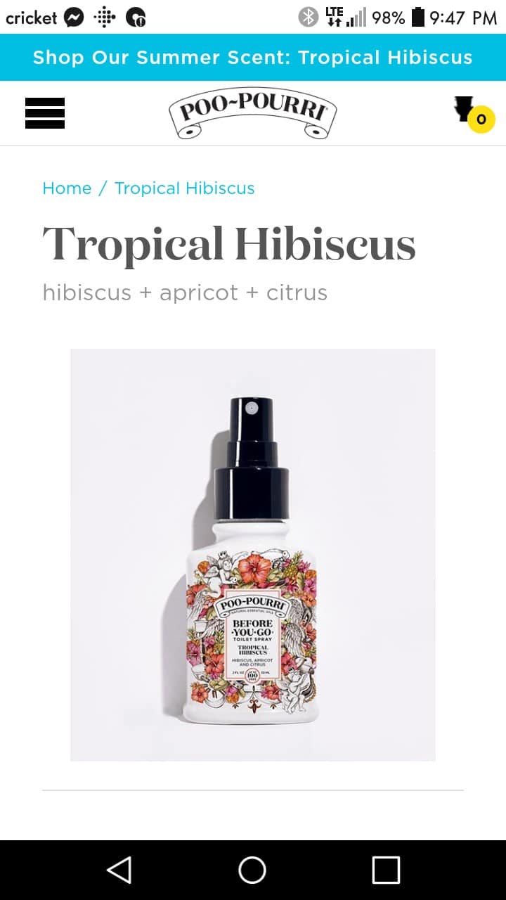
Source: Poo-Pourri
Notice that this company did an excellent job at keeping their themes in check (the hibiscus flowers), as well as their simplistic images that show one lone bottle. From their logo to their font choices, they are seamless and consistent with their brand.
Make sure your CTAs convert to mobile formats easily
Customers are more likely to click on an email marketing CTA if that button redirects them to an app that they already have or can download easily.
Take for example this email put out by the music platform Spotify:
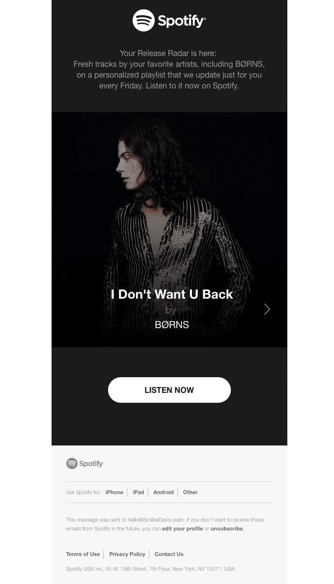
Source: Really Good Emails
Their email exemplifies CTA best practices. Their CTA button contrasts in a striking manner with their design background and tells the audience they can listen to this artist now.
The less time you have between the CTA and the end product, the better. If the customer has the Spotify app on their phone, they don’t have to wait for anything. Clicking on the email’s CTA button will immediately redirect the customer to the app. There’s no need to use a browser or read tiny words on a tiny screen.
In case they don’t have the app yet, Spotify went the extra mile to insert links that will redirect them to their proper app store.
Wrap up
The power of email lies in the actions they drive. In order to drive the desired actions, you need to define what your end goals are. Once you know what each email you send will lead to, you have to focus the subscriber’s attention by featuring one CTA and matching it with the main message of your email. Using the information we provided in this post, you should be able to include CTAs that increase click-through rates in your emails.