Every marketing email you send should include some form of clickable CTA that guides your subscribers back to your website. For nonprofits, having a clickable CTA is even more crucial.
While nonprofits share materials with their subscribers throughout the year, one of the essential jobs of their email campaigns is to continuously bring in donations to keep their organization up and running, while also giving to their cause.
That requires more than your standard CTA; it requires clickable email donation buttons for nonprofits.
Why clickable email donate buttons are crucial for nonprofits
While some brands choose to simply hyperlink anchor text for their readers to click and follow, our own studies have shown that having a clickable button for our CTAs are more effective.
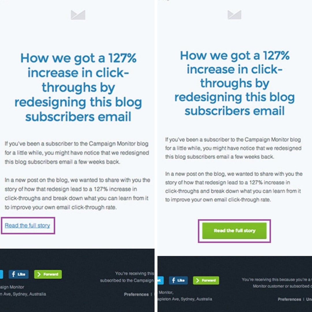
We ran two versions of an email amongst our subscribers—one with a hyperlinked CTA and one with a button CTA.
During our study, we found that using the green CTA button received a 127% increase in click-throughs for this particular email. Overall, we found that using a CTA button, instead of just a text link, garnered us a 28% increase in overall click-throughs.
Email metrics play a significant role in not only determining the success of your campaign, but they help monitor your subscriber’s activities. In the case of nonprofit organizations, they must pay careful attention to these metrics to see who’s contributing and who isn’t, while also determining why. Nonprofits particularly rely on click-throughs from their readers because that means they’ve decided to act.
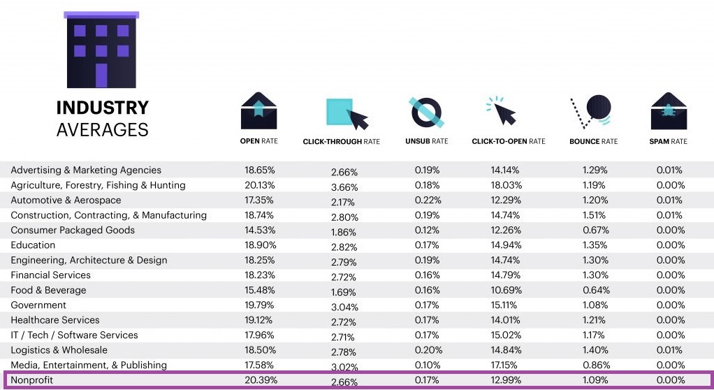
While nonprofits have some of the highest average open rates, those numbers don’t always convert to click-throughs.
Want more nonprofit specific metrics? Read the read the latest Nonprofit Email Marketing Benchmarks guide.
When we compare these numbers with our study on the effectiveness of CTA buttons, there’s reason to believe that there’s a strong correlation between donate buttons for nonprofits and their click-through averages.
This means that those in the nonprofit industry need to pay careful attention to whether or not they have a CTA as well as what their CTA says and how it looks. Remember, design plays a significant role in your marketing messages, and that includes your call to action.
3 email donate button must-haves
As with any part of your email marketing, your CTA button requires plenty of attention to detail. Donate buttons for nonprofits are no exception and require particular attention because this is the piece of your email message that’ll get your readers to take action.
Read on for a short list of email donate button must-haves for nonprofits.
1. Compelling copy
Getting your readers to take the desired action—in this case, make a donation—you want to craft truly persuasive copy. What your CTA button says can say a lot about you, and that means you want to avoid certain words.
These friction words include:
- Download
- Buy
- Order
- Submit
These words come off as orders, which can cause subscribers to take offense. At the very least, these commands can feel off-putting.
In the case of nonprofits, readers turn to your specific group because it fulfills their desire to help others and they might not appreciate being bossed around.
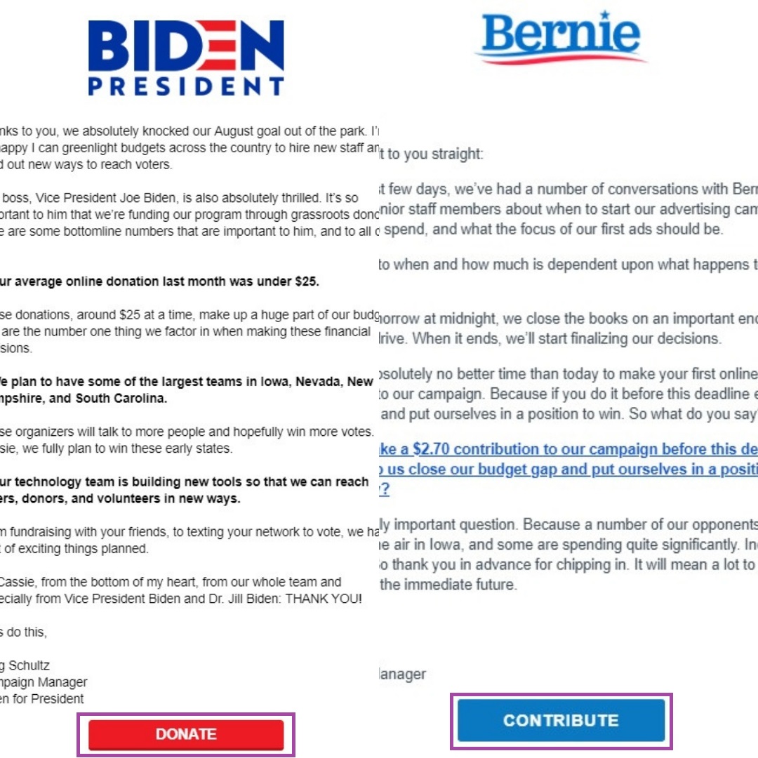
When comparing these two political fundraising emails, it’s clear they’re both trying to keep their CTAs short, sweet, and to the point.
However, it’s the choice in words that sets the two emails apart: The red CTA simply states “Donate” while the blue CTA asks readers to “Contribute.” The “Donate” button comes off more demanding than the other, creating friction between the reader and the campaign.
And while not all readers will take offense at the harsh commands, why risk it?
Your marketing emails must focus on the benefit of the reader, which can be particularly tricky for nonprofits. While you’re trying to ask them for donations, remember to make your message about subscribers and their need to feel helpful, not about you needing money.
2. User-friendly design
The design of your donate button for nonprofits plays a bigger role in getting readers to take action than you may think. Just like with the design of the rest of your email, you have to make sure your CTA button’s design stands out, is easy to find, and gets the reader to act.
One significant design aspect to keep in mind when building a donate button for nonprofits is to make sure it stands out on the page and actually looks like a button, as this lets people know exactly what you’re expecting them to do.
A hyperlink doesn’t always give that impression, which is another reason why nonprofits should avoid hyperlinking their primary CTA.
First, focus on the overall size of your CTA button. You want it to stand out, but you don’t want it to look obnoxious. You want your readers to pay careful attention to the rest of the copy and imagery within the message because that’s where the storytelling magic will happen, and that’s what’ll convince your readers that they need to contribute to your cause.
An easy way to help your button stand out is to make quality use of whitespace. Often referred to as “dead space,” this is the blank spacing around your CTA button. When used appropriately, it helps your buttons stand out, even if you’re including plenty of copywriting, imagery, and multiple CTA buttons.
Source: Really Good Emails
This example by Patagonia makes use of compelling copy, imagery, and even includes multiple CTAs without being overwhelming. The ample use of white space and clear lines ensures every subscriber can find a CTA that resonates.
Thanks to their various color choices and whitespace surrounding their buttons, readers know exactly where to go if they want to learn more or get involved.
3. Proper placement of the donate button for nonprofits
Although getting your donate button seen is a priority, you can’t simply shove a button into your reader’s face and expect them to act on it. As a nonprofit, you aren’t simply selling a product to your audience members. You have to convince them that giving to your cause is what’s in their best interest. This can be very difficult for some nonprofits, considering the mission is to give back to those in need.
This is where storytelling comes into play.
With the right combination of copywriting and imagery, you can tell the story of someone your nonprofit has helped in the past or put the readers right into the shoes of the people you’re aiming to help.
Once that’s done, then you can place your CTA and see results.
Source: Really Good Emails
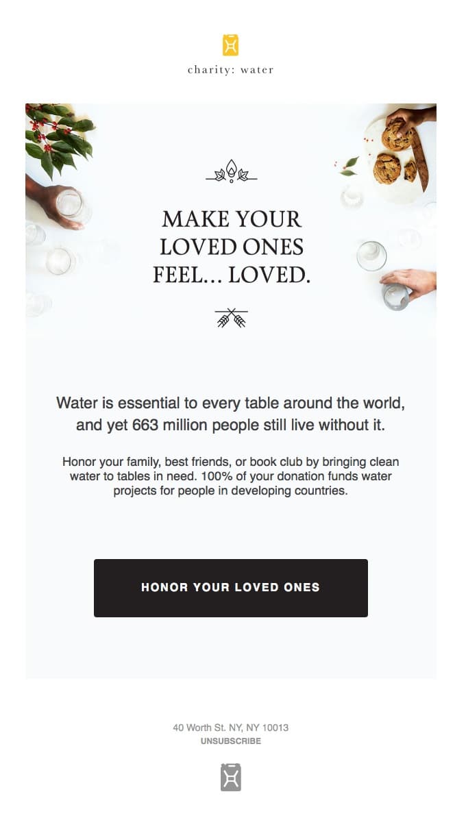
What makes this nonprofit newsletter from charity: water stand out is that they put the reader right into the scenario. With very little copywriting, they put the reader into the story and then carefully craft a donate button that doesn’t directly tell them to contribute or donate.
Instead, they use clever copywriting to entice readers to donate in the name of someone they love, as a way to honor them.
The reader feels compelled to honor their loved one and, therefore, is more likely to want to give to charity: water because they reached the reader on such a human level.
How to create a donate button for your nonprofit
There are many tools out there for nonprofit marketers to use when creating their marketing materials and buttons to include within their email campaigns. Campaign Monitor makes it easy, with our free-to-use Bulletproof email buttons resource.
This resource allows you to customize not only your button text, but also the background image, color, size, and more. Once you’re done, simply copy your customized HTML code and paste it into your email template of choice.
For those who are already partnered up with Campaign Monitor, our easy-to-use email builder allows you to drag and drop a button content block into your email template. From there, you have the opportunity to customize the button’s style, size, alignment, and link.
Wrap up
A donate button for nonprofits is more than a call to action; it can make or break a nonprofit’s budget. Nonprofits need to focus on their donate buttons because they need to entice readers to act and make donations that the brand relies on to not only help others but to remain up and running.
When crafting your donate button, keep these tips in mind:
- Make it about your readers’ needs
- Appeal to their emotional side through compelling copywriting
- Make it stand out with branded colors and proper use of whitespace
- Avoid friction words that could seem off-putting or demanding
- Place it after your storytelling, so readers have a chance to be compelled to take action
Ready to start building your next nonprofit email campaign? Contact us today and request your live demo.

