9 minute read time
Conversion-Centered Design Principles for Email

Article first published in April 2017, updated July 2019
Crisp, simple, and engaging email designs filled with dynamic content draw subscribers in—allowing them to build a relationship with your brand. When the goal is increased customer conversion rates, it’s essential to understand what customers are looking for and how email design plays a role in fulfilling their needs.
According to the psychologist, Dr. Robert Beno Cialdini, consumers want honesty from brands, and they want to feel understood and included in brand messaging. They’re looking to have their pain points alleviated quickly, or they’re looking for instant gratification from services. When consumers feel that their values are in line with your values—email conversion rates climb.
What is conversion centered design?
How does email design play a role in lead conversion? Different aspects of email design influence how a subscriber connects with your brand. Design grids, imagery, simple layouts, calls to action, and responsive design are essential elements that can be used in creative ways in order to engage with audiences.
What are the principles of conversion-centered design?
When defining the principles of conversion-centered design, marketers break it down into seven principles:
- Attention – Begin by grabbing your readers’ attention from your traffic source, such as your promotional email
- Context – Convince your reader they can learn more by taking action, such as clicking on a CTA
- Clarity – Explain the value of your campaign by detailing what you’re providing and why it’s worth it to the reader.
- Congruence – Align your copy and design to your mission (i.e. getting conversions)
- Credibility – Build your social proof, such as your reviews or testimonials
- Closing – Capitalize on the impact your CTA has and make sure your viewers understand why they need to take action and now
- Continuance – Encourage follow-up and returning consumers

Source: SlideShare/LinkedIn
Conversion-centered design tips for email marketers
1. Use email design grids that will guide your clients’ subscribers
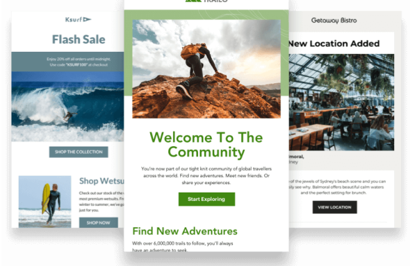
Through certain email design grids, you can actually guide customers, allowing them to engage with your content. For example, using an Inverted Pyramid design is an effective way to focus subscribers on what’s most important.
This design should include a strong headline that delivers your campaign’s key message. The email should also contain supporting materials and imagery in order to encourage their subscribers to click through and engage with the email.
The pyramid should always lead readers to a call to action—we will look more extensively at effective CTA designs toward the end of this guide. You can even use several inverted pyramid designs within one email if the email consists of different exciting topics. This helps to break down each set of information into easy-to-read sections.
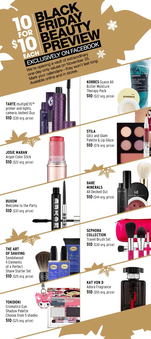
Another effective design grid is an angular one with a zig-zag layout.
According to the graphic designer, Mary Stribley, an “angular layout is both enticing to look at as well as functional to order lots of information and imagery.” You can create these angles through imagery or color blocking in order to guide the reader through each step of the email. This not only creates a visually pleasing layout, it also helps to simplify each section of the email so that it is easy to read.”

Takeaway: Design grids are not only helpful during the design process, but they guide a reader’s attention. Providing this organization helps consumers find important information quickly while making it easy to digest.
2. Include Imagery, graphics, and colors that will grab their attention
Filling your clients’ emails with bright imagery, graphics, and colors can lead to increased attention time and conversion rates. It’s essential to make sure that every color, font, and image within emails match your brand’s.
Staying in line with brand messaging and brand voice increases email personalization and builds trust. When email design builds trust with subscribers, engagement, and click-throughs increase.
Using bright colors attracts attention, and color blocking allows subscribers to focus on the key message of every email. Product-oriented emails can use white space in order to focus the reader’s attention on the featured product.
According to Canva’s graphic designer, Mary Stribley, using “different type sizes and grayscale colors lets readers understand what’s important and what’s less important.”
Colors, font sizing, and brand images will help to increase conversion rates.
According to Contently, images can improve reader engagement if the images are chosen wisely. Images within your clients’ emails should match brand voice, be relatable, appeal to subscriber emotions, and avoid cheesy stock photos.

Takeaway: Plain-text emails are fine in certain scenarios. However, most promotional materials you’ll be sending out need to stand out amongst your competitors. Having a design that makes creative and bold use of images, fonts, and colors will help readers remember your brand and could help encourage user engagement.
3. Break up your content
It’s important for each email to be simple and visually pleasing without too many distractions. When sending emails with multiple layers of information, it’s important to divide each section effectively and easily. You can do this by creating horizontal borders, geometric shapes, interactive maps, or other layouts that fit within an easy-to-read design.
This tool is especially effective when you use targeted marketing through segmented lists. You can divide different pieces of information within each email that are most relevant to your clients’ lists of subscribers.
Using a marketing automation tool that has email design capabilities will allow you to drag and drop different pieces of information and break up your content into more digestible sections.
Breaking up your content with simple design strategies is very important when it comes to email scanners. Those subscribers who click in for only a few seconds in order to grasp the main focus of the email will be able to consume your dynamic content while quickly being led to the CTA.

Source: Really Good Emails
Takeaway: Breaking up your email means more than adding attractive images. Some designers fear whitespace. However, it can be used strategically and encourage users to keep moving along your email instead of getting frustrated with too many images and blocks of text.
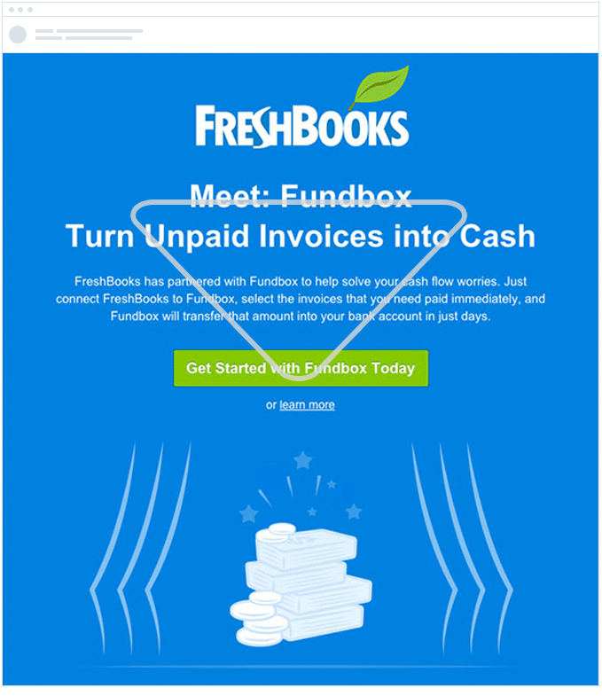
4. Have “stand-out” calls to action
When it comes to customer conversion, it’s vital that every email includes a “next step,” or call to action, in order to encourage subscribers to interact with your brand beyond the email platform.
Your CTA could be “Shop now” and link customers to your site—or it could be “Read more here” and link out to a helpful blog post. Calls to action are the best way to measure and increase lead conversion.
Placement and colors are key when it comes to a CTA. You want to make sure that your readers get there fast while still relating to the content of your email.
Many marketers debate over where A CTA should be placed in an email. Some say that readers should see it right away without needing to scroll down to the end of an email.
Other marketers argue that content matters first and gives the subscriber a reason to engage with the CTA. Ultimately, the choice is yours.
When designing your CTA, using a button, rather than a hyperlink, can increase conversion rates by as much as 28%. You also want to make sure this button has a unique color that makes it stand out from the other colors used in your emails.
Pay attention to sizing and using white space in order to draw attention. Here are some more tips on how you can design high-quality CTA’s for your clients.

Source: Really Good Emails
Takeaway: CTAs don’t have to be flashy to stand out. This example above makes use of contrasting colors along with whitespace to create a clear call to action for readers to spot and click on easily.
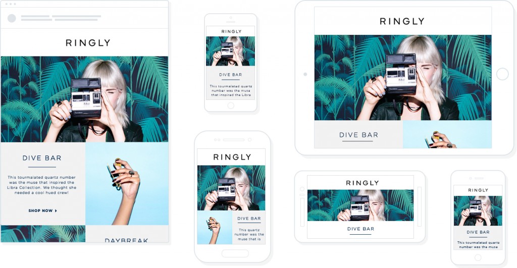
5. Make sure you use responsive email design
According to our own research, nearly 63% of email opens are happening on mobile devices. This means that having an effective, responsive design for mobile is super important when it comes to conversions. Every email should be fluid, clutter-free and just as easy to read on mobile phones as they are on desktops.
You can code the designs yourselves or use a marketing automation tool with mobile-ready design templates that create a responsive design for you. Be sure to balance your image size and text so that it is compatible on mobile and still has the same engaging effect as the desktop version has.
You can learn more about how easily create a responsive email for mobile in our guide.
Takeaway: Responsive designs are the way of the future. With more users opening their emails on cell phones, smartphones, and tablets, if your messages aren’t responsive, then they likely won’t open correctly.
6. Mobile-friendly emails mean having optimizing mobile landing pages
Having a mobile-friendly, responsive email design is great: However, it doesn’t help you much if your website isn’t optimized for mobile users. Website landing pages, just like emails, are being visited more and more through the use of smartphones and other mobile devices, making it vital for brands to update their website for mobile users.
In just the first quarter of 2019, mobile devices generated 48.71% of all website traffic. This means that your landing pages need to be optimized for those using these devices, which requires making information easy to scan and CTAs easy to find and click. If it’s not made simple to navigate, conversions won’t happen.
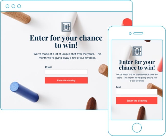 Source: Popupsmart
Takeaway: Mobile-optimized emails won’t help with your conversion rate if your website landing pages aren’t optimized as well.
Wrap up
Using creative email design can drastically increase conversion rates. When subscribers like what they’re seeing and reading, they’ll want to learn more.
It’s crucial that your clients’ emails use clear grids that guide their readers, bright imagery that matches their brand voice, easy-to-read sections, clear CTA buttons, and responsive design for mobile.
Want to stay up to date on email design trends? Then take a few minutes to check out our 5 email design trends to watch for in the coming year.