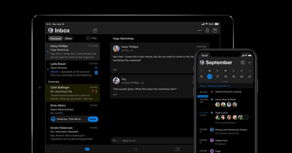
Dark mode is a term that seems to be trending everywhere, especially when it comes to email and smartphone apps.
With the release of various dark modes for apps and email service providers, email marketers must learn the difference between dark and light optimization. If they don’t, their messages could render incorrectly, causing frustration for readers.
Read on to learn about dark and light mode, the differences between them, and what it all means for email marketers.
Defining dark mode
Dark mode is often referred to as color inversion. However, that isn’t the case.
There are some themes out there for various apps and settings that allow for color inversion, the different dark modes available for many apps and email service providers simply refer to the use of dark background with white text, as opposed to lighter background with black text.
The idea behind dark mode is that it helps a user’s eyes relax while also allowing users to focus on what they’re doing.
Studies have shown that 80% of American adults report that they use their digital devices for more than two hours per day, and another 67% state that they use more than two devices at the same time.
Another study said that a significant portion of adults report using a digital device for an average of 11 hours a day. It’s no wonder so many people are looking for relief from eye strain and the problems associated with it.
Source: Weekdone
While dark mode isn’t the solution to all of our digital device-related issues, it’s a start and worth exploring for many.
Which email providers have a dark mode option?
While many email service providers have allowed their users to customize their themes for some time, it’s only been recently that major ESPs have designed designated “dark” modes that would essentially give everything a black background and, instead of traditional black text, would convert to using white as its standard font color.
Three of the largest email service providers have announced the arrival or the coming of a designated dark mode in 2019: Apple, Microsoft’s Outlook, and Google’s Gmail.
Apple
Apple’s dark mode is available in iOS 13.0 and later, allowing users to choose a dark system-wide appearance.
Also referred to as MacOS Mojave, dark mode uses a darker color palette for all controls, views, menus, and screens.
Source: Apple Developer
For those who don’t want to use the dark mode setting all day, there’s a setting that allows users to have their devices switch to dark mode when ambient light is dim.
Outlook
Microsoft’s email service provider, Outlook, has also given users a dark mode to work with: However, it’s currently only available in the new Outlook.com and Outlook on the web experience.
Rumor has it that Outlook will soon be releasing a dark mode for their mobile app as well, shortly.
While some sources have stated that Outlook has already released a dark mode for mobile, users have reported that it’s not fully functional at this time and has several bugs that need to be worked out.
Source: Microsoft Blog
Gmail
Rumor also has it that Gmail users will soon be getting a dark mode of their own, although some have had access to a “dark” theme that appears similar to the dark mode options in both Apple and Outlook.
At the time of this publication, the dark theme for Gmail is only available when accessing your Gmail through your internet browser on select devices.
However, in the past few days, some sources have claimed that Gmail began rolling out dark modes to some users but, again, for the few that have alleged to have received the Gmail dark mode update, it’s been a bit buggy.
Dark and light optimization: how to make the most of the dark side
With many individuals opting to utilize their email service provider’s dark themes, email marketers need to learn how to optimize their messages for both the light and dark side.
While there’s plenty of advice out there for adequately optimizing your email content for the average inbox, email marketers need to start learning how to work with both dark and light optimization simultaneously, so that their audience can view these emails without issues.
Since optimizing emails for dark mode is still relatively new, knowing how to design your emails for both dark and light optimization is crucial. Why? Just look at what can happen if you don’t:
In the first photo, this simple email is clearly seen with little issue. Thanks to the all text copy and no images, rendering isn’t a problem.
However, you switch to a dark mode theme and, instantly, this once easy-to-read email is a mass of nothing. To see the text within the email, we had to drag our mouse across the message and highlight it.
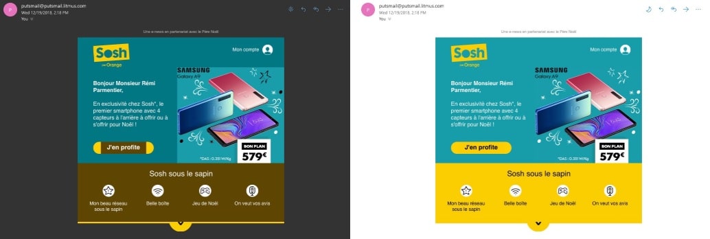
The same thing can and does happen with other emails that include photos and images as well, which can be seen in this example below.
While the image included within this HTML email message helps more information stand out for the reader, it’s clear that there are still some issues regarding difficult-to-read text.
So how can email marketers start designing their messages for both dark and light optimization? While there’s no true way around it just yet, there are some design tricks that your marketing team can try implementing to get you ahead of this curveball.
1. Use transparent images.
Currently, email service providers that allow for dark mode settings will automatically alter the colors in CSS, but not colors within images. That’s why the 1-800-PetMeds image stood out amongst the dark surroundings.
If you’re using images, in most cases, it’s best to use transparent backgrounds, so that the image will change according to the background color your theme sets.
In the example below, the “Buy now!” button is surrounded by a transparent background, making it stand out in both dark and light modes.
The main image and the lightning bolt separator, however, do not, and that makes them look a tad funny in the dark mode rendering, but it still works.
Source: Medium
Just remember, this won’t work with social media icons, and the icons may fade into the dark background.
2. Avoid mixing images and background colors.
While many graphic designers may combine images and background colors to create buttons and other design elements, it may not be wise if you’re trying to implement both dark and light optimization.
Remember, if you’re using background colors, they’re likely to change between the dark and light modes, whereas images won’t.
Source: Medium
3. Add a white stroke around your dark fonts.
When it comes to the fonts you choose, one hack to try is adding a white stroke around your darker fonts. While the white stroke won’t show up much, if at all, in lighter settings, in dark mode, it’ll help define your text, making it easier to read.
Source: Email on Acid
4. Always test before you send.
Finally, testing your messages in both light and dark modes is absolutely essential. While you may not be able to make your messages look perfect for each and every setting, you can find tricks to creating messages that work for both dark and light optimization.
By testing your emails, you’ll have a better idea of what tricks work with what combinations, enabling you to get the most out of either setting.
Wrap up
While designing for both dark and light optimization is the goal, there’s currently no single method to make your emails work perfectly for both settings. However, with time and plenty of testing, some methods can help your messages stand out, no matter which setting your readers are using:
- Use transparent images, where applicable.
- Avoid using background colors and images to create certain design elements, such as buttons.
- Use a white stroke around your black text to help it stand out on darker backgrounds.
- Always test before you send.
Word has it that there are some CSS workarounds in progress to help email marketers create messages that cater to both the dark and light sides: However, nothing has proven 100% effective.
Once we find methods that do work, we’ll be sure to bring them to our valued readers.
Need a refresher on your CSS knowledge? Be sure to check out our CSS support guide to freshen up your CSS know-how.


