7 minute read time
Email Design Fundamentals: Everything You Need to Know (Part 1)

This is part one of a series on email design essentials from our resident Art Director and design specialist, Tylor Loposser.
Why email design matters
It’s wise to approach design as an intentional act, an act that shows we are interested in experience and want to create a response to our audience. I think it’s a good idea to break down some of the more specific impacts that design has on your email marketing program:
Great design is a way to stand out in the inbox.
It’s estimated that the average office worker receives over 120 emails per day! A well-designed email is going to help you break through the noise of the inbox and engage your subscribers. Make your emails enjoyable, your content relevant and take your audience on a journey – so that people can’t wait to interact.
Design is an extension of your brand.
Your email marketing program should reflect your company’s brand voice. Be sure to use every opportunity, from the subject line to the CTA, to echo your brand’s sentiments. Always look for opportunities to add personality into your copy, this can be done by using a conversational style of writing.
Consistent and on-brand email design (using colour, logos and layout), reduces the chance of confusing your subscribers, making it easier for them to absorb your key messages.
Increase your deliverability.
It is worth noting that poor email design can trigger automatic spam filters but more likely, it will lead to your subscribers taking action such as unsubscribing or marking it as spam which can impact your sender reputation. Analytics and insights allow you to keep an eye on how subscribers respond to your messages, so use this data to guide your process.
Increase accessibility with inclusive design.
As a marketer, you want to reach a large and engaged audience. Email design that doesn’t take into account accessibility guidelines which can range from insufficient color contrast, exclusionary language, and poor coding habits will mean that your message isn’t going to resonate/ or perhaps won’t even be available to all your subscribers.
While accessibility focuses on the structures and containers that hold information, Inclusive Design is based on the information itself, and on your understanding and empathy with your audience. Consider your subscribers’ experiences and abilities, then create emails that reflect that. These connections your draw between what you’ve made and who interacts with it will pay off tenfold.
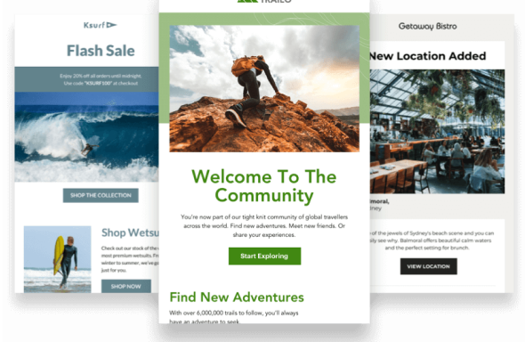
Brand consistency
When people first get an email, one of their first reactions is to wonder; “Who is this from?” If this question is left ambiguous, they will unsubscribe, or worse mark it as spam.
The ‘From Mailing Address’ and Subject Lines do a lot of the heavy lifting, but the visuals can have a lot more staying power. Brand recognition allows them to spend more time with the content, and brand consistency increases your resonance with your user. It enables them to picture something specific; opposed to something generic.
For example; picture coffee. Now picture Starbucks.
I imagine you are seeing a specific shade of green, those plastic cups, their unique way of labeling their sizes, and that mythical siren, right?
While your industry may be vast, you want to find what elements your brand needs to stick out and be unique.
This is why it’s important to make your emails easily recognizable and build a seamless experience between your email program and your other marketing channels. All of these touchpoints can help to assist in this consistency. Using your logo and any marks to accompany it, plus applying a color story is one of the most effective ways to accomplish this.
Follow your brand guidelines to keep colors, font styles, tone, and imagery similar. If you don’t have brand guidelines, my recommendation is to make creating them the top of your priority list.
These don’t need to be complicated design systems. It’s all about building consistency that helps create recognizable experiences throughout all media.
Another great tip; if the goal of your campaign is to drive traffic to your landing pages, your email template should share the same guidelines as your website. Think of your template as the sibling to your website. They don’t need to be identical, just share the same visual language.
Content hierarchy
Whether you realize it or not, you’ve probably done some of this work during the content creation process. Maybe you’ve established the most important pieces of content and created an inverted pyramid ranking your content from most important to least. Even starting with a headline or hero image that then feeds into a paragraph or body copy is a form of basic content hierarchy, which translates well to email.
These distinctions create visual interest and help to guide your subscribers through a campaign and keep them engaged. This practice can manifest in two different ways:
Typographically
The use of weights/styles/colors within our fonts establishes the way in which people read and rank importance. I suggest a 4px difference between each one of your styles to create a good definition. Also, be sure to assign these styles in your HTML to assist with screen readers.
To all you Campaign Monitor Drag-and-Droppers; don’t worry, the editor will do this automatically!
Pictographically
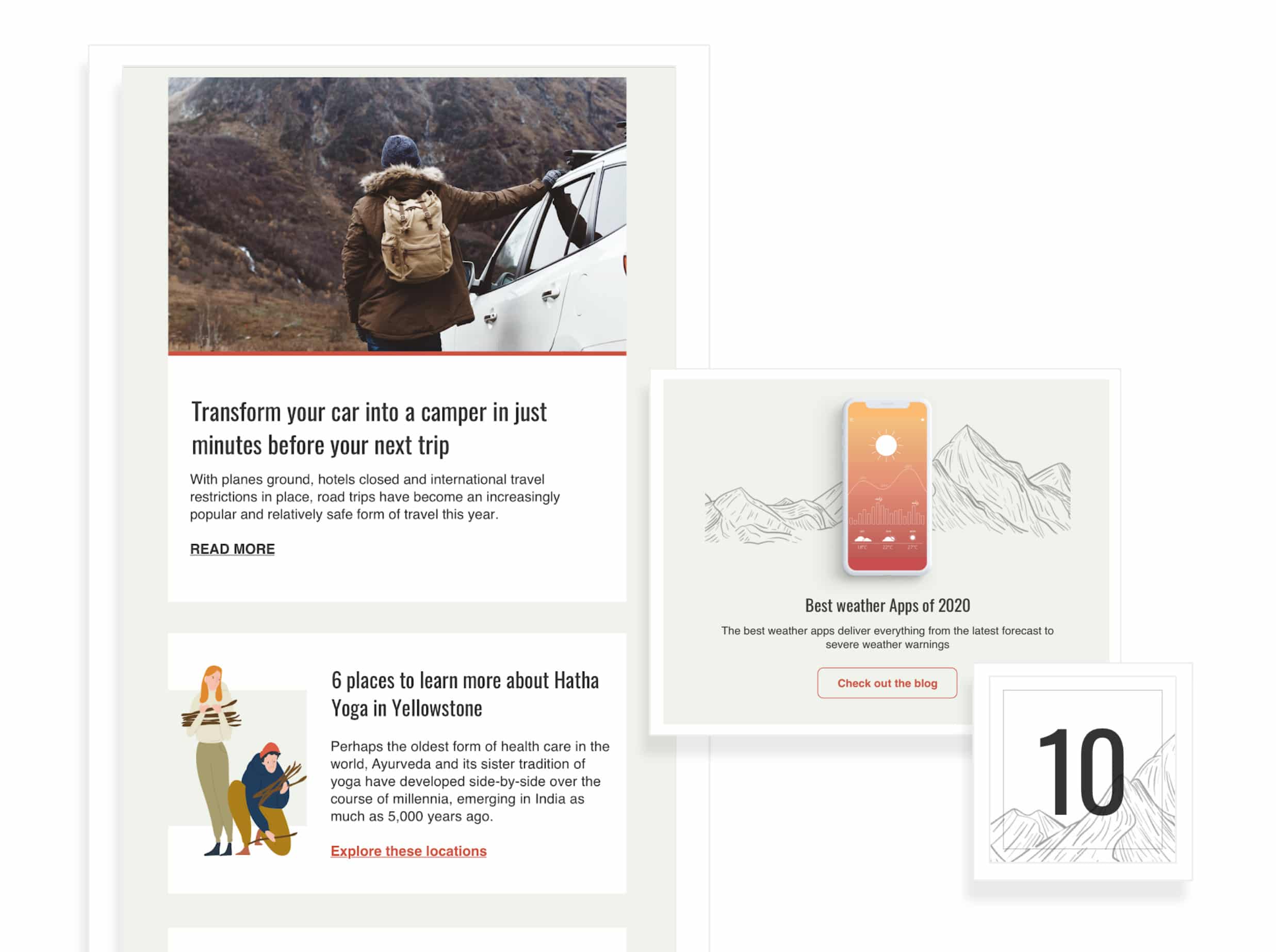
This pertains to imagery; primarily photos, illustrations, and icons within your email.
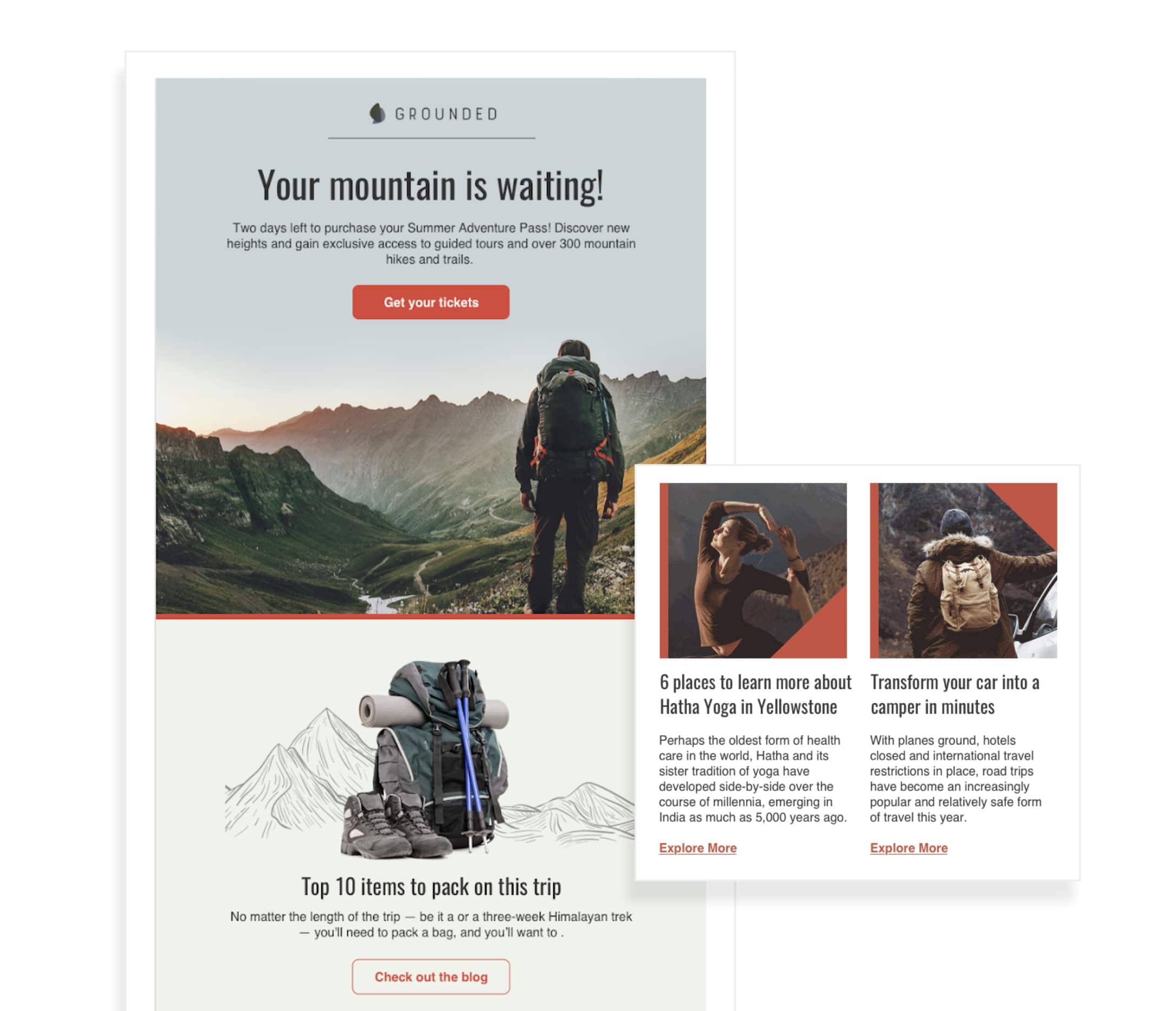
Photography should be assigned to the most important topic, it’s the most effective way to engage your audience – because people tend to look to other humans for connections.
On the other hand, using illustrations for secondary messaging can be effective because they often use brighter colors and explore more complex situations.
While iconography allows you a quick solution by using elemental shapes to create a simple understanding, it’s worth noting that these can be lost in translation.
While your brand may have slightly different standards, designers should combine the qualities of each one of these to tell compelling stories.
Balancing color with size and layout can help build a clear hierarchy that is immediately recognizable. This creates visual interest and helps with skimming, which we know is a common practice in email. Easily-read copy turns into engagement, which leads to the interaction like clicks, forwards, and shares.
P.S. I know finding good stock images for your emails and getting them embedded can be a time-consuming pain. Check out our Free Image Gallery, which lets you pull from the curated Unsplash library of millions of images and add them straight into your campaigns!
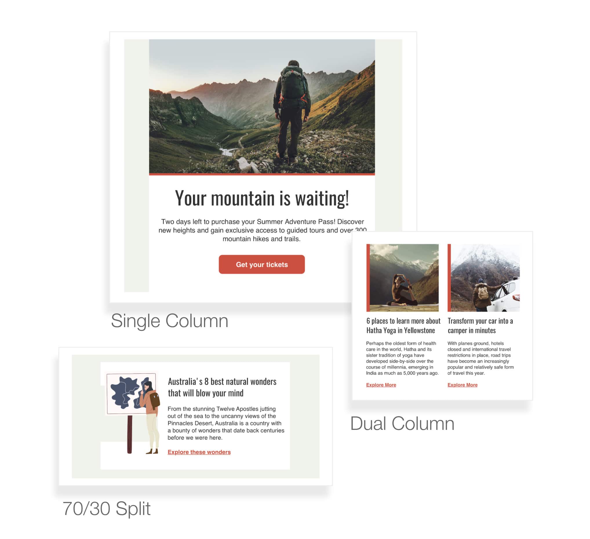
Sections and modules
These are imperative to agile design. The needs for sending email are ever changing, and we need to be able to move quickly. These sections help set expectations for copy and design by having established parameters, allowing you to place content appropriately.
Sections and modules make testing super easy, you can move these around throughout your campaign and see which ones and in what quantity work best for your audience.
You can see above some of the most popular options, these naturally set hierarchies allowing you to give the biggest real estate to your most important topics – and as importance or content availability shrinks so does space. There’s an old saying: When you emphasize everything, you emphasize nothing.
There are a few proven layouts that work consistently well for email. We’ve already built out many of them in our premade, high-performing email templates. You can use them any time and simplify your design work. These allow you to spend more time perfecting your content and analyzing your results.
Wrap up
Design is the foundation of your emails. It has a huge influence on your brand and the overall impact of your campaigns. There’s a lot to consider when approaching email design, from accessibility and inclusion to hierarchy and deliverability. Fortunately, you can make the work streamlined and easy using Campaign Monitor’s prebuilt templates.
Stay tuned for the next part of this series, where I’ll share some of my own creative process and some tips to help you get the most impact out of every email!