10 minute read time
How to Boost Your Landing Page Conversion Rate

Your landing page is the first product your customer buys.
Think of your landing page like a handshake—an initial greeting to your prospects. You have eight seconds to grab your customer’s attention, and your landing page—their first impression of your business—determines whether they’ll stick around. Having a landing page that converts is crucial.
It’s not as simple as coming up with a flashy design and a traditional sales funnel, though. To really boost your landing page conversion rate, there are other factors you must consider.
9 steps to create a high-performance landing page
Before you begin crafting your landing page, apply what you’ve learned about content marketing and marketing psychology, and create an outline highlighting key components of the message you want to convey to your customers.
Follow these nine steps to get the most out of your landing page:
1. Understand your goals.
The goal of your landing page is to boost conversions. To accomplish that, your page should have one specific focus—one primary purpose—and a clear CTA. Don’t use your landing page as a hub or index of all of your company’s offers. Displaying too many options is distracting and confuses your customers, causing them to lose sight of what brought them to your landing page in the first place.
It’s also important to understand your customer’s goals, so, when you write your copy, you can explain how your product or service is going to help them achieve them.
In this example, our landing page’s focus is on generating new prospects by inviting them to “get started with one of our free templates.” We also show the customer that we understand their goal of reaching their target audience through different types of email campaigns.

2. Know your audience and speak their language.
To build a landing page that converts, use language that speaks directly to your target audience.
Go back to those buyer personas you built when you developed your initial marketing strategy and take the time to understand your audience and learn how they think. Who’s your ideal customer, and what are their pain points? What do you want them to learn from your landing page, and what action do you want them to take?
Decide which tone of voice you want to use in your copy and stay consistent.
Consider your customer’s buying journey too. Does your customer need a hand to hold, or are they ready to take immediate action? Understanding your customer’s route to purchase will help you to determine which CTA will be most effective.
In this example, Zapier understands that their customers are busy people who appreciate efficiency, so they use short, punctuated copy to get to the point. Signing up is quick and easy, without any fluff or additional convincing required.

3. Craft a compelling headline that draws on emotions.
Remember, you have eight seconds to capture the attention of your reader. Whether they stick around after those eight seconds could depend on the effectiveness of your headlines.
Your headline is the most prominent text on your landing page, so write a bold and straightforward headline that draws on your customer’s emotions. Speak to the problem that your product or service will solve for your customer, using a statement that prompts the user to take action.
A compelling headline will instantly catch your audience’s attention, helping them understand the value of your product or service. In this example, Privy speaks directly to their customer’s pain point: low conversion rates.

Use a tool like CoSchedule’s Headline Analyzer to help you craft a headline that converts.
4. Make your promise above the fold.
Use the space on your landing page wisely.
As soon as a customer lands on your page, the content they see should be clear and concise, so they know and understand your offer. Use compelling language above the fold that entices readers to act right away, but also invites them to scroll below the fold to learn more.
State your UVP (unique value proposition) and make your promise above the fold, being careful not to stuff the section with too much information. Use scarcity and white space to draw the reader’s attention to what matters.
In this example, our landing page tells the customer—right away, above the fold—exactly what to expect when they sign up and offers only three choices: sign up now, watch a demo, or scroll to read more.

5. Write content that converts.
The written content on your landing page is crucial to conversions. Your landing page’s copy should be convincing, customer-centric, and genuine, and should speak to the value of your product or service.
Pique your customer’s interest by explaining how your company helps to solve a problem. Use traditional copywriting formulas like PAS (Problem-Agitate-Solve) or AIDA (Attention-Interest-Desire-Action), and employ old-school copy techniques: Be specific, be credible, offer incentives, and feed the fear of missing out.
Ultimately, though, your landing page must deliver value to your customers. If your company isn’t offering something of value, prospects will click away in search of a company that is.
The copy on Vuture’s landing page is authority-building and convincing, throughout. They’re speaking to knowledgeable professionals who know precisely what they need, so their copy doesn’t waste any time. The text also includes many proven claims, showing customers that Vuture is a trusted expert in the industry.

6. Get to the point.
Your landing page’s copy should be concise and scannable. User intent—the solution your customer is looking for—and your unique value proposition, should be addressed very early on in your copy, as soon as the first paragraph. Use short sentences to help get your message across and create a sense of urgency by inviting immediate action.
In this example, EverTrue’s copy above the fold is short, punchy, and to the point. Their copy takes advantage of FOMO by sharing the hint of a successful client story. By telling the customer that it’s possible for them to “turn data into dollars” too, the copy entices the audience to click through, and learn how it can work for them.

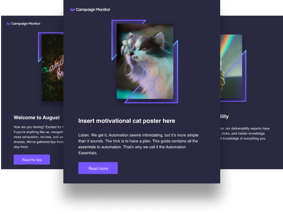
7. Include relevant visuals to enhance your content.
Using relevant visuals can draw on emotions and persuade readers to take action. All media—images, videos, GIFs—used on a landing page should be aligned with the content, enhancing the reader’s experience.
Take advantage of a deictic gaze in visuals to draw the customer’s attention to the content that you most want them to see. An example of this is a person looking or pointing in the direction of valuable content—your CTA—which brings the customer’s attention to an actionable step. On Nike’s landing page, three people run toward the “Shop” button:

Any media used on your landing page can be used to entice readers to take action. In fact, a recent study showed that using “video on a landing page can increase conversions by 80% or more.” But creating balance is critical. The number of visuals used—and their position on the page—should enhance your written copy, not overtake it.
In this example, Emma’s illustrated visual is clean and simplistic, showing people reading emails, and seeming to enjoy it. The tone of the visual is playful and modern, and enhances the text that appears below it:

8. Establish trust.
To instill trust is a crucial step in boosting landing page conversion rates. Customers are more likely to purchase when there’s data to back a company’s claims, when they can see proven results, and when there are positive client testimonials and success stories to be read.
Including trust signals on your landing page makes it easy for customers to see that your company is an authority and expert in your industry. The customer won’t have to click around or “dig” to learn the value of your product or service.
On Campaign Monitor’s landing page, we include numbers—”Loved by over 2 million marketers at 250,000 businesses around the world”—and brand logos, making the reader feel more confident in taking action. Customers are also invited to watch a video testimonial to instill trust even further:


9. Deliver a strong CTA.
The purpose of your landing page is to keep readers focused on one action. Providing too many offers or too many CTAs will confuse the customer and may even drive them away.
Your CTA is the most important element of your landing page. It should be clear—the customer should know what to expect after they sign up, enroll, subscribe, etc.—and should prompt the customer to take action. The copy should emphasize the importance of taking action, instilling a sense of urgency.
A strong CTA is about more than compelling copy and a flashy button, though. A good CTA will draw the reader’s attention without distracting them. Consider these elements when crafting your CTA:
Color: the CTA button color should be in contrast with the landing page background.
Size: the size of the CTA button shouldn’t be so small that readers can’t find it, but it shouldn’t be so large that it doesn’t leave room for any other content.
Position: your CTA should be placed only once, above the fold. Consider visual hierarchy—F- and Z-Patterns—when designing your landing page, particularly when it comes to your CTA.
In this example, Delivra’s landing page has one CTA appearing three times. The CTA above the fold uses bright and highly contrasting colors, creating an eye-catching visual experience. The copy is clear, to the point, and tells customers exactly what they’ll get when they take action. Below the fold is another concisely written, highly contrasted CTA (employing deictic gaze). As readers continue to scroll on Delivra’s landing page, below customer testimonials, they’ll find one more straightforward and stand-out CTA with the same message: Get a demo.

Test your landing page to improve conversion rates
Crafting a landing page that converts comes down to testing the page and each of its elements. Fortunately, testing isn’t very complicated. By changing aspects of your landing page, one at a time, you can determine which headlines, visuals, copy, or CTAs most resonate with your customer. Also, test different landing page layouts or templates and the placement of media and CTAs.
With each alteration you make to your landing page, check its effects. Keep track of every change and ask, “How was the landing page’s conversion rate affected by this change?” This information will inform you of what to do—or what not to do—to optimize your page.
Continuing to test and optimize your landing page will help you boost conversion rates and increase revenue.
Wrap up
Design your landing page using these nine tips and by employing content marketing tactics that not only draw traffic, but also persuade readers to convert.
Remember to:
- Understand your goals
- Know your audience and speak their language
- Craft a compelling headline that draws on emotions
- Make your promise above the fold
- Write content that converts
- Get to the point
- Include relevant visuals to enhance your content
- Establish trust
- Deliver a strong CTA
Keep in mind that not all landing pages will produce the same results, so continually run tests and optimize your page for higher conversions.
Need some inspiration? Learn from your peers and be inspired by some highly converting landing pages in our article, “12 Best Landing Page Designs of 2018.”