Article first published November 2017, updated March 2019
Email newsletters are the perfect way to stay in touch. People skim their emails while on the bus, during their lunch break, and while they’re watching TV.
Even though email marketing delivers an ROI of $44 for every $1 spent, an individual’s email inbox is a competitive environment. According to Sendgrid, “the average click-through rate on B2C emails is about 2%, versus an open rate of 18%.”
How can you encourage more people to take action when they receive your email newsletter? The answer is design.
If you’re not using the best design for your emails, you might be disappointed by your results.
Read on to discover how you can update your email newsletter design to help increase your click-through rate and get better results.
When do you need to update your email newsletter?
First, it’s important to consider whether or not you need to update your email newsletter.
Is your email newsletter still using any of these items?
- Outdated background patterns that ignore white space
- Too much text
- Unresponsive template designs
- Unattractive clip art
If your newsletters are using any of these items, it’s time to update your email newsletter design.
How to update your email newsletter
Switch up your email templates
Your email template has the potential to help you increase clicks, but you may become over-reliant on the same templates.
Once you have effective email templates, it can be tempting to send the same types of emails repeatedly. This is a major cause contributing to disappointing click-through rates. Email subscribers get tired of seeing the same email over and over again.
There’s a general format that most brands use in their email newsletters:
- Featured article or announcement as a header
- A line or two of copy promoting the content
- A link to a webinar, a course, or new product features, etc.
- Two supporting articles
is extremely valuable for engaging and converting your customers, but many companies still aren’t doing it in the right way.
Responsive email designs
Responsive email designs are the best sizes for email newsletters.
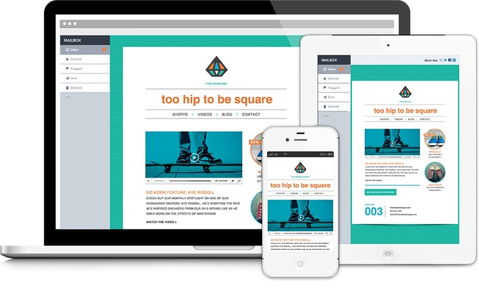
When email messaging was first introduced, computer delivery was the only format emails came in. Now readers access their emails on three primary devices (cell phones, tablets, and computers) that are all different screen sizes, so, if your email templates aren’t formatted the correct way, readers will not be able to read your messages properly.
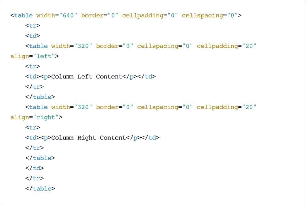
HTML email newsletter design versions use a special code to adapt to various screen sizes. If the screen is smaller than a certain size, the email’s format will look differently than if it was the size of a larger desktop screen.
Below is an example of responsive HTML coding and the final results:
Image Source: Campaign Monitor
Source: MyEmma
Emails that don’t use responsive design templates are deleted within three seconds of being opened
, so you will want to update your email newsletter design if a responsive template is something you’re newsletters are lacking.
Reducing options increases action
In Sheena Lyengar’s jam study, one group of shoppers were given a choice of 24 different flavors of jam, and another group had only six flavors. Amazingly, 30% of customers bought jam after seeing only six flavors, while just 3% of customers purchased after viewing 24 flavors.
This study illustrates how human beings can become paralyzed in the face of too many options. Although it may seem counterintuitive, offering more choices can be overwhelming.
You can also apply this principle to your email newsletter design to increase clicks.
The ideal way to do this is to drastically limit the number of choices you offer your subscribers. This tactic can work for all types of emails, whether it is a direct marketing campaign or weekly newsletter.
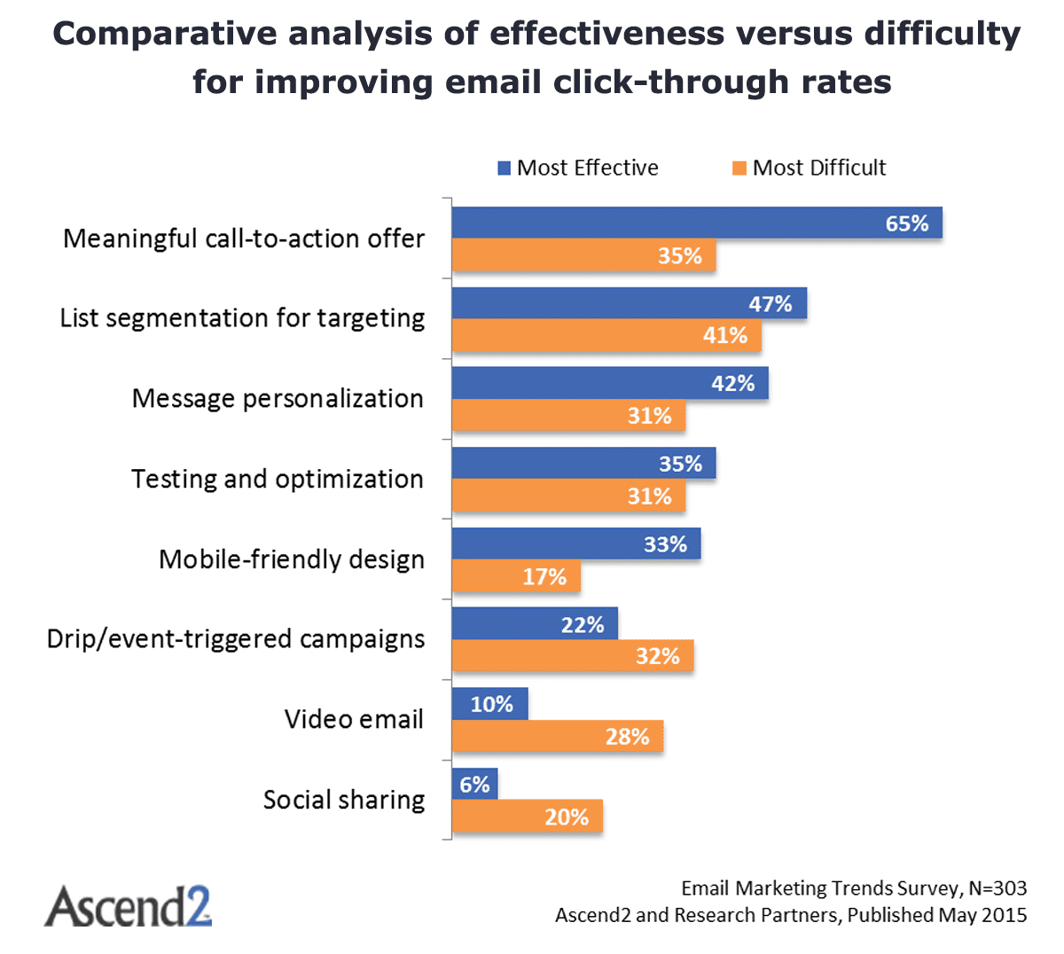
Ascend2 cites including a meaningful call to action (CTA)—rather than a generic one—as the most effective way to improve click rates.
Limiting the choices you offer is a foolproof way to power up your CTA. Rather than offering three different CTAs, why not offer only one?
Send and study more emails with less content
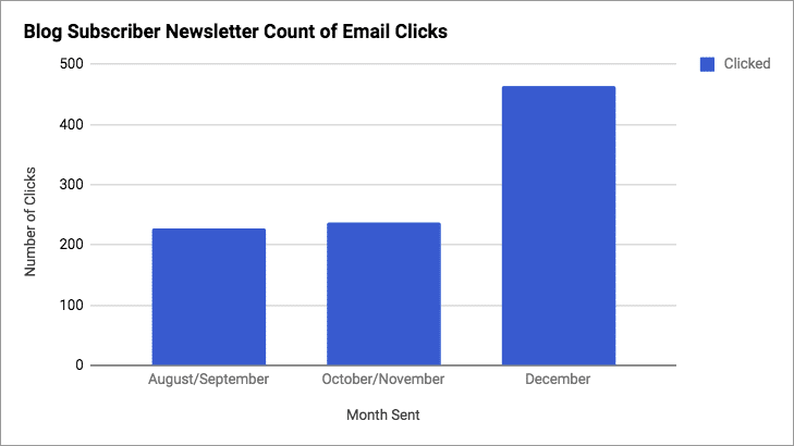
The team at Kayako overhauled their newsletter design and gained some interesting insights.
They went from a bi-monthly plain-text email with three links to the blog to a much more visually appealing weekly one-shot format.
The new design directed subscribers to just one article they thought would interest them most that week.
Send more emails with less content
The team at Kayako overhauled their newsletter design and gained some interesting insights.
They went from a bi-monthly plain-text email with three links to the blog to a much more visually appealing weekly one-shot format.
The new design directed subscribers to just one article they thought would interest them most that week.
Notice how the above examples have:
- Far less text (less copy is more)
- An eye-catching CTA button
- An attractive color palette
- A custom header image
- Social buttons
- One choice to click

Click rates doubled in that month’s newsletter at a rate of 97.03%.
A/B test your email newsletter design
What content should you include in your campaign? Rather than simply hitting send and waiting for results, you can A/B test your campaigns to find out what works.
In the above case, Kayako already knew their subscribers responded better to the weekly campaigns than the bi-monthly ones because they were emails containing just one choice of content. The next step was finding out just how significant choice was in determining click rates.
Building on their earlier success with changing newsletter design, they came up with two alternative designs to test against each other:
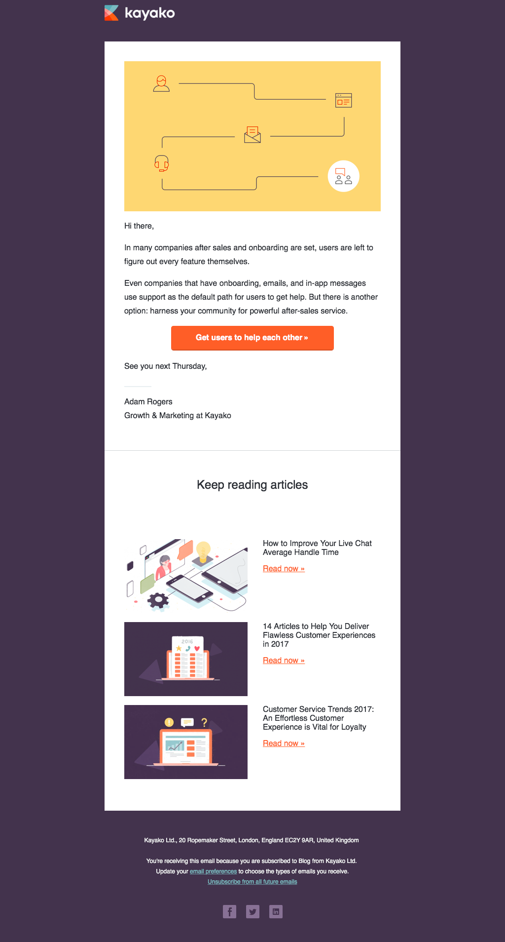
- Version A: feature post and three supporting links.
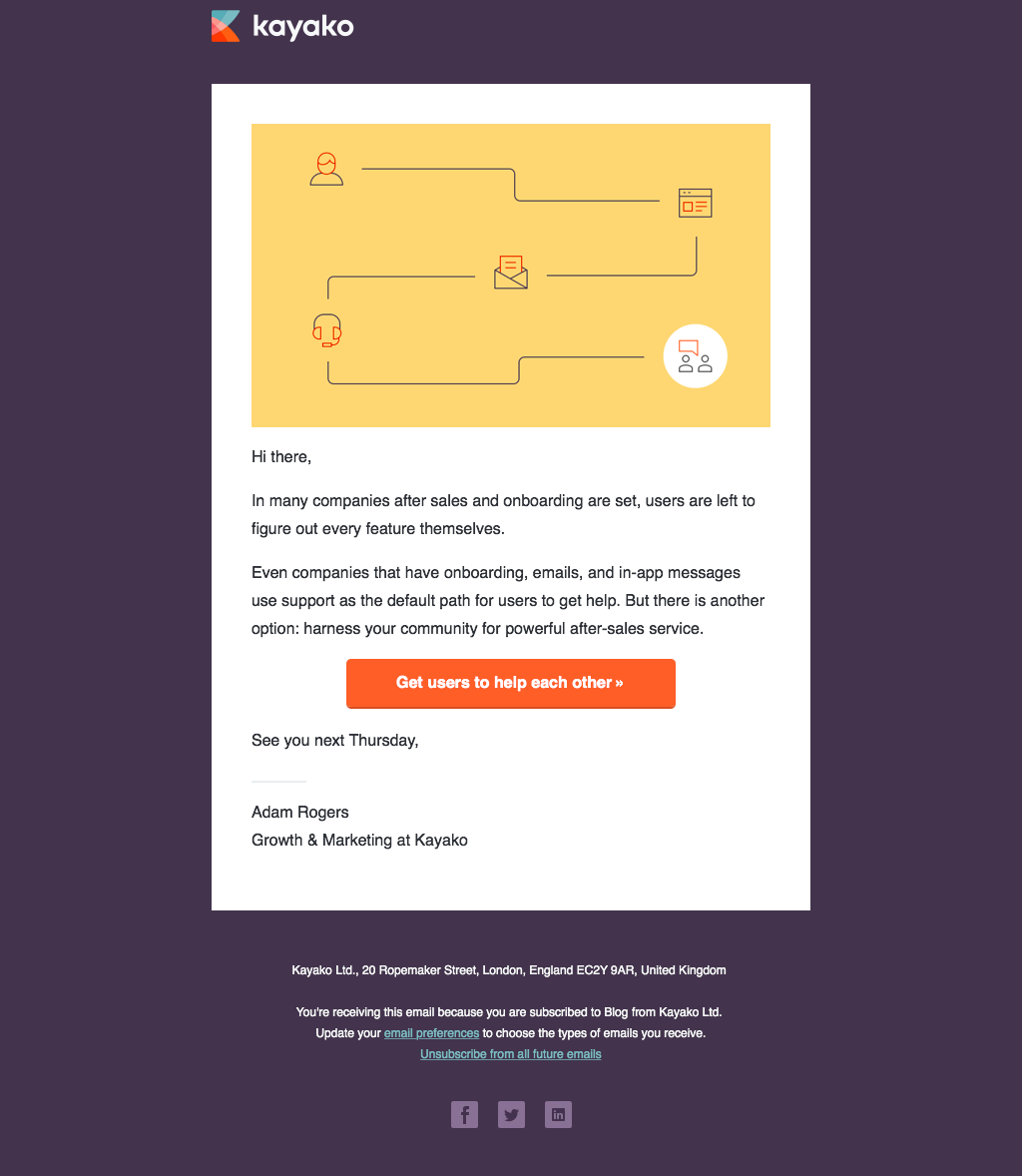
- Version B: single feature post.
The hypothesis was that, to get more bang for their buck with each email, they should include three further reading links. This was in case the main content post didn’t catch a reader’s interest.
Check out version A:
With version B, they stuck to just one featured post and no more links.
The A/B test was run for 8 weeks.
Version A performed only slightly better than Version B, with a total of 13 more clicks. Kayako subscribers weren’t clicking much more on their further reading links, but the extra choices were also not putting them off clicking anything at all.
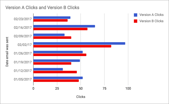
Choice is not always demotivating, and having a clear purpose to your emails and sending them regularly is also important.
Your email marketing software should enable A/B testing for your campaigns. This is usually done by sending each version of your email to a different segment of your subscriber list.
Keep your content laser-focused
B2B emails tend to follow the same format and often fail to inspire readers. However, B2C emails have to be incredibly high quality to even have a chance of making it into a subscriber’s inbox. The competition for your audience’s attention is much fiercer.
Too many emails have too many choices. Avoid this problem by keeping your marketing emails laser-focused. Don’t confuse your readers by offering them all the content you published last month.
Tell subscribers exactly what to expect in your email subject title (don’t overdo it), and keep your email body strictly limited to that one topic.
Remember, most of your readers will be viewing your email on their smartphone. It’s much harder to concentrate using such a small screen. Your subscribers are also pushed for time. That’s more incentive to keep your marketing emails short. A focused, regular one-shot email can achieve that.
Wrap up
The reason you want more clicks in your emails is that you’re trying to improve conversions and make more sales. Every piece of content you include should contribute towards achieving your strategic goal and be something your subscribers will be genuinely interested in.
You may think you’re giving your subscribers more incentive to click through your emails by including as much content as possible, but you could be demotivating your audience with excessive choice.
Try simplifying your email newsletter design and A/B testing different content, and see if your results improve.
Have you updated your email newsletter design? Share with us how you did it and what you love the most about your updated design in the comments below!

