5 minute read time
What Email Designers Can Learn From Web Developers
Email design has lagged behind website design for years. Largely, this is because email clients have not optimized as quickly to the changing digital design landscape (especially the rise of responsive design).
However, in the past five years, email clients have begun to support capabilities initially reserved for the web. Most notably was the announcement in 2016 that Gmail would now support embedded CSS and media queries — two tools that enable responsive design.
Email designers finally have the opportunity to apply to email what web developers have learned over the past two decades about modern design. Here’s what email designers can learn from web developers.
Ensure responsive design, especially on mobile
In 2019, more emails were opened on mobile devices than on desktop. Email designers today must prioritize how emails render on mobile devices without sacrificing readability on desktop or tablets.
This is where responsive design comes in. Responsive design means that your design will adapt to the screen size and resolution of the device it’s read on.
We recommend following the example of website developers and creating three different wireframes for each email (or each email template): one for mobile, one for desktop, and one for tablets.
Then, use media queries to tell the layout how to render based on factors like screen size, or use the fluid method for email clients that don’t support media queries.
Let’s look at the difference. A non-responsive email may render in mobile with small text that’s hard to read:

Responsive email design, on the other hand, appears optimized for mobile reading:

Keep design simple to improve readability
Website developers know that when it comes to mobile readability, simple design is best. Smaller screens make it impossible to comfortably navigate multiple columns or creative fonts and designs.
Here are the best ways to keep the design simple:
Use a single-column layout
Single column layouts render most clearly on smaller screens like mobile devices. Additionally, they allow designers to create a single flow of information that guides readers toward taking a desired action (like clicking a button).
This single flow of information is also a better user experience than having to scroll side-to-side or zoom in on a small smartphone screen to access all the content.
Reduce visual clutter
Visual clutter is any design element that can be removed and not change the impact of the message.
For example, dividers to separate sections instead of white space could be considered visual clutter. Similarly, font styles like bold, italics, and different headings could be considered clutter if they are not absolutely necessary to convey the message.
Aim to create as clean a design as possible, and you will likely enhance the user experience.
Have only one CTA button
Having mastered the art of conversion-focused design, developers know that it’s crucial to not ask readers to choose from multiple actions to take. Instead, designers should have only one call-to-action so it’s clear what readers should do next.
Additionally, make your CTA a larger, contrasting button rather than hyperlinked text. A button is easier to tap with a finger on a mobile device or tablet than hyperlinked text.
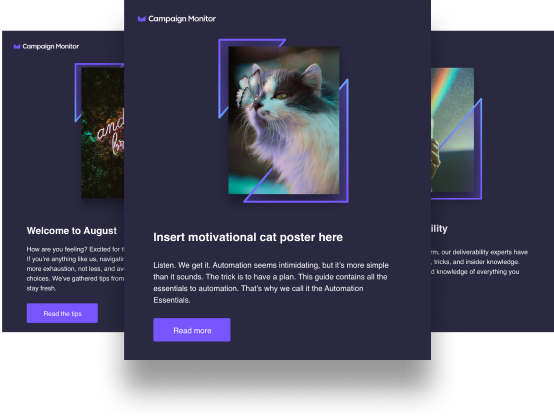
For example, this single-column email from Planoly is visually minimal and leads directly into a single CTA button:

Borrow advanced responsive design strategies from the web
Creating a single-column design for mobile is the minimum email designers must do to create responsive emails. However, designers who want to make the user experience even better on all devices can take advantage of these slightly more advanced strategies:
Use progressive disclosure for text-heavy emails
When emails are written like mini-essays, readers experience a seemingly endless scroll of text on a mobile device, even though on desktop, the email doesn’t seem long.
To solve this problem, email designers can borrow the “progressive disclosure” strategy from web developers. This is when certain elements of the email (such as sections of text) appear hidden under interactive elements (such as headings) and are revealed only when the reader taps.
Progressive disclosure allows readers to experience the email as organized and minimal and skip to the section they want to read.
Overlay text on images with live text + background images
Previously, any time an email designer wanted to show text overlaid on an image, they had to create a standalone graphic of the image and the overlaid text, and then insert that graphic into the email template.
This works okay unless the email client fails to render your graphic correctly — and then suddenly, your message is missing a crucial headline. Additionally, it requires designers to create different graphics for each device wireframe, which is extra time spent.
Instead, designers can borrow a strategy from website developers: Use live text and a background image to create your text overlays. This allows you to have the overlaid text image automatically adjust for each device — without risking a failure to render.
For example, The Royal Children’s Hospital used live text over a background image to create this dynamic email:

Wrap up
Email clients are finally catching up to website platforms in terms of design capabilities. Email designers should look to web developers for how to take advantage of these new capabilities and create more responsive, beautiful, and conversion-friendly emails.