Popup forms are kind of a necessary evil in the world of email marketing. Often in the form of a lightbox pop-up, the pop-up form takes over a browsing window with a specific call to action (CTA), such as downloading a piece of content, signing up for a newsletter, or checking out a new product.
On one hand, email signup forms present a rare opportunity to meet your audience where they are; to gather their information so you can keep the conversation going; to offer up some value to your site visitor that will make them more likely to come back.
On the other hand, when done poorly, they can feel intrusive, pushy, and off-putting to your site visitors—turning what could be a relationship-building opportunity into a decidedly negative touchpoint. So what’s a marketer to do?
Luckily, popup form technology has evolved over the years, giving marketers better tools to offer value without seeming smarmy. Marketers can not only determine the timing, format, and design of their pop-up forms, but can even customize the popup experience based on what they know about each site visitor.
When done well, pop-ups can be very effective, quickly and easily converting customers who see the pop-up into ongoing followers of a brand, product, and service (also known as the conversion rate). The average conversion rate for all pop-ups is 3.09%, although the rate can be much higher for top performing pop-ups.
Here are some popup form best practices to help you use your popup forms for good.
Popup form best practices
Offer a clear incentive
If there’s one thing a majority of people don’t need more of, it’s promotional emails in their inboxes. We all have a few (hundred) brands sending us far too many emails with far too little value on a weekly basis.
You can’t blame your site visitors for not wanting to subject themselves to your emails unless they get a little something out of it. For most people visiting any random website, the answer to “WANNA GET RANDOM EMAILS FROM US?” is a definitive, “No please, thanks.”
As an email marketer, it’s your job to answer the question that your site visitors will inevitably have: “What’s in it for me?” Without an incentive, you’re missing out on some serious conversion potential: Based on a study of 50 pop-up clients, the average conversion rate for popups that included an incentive was 4.24%, almost three times higher than the ones that don’t include an offer.
If your brand sells a product, it’s almost expected that signing up for your mailing list will provide new customers with some sort of discount. But there are other ways to offer value, in the form of:
- Discount codes
- Free product with purchase
- Exclusive content offerings
- Free content downloads
- Early access to products, events, etc.
The type of incentive you offer will vary based on your business. A/B testing can be helpful to determine what offers are most likely to convert your visitors.
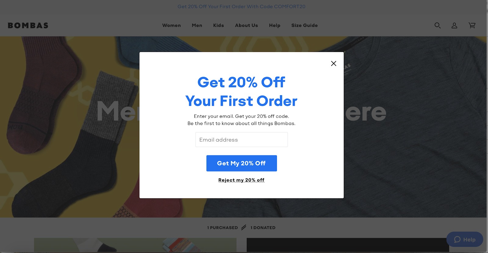
Cult-favorite sock retailer Bombas offers this straight-forward incentive to first-time site visitors. In large font, it reads: “Get 20% off your first order,” with instructions below stating: “Enter your email. Get your 20% off code. Be the first to know about all things Bombas.”
You came to the site curious to try their socks, and now all you have to do is type in (or let your computer auto-fill) your email address, and you’re already saving money. Win-win.
Optimize your CTA
Also noteworthy is the call to action: The big blue button reads, “Get My 20% Off.” Who doesn’t want 20% off?
Below it, you also have the option to “Reject my 20% off,” instead of the standard, “No, thanks,” (and in addition to the “X” to close the window in the corner). This subtle, perhaps even slightly passive-aggressive language, serves to enforce the idea that opting into the incentive is the obvious correct choice.
Your CTA button is arguably the most valuable real estate on your popup form, so it’s a great place to focus your A/B testing efforts. Aim to reinforce the value of your offer with the language of your CTA, instead of going with the standard “Sign Up” or “Subscribe” option.
Get the timing right
We’ve all had this experience: You walk into a store you’ve never been to, wanting to just look around. Immediately, a sales person pops up in front of you and starts asking you questions: What are you looking for? Are you shopping for yourself or someone else? Have you smelled any of our amazing candles?
Maybe these questions would be helpful in a few minutes, but getting battered with them immediately upon entering the store makes you want to run in the opposite direction.
The same is true with popup forms — timing is critical. Too early, and you risk annoying your customers, potentially even scaring them off of your site. But too late, and you might miss a chance to convert them before they wander off.
You want to give your visitors a chance to settle in before bombarding them with questions. One way to do that is to set a delay for your popup – research by Sleeknote found that popups that appear after eight seconds convert better than popups shown before or after. Although short, this delay gives your visitors time to orient themselves with your site before you ask anything of them.
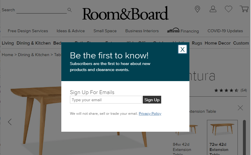
You can also wait until your visitors show some indication of interest before deploying your popup. Furniture retailer Room&Board, for example, only displays their popup after the visitor has navigated to their first product page.
Source: Room & Board
Master the art of targeting
Targeting is the art and science of matching intent with value. It’s taking what you know about a customer, or a type of customer (through Google Analytics, data enrichment tools, etc.), and using that information to customize how they interact with your site.
It’s no surprise that effective behavioral targeting can have a positive impact on your popup form conversions. Simply specifying the page or section of a website that a pop-up appears (as we saw in the Room&Board example) can increase your conversion rate upwards of 40% or more.
But targeting can go even deeper: Using information like user location, past site visits, and other web activity to serve up customized popup experiences.
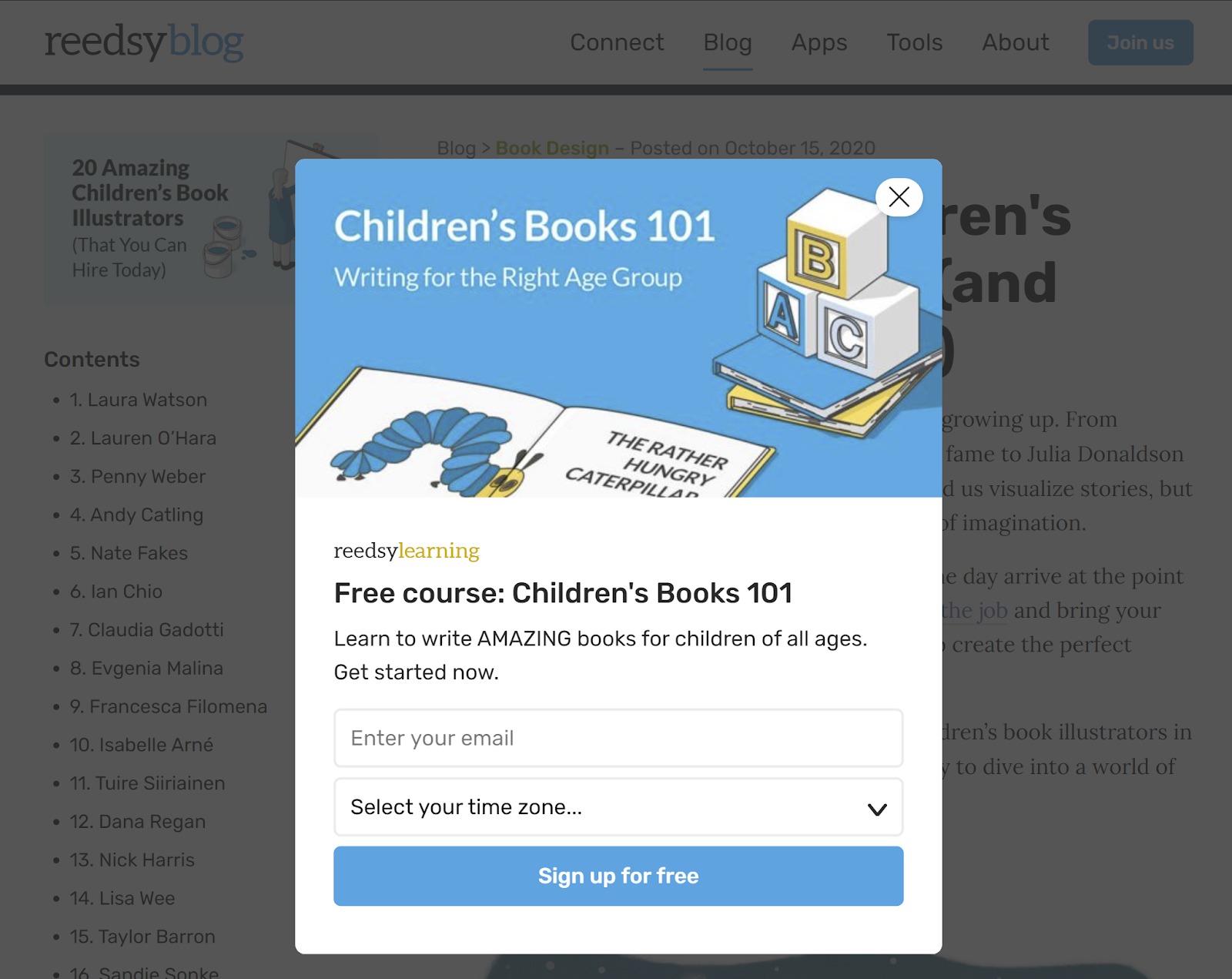
Reedsy, an online publishing platform that connects authors with professional book editors, does a great job of this by placing targeted pop-ups offering free, useful content for book authors on relevant pages of their site.
If a visitor clicks through to Reedsy’s blog on “20 Amazing Children’s Book Illustrators (and How to Hire Them)”, chances are, he or she is likely an aspiring author of children’s literature. Tapping into this, Reedsy has a pop-up form that offers the reader a way to learn more about writing children’s books through a free course. All they have to do is sign up with their email!
Source: Reedsy
Wrap up
To create an effective (read: not annoying) popup form, put yourself in your site visitors’ shoes. What would be useful to them? What are they looking for out of the experience? Instead of thinking of popup forms as a necessary evil, see the popup form for what it can be: An opportunity to start your relationship off with a win.


