6 minute read time
Design An Optimized Landing Page Using Mental Triggers

The goal of a landing page is to get visitors to take an action, whether that’s to buy a product, sign up for an email list, start a free trial, or something else.
But like any goal, you shouldn’t just “hope” that it’ll be achieved. You need a strategy that guides visitors toward completing the desired action.
One way to get visitors to take action is to use mental triggers — subtle cues that nudge readers in the right direction. In this post, we’re sharing effective mental triggers you can use to optimize every element of your landing page.
Optimizing your offer
Your offer is the most important part of your landing page. Because no matter how many optimization techniques you employ, if your target market doesn’t want your offer, your landing page will not convert.
A quick way to test whether your offer will convert is to see if it fulfills one of Maslow’s Hierarchy of Needs. Abraham Maslow was a psychologist who theorized that there were distinct levels of basic human needs. Certain levels (like the need for food and water) had to be met first before a person would care about more sophisticated needs (like creativity).
Maslow envisioned this hierarchy like a pyramid:
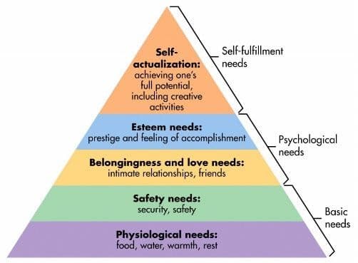
If you can match your offer to one of these basic human needs, you can be relatively sure it will be desired.
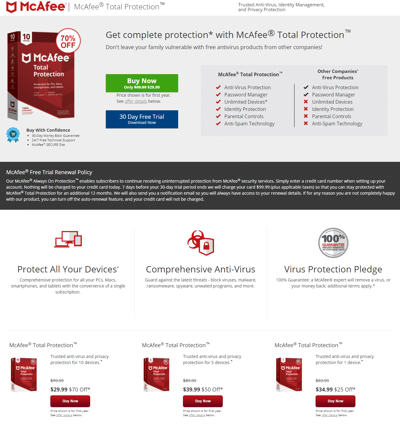
For example, computer security software would fall into the “safety needs” category, like this offer from McAfee Total Protection:
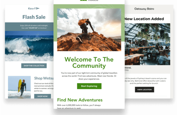
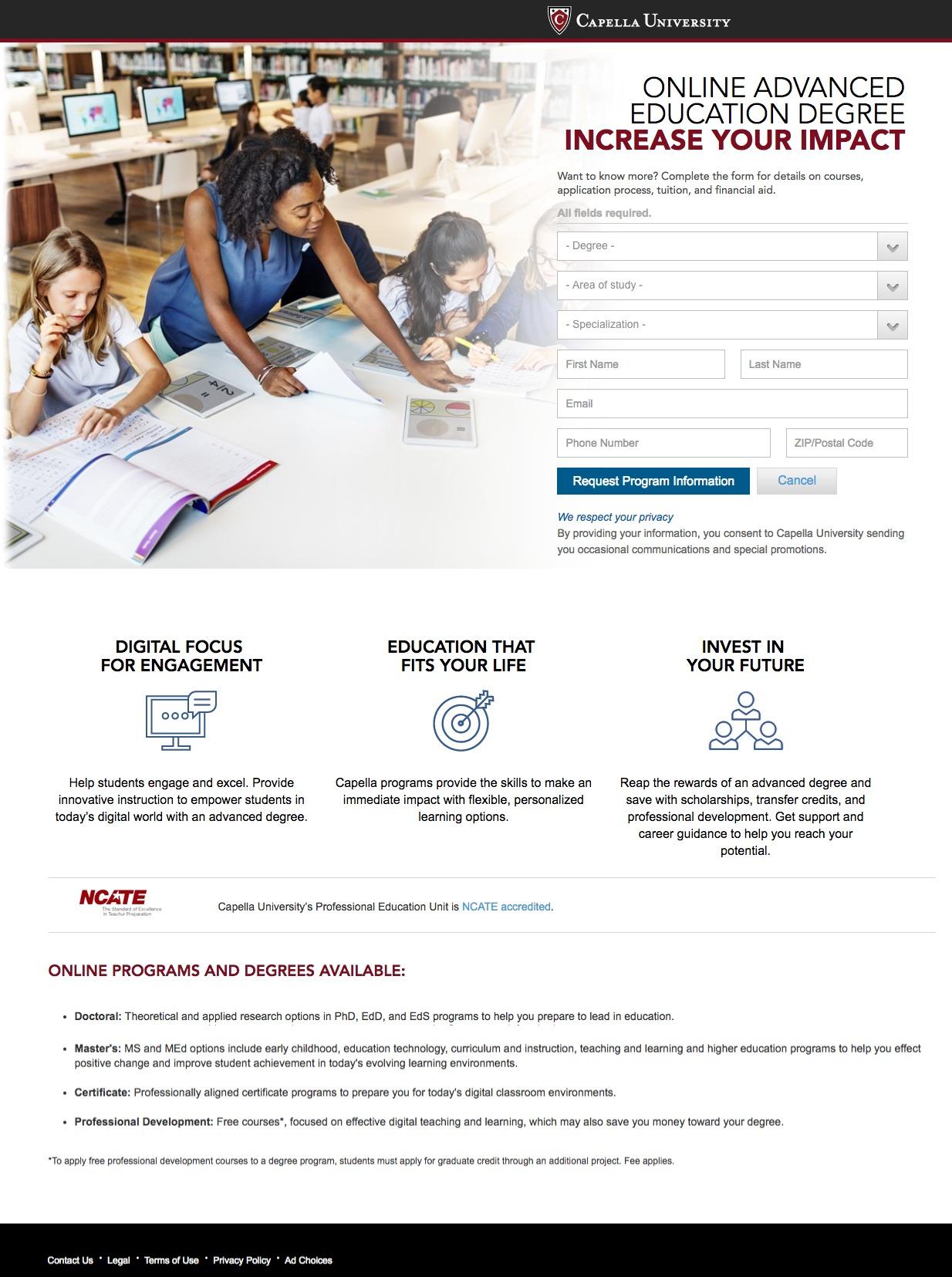
On the other hand, a university landing page inviting visitors to enroll would fall into the “esteem” or “self-actualization” category, like this offer from Capella University:
Optimizing your copy
Your copy – the words on your landing page – is what will ultimately persuade someone to take the desired action. So, it’s very important.
Don’t rely on sales techniques, such as using hyperbolic words like “best” or “only.” Today, most people are too familiar with marketing tactics to fall for these techniques — and may even resist them. For example, a 2013 study found that people react negatively when they sense someone is trying to persuade them in marketing.
Instead, emphasize the free will of the reader, so they feel empowered to make their own decision and will be more likely to trust your offer. Use phrases such as “you are free to choose” to ensure readers don’t feel they are being “sold to.”
Another non-salesy (but very effective) strategy is to use storytelling in your copy. Studies have found that traditional urgency techniques (e.g. “limited time offer”) are not as effective, especially in the long-term, as showing the value of your offer through storytelling.
To make storytelling easier, try following the simple framework created by the founder of Storybrand, Donald Miller. It consists of elements found in the hero’s journey:
- Character
- Has a Problem
- Meets a Guide
- Who Gives Them a Plan
- And Helps Them Avoid Failure
- To End in Success
For example, this accounting firm’s landing page uses the story of the Problem their market is facing to make their message persuasive, but not salesy:
Optimizing your headlines
To capture visitors’ attention immediately and keep them engaged on your page long enough to evaluate your offer, you need a compelling headline. Speak directly to the benefits of your product or service and how it fulfills an essential need for your prospect.
One technique to use is the focusing effect.
The focusing effect is the tendency of people to place too much emphasis on one thing at the expense of others. When it comes to your landing page headline, though, you can use this to your advantage.
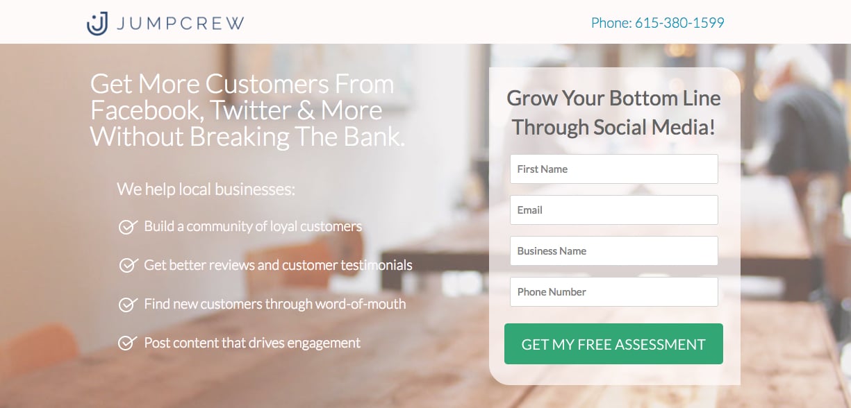
Your product or service likely has many benefits, but highlighting your unique value proposition (UVP) in your headline helps prospects focus strongly on that one feature.
JumpCrew lists several of its benefits in the copy, but highlights its UVP (more customers for less money) in the headline to grab visitors’ attention and make them hungry for more information:
Optimizing your images
Your images are also very important when it comes to how visitors will feel when they view your landing page.
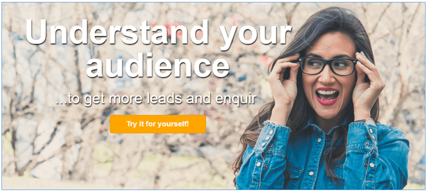
One proven strategy is to choose images of people (instead of inanimate objects).
The theory goes that it’s easier for people to relate to other people than to objects. But you can also take this a step further and take advantage of research that found that when the people in the images are looking at the CTA button, viewers also instinctively look at the button and become click it more often.
For other best principles, you might find it helpful to follow an image checklist created by the 60-Second Marketer. The images must…
- Look trustworthy
- Demonstrate the advantages of the offer
- Contrast with page design (stand out)
- Express desired emotions
- Make it easy to see the CTA button
For example, on the following landing page, there’s a photo of a person, who’s looking at the CTA button, and who conveys the desired emotions of the target audience:
Optimizing your CTA buttons
Finally, apply strategy to create CTA buttons that drive more conversions. One of the most effective strategies is to make your buttons stand out from the rest of the page as much as possible.
According to marketing and psychology researcher, Nick Kolenda, this strategy works because of something called processing fluency. Processing fluency refers to the phenomenon that the ease with which readers understand what to do is closely related to whether they perceive the action as easy and pleasant.
In other words, if a button is easy to spot and click, it feels easier and more pleasant to actually click. In turn, this will increase conversions.
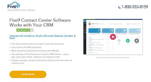
Take a look at the following example landing page. The CTA button is orange when nothing else on the page is orange. This makes the CTA stand out more.
Wrap Up
Simply creating a landing page and generating traffic to it is not sufficient to increase your conversions. You must design the page with the right elements while implementing some mental triggers. Only then will your visitors be persuaded to take action and your marketing funnel start to collect more and more leads.