Article first published May 2011, updated April 2020
When it comes to subscribe forms, it looks like the difference between creating the most-loved or most-hated design element on your site comes down to shades of grey—quite literally.
Email subscribe forms come in dozens of different setups, including:
- Popovers
- Pop-ups
- Slide-ins
- Lightboxes
One popular email subscribe form that’s commonly used by digital marketers is the lightbox overlay email subscribe form.
What is a lightbox overlay email subscribe form?
For those who need a quick recap, a lightbox is a web page overlay that encourages your website visitors to sign up for your email list. What makes these overlays different from, say, a traditional pop-up is that the overlay takes up the entire screen.
While the form itself is small, there is either a gray or white background that semi-blocks the background material—forcing the reader to pay attention to the signup form.
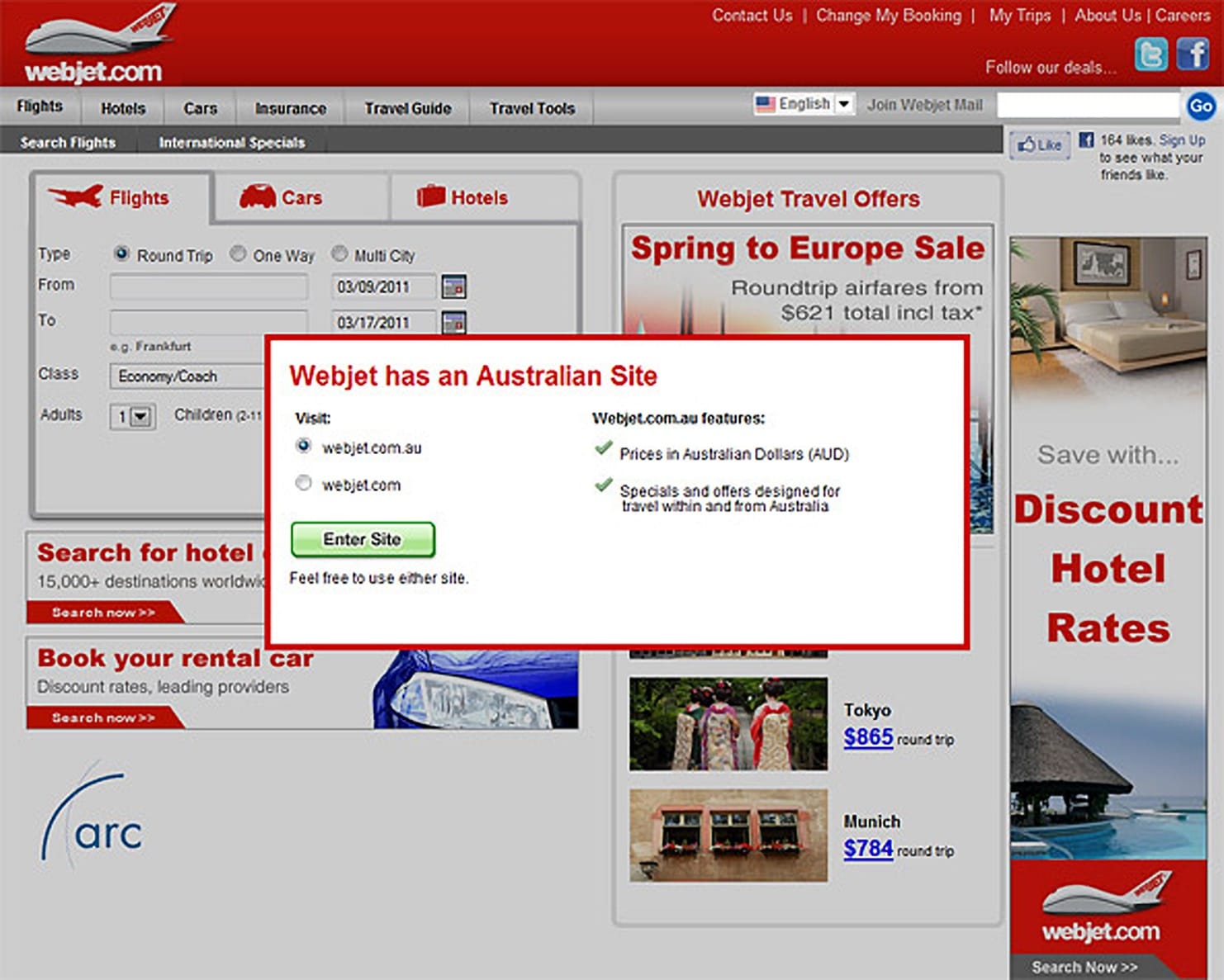
I came across an interesting study on “Lightbox Overlay Dialog Boxes” via Jakob Nielsen’s Alertbox blog. In one example, he shows a lightbox that’s not at all dissimilar from one we featured in our earlier round-up of email subscribe forms:
Source: Nielsen Norman Group
Regarding lightboxes like this, Nielsen is gushing, calling them the “interaction design technique of the year” in his 2008 study on good application UIs. He reiterated this point in March, stating:
“In last week’s study, this (lightbox design) worked well, just as many other lightbox designs have performed swimmingly in our previous usability studies.”
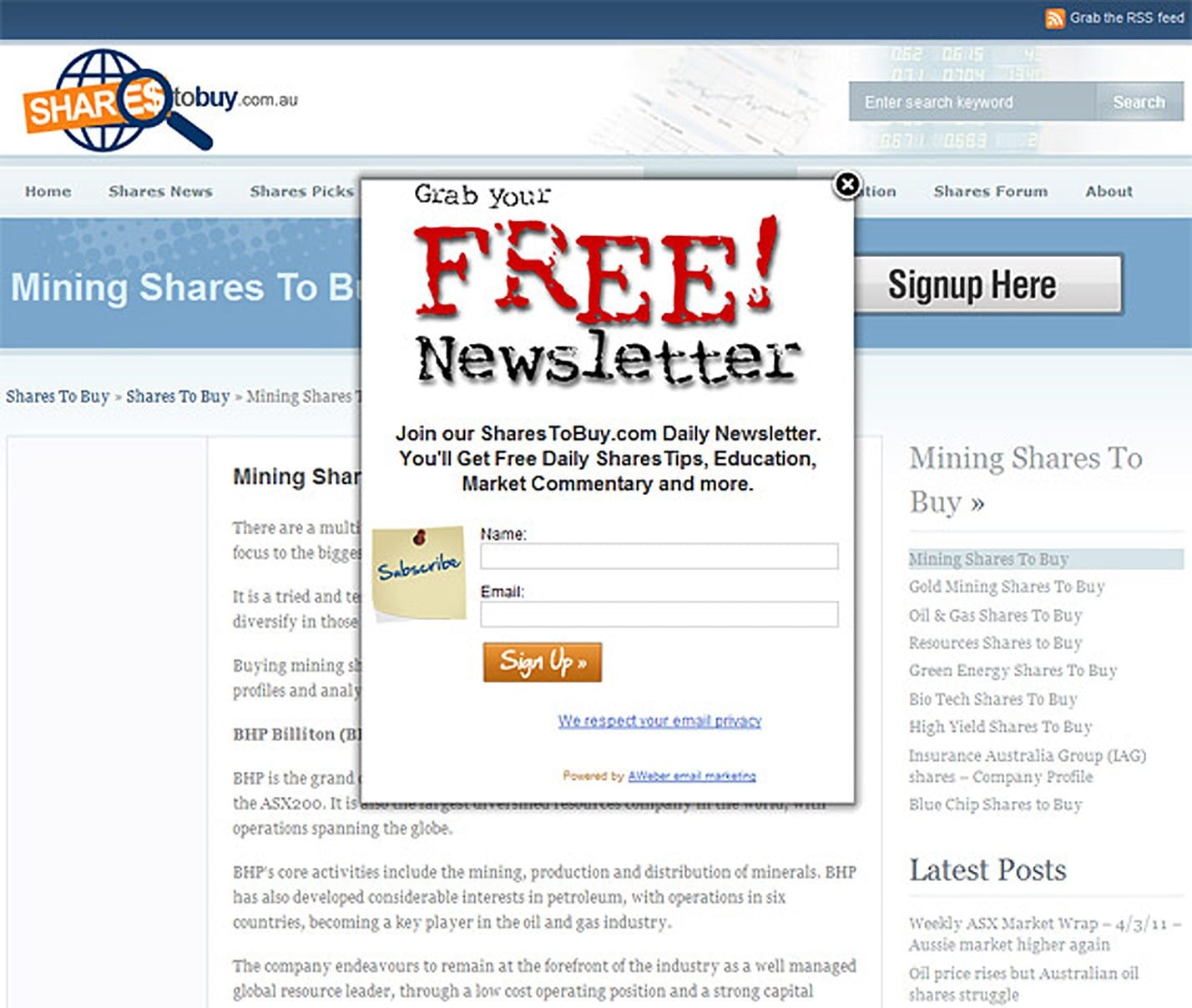
However, in the same study, Nielsen goes on to slam another overlay dialog box, calling it a “repugnant perversion” and “no better than a pop-up, which is the #1 most hated advertising design.” Here’s the subscribe form in mention:
Source: Nielsen Norman Group
So what makes the Webjet lightbox superior to this overlay? The dimming effect. This is put eloquently in the 2008 study, which states:
“The lightbox benefit is obvious: it’s impossible for users to overlook the only bright part of the screen. This is in stark contrast to many traditional designs, where users often remain blissfully ignorant of notifications that are camouflaged within busy pages.”
The overriding problem with the later design is that it, in no way, stands out from the busy (and not particularly attractive) page below it, creating a confusing visual in which the reader doesn’t know whether to look at the site logo, the prominent “Signup Here” button, or the prompt to subscribe. Plus, the overlay has no visual consistency at all with the rest of the site, even going as far as using a totally different set of fonts.
How overlays work in 2020
Now, some time has passed since the original study, and one thing hasn’t changed: lightbox overlay subscribe forms are still quite controversial.
In fact, an updated piece by the Nielsen Norman Group claims that lightboxes are frequently misused or designed incorrectly, which is why they’re often found “annoying.”
For example, many of these forms don’t include an easily accessible exit command. The “x” is often too small for some users to utilize, or the page renders wrong on their devices (such as mobile devices), and the close option is nowhere to be found.
Here are some overlays that work well.
1. Glossier
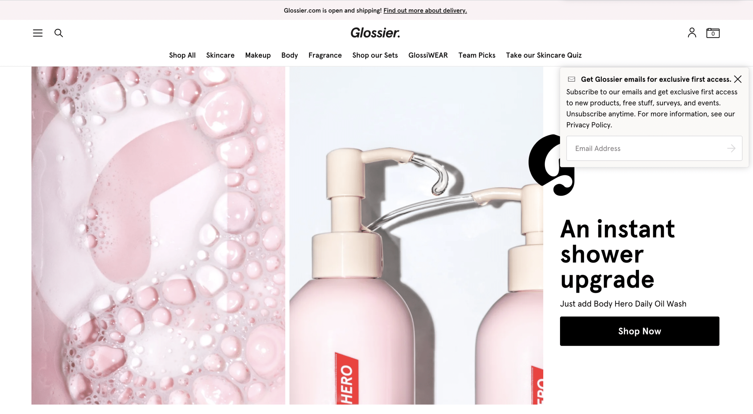
Here’s a subtle lightbox from Glossier:
This lightbox is certainly not annoying. It’s subtle but still available in the top right for anyone who wants to subscribe. It’s a great way to keep the subscribe form readily available without impairing the rest of your site.
2. SeedProd
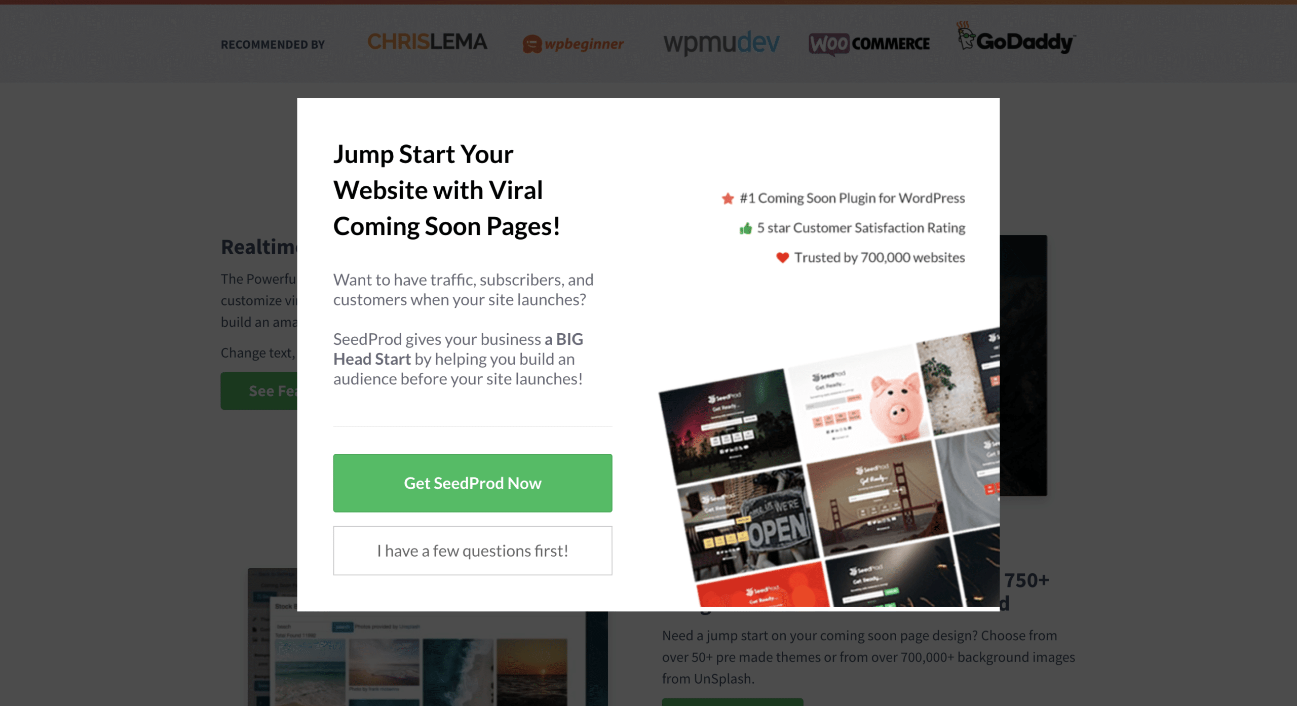
This lightbox from SeedProd makes it simple to say no, a key feature that will keep customers engaged and not annoyed:
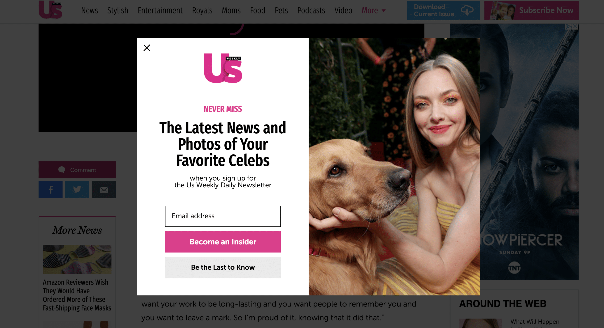
3. Us Weekly
Us Weekly sticks to their familiar brand voice with this one. The witty copy resonates with readers and is an easy way to grab subscribers’ information:
Adding a lightbox subscribe form to your site
When deciding whether a lightbox subscribe form is right for your brand, you’ll want to consider a few things:
- Is the content considered urgent enough to be used in an overlay instead of in the copy of the page itself?
- Is the information essential to collect before a visitor can move on with whatever they were doing on your page?
- How likely is the visitor to take action?
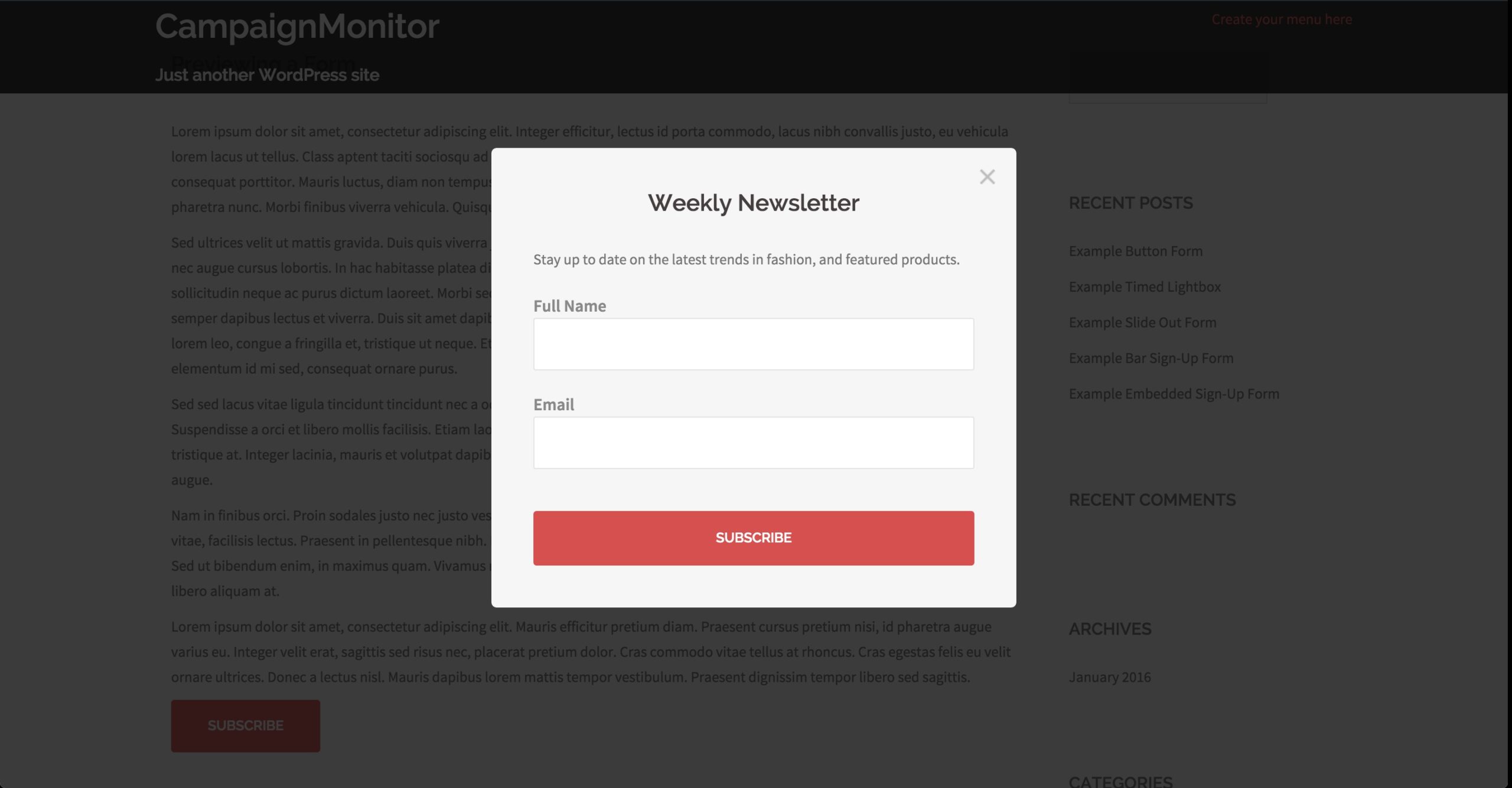
These are all important factors to consider before you add a lightbox subscribe form to your site. If you’ve deemed it necessary and beneficial to your brand, then adding a lightbox overlay subscribe form to your site isn’t as difficult as you may think.
Source: WordPress
Email form best practices
Adding your email forms into your digital marketing content is simply a matter of choosing the right integrations. However, when it comes to designing the content that goes into the form, consider the following best practices.
Ask for only the essentials.
Consumers are very wary of their cybersecurity. That’s why they often avoid forms that ask for too much personal information upfront. In most cases, asking for their name and email is sufficient to get started.
Utilize a persuasive CTA.
Persuasive CTAs include personal words, such as “me” instead of “you.” As your visitor is reading the CTA, they’re reading it as if it’s their idea, not yours. You also want to avoid friction words, such as “download” and “buy.” These terms often come off as forceful to a reader. Instead, use terms that imply getting something for nothing, such as “learn” or “get.”
Wrap up
Deciding whether to utilize overlay email subscribe forms comes down to personal preference and how well it suits your website. The best way to determine which type of email subscribe form works best with your audience members is to run several A/B tests to see which one does best. Once you know which type of form works, you’ll want to remember these two email form best practices:
- Persuasive CTAs
- Less is more
Curious about which email opt-in strategies work and which ones don’t? Check out these 4 successful strategies and examples.

