Lily: Hi everyone, thank you for joining us today for our email design webinar. We’re really excited to share best practices for using imagery and branding in your email designs, and we also hope you’re gonna learn lots of helpful tips and tricks that you can apply in your own email marketing program. Just a few admin things. If you have any questions, feel free to put them into the chat, and we’re gonna do our best to get back to you. And just a reminder, we’re also going to be sharing a recording of this session afterwards.
Before we get into the content, here’s a quick intro to who’s going to be speaking today. So first up, my name is Lily Tansey. I’m a product marketing manager here at Campaign Monitor, and I’m gonna be speaking to you a little bit later about how to apply all of what you learned today in the Campaign Monitor platform. Tylor, did you wanna say hi to everyone?
Tylor: Yeah. Hey everyone, Tylor here. Currently, I work with our brain team as the art director. But prior to that work, I was working with our professional services team and they helped to design and develop email templates that work with our email builder. But I’m really excited about the opportunity to share some tips and about how adding the right visuals to your design can really help your engagement.
Lily: Awesome. Thanks Tylor. So here’s the agenda for today. We’re gonna be covering the basics of incorporating imagery into your email designs. So first up, Tylor’s going to share some insights around the purpose of imagery in email and also the value it can add to your marketing program. Then he’s gonna cover some practical tips about how to best use images in your email designs. And then I’m gonna show you a quick demo in the Campaign Monitor platform so that you can see how easy it is to apply all of these tips. And we’re also gonna be covering off some questions at the end. So Tylor, over to you.
Tylor: Yeah, thanks Lily. There are two reasons why we thought hosting a webinar about visual design could be helpful to our users. One, we know that imagery is really important to your email marketing and we see that reflected in how our users are using the email builder. Of all the content that our customers add to their mailings, 70% of that is images. Secondly, we’ve recently launched an exciting new feature and that’s the free image gallery, which gives customers the ability to search and place Unsplash images all from inside the builder. Lily will get into the details of that a little bit later, but with all that considered, it seemed like a timely topic to discuss.
Now the impact of visuals inside of an email, can be really hard to measure because visuals tend to be subjective. However, we do know that visuals can affect engagement, specifically click-through rates. This metric ties back to creating emails that deliver that is relevant and has value to your user. By adding images to your emails, you’re increasing the connection that you make with your audience.
Today, I’ll touch on three ways that adding visuals to your content can improve engagement. First, we’ll touch on how images can create brand resonance, which helps to establish your place in the inbox. Then I’ll show you how to use images to reflect the values of your brand. And lastly, we’ll talk about how images inside of an email can improve the user’s experience as they navigate through the mailing. These tips can be helpful for people that have access to stock imagery sites, and even those who can shoot their own photography.
So let’s imagine that your images are all sending a signal and each one of those reveal new information to your user. A set of images within a single mailing will create a particular meaning that strikes a chord with your audience. When all of those signals link up, you get brand resonance and resonance is what makes your brand stand out and stay memorable.
With so many options out there, it can be overwhelming to find the right images, but one of the quickest way to narrow that search down is to set some parameters for the images that your brand wants to use. Creating rules helps you develop a style that can elevate images to something that feels unique to your brand. When establishing a style, you should make thoughtful and deliberate considerations for the audience. Now, you’re designing as opposed to just making selections for that look good. I’ll go ahead and say, we won’t be identifying good versus bad images today. A better way to reframe this conversation is what images send the right messages to your audiences and which reflect the brand that you’re trying to build.
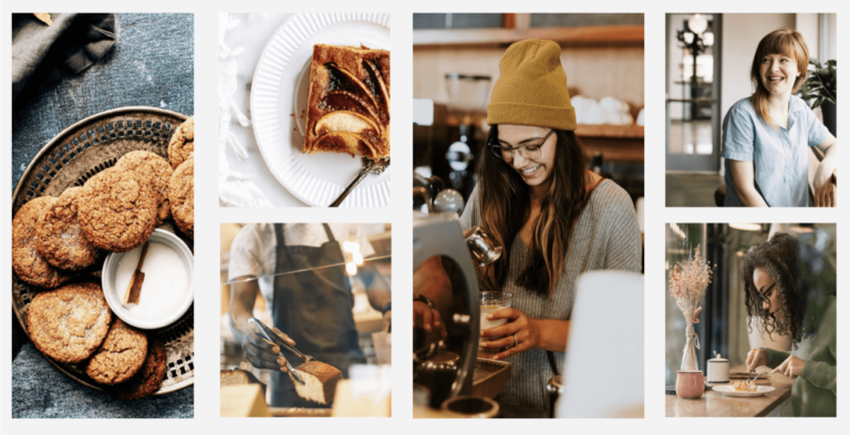
Now, speaking of brands, I have some fantastic news to share with you all today. For the purposes of this webinar, I’m the new owner of a bakery, and I’ve been tasked with growing my brand through email marketing. Now, despite my specific field of work, I believe the sentiments of this talk will be applicable to everyone who have the same strategy. So let’s start setting some rules. I’ve selected three parameters to help curate images that are best for my brand. Let’s start with color.
Now, it plays a huge role in the sensory perception of brands. And because I’m in the food industry, I need to always be serving up color palettes that help activate those associations with delicious treats. I’m also well aware that desserts are a luxury item, and with that, I’m tasked with creating moments of enticement. So it’s important that I select images that are appetizing and ask people to go that extra mile to indulge.
What we know from the cooking world is that brown equals flavor. So when we combine these golden shades of brown with vibrant fruit colors, such as pinks and reds, we activate the brain’s recognition of edible treats. Now, I deliberately chose images that have textured backdrops. Whether it be the porcelain in the plates, the marble countertops, or the cloth texture of those napkins, I wanted the stability of texture to contrast the pastries. And for our employees, we selected images where they are active to remind people of the services that we provide and our patrons, they’re always shown happy and enjoying our product.
When considering compositions, I realized our product looks great when shot from above. This view works best because it allows you to see the whole pastry and delicious details on top. For our people, I always show them cropped from the waist up. From this perspective, we can see the detailed emotional cues from them, and it allows them to fill the space. We find that the closer you get to an image of a person, the more you can locate their qualities that help build connections. Giving them this prominence in place also helps to illustrate my company’s values of putting people first.
Now, as we make our list of things that we want to attach to our brand, we also find that we’re making a list of things that do not. These represent a host of images that don’t fall into the parameters that I’ve set for this brand. If we take a look at the image of the cake, the image is taken from the front lower point view angle that is vastly different from the aerial shots that we prefer.
Now, I know I said that there are no bad images, but an empty storefront is never ideal. We always should show that our businesses are full of patrons who are eager to buy. I would only recommend this type of photo if we wanted to show off prized architecture or maybe highlight some of our fixtures. Lastly, we have this image of a person posing with a cake and engaging the camera. This falls out of the bounds of how we want to depict people in our shop.
For instance, if this is a patron, they should be enjoying that cake. And if they’re an employee, they should actually be working on that cake. This image asks us to split our focus. Is it the person or is it the cake? Another note with this image is keep an eye on the atmosphere. This appears to be a home kitchen and the person in it isn’t wearing an apron or uniform. So contextually, this doesn’t read as a professional business. It feels more like a home cook, while wonderful, isn’t quite the message that we’re hoping to send. By understanding the images that we don’t want, we can build consistency. And as your brain grows, you may need to hand these responsibilities to another team member. These parameters offer direction to anyone who needs to step into your place and give your campaigns a consistent appearance.
Images, especially those with humans, create a path to building connections with our audiences. This is a key opportunity to help reflect the world you want to see and create direction for how you want people to feel. Obviously showing people who are having a good time can always be a helpful way to convey the messaging of your brand. As humans, we turn to other humans to help guide our moods and use these as an indicator for direction. So pay attention to the way people are acting in these images that you select and make sure these feel correct even…
Tylor: Okay. Obviously showing people who are having a good time can always be a helpful way to convey the messaging of your brand. As humans, we turn to other humans to help guide our moods and use these as an indicator for direction. So pay attention to the way people are acting in the images that you select and make sure that these feel correct either for your brand or for the message in which they appear.
It’s important to consider how incredibly powerful photography is at creating representation and how it plays a huge role in shaping how we see the world and the people around us. Inclusivity comes in many different forms and selecting images is just the start. But with the access of tons of images, it’s important that we acknowledge our own biases and make concerted efforts to feature the full range of human experiences. So periodically, it’s a good idea to stand back and look at the types of images you’ve selected and make sure you’re offering a diverse grouping of people and their individual experiences. Like with all design, making space for feedback and allowing the influences of others to advance your work. With a bit of extra effort and care, it’s relatively easy to make a choice to include more types of people ranging from skin tones, abilities and cultural differences.
Regionality is another way that we can increase visibility by acknowledging the different environments that your audiences may live in. This works well for marketers who have segmented their subscribers. So now you can have that work reflected visually. Let’s say your business is based in New York, but you have a significant group of Australians in your list. It would be important to acknowledge the atmospheric differences at different types of year.
For instance, if you’re having a winter holiday promotion, you may not want to share images of snow covered trees and people bundled up in sweaters and coats because as we know, our friends in Australia have completely different experiences at this time of year. The lesson here is to make sure you’re creating content that’s as diverse as possible so you can share your messaging with as many people as possible.
There are some types of images that offer a better experience for interacting. These can help us open up new meanings as well as offer a helping hand to navigate the spaces that we’ve built. Conceptual images offer a solution to explaining messages that can’t always be said with words. These images also have a way of increasing engagement because they ask a little more from the user. In these examples, we see the macaroons appearing in an environment where they seem weightless, perhaps speaking to the airy, delicate nature of this cookie.
We also see the macaroon wrapped in a ribbon to prompt ideas of gift giving or perhaps an upcoming holiday. These types of images can also be a way of speaking more broadly. For instance, with the evergreen image, it can speak to a specific time of year without singling out any specific dates or holiday tropes. These images create space for interpretation and create opportunities to engage with more people, especially when language could be a barrier.
On the other hand, some images can provide directional guidance to where we want our user to go next. In this example, we see a diagonal line being created by the arrangement of the tarts and the extended arm of the baker, which pushes our focus back over to the left, which of course is where a headline would be leading us to continue throughout the mailing. These compositions make triangle shapes and those diagonal lines have a way of leading our eyes throughout the page. A key tip here is to always make sure that those diagonal lines are heading to the left because anything to the right would lead our user off the page.
Now that we’ve covered different types of images and how they function within an email, let’s talk about how we should go about considering where to place them. One of the first images to always consider is the hero image. It’s the image that greets your users and sets the tone for the rest of the mailing. Consider it your hook. It needs to be what grabs their attention as they sort through their inbox. Coupled with your logo and a great headline, this combination becomes your first opportunity at creating resonance.
So when thinking about which images work better, let’s figure out if they have dead space or white space. Images with white space have breath around the subject. In this case, the subject is the apple tart and the plate and the marble texture helped to create that breath, providing clarity for the subject and allowing us to focus. This image is cropped horizontally because it allows us to focus on a single point.
Now, dead space is what happens when you don’t crop the image thoughtfully. It can be an obstacle in email design because it can eat up valuable space and become a barrier for users trying to get to that CTA. In this image of the cookies on the plate, the dead space is made up of the upper half. At this point, it doesn’t provide any new information, just additional space.
Now that we’ve categorized these, let’s find a good place in the mailing for them. For your horizontal image, I would pair that with a great headline followed by some supporting copy and a CTA. For your vertical image, the one with the dead space, let’s make that a background image. And luckily for us, Campaign Monitor’s email builder has made that process super easy. Plus it allows you to select a focal point for when your images scale for mobile devices.
As a quick aside, I’ll recognize that background images are supported by all mail clients so it’s important to set a background color that has a good contrast with your copy color in the event that the image doesn’t render properly. But being bold has its risks and once you know more about your audience and who their mail clients are, you can use this feature with more confidence.
All right. Let’s take a look at some secondary images. This placement is typically further down in your mailing and is meant to keep people engaged with the content. At this point, your user can be a little fatigued, so let’s not overwhelm them. Keep these images concise and simple in subject. This is not a good place for some of those more conceptual images. Some of the most common orientations are a square when we’re thinking about dual-column layouts and a rectangle when we’re thinking about those single-column layouts.
Be sure to think about ratios in relation to your hero image. Always make sure images are consuming half of the space of the image that came before it. By doing this, you create a visual hierarchy. I like to think of it as an inverted pyramid. I’ll take all of the content and rank it from most important to least so as a user makes their way down the page, we reduce the emphasis by being more concise.
In these examples, you’ll see some of the placements that I made within our layout. As the image sizes decrease, you’ll also want to do the same with your header styles. Create something that is a bit smaller. I’d recommend four pixels less than what your headline font size is, and this will help to continue that theme of the inverted pyramid.
Here, we can loop back to that concept of how images create shapes that direct our readers towards specific content. Using eye tracking data, we can see that users look into the same part of the screen where the images of people are looking. So that seems like a really great place to put a call to action. Here are some examples of how we can place images into our layouts to act as way-finding for our users. Once again, this creates directional guidance, pushing them further down the page
In the spirit of inclusivity, I would be remiss if I didn’t mention some solutions that we can create for people who have varying abilities with sight. All of today’s conversation has been based on the assumption that your users have the ability to see those images. But it’s important to understand that these could also act as a barrier for some of your audiences. Adding alt text to all your images is an important practice because it can be really helpful for those who use screen readers, those who have blocked images inside of their email client, and even for those experiencing low Wi-Fi signals.
This is just one of those examples of when you create a solution with some in mind, you actually help the experience of many others. I’ll also let this be a reminder to not populate your imagery with vital information such as time and day of an event or any calls to action because that information could be hidden from some users. However, if you need to do this, just make sure that you also repeat that info in the live text of your email.
I can also offer some best practices for writing these short clips of texts. First, ask yourself, “What is the image’s functionality and how does it assist in telling the full story of this message?” In this example for this hero image, I would probably go with something like “young person enjoying our signature chai latte.” It’s short and descriptive, and why not use this opportunity to brag about our delicious coffee? Don’t waste time including text like “image of,” or “photo of.” If we imagine this mailing being read aloud, repetitive statements like that could become annoying. And if your images are purely decorative, just leave the alt text blank. The best part about all of this is that Campaign Monitor’s platform makes it easy to add this practice into your email creation process. And Lily will walk you through those steps in our demo.
So let’s wrap up what we’ve learned today. First, set some rules and curate imagery that feels unique to your brand. Secondly, create space for representation, make sure your images reflect your brand and the people you want to help grow in your success. Thirdly, let images help you tell stories and offer directions in your mailings. Fourthly, consider the proportions of these images and how they guide where to place them in your email. And lastly, make sure you’re removing any barriers so that people with a range of abilities, whether they be permanent, situational, or temporary, can experience your content. I wanna thank you all for letting me run through some of my thoughts about imagery, and now I’m gonna pass the mic back to Lily who will walk us through the platform. And I’ll be back here in a little bit for some questions.
Lily: Awesome. Thanks so much, Tylor. So now with all of that in mind, we wanna show you how you can apply all of these super helpful tips in your email designs in the Campaign Monitor platform. So if you haven’t used our platform before, we have a really simple email builder that makes it really quick and easy to create email designs. I personally use it all the time. I don’t have a design background and I still find it easy to create professional-looking designs using the builder.
I’m gonna demo that really shortly, but first, let me give you a little bit more detail on the free image gallery. So as Tylor mentioned earlier, this is a really exciting new feature that we’ve released in our email builder recently. And what it does is it allows you to drag and drop Unsplash images straight into your email designs. So we’re connected into the Unsplash image library, which has over two million free images and you can drag and drop the image that best suits your design without leaving the email builder, so really simple and easy.
The reason we decided to release this feature is because we know it can be really time consuming and also very expensive to source imagery. So for many of us marketers, it’s not always an option to shoot your own photography, which means we do kind of have to rely on what’s already out there, but it can be hard to find the right thing and find the right thing that doesn’t cost any money. And if you do source your images from stock image sites, which I’m sure probably many of you already do today, you’re probably familiar with that lengthy process of scouring online for the right stock site, finding the image you want that suits your budget but still looks great, navigating copyright rules, and then having to manually download it and then re-upload it into your email design. So it can be a bit of a hassle and with free image gallery, we have introduced this just to eliminate all of that time and effort for you. So it’s super simple to use.
And also if you have used Unsplash images before, you will notice how high quality they are. We find they’re quite differentiated from the rest of the stock imagery that kind of saturates the market. So it does help you create a bit of a point of difference and really engage your users. Okay. So now I’m gonna show you how to apply all of these tips in the Campaign Monitor platform using the free image gallery. Here’s an example of an email design that we’ve built using one of the free templates available in Campaign Monitor, which is advertising Tylor’s bakery.
You can see we’re pretty much ready to send this, but we do have one more image to add in here, so I’m gonna show you how to do that using the free image gallery. So what I’m gonna do is drag and drop one of our image content blocks here. That’s gonna give me the option to find an image that suits my design using the free image gallery. So I’m gonna select browse free images, which is now gonna give me access to the Unsplash library.
I know based on the copy here that we’re looking for an image that represents our signature snickerdoodle cookie. So what I’m gonna do is search in the search bar here for cookie. What that’s gonna do is bring up all of these different images from the Unsplash library, and I’m gonna be able to pick one that suits my design. So I’m gonna scroll through all of these designs, all of these images, to find one that suits and one that aligns with the brand guidelines that Tylor set for his bakery earlier in the presentation.
So here we go, I’m gonna select this one because it really aligns with the color themes and textures and composition that he covered earlier. So once I have selected that, it dropped straight into my design. You can see it’s not quite the right size so now I’m gonna crop in. You can see here that we’ve used a square two-column layout for our secondary images just to follow that kind of visual hierarchy Tylor mentioned earlier, and also so it doesn’t detract from our hero image at the top. But we can see we’ve got a lot of dead space in this image. So I’m going to crop it into a square ratio and also really dial in on the focal point of the image, which is these cookies here.
So I’m really gonna make them the focal point by cropping in quite close. So once I’m happy with this, I can select done cropping. You can see it’s still a little bit too large for my design, so I can easily just adjust the size down to suit the rest of the template. And there we go. That means we’re ready to send. You can see just how quick it was for me to do that and how easy it is to use that free image gallery.
So with that, that wraps up our presentation and also the demo. What we’re gonna do now is address some of your questions. So lots of the questions that we’ve got here are design-based questions, so I’m gonna ask Tylor to answer them for us. So let’s jump straight into it. So Tylor, our first question was, “In the header of your email, should you use a big inspiring image or should you keep the image as small as possible so that the reader can quickly see your introduction copy?”
Tylor: Let’s see. So I read a stat one time that said our brains process images 60,000 times faster than our brain can process text. So with that in mind, I think images will always help with conveying messages. But for your header or hero image it’s less about size and more about impact. If I can’t find an image that helps me tell the story a little bit better, then I’m just gonna leave it out and let the copy speak for itself. So I guess my recommendation would be like, don’t use images out of necessity or because you think you have to. I guess use images because you think that you’re sharing something new with the user.
Lily: Awesome. Thank you. Here we’ve got another question that’s come through from Cherie. Cherie is asking, “What’s the preferred sizing of images to use in email campaigns?” Do you have any tips on that, Tylor?
Tylor: Yeah. let’s see. Sometimes preferred, it sort of just really depends on when you’re starting to lay things out and you’re sort of just wanting to balance things visually. But if we take that version that you just showed, I could say that for that hero image the max width with that was 600 pixels wide, and that was sort of the parameter was set by that template, which 600 pixels wide is great. And the height was about 450 pixels. And kind of how I chose that is once I sort of sent that test to myself, I saw that the height of that image with the headline and that copy underneath it, that sort of all was “above the fold” as we may say. And so that height worked really well in the inbox, so that I could sort of, like, capture a little bit of everything without having to scroll.
Those two square images, they were 260 squared. So 260 pixels and I came to that number by just dividing the width that I had by two. So 600, you know, divided by 2 was 300 and then I wanted some padding on both sides. So I just let it be, you know, 20 pixels of padding 260, 20 pixels of padding. So yeah, I was doing a little bit of math there to sort of, you know, to come to my reasoning behind why I made that selection. And then that rectangle image, the one that we sort of lightly saw with the tarts on it, that was 600 pixels wide just like the hero image, but I borrowed from the squares and I made it 260 pixels tall. So really just sort of reusing those proportions, which helped to create, like, a visual balance.
Lily: Great, thank you. That’s super helpful. And definitely some of the templates that we do have in Campaign Monitor will help you manage those ratios as well, so something that we can help you with. The next question that we’ve got has come through from Dan. So Dan asks, “What are the pros and cons of using text with custom brand fonts inside an image?” And he means not live text, but text inside an image.
Tylor: Yeah, so you know, this is always a pin in our sides for visual designers. But, you know, how fonts appear in the inbox is mostly all up to the mail clients, so we don’t have a lot of control over that. But by pulling in some of your brand fonts and placing those on top of a couple of images, I don’t see anything wrong with that, you know, just as long as you continue to use alt text and then also repeat that copy somewhere else in your live text.
So of course, you know, if you’re promoting an event and you’ve got the date of the event with, you know, inside the image, I would just also just repeat that, those vital details outside of the image once again, just to capture anyone who doesn’t get to see the image. But yeah, I have sort of made the recommendations to a lot of brands to consider selecting an email, say font and placing that into their brand guidelines. And that will help with build at least some consistency in the future that you may not be able to use your custom brand font in emails, but at least you could use the same one every time. Once again, just, you know, sort of helping tell that story though.
Lily: Fantastic. Thanks. And you mentioned something there about adding alt text into an image. That’s also something I want, I’d like to quickly demo for everyone just to show you how you can actually do that in Campaign Monitor, because it is really easy and as Tylor has covered it, really crucial to make sure your email designs are as accessible as possible for everyone.
So if I go back to my design that I’ve got up here and the cookie image that I dropped in recently, what I can do is just click on that image and it shows up this alt text bar and I can enter in whatever text I want. So here, I’m going to say “our famous snickerdoodle cookie.” So that’s descriptive, but also short enough, but gives an idea of what we’re really known for as a bakery or what Tylor is known for as a bakery. So that’s just a quick demo in there.
Let’s go back to some more questions. The next question we have is from Marianne. So she wants to know, “Can you put a call-to-action box on a picture or is there a way to put text over a picture?” She also wants to know as well if background images work in Campaign Monitor. So a few different questions in there for you, Tylor.
Tylor: Yeah. So like I mentioned in my talk, yeah, you can definitely use the background image function inside the builder. But yeah, just use with a little bit of caution unless you know your user’s mail clients, because sometimes those background images are not supported by all mail clients. But the way that you sort of, you know, have an insurance plan is just to make sure that the background color offers enough contrast with that CTA button that you put on top of it and that body copy so that will sort of help prevent any rendering issues that may happen. And also be sure to adjust the focal point, which is something that you can do inside of the editor too. And then, you know then test it in a mobile atmosphere and that just makes sure that your image doesn’t slide over and sort of block any vital text that you want your reader to see. But yeah, it’s certainly possible inside of CM.
Lily: Fantastic. And really great point there around testing in the builder. Our builder does have the functionality to preview what your email design will look like, not just on the desktop, but also on the mobile. So you can just make sure it’s all rendering correctly before you send. Okay, I think we’ve got time for maybe a few more questions. We’ve got one here from Rebecca. So, “How does the strategy of utilizing imagery change in working with B2B versus B2C campaigns?”
Tylor: Yeah. I think the only way that I would think that you could switch up imagery is if we were thinking about like, what are your intentions when sending the email? I would think in a B2C situation, you’re more focused on the product that you’re selling. You’re wanting people to like buy the product. But maybe when it comes to like B2B, you may be looking at sort of partnerships or stuff like that. And so you may be more interested in sort of selling the company itself or the brand itself, or…and so you may find yourself focusing on like business philosophies or values, the happiness of your employees, things like that because you’re wanting to sort of build those relationships and not so much, like, sell a product. But other than that I can’t really think of how they may be, you know, I would probably make need to know more details to sort of get specific, but I really think it’s about just making sure that your images fit the content that you’re sharing.
Lily: Absolutely. Thanks. Next question from Jonathan, “What’s best resolution to save images at, for modern devices?” So he means things like retina displays.
Tylor: Yeah. So I would always recommend bringing images into the builder at twice the size that you want them to render. And so once you move them into CM, it is going to compress that image much like a zip file would work. But also like a zip file, you know, if you zip a file up, you don’t lose any of that data, it just is stored differently. And so whenever you do have those sort of compressed images when they go out to the world and they’re viewed on different devices, those devices like retina screens, they will be able to use that extra data in that compressed image in order to make those images more crisp.
But if probably, you know, what happens is that, you know, when a retina screen wants to display an image and it doesn’t have all that data, it just fills in, it makes assumptions and guesses with, like, little colored pixels. And that’s how we get blurry images is when there’s not enough data to tell the device what to put in these pixels. So yeah, I would definitely recommend bringing images in at double the size you want them to render. And for, like, formats, I would recommend JPEGs for any sort of imagery. Like, all of the things that we looked at today, I would pull those in as JPEGs. But if we were looking at illustrations or vectors, I would recommend PNGs for that type of imagery.
Lily: Awesome. Thank you. We’ve got a few more questions relating to kind of best practice with using images in your design. So Betty would like to know, “What’s better using multiple pictures, showing different aspects of one’s work or just one single image?”
Tylor: So currently they say that the average attention span in an email is 11 seconds, which that’s actually growing from what it used to be, which I think was, like, 9 seconds. And I think mobile devices have really helped with that so people can, you know, stay with your emails a little bit longer. But in my opinion, images should still be really sort of bold and impactful and lack any sort of complexity. You know, if someone has to zoom in to an image, I don’t think it will be as successful. So if I was making a recommendation, I would say, you know, a single solid impactful image over many different ones.
Lily: So I think we’re gonna have to wrap it up there as we are out of time. We just wanna say thank you everyone so much for attending. We hope you took away some helpful tips from today’s session. We are going to also email out a recording of the webinar so that you can watch it back at any time, and we’ll also send out some follow-up details to all of you via email. And just a quick note, if you are a customer, just make sure you log in and check out the free image gallery, test it out, see how useful it is, and we’d love to hear your feedback.
If you’re not a customer yet, you can also just sign up for free on our website and you can test out the free image gallery on the rest of the Campaign Monitor product for yourself. And we’re also gonna share sign up details with you in our follow-up email that we’ll send in the coming weeks. So thank you so much, everyone, we’ll wrap up there, and enjoy the rest of your day or your evening.