9 minute read time
24 of the Best Call-to-Action Examples You Can Click On

Whether you want more visitors to your website or sign-ups for your newsletter, your call-to-action (CTA) will play an integral role in encouraging people to take action.
More often than not, CTAs drive our next steps and we don’t even know it. For example, think about what enticed you to click on this article. Pretty cool, huh?
So how do you make sure people notice, engage with, and click on your call-to-action?
Below, we look at the 24 of the best call-to-action examples we could find, covering everything from newsletter sign-ups to eBook downloads.
The 24 best call-to-action examples
CTAs are all about getting the right balance between simplicity, information, and intrigue. And to help you understand the best call-to-action types for each requirement, we’ve pulled together a wonderful mixture of examples for you.
1. Netflix CTA example: Free trial
The persuasive text in this CTA encourages you to take advantage of Netflix’s free trial. And the text just above the CTA also lets you know that the product is incredibly flexible and can be canceled whenever you wish. This helps builds confidence and knowledge before you click on the CTA.

Image Source: Netflix
2. Plated: Sign up now
First, Plated shows the benefits of the subscription, using phrases like “Everything you need,” “Amazing dinners,” and “Perfectly customized.” This builds a luxurious-yet-convenient picture of the product. Then, the CTA is highlighted with the bright pastel green box.

Image Source: Plated
3. Backlinko CTA example: Sign up
This CTA takes over the whole landing page, making it a really dominant feature. Adding to this is the great contrast between the lime green background and the red “Sign Up” button. It immediately grabs your attention and leads it to focus on the CTA.. Plus, its bold simplicity really instills a sense of confidence in the program.

Image Source: Backlinko
4. Lyft CTA example: Join in
In this email, Lyft draws the readers’ eyes straight to the CTA button, “Join in,” by using a bright pink color that matches its brand logo. If people want to know more before clicking on it, they can find easy-to-digest information right underneath it. And if they still want to know more, they can read the entire email without losing sight of the CTA.

Image Source: Really Good Emails
5. Dollar Shave Club CTA example: Get started
Instead of using the word “join,” the Dollar Shave Club has opted for “try.” This is slightly less committal and helps increase the confidence you feel in clicking the main CTA. This is further added to with the use of “risk-free” and the simple message about what you can expect from the service.

Image Source: Dollar Shave Club
6. Trello CTA example: Sign up—It’s free
Using a blue background, Trello ensures its CTA stands out with contrasting colors. The persuasive copy in white details the benefits of the product, while the green CTA button makes it clear what you need to do—sign up – for free!

Image Source: Trello
7. Campaign Monitor CTA example: Try it for free
Call us biased, but we follow our own advice! Highlighted on a dark background, Campaign Monitor’s CTA is clear, concise, and informative. Users find confidence in the stats (250,000 businesses around the world are already using it) and the mention of no credit card being required. You also know help is instantly available with the button in the bottom right-hand corner.
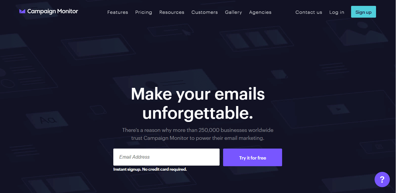
Image Source: Campaign Monitor
8. Whistle CTA example: Learn more
Here, someone’s signed up to hear more about Whistle, so it’s important the email actions this. The “Learn More” button meets this desire and stand out with their bright blue color. However, should the recipient feel they’re ready to proceed, the orange CTA “Buy Now” stands out at the bottom of the email. This is clever as it doesn’t make the email feel pushy or persuasive, it encourages readers to learn more before it presents the sell.
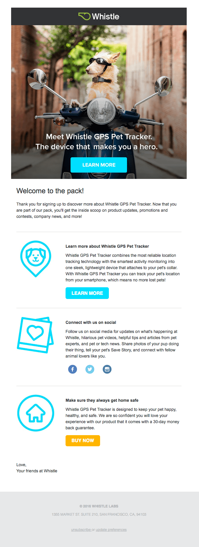
Image Source: Really Good Emails
9. Huemor CTA example: View our work
As a web design agency, Huemor probably feels a little pressure to have a great landing page.
And it does.
By incorporating a beautiful background that looks hand painted (and, therefore, expertly creative) and adds to its bold statement (it’s landed someone on the moon), it really draws you in. Then, the pink CTAs guide your attention, allowing you to find out more whether it’s by contacting the agency or viewing its work.

Image Source: Huemor
10. Cools CTA example: Sign me up
As a pop-up box, this CTA is incredibly visual and the red certainly calls for your undivided attention. The witty CTA “Make your inbox a little cooler…” adds a playful twist which helps keep you engaged so you don’t simply click off the box.

Image Source: Cools
11. Ugmonk CTA example: Enter giveaway
This exit pop-up from Ugmonk really works in keeping you on the site and engaging with the brand. It’s simple but effective in its messaging and the giveaway is the perfect temptation to submit your email address. You also feel comforted by the fact you can easily click “No thanks, I’m not interested” if you don’t wish to take part.

Image Source: Ugmonk
12. Rothy’s CTA example: Email address
This pop-up is warm and inviting thanks to its “Hello!” and understated, cool design. It tells people exactly what they can expect from the newsletters as well as the website. And, users don’t even need to click on anything. They just enter their email and hit enter. This makes it super convenient and won’t take you away from the page you’re browsing.

Image Source: Rothy’s
13. Marie Forleo CTA example: Download now
This CTA shows how you don’t always need bright colors. Rather, the simple monochrome design works beautifully and adds to the strong, authoritative message Marie is sending. Plus, the text, teamed with the image on the right, shows you exactly what you’re going to get if you click “Download Now.”

Image Source: Marie Forleo
14. Crazy Egg CTA example: Show me my heatmap
Not only does this CTA stand out on the pale background, but even the cartoon graphics are pointing toward it. This all draws your attention to exactly where it should be going. Again, stats build confidence and so does the “cancel anytime” reassuring text below.

Image Source: Crazy Egg
15. Laughing Constable CTA example: Download eBook
The graphics in this email are incredibly vibrant, but the CTAs always stand out as a contrasting color. The two CTAs not only accommodate for people scrolling down the email but also incorporate two different types of wording. The latter helps appeal to two different audiences.

Image Source: Really Good Emails
16. Nerd Fitness CTA example: More success stories
This CTA gets incredibly specific. And the compelling nature of the copy is brought to life in the before and after pictures that rest above it. This all works to build up momentum within the viewer, making them want to be a part of these success stories.

Image Source: Nerd Fitness
17. WDC CTA example: I wish to end whaling
Another very specific CTA but one that pulls on your heartstrings. It appeals to the emotions of the reader, and compels them into taking action because of their beliefs. Clicking on the CTA means they’re making a pledge against the statistics they’re reading above the CTA.

Image Source: Campaign Monitor
18. Casper CTA example: Return to cart
While the CTA in this email is quite straightforward, it’s the added “Come back to bed” message that really drags you in. The simple dark blue and white format means you’re instantly drawn to the bolder blue text and buttons. Plus, Casper has ensured that if people aren’t ready for the “Return to cart” action, they can find out more by reading more reviews. This ensures recipients don’t feel restricted or pushed in their choice.

Image Source: Really Good Emails
19. Harry’s CTA example: Save the stout
This incredibly funny email from Harry’s really grabs your attention. You can’t help but feel drawn to the play button because of the high contrast in colors. Plus, with the added hashtag at the end, this CTA also works to get people sharing the humor with their friends.

Image Source: Really Good Emails
20. Cupid CTA example: Sign-up form
The “Join Now” CTA at the bottom of the signup form makes users feel as though it’s quick and easy to find love (just like the deliriously happy couple on the left). Plus, the clever idea of “catching” your match adds to the overall branding of Cupid.

Image Source: Cupid
21. WWF CTA example: Donate or adopt
Notice how well the two key CTAs, “Donate” and “Adopt” match the background image. This helps them stand out without them looking out of place or obvious. WWF uses two colors to differentiate the CTAs but without making one more dominant than the other.
Why?
Whether you donate directly or adopt an animal, you’re still contributing to the cause.

Image Source: WWF
22. Krrb CTA example: Yes, verified
This email features two CTAs, one that takes more prominence than the other—the blue draws your eye far more than the gray. This is because the “Yes, verified!” button is the one the recipient’s hopefully going to click.

Image Source: Really Good Emails
23. BarkBox CTA example: Choose your BarkBox or give a gift
The two CTAs here boast equal dominance and simply mirror each other’s colors. However, the choice shows BarkBox really knows its customers—a lot will just want to give it as a gift and don’t want to subscribe themselves. The cool CTA in the bottom right also adds to the fun feel of the site while allowing customers to get the help they need.

Image Source: BarkBox
24. LastMinute CTA example: Find
The pink “Find” CTA really stands out on this website, fitting in with its overall theme. And to make sure you know what you’re looking for at all times, the clear black and white boxes differentiate the various search options you have (Flight, Hotel, Flight + Hotel, etc.).

Image Source: LastMinute
Wrap up
As you can see, the best call-to-action needn’t be time-consuming or elaborate. Instead, it just needs to be prominent, clear, and use engaging copy.
Incorporate some of these best practices on your website, in your emails, and on your pop-up forms and you should notice your click rates skyrocketing.
For more information on how to create stellar CTAs in your emails, read our guide, 4 Elements of Successful Email Calls to Action.