Article published in October 2014, updated June 2019
There’s a lot that goes into an effective email campaign. A lot. Knowing what you really need to do to make your emails convert better can seem murky at best.
You can structure your email for scanners, write copy that’s compelling, and create CTAs that are unique and awesome, but many of you will probably still experience a lack of conversion.
So what do you do? Following the principles of high-converting campaigns and how to optimize your emails before sending can set you on the path to better email conversion.
In this post, you’ll learn the three principles of optimizing email conversion for your campaigns. We’ll give you actionable tactics you can use to increase your conversion rates in your next email campaign.
Get more conversions with these 3 principles.
In our guide on How to Get Better Marketing Results With Beautiful Design, we laid out the three principles of beautiful design that supports email conversion.
- Your campaign should motivate a person to take action. Through the design and copy of your campaign, you should be giving the reader sufficient motivation to click through and take your conversion action.
- Your campaign should reduce anxiety toward taking the action. Through the design and copy of your campaign, you should be reducing any anxiety the reader may have towards clicking through and taking your conversion action.
- Your campaign should make it easy to convert. Through the design of your campaign, you should make it shockingly easy for readers to click through and take your conversion action.
These three principles form the basis of any successful email marketing campaign. By applying them to the design and development of your campaigns, you’ll see great conversion rates.
Apply these principles to increase conversions.
Now it’s time to put the principles into action. Let’s take a look at some examples of how others have done it before.
Step 1: Motivate your recipient to take action.
To motivate someone to click through your email campaign, you need to create a desire in them for your product or content.
According to consumer psychologist Adam Ferrier, desire is made up of two key elements: individual incentive and social norms.
The individual incentive is the idea that people are motivated to behave a certain way either to gain pleasure or to avoid pain. In marketing terms, desire to convert is created when people can see how your product or service will either please them or solve their problem (or potential problem).
With that said, humans are inherently social, and we’re driven to act in a way we believe would be considered “normal” in society. When deciding whether or not to act (in this case, to click through), we also consider things like how we’ll look if we perform this behavior. Our brain analyzes the social norms around this action, and whether people we consider influential are undertaking the same action.
So, in order to create a desire for your product, you actually need to satisfy both the individual incentive and social norm elements at the same time. You need to show people how your product will reduce pain or increase pleasure, and you need to reassure them that using your product is acceptable or encouraged by their peers.
Here are some examples of how you can motivate in your email campaign.
Use irresistible imagery.
Using beautiful and compelling imagery in your email campaigns can motivate by appealing to the pleasure side of someone’s individual incentive.
This is particularly important in visually driven businesses, like food and fashion, and Campaign Monitor customer The Restaurant understands this point.
In their email campaign for the launch of their winter menu, The Restaurant used high-quality images of their food to stir people’s appetite. This mouthwatering imagery creates a desire to eat, which motivates the viewer to convert. Imagery can also portray social incentives that might cause someone to feel like they’re missing out if they don’t buy the product.

Try it out.
When using images or screenshots of your product in your marketing content, use irresistible and compelling graphics or photos to increase individual incentive and drive people to click through to your email conversion.
Write benefit-focused copy.
Focusing your copy on the benefits of your product—rather than its features and options—helps people understand how your product can make their lives better and increases their individual incentive to convert.
Although this concept is fairly well-known, when you’re strapped for time, it’s easy to start writing about features, forgetting to write about how they actually meet the wants and needs of your audience.
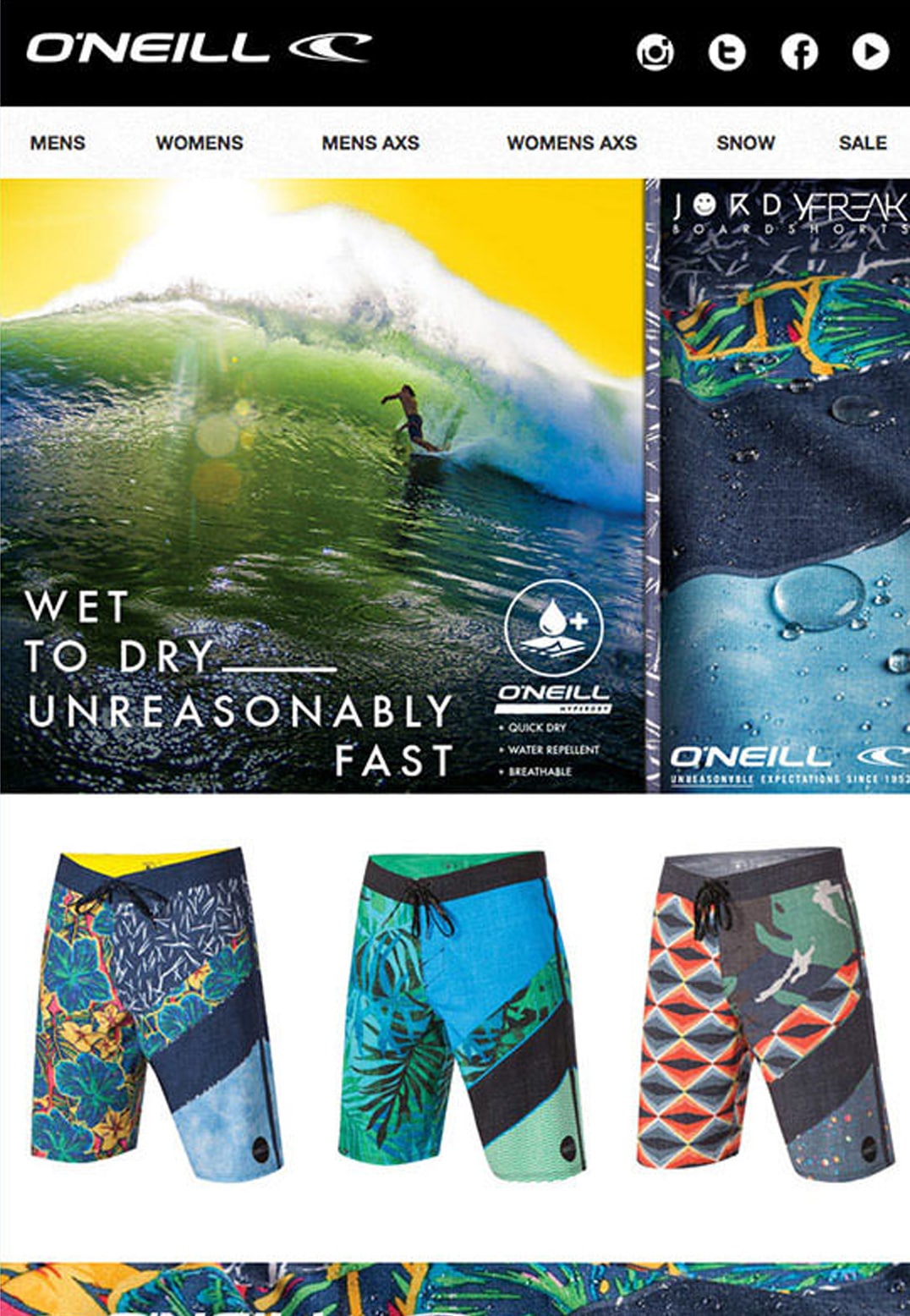
O’Neill does a great job of showing how to avoid the pain someone might experience.
This header says, “Wet to dry—unreasonably fast,” hinting at the pain of being wet for too long. They focus on the benefit of their product instead of the feature. The feature is that the materials used in this product can make the aquatic activist dry quickly. The benefit: when you’re wet, you can get dry in an unbelievably short time.
Try it out.
If you’re stuck only thinking about the features of your product, try making two columns on a piece of paper, with features on the left and benefits on the right. Think of it as a translator, and focus on translating features into statements about benefits. This can be a guideline for you as you approach your email copy in the future.
Step 2: Reduce anxiety around taking the conversion action.
Reduce any potential anxiety toward taking an action.
In marketing, anxiety is essentially any feeling of discomfort or unease toward making a conversion.
Anxiety can be caused by any number of things, including:
- Concern that your offer isn’t worth their time and/or money
- Worry that your product or service isn’t the right choice for them
- Doubt that your product or service is reliable or can deliver what you claim
- Fear that purchasing your product is insecure
Put yourself in your customers’ shoes and try to understand what their points of anxiety may be. Then take steps to reduce those anxieties.
Here are a few ideas to reduce your recipients’ anxiety in your email campaigns.
Show testimonials.
Featuring testimonials from happy customers in your campaigns is a great way to reduce any anxiety people may have toward your product.
However, it’s not enough to just include a small snippet from a customer about how great your product is. People don’t always trust that these snippets are genuine. Instead, include the customer’s name and photo to increase the credibility of the testimonial. More credibility creates more trust, ultimately relieving anxiety.
The email marketers at Freshbooks leverage a testimonial from a happy customer to help reduce anxiety around their new feature announcement.

Try it out.
Using testimonials in your email campaigns can help reduce anxiety people may have toward your product and help drive more conversions. And make sure your testimonial is trustworthy and includes the person’s name and photo to enhance credibility.
Showcase customer counts.
Showcasing customer counts and creating social proof in your campaigns can also help reduce anxiety toward conversion.
These metrics and statistics help reassure people that your product is secure and reliable. It shows how dependable your product is to do the task people need it to do. This goes back to the principle of consumers following social norms. They want to know that people like them are using the product and achieving their goals.
InVision uses customer metrics in their email marketing campaigns. By including the number of other designers using InVision, they create a sense of safety and security in the product that gives people the confidence to sign up and start using it.

Try it out.
If you have some impressive customer numbers, incorporate them into the design of your email campaigns to address people’s concerns and provide social proof. However, avoid showcasing customer counts if you don’t yet have an impressive number. Few people like to be the first to try something, and this form of negative social proof could actually lead to anxiety.
Step 3: Make your email conversion easy.
Make it as simple as possible for your recipient to take action.
According to consumer psychologist Adam Ferrier, increasing ease is one of the most effective ways to multiply people’s likelihood of taking your desired conversion action.
Ferrier cites a study where researchers compared how many chocolates a person consumed when the chocolates were placed on their desk, versus when they were placed just two meters away. They found that, when the chocolates were placed on the desk, people ate an astonishing five times more chocolates than when they were a couple of meters away.
This study highlights the importance of ease in getting people to convert. Even though consumers’ desires and anxieties toward eating chocolates were exactly the same, making the candies easy to access increased consumption five times over.
How can you make your email conversion shockingly simple for your subscribers? Here are a few ideas you can apply to your next campaign.
Use buttons that stand out.
Using a highly visible CTA button is one of the quickest and most effective ways to make it easy for people to convert.
When we tested replacing the call to action links with a large CTA button, we got a 22% increase in click-throughs.
Rip Curl does this well in their email campaign for a new GPS watch. The big “Shop Now” CTA button utilizes size and contrast to stand out from the rest of the email. By standing out, it ensures readers know exactly which step to take next.

Try it out.
Use a CTA button in your email marketing campaigns instead of just a text link. Make it stand out by choosing a color that pops against the background of your email. Before you send, circulate a test to a variety of people to see if the CTA is extremely clear.
Remove distracting elements.
Sometimes, making it easier to convert isn’t about adding new elements like buttons and images. Instead, it can be about taking things away.
Making their email conversion easy for subscribers of their newsletter, SitePoint uses a simplified design, with no extraneous images or design elements.

This lack of other design elements focuses the reader’s attention on the news stories in the email. This focus drives them to read the snippets, piquing their interest to read more of the article by clicking through.
Try it out.
Try removing extraneous elements from your campaigns to focus people’s attention on your key conversion actions. The added simplicity can make your CTAs stand out from the rest of the content and help funnel people into clicking them and converting.
Use conversion-centric design in email.
Email campaign optimization is about designing the content around a goal. When you set out with a goal in mind, your content will be geared more optimally to achieve results with engaging in text, imagery, and layouts.
The best way to receive conversions from email is to understand the components that garner engagement and, more specifically, how to drive users towards a profitable call to action.
Soló
Source: Really Good Emails
This email example showcases the time-sensitive nature of a deal. Oftentimes, driving an individual to a preferred action merely requires you to bring up a timeframe that creates a sense of urgency. If there’s a limited amount of time to take advantage of a promotion, it’s more likely that your subscriber will take action.
Even the image itself conveys that some time has passed and the reader may need to act fast. If you want the user to click through and engage, you need to let them know the opportunity won’t last forever.
Quickbooks
Source: Really Good Emails
Quickbooks also utilizes an email to express time sensitivity, albeit with a different aim. In this example, the person isn’t being offered a discount. Instead, they’re using the trial version of a product. The trial is about to expire, so the aim is to get them to sign up for the full version.
The email offers a simple presentation but highlights how the user has already been using the product. Talking about the concept of momentum brings to mind what the user has gained from the product. They’re already seeing its benefits and, what’s more, they’re learning to use it. With that knowledge, it’s likely they could get even more out of the product by signing up for the full version.
Source: Really Good Emails
This example from Basecamp proves that conversion-centric design isn’t always about flare. This email cuts straight to the point with text rather than flashy graphics. The minimalistic approach is even more pronounced than the previous examples, but the goal is clear.
Email campaign optimization and, specifically, click-through optimization is about giving a user an easy path to engagement. Basecamp’s email does that by providing multiple ways the reader can click through and listen to the podcast. Providing interesting snippets about what to expect doesn’t hurt either, and helps build more interest.
Reelgood
 Source: Really Good Emails


